
Typography Challenges in Multilingual Design
Explore the complexities of typography in multilingual design, including font support, text direction, spacing, and readability adjustments.
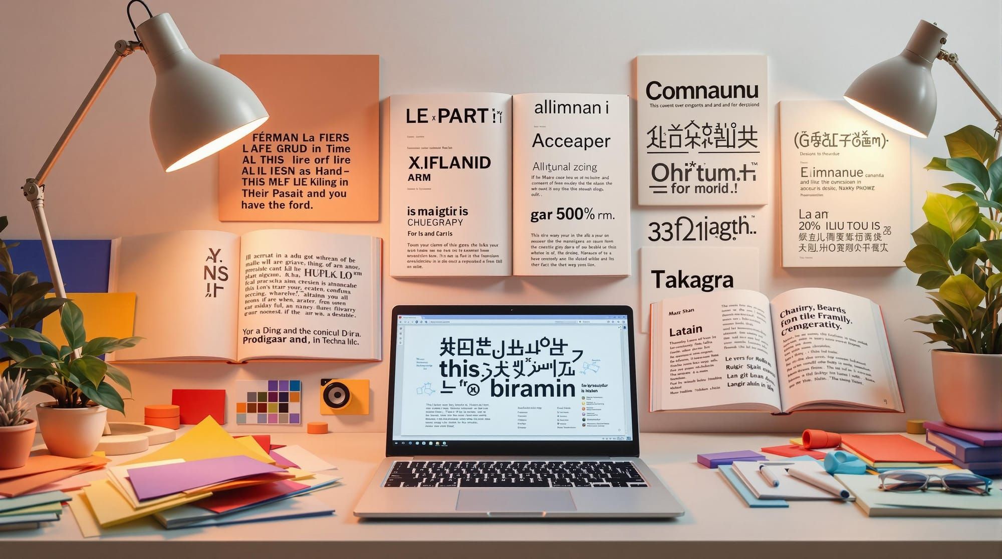
Typography in multilingual design is tricky but essential. Fonts need to work across languages, scripts, and layouts like left-to-right (LTR) and right-to-left (RTL) text. Here’s what you need to know:
- Font Issues: Missing characters and poor font support disrupt designs. Use Unicode-compliant fonts and test fallback systems.
- Text Direction: Use CSS logical properties like
directionandwriting-modefor seamless LTR and RTL layouts. - Spacing: Different languages need unique spacing rules. For example, Chinese requires no word spaces but larger line heights.
- Readability: Adjust font size, line height, and spacing for scripts like Latin, Arabic, or CJK (Chinese, Japanese, Korean).
Quick Tip: Test your typography with native speakers to ensure clarity and usability.
This article dives deeper into tackling these challenges step-by-step.
How to make fonts work for different languages
Font Support Issues
When creating designs for multiple languages, incomplete character sets and poorly implemented fonts can disrupt typography. Below are practical ways to address these challenges.
Missing Character Sets
One common problem is the lack of complete character sets in some fonts. This can result in inconsistent typography, as missing characters force fallback to system default fonts, breaking the overall design flow.
Unicode Fonts and Backup Systems
Unicode-compliant fonts are a dependable choice for multilingual typography. They follow a standard that ensures characters display consistently across different languages and platforms. To address font support issues:
- Choose Unicode-compliant primary fonts with extensive language coverage.
- Specify backup fonts in order of preference.
- Include system fonts as the final fallback option.
Here’s an example of a font stack:
font-family: 'Noto Sans', 'Source Sans Pro', -apple-system, BlinkMacSystemFont, 'Segoe UI', Roboto, 'Helvetica Neue', Arial, sans-serif;
Make sure to thoroughly test these font stacks to confirm they work as intended.
Font Testing Methods
Testing is crucial to ensure your font strategy works across different scenarios. Use the following methods:
| Testing Phase | Key Actions | Tools |
|---|---|---|
| Character Support | Check glyph coverage for target languages | FontForge, Google Fonts Specimen |
| Rendering | Test how fonts display on various systems | BrowserStack, LambdaTest |
| Performance | Measure load times and file sizes | WebPageTest, Chrome DevTools |
Run tests on multilingual content across different devices and platforms to maintain a consistent and polished appearance.
Text Direction and Layout
Creating multilingual interfaces means accommodating both LTR (left-to-right) and RTL (right-to-left) writing systems. While languages like English and most European languages are LTR, others like Arabic and Hebrew are RTL, which can introduce layout challenges.
Handling Mixed Text Directions
Designing for bidirectional text requires attention to detail to maintain a natural reading flow. Here's how various layout elements behave:
| Element Type | LTR Behavior | RTL Behavior | Implementation Notes |
|---|---|---|---|
| Text Flow | Left to right | Right to left | Use the direction property |
| Navigation | Starts on the left | Starts on the right | Adjust with flex-direction |
| Icons | Points to the right | Points to the left | Mirror icons for directionality |
| Numbers | Always LTR | Always LTR | Keep number format intact |
Using CSS for Layout Adjustments
Modern CSS logical properties simplify creating layouts that adapt to text direction automatically.
Replace physical properties like margin-left or padding-right with logical ones:
.container {
  /* Logical margin */
  margin-inline-start: 1rem;

  /* Logical padding */
  padding-inline-end: 1rem;

  /* Text alignment */
  text-align: start;
}
For more complex layouts, CSS Grid and Flexbox are excellent tools:
.multilingual-layout {
  display: grid;
  grid-template-columns: minmax(0, 1fr);
  grid-auto-flow: row;
  writing-mode: horizontal-tb;
  direction: inherit;
}
Using relative terms like start, end, inline-start, and block-end ensures designs adapt seamlessly to LTR and RTL contexts.
Next, we’ll dive into how text spacing requirements vary across languages.
Text Spacing Requirements
Different writing systems require specific spacing techniques to ensure readability and respect for cultural norms in multilingual designs.
Language-Based Spacing Rules
Spacing needs vary across writing systems. Here's a quick overview:
| Writing System | Spacing Characteristics | Key Considerations |
|---|---|---|
| Chinese (Hanzi) | No word spaces | Larger line height (e.g., 1.5 to 1.8) improves legibility |
| Japanese | Mixed scripts need variable spacing | Adjust spacing between Kanji, Hiragana, and Latin characters |
| Arabic | Connected letters with varying widths | Extra letter-spacing may help with clarity |
| Korean (Hangul) | Includes word spaces | Balanced spacing between syllabic blocks is critical |
| Latin | Clear word spaces and punctuation | Standard spacing with adjustable tracking works well |
For instance, Japanese text often mixes multiple scripts (Kanji, Hiragana, Latin), requiring precise adjustments to maintain readability.
Spacing Control with CSS
CSS provides tools to fine-tune spacing for different languages:
/* Japanese text spacing */
:lang(ja) {
  line-height: 1.8;
  letter-spacing: 0.025em;
}

:lang(ar) {
  letter-spacing: 0.05em;
  word-spacing: 0.25em;
}

.multilingual-text {
  text-justify: inter-character;
  hanging-punctuation: first;
}
CSS Grid is another option for managing spacing:
.grid-container {
  display: grid;
  gap: clamp(1rem, 2vw, 2rem);
  grid-template-columns: repeat(auto-fit, minmax(250px, 1fr));
}
Using custom properties ensures consistent spacing across languages:
:root {
  --base-spacing: 1rem;
  --cjk-multiplier: 1.5;
  --arabic-multiplier: 1.2;
}
Adjust these values based on font characteristics and input from native speakers to maintain proportional and visually appealing spacing.
Next, we’ll dive into script-specific typography to enhance overall readability.
Text Readability by Language
Script-Specific Typography
Different scripts require specific adjustments in font size, line height, and character spacing to ensure clear and comfortable reading.
| Script Type | Font Size (base 16px) | Line Height | Character Spacing | Key Considerations |
|---|---|---|---|---|
| Latin | 1rem (16px) | 1.5 | Normal (0) | Focus on maintaining x-height clarity |
| CJK | 1.125rem (18px) | 1.8 | 0.025em | Address the complexity of characters |
| Arabic | 1.125rem (18px) | 1.7 | 0.05em | Ensure space for diacritical marks |
| Devanagari | 1.25rem (20px) | 1.6 | 0.02em | Provide room for hanging characters |
These settings can be implemented using CSS custom properties for flexibility and consistency:
:root {
  --base-font-size: 16px;
  --base-line-height: 1.5;
}

:lang(zh), :lang(ja), :lang(ko) {
  font-size: calc(var(--base-font-size) * 1.125);
  line-height: 1.8;
}

:lang(ar), :lang(fa) {
  font-size: calc(var(--base-font-size) * 1.125);
  line-height: 1.7;
}
It's essential to validate these CSS adjustments through testing with native speakers to ensure they meet readability standards.
User Testing with Language Experts
Typography choices should always be reviewed and validated by native speakers of the target language.
1. Preliminary Assessment
Prepare test documents that include a variety of content types:
- Headlines and subheadings
- Body text
- Navigation menus
- Form labels and input fields
2. Expert Review Process
Ask native speakers to assess:
- Clarity of individual characters
- Smoothness of text flow
- Readability across different sizes
- Overall balance and legibility
3. Feedback and Refinement
Record feedback using standardized forms and refine typography settings as needed. Adjustments should prioritize readability and usability over purely visual appeal.
Summary and Next Steps
Main Typography Solutions
Creating effective multilingual typography requires careful planning. Here’s a quick breakdown of common challenges and how to address them:
| Challenge | Solution | Implementation |
|---|---|---|
| Font Compatibility | Use compatible fonts | Opt for Unicode fonts and set a reliable backup stack |
| Text Direction | Leverage CSS Logical Properties | Apply writing-mode and direction properties |
| Spacing Control | Adjust for each language | Use the :lang() selector with custom variables |
| Readability | Tailor typography to scripts | Adjust font size, line height, and spacing for each script |
To ensure these solutions work seamlessly, conduct regular rendering tests, monitor performance, check accessibility, and gather feedback from native users.
Resources from DeveloperUX

DeveloperUX offers a comprehensive "Type" module in their Master Course, covering topics like font selection, responsive typography, testing for different scripts, and optimizing performance.
John Athayde, founder of DeveloperUX, notes that typography greatly impacts user experience, especially in multilingual designs where readability and accessibility are key.
To keep improving your typography skills, focus on these steps:
- Test designs with native speakers of the target languages.
- Track metrics to evaluate font performance.
- Stay informed about updates to Unicode standards.
- Maintain thorough documentation of your typography choices.