
7 Principles of Interactive Animation in UX
Explore 7 key principles of interactive animation that enhance user experience and usability in digital interfaces without overwhelming users.
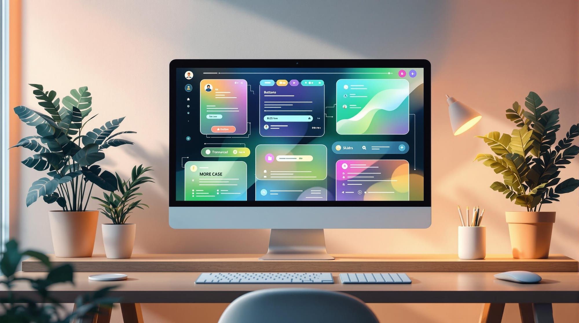
Interactive animations can make user interfaces easier to use and more engaging when applied thoughtfully. Here’s a quick summary of the 7 principles to create purposeful animations that improve usability without overwhelming users:
- Timing: Keep animations between 200-500ms for smooth transitions without delays. Adjust based on context (e.g., quicker for task-driven actions).
- Anticipation: Prepare users for actions with subtle cues like hover effects or loading indicators.
- Easing: Use natural acceleration and deceleration to mimic real-world motion.
- Supporting Movements: Add small animations to reinforce primary actions, like fading or sliding related elements.
- Smart Exaggeration: Highlight important actions (e.g., alerts) with bold but short effects.
- Natural Motion Paths: Use smooth curves and arcs for lifelike movements.
- Visual Feedback: Confirm user actions with immediate responses like button color changes or progress indicators.
These principles ensure animations are functional, intuitive, and accessible, enhancing user experience while maintaining performance.
Easing – Principles of UX Animation with Val Head | Adobe ...

1. Perfect Your Animation Timing
Animation timing plays a key role in keeping users engaged. Most UI animations work best when they last between 200-500 milliseconds. This range ensures users notice changes without interrupting their workflow.
Here’s a quick guide to recommended animation durations for common UI elements:
| UI Element | Recommended Duration | Purpose |
|---|---|---|
| Button hover | 200ms | Provides instant feedback |
| Menu expansion | 300ms | Shows clear, smooth progression |
| Modal opening | 400ms | Creates a smooth, natural entry |
| Page transition | 500ms | Helps users follow complex changes |
Adjusting Timing for Different Contexts
- Task-oriented interfaces: Stick to faster animations (200-300ms) to keep things efficient.
- Storytelling or branding experiences: Slightly longer animations (400-500ms) can add emotional depth without slowing users down.
Balancing Performance and Accessibility
Animation timing doesn’t just affect how users feel - it also impacts system performance. Poorly timed animations can lead to:
- Jarring visuals caused by frame drops
- Higher CPU usage on mobile devices
- Faster battery drain due to unnecessary animation cycles
Accessibility is another critical factor. To accommodate diverse user needs, consider adding controls for animation speed or using the prefers-reduced-motion media query to align with system-level preferences.
Always test your animations. If they feel sluggish, shorten the duration. The goal is to make interactions smoother and more intuitive without making the animation itself the center of attention.
2. Build User Anticipation
Timing matters, but creating anticipation can take user interaction to the next level. Anticipatory animations provide subtle cues for upcoming actions, making interactions feel smoother and reducing mental effort.
Hover State Animations
Hover effects can signal interactivity. Adding small, thoughtful animations helps users understand what they can interact with:
| Element Type | Animation Style | Duration | Purpose |
|---|---|---|---|
| Call-to-action buttons | Slight scale increase (102–105%) | 200ms | Highlights clickability |
| Card elements | Soft shadow elevation | 250ms | Suggests selection potential |
| Navigation items | Expanding underline | 200ms | Indicates active state |
Progressive Loading Indicators
Loading animations keep users engaged during wait times:
- Skeleton Screens: These placeholders mimic the layout of actual content, making wait times feel shorter compared to static spinners.
- Progress Indicators: For tasks longer than a second, use progress bars. Start at 20%, progress steadily to 80% during processing, and complete at 100% when finished.
These animations don't just fill the gap - they make the experience feel faster and more seamless.
Microinteractions for State Changes
Small animations can prepare users for what’s about to happen. For instance, a delete button might subtly shake when hovered over, hinting at its potentially destructive action.
Timing Tips for Microinteractions:
- Keep animations between 150–250ms.
- Ensure animations finish before the actual state change occurs.
- Use consistent timing across similar elements to maintain a cohesive feel.
When done right, these animations feel natural, offering clear, visual feedback without being distracting.
Performance Impact
Make sure animations run smoothly on mobile devices. Use CSS transforms and opacity adjustments to optimize performance and avoid lag.
3. Apply Easing Effects
Easing effects make animations feel more natural by mimicking real-world acceleration and deceleration rather than relying on rigid, linear motion. This smooth movement helps guide users and makes your interface feel intuitive.
However, overusing or misapplying easing can lead to chaotic, distracting animations that confuse users. Stick to consistent easing curves and test animations regularly to avoid performance issues and maintain smooth, unified motion.
Tips for effective easing:
- Use easing to create smooth, natural transitions that improve user experience.
- Keep timing and motion consistent across related interface elements.
- Test animations often to ensure they run smoothly without lag.
Once you've fine-tuned your easing effects, you can focus on adding supporting movements to further enhance your interface's interactivity.
4. Add Supporting Movements
Supporting movements are subtle animations that complement primary interactions. These small details enhance the user experience by visually connecting interface elements and actions, making interactions feel smoother and more intuitive.
Primary vs. Supporting Movements
| Movement Type | Purpose | Example Usage |
|---|---|---|
| Primary | Main interaction feedback | Button click animation |
| Supporting | Visual reinforcement | Related items sliding or fading |
| Enhancement | Added visual appeal | Background particle effects |
Take the example of deleting an email: the primary animation might show the email sliding off-screen, while supporting movements could include a slight fade or repositioning of the remaining emails. These subtle touches make the action clearer and more engaging.
Tips for Effective Supporting Animations
- Keep it subtle: Supporting movements should never overshadow primary animations. They should be shorter and less noticeable.
- Maintain hierarchy: Secondary animations should always complement, not compete with, the main interaction.
- Optimize for performance: Use hardware-accelerated properties like transform and opacity to ensure smooth animations. Avoid overloading the interface with too many simultaneous effects.
For example, when expanding a navigation menu, focus supporting animations on nearby icons or text labels to provide immediate feedback. This keeps the user’s attention where it matters most.
Performance Considerations
Keep animations short and efficient to avoid lag. Test across different devices to ensure smooth operation, especially on lower-end hardware. Using lightweight, optimized animations ensures the interface remains fast and responsive.
When done right, supporting movements enhance the flow of interactions, making the design feel polished and professional. These animations guide users seamlessly without overwhelming them. Next, you’ll see how smart exaggeration can amplify key interactions even further.
5. Use Smart Exaggeration
Smart exaggeration in animation helps draw attention to important interface elements, making interactions more engaging without overwhelming users. Here are some practical tips to get it right:
- Scale: Use bold effects for major alerts or state changes to grab attention. For routine interactions, keep effects subtle to avoid overloading the user.
- Timing: Keep exaggerated animations short. They should highlight the message without causing unnecessary delays.
- Accessibility: Provide reduced-motion options to ensure the experience is comfortable for everyone, including users sensitive to motion.
- Context: Save stronger animations for interactions that truly matter, like guiding users through key actions.
- Testing: Always test with real users to ensure the animations enhance the experience rather than distract from it.
6. Design Natural Motion Paths
To make your animations feel more lifelike, focus on creating natural motion paths. These paths use smooth curves to reflect how objects move in the real world, making animations more fluid and engaging.
Here are some tips for crafting natural motion paths:
- Use curves over straight lines: Gentle arcs create a more organic movement than rigid, straight paths.
- Smooth acceleration and deceleration: Avoid sudden starts or stops - let elements gain and lose speed naturally.
- Adjust curves based on distance: Longer movements benefit from more noticeable curves, while shorter ones should be subtler.
With natural motion paths in place, the next step is to ensure your animations provide clear visual feedback.
7. Provide Clear Visual Feedback
Users need quick confirmation that their actions have been registered. Visual cues, built on natural motion paths, help confirm these actions effectively.
Immediate Response Indicators
Use animations to provide immediate feedback. For instance, a button can momentarily change color or size when clicked, signaling that the action was received.
Clear State Changes
Keep animations short and consistent. Use a clear visual hierarchy to guide user attention where it’s needed most.
Progressive Loading Indicators
For tasks that take longer, use animations that show progress in stages, helping users understand where they are in the process.
Contextual Motion
Match the direction of animations to the action being performed. This alignment reinforces the user’s intent.
Error Feedback Animations
When errors occur, subtle animations like a slight shake for invalid fields can help users identify and fix the issue quickly.
Consistent and clear visual feedback enhances the overall user experience, ensuring interactive elements feel intuitive and responsive.
Conclusion
Interactive animations play a key role in making digital experiences more engaging and user-friendly. The seven principles outlined here serve as a practical guide to designing animations that improve usability.
When done right, animations can bridge the gap between creativity and functionality, helping users navigate interfaces with ease. Proper timing and natural motion cues, for example, clarify interactions and confirm user actions.
Here’s a quick overview of the principles:
| Principle | Benefit | Key Focus |
|---|---|---|
| Timing | Simplifies user processing | Keep animations under 300ms for quick feedback |
| Anticipation | Makes actions predictable | Prepare users for the main event |
| Easing | Feels more natural | Use acceleration and deceleration curves |
| Supporting Movements | Adds context | Reinforce main actions with secondary animations |
| Smart Exaggeration | Highlights key elements | Draw attention without overwhelming |
| Natural Motion | Feels intuitive | Base movements on real-world physics |
| Visual Feedback | Confirms user actions | Provide clear, immediate responses |
While these principles offer a solid foundation, real-world application often requires tailoring them to fit specific user needs and contexts. For those wanting to dive deeper, DeveloperUX's Master Course provides in-depth training on implementing these concepts effectively in projects.