
10 Mobile Checkout UX Tips for 2025
Explore essential tips to enhance mobile checkout experiences, reduce cart abandonment, and boost conversions in 2025.
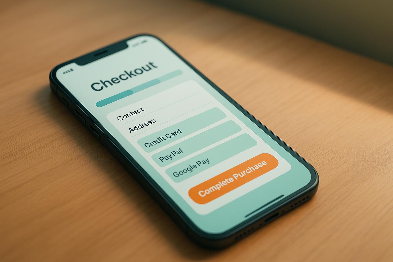
Mobile commerce is booming, with U.S. sales projected to hit $1.7 trillion in 2025. Yet, 80% of mobile shopping carts are abandoned, signaling a major opportunity to improve checkout experiences. This guide reveals 10 actionable tips to streamline mobile checkouts, reduce friction, and boost conversions. Here’s what you’ll learn:
- Simplify checkout by reducing steps and form fields.
- Offer guest checkout to avoid unnecessary account creation.
- Optimize input fields for mobile, like numeric keypads for credit cards.
- Display clear pricing upfront to avoid surprises.
- Support popular payment methods like Apple Pay, Google Pay, and PayPal.
- Use trust signals like SSL badges and customer reviews to reassure buyers.
- Provide real-time support with live chat or AI chatbots.
- Enable autofill and address validation to save time.
- Design for accessibility to accommodate all users.
- Implement one-tap and biometric authentication for speed and security.
1. Reduce Checkout Steps
Every extra step in your mobile checkout process increases the chance of customers abandoning their purchases. In fact, 22% of users leave their carts because the checkout feels too complicated. Simplifying your checkout flow isn’t just helpful - it’s critical for staying competitive in mobile commerce.
Mobile users deal with distractions and small screens, so reducing clicks is a must. The average checkout process has 11.3 form fields. By cutting unnecessary steps, combining stages, and asking only for essential information, you could see conversion rates climb by up to 35.62%. For example, instead of separating billing and shipping details across multiple pages, group them logically into one section that works well on mobile screens. The smoother the process, the fewer drop-offs you’ll encounter.
The structure of your checkout should also align with your product type and customer behavior.
Choosing Between One-Page and Multi-Step Checkout
Deciding between a one-page checkout and a multi-step process depends on what you’re selling and your customers’ needs. For low-cost or impulse buys, a fast, one-page option often works best. On the other hand, high-value or customizable products may benefit from the clarity of a step-by-step approach.
| Checkout Type | Best For | Mobile Advantages | Potential Drawbacks |
|---|---|---|---|
| One-Page | Digital goods, repeat customers, impulse buys | Quick completion, fewer interruptions, clear overview | Can feel overwhelming on small screens, fewer upsell opportunities |
| Multi-Step | Complex orders, high-ticket items, new customers | Organized steps with clear guidance | More opportunities for drop-offs, slower process |
For B2C customers, speed is often the top priority. B2B customers, on the other hand, might need more detailed confirmation and options during checkout. For digital products that don’t require shipping, a one-page checkout can usually do the job. But physical products often benefit from the structure of a multi-step process.
Testing will help you find the right approach. Use A/B testing to compare a one-page checkout against a multi-step version. Divide your traffic evenly, analyze metrics like completion rates, average order value, and abandonment points, and pay special attention to how mobile users perform. Keep in mind that mobile basket abandonment rates hover around 79%, compared to roughly 67% on desktops.
Simplifying form fields is another proven way to boost conversions - trimming them down can increase rates by up to 34%. Only ask for what’s absolutely necessary to complete the transaction. Also, remember that 66% of shoppers expect checkout to take no more than four minutes, and even a delay of less than a second can lower conversions by 7%.
Mobile users are often multitasking, dealing with slower connections, and working with limited attention spans. To keep them engaged, remove distractions from your checkout pages and include progress indicators so they know exactly where they are in the process and what’s left to complete.
2. Allow Guest Checkout
Forcing customers to create an account before purchasing is a deal-breaker for many - 24% of shoppers abandon their carts because of it. Nearly half of consumers prefer the ease and speed of guest checkout, especially on mobile devices where typing can be a hassle. Offering this option can increase conversions by 45% and reduce cart abandonment by 63%.
Yet, 60% of shoppers report difficulty finding the guest checkout option, and nearly half of websites fail to highlight it clearly. Mobile users, in particular, expect a quick and hassle-free experience, and forcing account creation only adds unnecessary friction, costing you potential sales.
To make guest checkout effective, it should be the default option with a clearly visible button. Examples like Bass Pro Shops and Home Depot show how to do this well, using prominent "Continue as Guest" buttons. Retailers such as Target and Best Buy also make it clear that account creation isn’t mandatory. ASOS simplifies the process even further by allowing users to save their details only after completing their purchase. When designing your guest checkout flow, keep it simple - ask only for the essentials needed to process and ship the order.
And here’s the good news: you don’t have to sacrifice building your customer database. A smart strategy is to encourage account creation after the purchase. Once the sale is complete, you can offer perks like saved information for future orders, exclusive discounts, or loyalty points to motivate users to sign up.
The benefits are clear. For instance, Easton Baseball saw a staggering 659% increase in mobile revenue, and Klean Kanteen boosted their revenue by 80% after introducing guest checkout.
3. Design for Mobile Input
Typing on mobile devices isn't exactly a breeze. Small screens and touch-based keyboards can make entering information frustrating, yet a surprising 54% of websites fail to optimize keyboards for fields like phone numbers, ZIP codes, or credit card details. This oversight often creates unnecessary friction, causing users to abandon their purchases.
The fix? Use the right keyboard for the right input. For example, credit card fields should trigger a numeric keypad instead of a full keyboard. On iOS, the numeric keyboard offers keys that are 471% larger than those on a traditional keyboard, making it significantly easier to type accurately. The same applies to fields for phone numbers, ZIP codes, and other numeric inputs.
For email fields, show a keyboard that includes shortcuts like "@" and ".com." These small tweaks can make a big difference. Mandy Trent, a developer at Elite Assignment Help, shared how this simple adjustment boosted their results:
"Using HTML code to ensure that our fields will ask for specific keyboards, we managed to increase the number of our successful mobile conversions by 30% this year. Users like simplicity and an easy flow of the checkout – you should use it to your advantage."
Another helpful trick is auto-capitalizing fields like names and addresses to save users time. However, only 27% of mobile sites make use of this feature, missing a chance to streamline the process. That said, knowing when not to auto-capitalize is just as important. Email fields, for instance, should avoid this feature. Usability tests revealed that users often assumed their email addresses needed to be entered in lowercase and got confused when the system capitalized the first letter. On sites that turned off auto-capitalization for email inputs, users had no issues leaving the first character lowercase.
Input masks are another powerful tool. They automatically format data as users type, reducing errors and making information easier to review. For example, instead of letting users type a credit card number as one long string, break it into four-digit chunks (e.g., 1234 5678 9012 3456). This approach not only makes verification easier but also lowers the mental effort required to process a long series of numbers.
When it comes to security code fields, 53% of sites fail to provide proper validation. To avoid confusion, label this field clearly as "Security Code" rather than using abbreviations like "CVV" or "CID." Including a small tooltip or image showing where to find the code on a physical card can also help guide users.
It’s worth noting that 89% of users enter numerical inputs in various formats, even when examples are provided. Instead of enforcing strict formatting rules that may lead to validation errors, allow users to input data however they prefer and handle the formatting on your end.
Finally, consider the overall number of form fields in your checkout process. The average checkout contains nearly 15 fields, but many services could reduce this by 20–60%. Each unnecessary field you remove means less typing, fewer mistakes, and a faster checkout process. By optimizing input methods, you not only reduce errors but also create a smoother, more enjoyable experience for your users.
4. Show Clear Pricing and Order Summary
Unexpected fees are one of the biggest deal-breakers for mobile shoppers - 55% of them abandon their carts when surprise costs pop up during checkout. Imagine thinking you've got the total cost figured out, only to discover extra charges for shipping or taxes at the last step. It's no wonder people walk away.
The solution? Be upfront about pricing. Display all costs - item price, shipping, taxes, and any fees - clearly and in US dollars ($) from the very beginning. This transparency builds trust and reduces unpleasant surprises.
Some retailers are already nailing this. Target, for example, uses location detection to show accurate shipping costs early in the shopping process. Similarly, Room & Board provides clear, state-specific tax details using helpful pop-ups.
Another way to keep shoppers happy is by offering dynamic updates to the order summary. Make sure the summary is always visible - on mobile, placing it at the top of the screen works best. This way, customers can easily see what they're buying and how much it costs. Anthropologie does this well by offering three shipping options with clear pricing and loyalty benefits. Adding features like real-time cost updates and postal code entry on product pages can also help avoid last-minute fee surprises.
"Unexpected service fees and special-delivery costs should be disclosed early in the shopping process to avoid losing customers." - Kim Flaherty, NN/g
Another key tip: don’t bury fees in fine print. Transparent pricing can increase conversion rates by 35.26%. Use straightforward labels like "Product Total", "Shipping", and "Tax" so shoppers know exactly what they’re paying for. These simple practices make the checkout process smooth and consistent, aligning with other recommendations for a frictionless shopping experience. Keep in mind, 41% of shoppers abandon their carts because of high delivery fees alone.
5. Include Popular US Payment Methods
Did you know that 55% of shoppers abandon their carts when their preferred payment option isn’t available? This highlights just how important it is for retailers to understand and adapt to the payment methods favored by US consumers, especially when it comes to mobile checkouts.
By 2025, credit and debit cards are expected to account for over 65% of consumer payments. But digital wallets are quickly catching up. More than half of US consumers now use Apple Pay, Google Pay, or similar services for both online and in-store purchases. For Gen Z, this trend is even more pronounced - 79% of them rely on mobile wallets for everything from online shopping to paying monthly bills.
PayPal is another must-have, with a commanding 45% share of the global market. Its reputation for security and ease of use makes it especially appealing to first-time buyers who might hesitate to share their card details directly.
Why are digital wallets so effective? They speed up the checkout process by 23% and can increase the average spend by 31%. By eliminating the need to manually enter card details, they make transactions faster and smoother. Michael Seifert points out that industries like travel, where speed is critical, benefit greatly from this efficiency.
Then there’s the growing popularity of Buy Now, Pay Later (BNPL) services like Afterpay and Klarna, which now account for 6% of all US e-commerce transactions. These flexible payment options are especially attractive to younger shoppers who appreciate the ability to spread out payments over time.
For US retailers, offering the top 3–4 payment methods - major credit cards, a digital wallet, and PayPal - is a smart way to streamline mobile checkouts and drive conversions. It’s worth noting that 92% of US adults now use digital payment methods. As David Axler, chief strategy officer at Wave, explains:
"Digital payments have become far more accepted. It's become a part of our daily routine".
With mobile transactions up to 23% faster when using digital wallets and conversions more likely when checkout takes under 90 seconds, providing the right payment options is essential to creating a seamless shopping experience.
6. Add Trust Signals
Shoppers often hesitate at checkout if they’re unsure about security. In fact, 19% of cart abandonments stem from concerns over payment security. This is where trust signals come into play - visual cues that reassure customers their personal and financial information is protected.
Start with the basics: display SSL certificates and ensure your site runs on HTTPS. These security badges go a long way in building confidence. It's worth noting that 45% of consumers actively search for security information on a website's homepage. On your checkout page, include icons for trusted payment methods like Visa, Mastercard, PayPal, and others. These small but powerful details can ease hesitation and encourage customers to complete their purchase.
With cyberattacks expected to surge by 40% in 2025, and data breaches costing over $4 million on average, trust signals are more than just helpful - they’re essential. But technical trust signals alone aren’t enough; real-world validation matters just as much.
Customer reviews provide that validation. 92% of consumers read online reviews before making a purchase, and products with as few as five reviews are 270% more likely to sell compared to those without any. Strategically place review snippets throughout your mobile checkout process. For example, a simple three-line testimonial near your purchase button can boost conversions by 34%. Use bold text or callout boxes to make these reviews stand out.
"When you say it, it's marketing. When your customers say it, it's evidence", says Sam Shepler, CEO of Testimonial Hero.
Transparent security messaging, like “100% secure checkout,” further reassures customers. Highlight PCI compliance and display security certifications prominently. Don’t overlook the importance of return policies either - 88% of online shoppers review return policies, and 66% check them before buying. Visible, clear policies can make all the difference in reducing friction during checkout.
The impact of trust signals is undeniable. A study of 130 online sellers across Europe and Latin America found that 66% experienced increased sales after adding third-party assurance seals. These signals don’t just reduce cart abandonment; they actively address the doubts that prevent customers from completing their purchases.
Make your mobile checkout feel as secure as it actually is. When customers see familiar badges, read glowing reviews, and understand your policies, they’re far more likely to click that final "Buy Now" button.
7. Offer Real-Time Support
Unanswered questions can bring mobile checkouts to a screeching halt. Whether it’s confusion over shipping costs, payment methods, or product details, customers need answers fast. Without immediate help, they’re likely to abandon their carts. Real-time support is the key to keeping the checkout process smooth and frustration-free.
Think of it this way: just as clear pricing and simple forms minimize friction, real-time support ensures customers don’t get stuck. And the stats back this up - 90% of customers say getting an "immediate" response is important, with 60% defining "immediate" as 10 minutes or less. That’s not much time, especially during checkout, when the intent to buy is at its peak.
A mix of live chat and AI chatbots can deliver the quick responses customers expect. Live chat is perfect for handling detailed or unique questions, and it’s a favorite among customers - 73% say it’s the most satisfying way to communicate with a company. For high-value purchases or first-time buyers, this human touch can make all the difference.
On the other hand, AI chatbots shine in their ability to provide 24/7 support, which 64% of customers appreciate. They’re great for answering common questions about payment options, shipping times, and more. Plus, they’re cost-effective, helping businesses cut operational expenses by 30% while maintaining service quality.
The best approach? A hybrid model. Use AI chatbots for instant replies and escalate more complex issues to live agents. This ensures customers feel acknowledged right away while reserving human expertise for situations that need it.
Visibility is crucial, too. Support options should be easy to find but unobtrusive - a small chat bubble in the corner of the screen works well, as long as it doesn’t block key elements like the "Buy Now" button. You can even use contextual triggers to display helpful messages if a customer lingers too long on the payment page.
Security concerns are another big hurdle. Train your support team to handle these issues confidently, as 17% of users abandon carts over credit card trust worries. A quick reassurance about your security measures can turn hesitation into action.
And don’t stop at checkout. Real-time support should extend beyond the purchase. Whether it’s helping with order tracking, delivery questions, or returns, post-purchase assistance builds trust and encourages repeat business. When customers know help is just a click away, they’re more likely to complete their current purchase - and come back for more.
8. Use Autofill and Address Validation
Filling out a complete address on a small mobile screen can be a frustrating experience, often leading to typing errors and abandoned carts. That’s why integrating autofill and address validation can transform checkout into a smooth, one-tap process. These tools not only save time but also significantly improve customer satisfaction and boost conversion rates.
In fact, Shopify found that guest checkouts using autofill saw a 45% higher conversion rate compared to those without it. Additionally, autofill reduced form abandonment by 75% - a game changer for mobile checkouts.
How Autofill Works
Autofill allows shoppers to complete forms with just one click, eliminating typos and speeding up the process. Whether it's during checkout or account creation, this feature simplifies the experience. To implement autofill effectively, consider using Google's Place Autocomplete via the JavaScript API. When customers start typing their address, the system suggests matching options in real time. This reduces errors, like forgotten apartment numbers or incorrect ZIP codes, and ensures a faster, more accurate entry process.
The Role of Address Validation
Once an address is entered, a real-time Address Validation API can verify and standardize it. This step ensures that abbreviations are consistent, minor spelling mistakes are corrected, and the address is ready for smooth delivery. Accurate addresses are crucial for on-time fulfillment and avoiding costly post-order corrections.
However, overly strict validation can frustrate users. To strike a balance, allow up to two attempts for address entry. If validation still fails, accept the address but flag it for customer service to review before shipping. This approach minimizes friction while maintaining accuracy.
Enhance the Experience with Visual Confirmation
Adding a visual confirmation element, like a map showing the delivery location, can further improve the checkout experience. This is especially helpful for mobile shoppers who may need extra assurance that their address is correct before completing their order.
Keep Validation User-Friendly
When presenting address corrections, use overlays or modals designed with clear visual cues, such as distinct colors and easily readable text. This ensures that corrections are noticeable without being intrusive.
Why It Matters
Surprisingly, 47% of sites don’t offer an address validator, despite the fact that 85% of online shoppers say a poor delivery experience would make them hesitant to order again. Accurate address collection not only speeds up checkout but also builds trust and encourages repeat purchases. By making the process fast and error-free, you can improve both immediate conversions and long-term customer loyalty.
9. Design for Accessibility
Creating an accessible mobile checkout ensures that every user can complete their purchase without obstacles. In 2023, a staggering 96.3% of the top million homepages failed to meet ADA standards, highlighting a massive gap in accessibility efforts. Addressing this issue not only aligns with inclusivity but also gives your business an edge in a competitive market.
Start with semantic HTML5 elements. Instead of relying on generic <div> tags, use specific elements like <nav>, <header>, <main>, and <aside>. These elements enhance how screen readers interpret your page structure, making navigation easier for users with visual impairments.
Optimize form design for accessibility. Every input field should have a clear label linked with a for attribute. For example, use "Credit Card Number" instead of a vague "Number." Group related inputs, such as billing information, within <fieldset> elements to help assistive technologies understand the context.
Pay close attention to color contrast, especially for mobile users who may be in bright environments or have color vision deficiencies. WCAG guidelines recommend a contrast ratio of 4.5:1 for standard text and 3:1 for larger text. Tools like WebAIM's Contrast Checker can help ensure your color schemes meet these requirements.
Keyboard navigation is another critical factor. Many users depend on keyboards rather than touch gestures to interact with websites. Make sure all interactive elements have visible focus indicators, and maintain a logical tab order that follows the visual flow of the page. Adding a "skip to content" link at the top of your checkout page allows users to bypass repetitive navigation easily.
Enhance the experience further with ARIA labels and properties. For example, use aria-live regions to announce real-time updates, like price changes or error messages. Buttons should have descriptive labels, such as <button aria-label="Complete Purchase - Total $49.99">, instead of generic text like "Submit". These small changes make the checkout process clearer and more user-friendly.
For users with motor impairments, ensure touch targets - like buttons and links - are large enough and spaced apart to avoid accidental taps. Similarly, setting clear language attributes (lang) in your HTML ensures that screen readers pronounce text correctly, especially when your checkout includes foreign-language terms.
Meeting WCAG 2.2 standards not only prepares your site for future compliance but also makes your checkout more inclusive.
As David Gibson from AccessibilityWorks emphasizes: "Unless a website is expressly designed and built with web accessibility and ADA compliance standards in mind, it simply won't meet current WCAG accessibility requirements."
Finally, test your checkout with both automated tools and real users. Automated scans can identify many issues, but real-world testing - like using screen readers and navigating via keyboard only - can uncover problems that scanners might miss. By implementing these measures, you not only ensure compliance but also create a smoother, more inclusive shopping experience for everyone.
10. Use One-Tap and Biometric Authentication
Streamlining mobile checkout goes beyond real-time support and simplified inputs - one-tap payments and biometric authentication take it to the next level. These technologies not only speed up transactions but also bolster user trust. In fact, 74% of consumers consider physical biometrics the most secure way to verify digital identities.
Biometric authentication uses unique physical characteristics like fingerprints, facial features, or palm prints to confirm identity almost instantly. Unlike passwords, which can be stolen or shared, these personal traits are exclusive to each individual, making them exceptionally secure. Advanced facial recognition systems, for instance, boast an impressive accuracy rate of 99.97%.
Speed is another major advantage. Biometric payments can be up to 120% faster than traditional methods, eliminating the need for complicated passwords. Amazon One's palm print system, for example, has handled millions of transactions without a single false positive. At the 2023 Formula 1 Crypto.com Miami Grand Prix, biometric payments achieved 100% authentication success, with processing times averaging less than a second. Looking ahead, Juniper Research predicts biometric transaction values will reach $1.2 trillion by 2028.
To ensure secure and effective implementation, consider these best practices:
- Store biometric data locally on devices.
- Offer fallback options like PINs for situations where biometric verification fails.
- Use liveness detection to guard against spoofing attacks.
These technologies integrate smoothly with popular payment platforms like Apple Pay, Google Pay, Samsung Pay, and contactless cards. With 80% of smartphones equipped with biometric capabilities as of 2022, most mobile users already have access to these features.
Financial institutions are also leading the charge. J.P. Morgan Payments, in collaboration with PopID, is testing face-based authentication at retail locations across the U.S. Jean-Marc Thienpont, Managing Director of Omnichannel & Biometric Solutions at J.P. Morgan Payments, highlighted the impact of these innovations:
"This is a giant step forward in helping our clients reimagine the entire retail experience for their customers and bringing best-in-class biometrics payments solutions to the market. We offer something that is hard to match - the stability, scale and trust of a world-class bank combined with the technology and agility of a fintech."
When adopting biometric authentication, prioritize transparency. Get explicit user consent and clearly explain how data will be handled. Rely on secure storage solutions like the iOS Keychain or Android Keystore, and ensure all communications are encrypted using HTTPS.
Consumer preferences also play a role. While 60% of users under 40 report using mobile wallets, only 38% of those over 40 do the same. By incorporating biometric solutions, you can meet the expectations of younger, tech-savvy customers. In today’s mobile-first world, these features don’t just speed up transactions - they also help build the trust needed to turn casual users into loyal customers.
Comparison Table
To support your design strategy, here’s a summary of key differences in checkout flows and payment methods. These comparisons can guide you in optimizing the mobile experience for your audience.
One-Page vs. Multi-Step Checkout Flows
One-page and multi-step checkouts each bring different strengths and challenges. Christian Holst of Baymard highlights:
"There do exist some A/B cases where one-page checkouts outperform multi-step checkouts significantly. However, these cases often compare a non-optimized multi-step checkout with a new optimized one-page checkout".
Here’s a breakdown of how they compare:
| Feature | One-Page Checkout | Multi-Step Checkout |
|---|---|---|
| Speed | Faster completion | Takes longer to complete |
| User Interface | Can feel overwhelming on mobile | Cleaner, less overwhelming |
| Data Capture | Happens only at final submission | Early email capture for recovery |
| Upselling | Limited screen space | More opportunities between steps |
| Analytics | Less detailed drop-off tracking | Granular abandonment data |
| Best Use Cases | Impulse buys, low-cost items | Complex or high-value items |
Speed is critical in mobile checkouts. Studies show that 57% of users abandon their carts if a page takes more than 3 seconds to load. Multi-step checkouts, while slower, allow you to collect email addresses early on, which is valuable for recovering abandoned carts.
US Payment Methods: Speed, Security, and User Preference
The choice of payment method significantly affects user satisfaction and your business outcomes. With over half of consumers regularly using Apple Pay, Google Pay, or similar digital wallets, it’s essential to understand how various options compare.
| Payment Method | Processing Speed | Security Level | User Preference | Transaction Fee |
|---|---|---|---|---|
| Mobile Wallets | Instant | Very High | 50%+ regular users | 2% – 3% |
| Credit Cards | Instant | High | 42% of POS transactions | 1.5% – 3.5% |
| Debit Cards | Instant | High | 28% of POS transactions | 1.5% – 3.5% |
| BNPL Services | Instant | High | 6% of e-commerce | 4% – 6% |
| Bank Transfers | 1–3 business days | High | Growing adoption | $0.20 – $1.50 |
Mobile wallets stand out for their instant processing and enhanced security, thanks to biometric authentication and tokenization. A recent study revealed that 42% of users prefer digital wallets for cross-border payments, citing speed and convenience as key factors.
Transaction costs vary widely. For instance, BNPL services charge 4–6% per transaction, while bank transfers via systems like FedNow - launched in 2023 - cost as little as $0.20 to $1.50 per transaction. Interestingly, around 90% of North American mobile wallet transactions are still funded by credit cards in the background.
As one expert wisely puts it:
"There's no universal best checkout design. The only way to know what works for your business is to test it with your audience and let the data lead".
Tailor your checkout process and payment options to align with your audience’s preferences and behaviors.
Conclusion
Optimizing mobile checkout is no longer optional - it's a necessity in today's competitive e-commerce world. With smartphones driving over 70% of e-commerce traffic and global online sales projected to hit $7.4 trillion by 2025, businesses that fail to prioritize mobile user experience (UX) are leaving money on the table.
The numbers tell the story: poor UX can slash sales by 35% and push 88% of users away for good. On the flip side, enhancing UX can increase conversions by up to 400%, while a smooth checkout process alone can improve conversion rates by as much as 35%. These are not just statistics - they’re wake-up calls for any business looking to thrive.
This guide outlined ten practical strategies to tackle the most pressing issues in mobile checkout. From simplifying the checkout process and offering guest checkout to integrating biometric authentication and ensuring accessibility, these changes can make a measurable difference. Companies that have embraced these strategies report impressive results, proving their effectiveness in real-world scenarios.
The mobile-first era leaves no room for delay. Mobile users are five times more likely to abandon a site that isn’t mobile-friendly, and mobile now accounts for 60% of all U.S. e-commerce sales. If your website isn’t optimized, your competitors will gladly take those sales.
For those eager to dive deeper into UX best practices, resources like DeveloperUX (https://developerux.com) offer valuable tools and courses. Their Master Course on UX equips businesses with the knowledge and tactics needed to create user experiences that drive meaningful results.
The time to act is now. Start refining your mobile checkout experience today - because every moment you wait is a chance for your competitors to pull ahead.
FAQs
What’s the best way to test if a one-page or multi-step checkout works better for mobile users?
To figure out whether a one-page checkout or a multi-step process works best for your mobile users, try running an A/B test. Divide your audience into two groups: one group experiences a one-page checkout, while the other goes through a multi-step process. Then, analyze key metrics like completion rates, cart abandonment, and average order value to see which approach delivers better results.
Make sure both versions provide a smooth and fast experience. By focusing on usability and performance, you’ll gather the insights needed to make smarter decisions that enhance user satisfaction and boost conversions.
What challenges come with adding biometric authentication to mobile checkouts, and how can they be addressed?
Implementing biometric authentication in mobile checkouts comes with its fair share of challenges. Businesses often grapple with high costs, privacy concerns, and security risks like false matches or errors. These hurdles can make companies hesitant to embrace the technology.
To overcome these obstacles, businesses can take several steps:
- Invest in advanced biometric systems that are designed to significantly reduce error rates.
- Add an extra layer of protection by incorporating multi-factor authentication alongside biometrics.
- Stay compliant with privacy regulations and be transparent about how user data is handled and secured.
By addressing these challenges head-on, businesses can offer users a checkout process that's not only more secure but also smoother and more trustworthy.
Why should businesses use both live chat and AI chatbots to enhance real-time support during mobile checkout, and how can they effectively combine them?
Using both live chat and AI chatbots during mobile checkout creates a smooth and efficient support system that caters to a variety of customer needs. AI chatbots are perfect for providing quick, around-the-clock answers to common questions, cutting down on wait times and keeping costs in check. On the other hand, live chat brings the human element into play, offering personalized support for more complex or sensitive concerns, which helps build trust and loyalty.
A smart way to balance the two is by using AI chatbots as the first line of support. They can handle routine questions and then pass more complicated or urgent matters to live agents. This setup ensures customers get fast and effective assistance while still having access to a real person when it matters most, enhancing the entire checkout experience.