
WCAG Guidelines for Interactive Elements
Learn how to create accessible interactive elements that comply with WCAG guidelines, enhancing usability for everyone.
Creating accessible websites isn't just a recommendation - it’s a necessity. Over 1.3 billion people globally live with disabilities, and inaccessible interactive elements like buttons, forms, and navigation can exclude them from essential online services. The Web Content Accessibility Guidelines (WCAG) provide a framework to ensure digital content works for everyone, including those relying on assistive technologies.
Here’s what you need to know:
- WCAG Overview: WCAG is the globally recognized standard for web accessibility. Its latest version, WCAG 2.2, builds on earlier iterations to address evolving accessibility needs.
- Key Principles (POUR): Accessibility is guided by four principles - Perceivable, Operable, Understandable, Robust. These principles ensure content is usable across disabilities and devices.
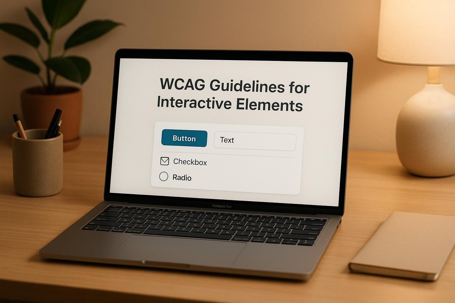
- Interactive Elements: Accessible buttons, forms, and navigation are vital. They require features like clear labels, keyboard compatibility, contrast adjustments, and error guidance.
- Legal Standards: In the U.S., laws like the ADA and Section 508 mandate web accessibility, often using WCAG compliance as a benchmark.
- Levels of Conformance: WCAG defines three levels - A, AA, and AAA. Most organizations aim for Level AA, balancing accessibility with practical implementation.
The takeaway is simple: accessible design improves usability for everyone, not just those with disabilities. By following WCAG, you create a better experience for all users while meeting legal obligations.
Core WCAG Principles for Interactive Elements
As we’ve discussed the importance of inclusive access, it’s essential to understand how the Web Content Accessibility Guidelines (WCAG) ensure accessibility for everyone. WCAG is built on four fundamental principles - Perceivable, Operable, Understandable, Robust (often abbreviated as POUR) - that guide the design of interactive elements like buttons, forms, and navigation tools.
Perceivable, Operable, Understandable, Robust (POUR)
The POUR framework is the foundation of accessible web design. These principles ensure that web content is usable by all individuals, including those with disabilities. Ignoring even one of these principles can create barriers that prevent access.
- Perceivable: Content and interface elements must be presented in ways that users can detect and understand. For example, buttons, form fields, and navigation links should be easy to spot and interact with. Avoid relying solely on color to convey meaning, as this can exclude users with visual impairments.
- Operable: All interface elements should be functional across different input methods. For instance, dropdown menus should work with a keyboard or voice commands, not just a mouse. A menu that depends on mouse hover alone can block users who rely on keyboard navigation.
- Understandable: Both the content and the interface’s functionality need to be clear and intuitive. This means using descriptive labels, providing clear instructions, and offering helpful error messages to guide users through interactions.
- Robust: Content must remain accessible across various platforms and technologies, even as they evolve. Using standard HTML and following best practices ensures compatibility with assistive tools like screen readers and future technologies.
These principles are the blueprint for creating accessible interactive components.
Key WCAG Guidelines for Components
To put the POUR principles into practice, WCAG offers actionable guidelines tailored to specific components:
- Keyboard Accessibility: According to WCAG’s Success Criterion 2.1.1, websites must be fully navigable using only a keyboard. This ensures that users who cannot use a mouse can still interact with the site effectively.
- Color and Contrast: Interactive elements should not rely solely on color to communicate meaning. For instance, a button’s state (e.g., active or disabled) should also be indicated through text, patterns, or opacity changes, accommodating users with visual impairments.
- Clear Labeling and Instructions: Form fields should include descriptive labels, and buttons should feature meaningful text that clearly communicates their purpose within the interface.
- Predictable Behavior: Consistency is key. Whether it’s clicking a button or submitting a form, users should be able to anticipate what will happen based on past interactions. This predictability builds trust and reduces confusion.
- Assistive Technology Compatibility: Interactive components must work seamlessly with tools like screen readers, magnifiers, and voice recognition software. Proper HTML tags and ARIA attributes help convey the role and state of each element to assistive technologies.
- Time Considerations: Features like auto-advancing carousels, session timeouts, or transient notifications should include options to pause, stop, or adjust timing. This gives users control, particularly those who may need more time to interact.
These guidelines are particularly critical given that over 25% of U.S. adults live with a disability. For most organizations, aiming for Level AA conformance strikes a practical balance between improving accessibility and managing implementation efforts.
Designing WCAG-Compliant Buttons, Forms, and Navigation
Now that we’ve covered the POUR principles, let’s focus on how to apply WCAG standards to three essential interactive elements: buttons, forms, and navigation. These components play a critical role in user interaction, and ensuring they are accessible requires careful attention to detail. Here’s how to make each of them more inclusive and functional.
Buttons: Making Actions Clear and Accessible
Buttons are key to any interface, serving as the triggers for user actions. To meet WCAG standards, buttons need to be more than visually appealing - they must also be functional for all users.
- Size and Clickable Area: Buttons should be at least 44px by 44px, making them easier to interact with, especially for users with motor impairments or those on touch devices.
- Descriptive Text: Avoid vague labels like "Click Here" or "Submit." Instead, use text that explains the action, such as "Download Report", "Create Account", or "Save Changes." This helps all users, including those relying on screen readers, understand the button's purpose.
- State Feedback: Buttons should visually communicate their different states - normal, hover, focus, active, and disabled. For instance, a focused button might show a distinct border, while a disabled one could use reduced opacity.
- Contrast: Ensure button text maintains a contrast ratio of at least 4.5:1 for normal text or 3:1 for larger text (18pt or above). This applies across all button states, ensuring readability in various conditions.
Forms: Clear Labels and User-Friendly Error Handling
Forms are complex elements that collect user input, making accessibility a bit more challenging. However, thoughtful design can make forms easier for everyone to use.
- Labels That Connect: Every form field needs a clear label. Use the HTML
<label>element with the appropriateforattribute or wrap the input directly with the label. Placeholder text alone isn’t enough since it disappears when users start typing. - Highlight Required Fields: Use multiple methods to indicate required fields. For example, include the word "required" in the label, use an asterisk (with an explanation), and add the
requiredattribute in the HTML. This ensures all users, including those using assistive technologies, know which fields are mandatory. - Helpful Error Messages: Place error messages near the relevant fields, and make them specific. Instead of saying "Invalid input", try "Please enter a valid email address in the format: name@example.com."
- Logical Tab Order: Arrange fields logically, following a left-to-right, top-to-bottom flow, to support intuitive keyboard navigation. Testing the form with just a keyboard can reveal potential issues.
- Guidance for Complex Fields: Provide clear instructions for fields that need specific formats, like dates or phone numbers. Example text or hints near the field can reduce errors and make the form easier to complete.
Navigation: Building a Clear and Consistent Path
Navigation acts as the backbone of your interface, guiding users through your content. Accessible navigation ensures that everyone can find what they’re looking for with ease.
- Multiple Ways to Navigate: Offer a variety of navigation methods - like menus, a search bar, breadcrumbs, and site maps. Different users prefer different approaches, so giving options improves usability.
- Consistency Across Pages: Keep navigation elements in the same place and order on every page. Familiar layouts, like horizontal menus at the top or vertical menus on the left, help users quickly understand your site structure .
- Skip Links and Landmarks: Add skip links to let keyboard users bypass repetitive navigation and jump straight to the main content. These links should be one of the first focusable elements and can remain hidden until needed. Use HTML landmarks (e.g.,
<nav>,<main>,<aside>) to divide the page into clear sections for screen readers. - Highlight the Current Page: Indicate the user’s current location in the navigation menu using visual styling and attributes like
aria-current="page". This helps users understand where they are within the site hierarchy. - Keyboard-Friendly Design: Ensure all navigation elements can be operated with a keyboard and include clear focus indicators for better visibility.
Regular testing and accessibility audits are essential to ensure these interactive elements meet WCAG standards in practice, not just on paper. By prioritizing accessibility, you create a more inclusive and effective user experience for everyone.
Keyboard Accessibility and Focus Management
For many individuals, the keyboard isn't just a backup to the mouse - it’s their primary tool for navigating digital spaces. Ensuring robust keyboard accessibility is crucial to creating interfaces that everyone can use with ease.
Keyboard Navigation Standards
Every interactive element should work seamlessly with a keyboard. This means users must be able to navigate menus, activate buttons and links, fill out forms, and control media without needing a mouse. To achieve this, the tab order - the sequence users follow when pressing the Tab key - should match the natural reading flow of the content. Avoid using positive tabindex values to manipulate this order, as it can disrupt the intuitive flow.
- Tab moves focus forward, while Shift+Tab moves it backward, creating a smooth and continuous cycle of focus.
- For components with multiple focusable elements (like dropdowns or sliders), use arrow keys to allow navigation within the component itself.
Avoid "keyboard traps", where users get stuck on an element and can’t navigate away. For example, in a custom modal dialog, users should be able to close it and have the focus return to the underlying page. Custom interactive elements, such as those with role="button", should respond to both the Enter and Spacebar keys to align with user expectations.
Focus Indicators and Testing
Focus indicators are visual markers that show which element is currently active and ready for interaction. These indicators are critical for keyboard users to navigate confidently.
- WCAG Level A (2.4.7) requires visible focus indicators.
- WCAG Level AA (1.4.11) mandates a contrast ratio of at least 3:1 for focus indicators.
- WCAG Level AAA (2.4.13) specifies an indicator at least 2 CSS pixels thick with the same contrast.
The placement of focus indicators - whether inside, outside, or along the border - can influence visibility and contrast. Testing focus visibility is essential. Navigate your site entirely with a keyboard to ensure every interactive element visibly receives focus. The tab order should feel natural and intuitive.
To maintain accessibility, avoid removing default focus styles (e.g., using outline: none). If you customize focus indicators, ensure they meet WCAG requirements. Tools like color contrast checkers can help verify that your indicators meet the necessary contrast ratio of 3:1.
Why It Matters
Around one in four adults in the U.S. may rely on keyboard navigation due to disabilities. Regular testing - both manual and with automated tools - ensures your focus management works consistently across browsers and assistive technologies. When done right, effective focus management doesn’t just meet WCAG standards; it also makes interactions smoother and more predictable for all users.
WCAG Levels A, AA, and AAA for Interactive Elements
The Web Content Accessibility Guidelines (WCAG) outline three levels of conformance to help shape your accessibility efforts. Level A tackles the most critical barriers, Level AA ensures compatibility across a wider range of devices and assistive technologies, and Level AAA represents the highest level of accessibility, though achieving it across an entire website is often impractical.
The W3C advises aiming for WCAG 2.1 Level AA compliance, as it strikes a balance between accessibility and practicality. Level AAA is not required for full-site implementation because some of its criteria may conflict with design or content goals and can be overly restrictive.
Differences Between Levels A, AA, and AAA
WCAG’s conformance levels are based on the POUR principles (Perceivable, Operable, Understandable, and Robust). Each level builds on the previous one, addressing progressively more advanced accessibility needs:
- Level A focuses on essential accessibility features.
- Level AA expands accessibility for a broader range of users.
- Level AAA offers the most extensive accessibility but is often too demanding for complete websites.
The table below highlights specific requirements for interactive elements at each level and how they are applied in real-world scenarios.
| WCAG Level | Interactive Element Requirements | Real-World Example |
|---|---|---|
| Level A | Provide text alternatives for all non-text content; ensure keyboard accessibility for interactive elements | The National Federation of the Blind uses concise, descriptive alt text for images |
| Level AA | Maintain a 4.5:1 contrast ratio for text; include focus indicators with a 3:1 contrast ratio; allow text resizing up to 200% | RNID enables users to scale text up to 300% without disrupting usability |
| Level AAA | Ensure a 7:1 contrast ratio for text; use focus indicators that are 2 CSS pixels thick; support 200% text resizing without assistive tools | Scope achieves a high contrast ratio of 9.66:1 between its logo and background |
Real-World Applications of WCAG Levels
Organizations across industries have applied WCAG standards to improve accessibility and inclusivity. For example:
- Target revamped its website after a 2006 lawsuit, enhancing accessibility and building a reputation for inclusivity, which also expanded its customer base among users with disabilities.
- Microsoft adheres to WCAG 2.1 standards across its products, ensuring broader usability and maintaining its leadership in accessibility efforts within the tech industry.
- The BBC consistently meets Level AA standards, benefiting not only users with disabilities but also those with diverse learning styles and device preferences.
- The Federal Aviation Administration (FAA) uses proper HTML heading tags to improve navigation for all users, aligning with WCAG Success Criterion 1.3.1.
Balancing Accessibility Goals
While Level AAA offers the most advanced accessibility, it’s often unnecessary for most interactive elements. For instance, BMW includes controls to pause scrolling content, fulfilling WCAG Success Criterion 2.2.2, but full Level AAA implementation could add unnecessary complexity.
Statistics underline the importance of prioritizing accessibility. According to the 2025 WebAIM Million report, 94.8% of home pages contained detectable WCAG 2 failures. Additionally, 15% of disabled individuals report avoiding the internet entirely due to inaccessible websites. These figures highlight the need for businesses to focus on Level AA compliance, which serves the widest audience effectively.
For most interactive elements, aim for WCAG 2.2 Level AA compliance, while selectively incorporating Level AAA criteria where it adds value. This approach ensures your website remains accessible, user-friendly, and inclusive for as many people as possible.
Adding WCAG to Product Design Workflows
Making interactive elements accessible means weaving WCAG principles into every stage of development. The most effective teams don’t see accessibility as a final task but as a core product standard.
"WCAG AA compliance doesn't start at the finish line. It's not a feature, it's a product standard." - Create Ape
By integrating WCAG early, teams can establish practical and effective accessibility practices in UX design.
Applying WCAG from the beginning supports the POUR principles (Perceivable, Operable, Understandable, and Robust), creating a seamless and accessible design experience.
Best Practices for Accessibility in UX Design
Start accessibility efforts early - this is often referred to as “shifting left.” By addressing accessibility at the beginning of the design process, you improve user experience, ensure compliance from the start, and avoid the higher costs of fixing issues later.
Define clear accessibility goals and assign specific roles within your team. This ensures that accessibility is prioritized and no one overlooks their responsibilities.
Add accessibility annotations to design specifications. These should include details like contrast ratios, screen reader tags, keyboard navigation paths, alt text, and clear headings. These annotations guide developers to write semantic code and build accessibility into the foundation of your product.
For example, in May 2025, Instructure’s design team introduced A11y Design Ambassadors. These ambassadors undergo internal training and share their expertise with design pods. Additionally, their Accessibility Engineers conduct audits during the design and development phases, embedding accessibility into the release process.
Use automated tools like WAVE, axe DevTools, or Google Lighthouse to conduct expert audits before handing designs over to developers. However, remember that automated tools only catch about 40% of accessibility barriers. Manual testing is crucial for identifying issues like keyboard navigation and screen reader compatibility.
Perform hands-on tests using keyboards and screen readers to uncover problems that automated tools might miss.
Integrate Continuous Accessibility Integration (CAI) tools, such as axe CI, into your CI/CD pipelines. This helps catch and prevent new accessibility issues during development.
"Remember that it's not just about handing over annotated designs to developers once you're done with them. It needs to be an iterative, collaborative workflow that involves everyone, both upstream and downstream." - David Swallow, Principal UX Consultant, TPGi
Involve users with disabilities during usability testing. Their feedback often highlights issues that technical audits alone can’t identify. Collaborate with cross-functional teams and, when possible, bring in external disability consultants to guide your efforts.
Regularly monitor accessibility compliance and adjust as needed. Conduct annual third-party audits to stay aligned with evolving WCAG standards and practices.
"Remember, if it's not usable, it's not accessible." - Matt Ater, Vice President of Business Development, Vispero
Resources for Learning More
To deepen your accessibility knowledge, consider these resources and strategies:
- DeveloperUX: This platform offers a Master Course on UX that includes in-depth modules on integrating accessibility principles into modern design workflows. Topics range from designing for diverse user needs to understanding how emerging technologies like AI intersect with accessibility.
- Shared Documentation and Training: Create accessible design guidelines that everyone in your organization can reference. This promotes consistency across projects and helps onboard new team members to your standards.
- Adopt an Accessibility Mindset: Approach accessibility as an ongoing mindset, not a checklist. Collaborate with the disability community from the start of every project. Every decision - whether it’s selecting color palettes, designing focus indicators, or structuring navigation - can enhance accessibility.
"If we can truly integrate accessibility into our products and processes, we can help to level the playing field, create meaningful opportunities, and change the trajectory of what's possible." - Laura Allen, Director, Accessibility & Disability Inclusion, Google
Take small steps - test, learn, and iterate. Remember, accessibility isn’t just for users with disabilities; it benefits everyone.
FAQs
How can I make sure the interactive elements on my website meet WCAG accessibility standards?
To make sure your website's interactive features align with WCAG accessibility standards, focus on these essential practices:
- Use high color contrast between text and background to make content easier to read for everyone, including those with visual impairments.
- Guarantee that all interactive elements - like buttons and forms - are completely keyboard accessible, catering to users who navigate without a mouse.
- Provide clear, descriptive labels, roles, and accessible names for interactive components to support assistive technologies.
Beyond these steps, thoroughly test your buttons, forms, and navigation with assistive tools and in various scenarios. This helps uncover and fix any barriers, ensuring your website offers a more inclusive and seamless experience for all users.
What are the differences between WCAG compliance levels A, AA, and AAA, and which level should my organization target?
WCAG compliance is categorized into three levels: A, AA, and AAA, each representing a different standard of accessibility.
- Level A focuses on the basics, ensuring that content meets the minimum requirements for accessibility. This level addresses fundamental barriers that might prevent users with disabilities from accessing or using content.
- Level AA goes a step further, tackling a wider range of issues to make content more accessible to a larger audience. This is often considered the standard goal for most organizations.
- Level AAA represents the highest standard of accessibility, aiming to make content as inclusive as possible. However, achieving this level consistently across all content can be quite challenging.
For most organizations, aiming for Level AA is a practical choice. It ensures that content is accessible to the majority of users without the extensive effort required for Level AAA. That said, organizations committed to creating the most inclusive experience possible might choose to pursue Level AAA, showcasing a deep commitment to accessibility and inclusion.
Why should accessibility be prioritized early in the design process?
Focusing on accessibility early in the design process helps streamline development and results in a product that's inclusive and easier for everyone to use. Tackling accessibility upfront can save you from expensive redesigns later, improve usability for a wider audience, and ensure compliance with legal standards.
On top of that, accessible designs boost user satisfaction and broaden your product's appeal to a more diverse range of users. Incorporating inclusivity into your workflow doesn’t just benefit the end user - it also elevates the overall quality and effectiveness of your product.