
How to Design Accessible Color Palettes
Learn how to create accessible color palettes that enhance usability for all users, including those with visual impairments and color blindness.
Accessible color palettes ensure your content is usable for everyone, including the 2.2 billion people worldwide with visual impairments and those with color blindness (8% of men, 0.5% of women). Poor contrast can make websites and apps difficult to navigate, while good design improves usability for all users - even in challenging conditions like bright sunlight. Following accessibility standards like WCAG not only improves user experience but also helps you meet legal requirements, such as the ADA Title III in the U.S.
Key Takeaways:
- Contrast Ratios Matter: WCAG Level AA requires a 4.5:1 ratio for normal text and 3:1 for large text.
- Avoid Color-Only Indicators: Pair colors with icons or text to ensure clarity.
- Test Your Palette: Use tools like WebAIM Contrast Checker and color blindness simulators to identify issues.
- Iterate with Feedback: Test designs with users who have visual impairments to refine accessibility.
Start by defining your accessibility goals, testing color combinations, and refining based on user feedback. Accessible design isn’t just about compliance - it’s about creating better experiences for everyone.
Color Accessibility Basics
Color accessibility starts with understanding contrast and how it affects users. Designing with accessibility in mind ensures that interfaces work for everyone - from individuals with perfect vision to those with color blindness or low vision. By grasping these key principles, you can create color palettes that are both visually appealing and functional. These basics lay the groundwork for the more detailed design strategies we'll explore later.
Color Contrast and Perception
At its core, color contrast refers to the difference in brightness or luminance between foreground elements (like text or buttons) and their background. This contrast helps separate elements visually, making them easier to distinguish. It's measured as a ratio ranging from 1:1 (no contrast) to 21:1 (maximum contrast), with higher ratios improving accessibility.
Contrast is particularly important for users with visual impairments. For example, red-green color blindness - the most common form - affects about 1 in 12 men and 1 in 200 women. This condition can make it difficult to differentiate between certain hues that appear adjacent on the color spectrum.
"The primary symptom that color blind people experience is color confusion. Put simply, color confusion is when someone mistakenly identifies a color, for example calling something orange when it is actually green."
– EnChroma
Other forms of color blindness, like blue-yellow color blindness, present unique challenges. Those affected may struggle to distinguish between blue and green or yellow and red. Complete color blindness, or monochromacy, is rare, affecting about 1 in 33,000 people. Individuals with this condition see the world entirely in shades of gray.
To put this into perspective, someone with moderate red-green color blindness might only be able to differentiate five colors from a standard box of 24 colored pencils. Alarmingly, around 40% of color-blind students finish school without ever being diagnosed, often discovering their condition only when they encounter accessibility issues in digital environments.
WCAG Guidelines Overview
The Web Content Accessibility Guidelines (WCAG) provide a standardized framework to ensure that color choices meet accessibility standards. These guidelines focus on luminance contrast rather than hue, making them effective for users with all types of color vision deficiencies.
WCAG divides its accessibility requirements into three levels: A, AA, and AAA. Most organizations aim for Level AA compliance, which strikes a balance between accessibility and design flexibility.
| WCAG Level | Normal Text Contrast | Large Text Contrast | Non-Text Elements |
|---|---|---|---|
| Level A | No specific ratio | No specific ratio | Cannot rely on color alone |
| Level AA | 4.5:1 minimum | 3:1 minimum | 3:1 minimum |
| Level AAA | 7:1 minimum | 4.5:1 minimum | 3:1 minimum |
For WCAG purposes, large text is defined as 18pt (24px) or 14pt (18.66px) bold. Larger text is generally easier to read, even with lower contrast ratios. Non-text elements, such as buttons, form fields, and icons, must also meet a 3:1 contrast ratio to ensure they effectively communicate key information.
Another key principle in WCAG is that color should never be the sole method of conveying information. For instance, if red text is used to indicate an error, it should be paired with an icon or additional text. Similarly, active navigation items highlighted in blue can be made clearer by adding underlines or using a different font weight.
Interactive elements like hover or focus states also need to meet the same contrast standards as their default appearances.
"Color themes that work well for a vision challenged audience will work well for everyone!"
– Alison Murphy, Designer, Pearson's
How to Create Accessible Color Palettes
Designing accessible color palettes isn’t just about making things look good - it’s about ensuring your designs work for as many people as possible. Accessibility should be baked into your process from the start, not added as an afterthought. With a significant number of users affected by visual impairments, thoughtful color choices can make a big difference.
It’s important to remember that individual colors aren’t inherently "accessible" or "inaccessible." As UX researcher Stéphanie Walter explains:
"Colors aren't 'accessible' or 'inaccessible' on their own: it's all about how you combine them."
This means the key lies in how colors interact with each other. Here’s how you can create accessible color palettes step by step.
Step 1: Set Accessibility Requirements
Start by defining clear accessibility goals based on your audience and any legal standards you need to meet. User research can help you understand the specific needs of your audience, including those with visual impairments or color blindness, which affect a significant number of people.
Decide on your WCAG compliance level early in the process. Most organizations target WCAG Level AA, which requires a contrast ratio of 4.5:1 for normal text and 3:1 for large text and non-text elements. If you want to aim higher, Level AAA requires 7:1 for normal text and 4.5:1 for large text.
If your brand colors don’t meet these standards, advocate for accessible adjustments. Start by selecting base colors that meet contrast requirements. Choose primary and secondary brand colors, then create a neutral gray by desaturating one of your main colors. Make sure this gray has at least a 4.5:1 contrast ratio against white for text. When creating lighter and darker variations, ensure they also meet the contrast ratio requirements when paired.
Certain color combinations are notoriously problematic. Avoid using red and green, green and brown, light gray on white, or yellow on white backgrounds unless you add extra visual cues. Yellow, in particular, is tricky - it’s naturally light and should never be used for text on light backgrounds without darker elements for balance.
Step 2: Choose and Test Colors
Once you’ve set your requirements, it’s time to test your palette. Use tools like the WebAIM Contrast Checker to calculate contrast ratios and ensure your colors meet WCAG standards. Desktop applications like TPGi Colour Contrast Analyser offer additional features like eyedropper tools and support for multiple WCAG versions.
Simulating color blindness can help you see how your palette works for users with visual impairments like protanopia, deuteranopia, or tritanopia. Tools like WhoCanUse combine contrast ratio checks with simulation features, while Skynettechnologies Color Blindness Simulator allows you to upload images or enter URLs for real-time transformations.
Don’t stop at text. Test non-text elements like buttons, icons, and interactive components. These should meet a 3:1 contrast ratio against surrounding colors. Also, check all interactive states - hover, focus, and active - to ensure they remain accessible. A quick way to spot issues is by testing your design in grayscale. This reveals whether you’re relying too much on color alone to convey meaning.
Step 3: Test and Improve
The last step is real-world testing and refining your palette based on user feedback. Automated tools are helpful, but they can’t catch everything. Testing with a diverse group of users often reveals challenges that might not show up in controlled conditions, even if your colors technically meet WCAG standards.
If testing highlights problems, adjust your palette systematically. Document your decisions, including contrast ratios, in your brand guidelines to maintain consistency. Regularly review your palette as part of your design process, especially when adding new content or features.
Tools and Resources for Accessible Color Design
Designing with accessibility in mind has become a necessity, especially when you consider that 2.2 billion people worldwide live with visual impairments, and about 1 in 12 men and 1 in 200 women experience some form of color vision deficiency. Thankfully, there are tools available to simplify the process of creating accessible color palettes.
Accessibility Tools
Accessibility tools generally fall into three categories: contrast checkers, color blindness simulators, and accessible palette generators. Each plays a unique role in ensuring your designs are inclusive.
Contrast checkers are your go-to tools for meeting WCAG compliance standards. For example, the WebAIM Contrast Checker is a trusted option for testing all WCAG levels, although it requires HEX color input and lacks a visual color picker. On the other hand, TPGi's Colour Contrast Analyser (CCA) includes an eyedropper tool, making it easier to select colors directly from your screen. If you're working in design software, the Stark Contrast & Accessibility Checker is a popular choice, especially with its seamless integration into platforms like Figma, Sketch, and Adobe XD. With over 513,000 users on Figma alone, Stark provides real-time feedback during the design process.
Color blindness simulators allow you to see your designs through the eyes of users with various visual impairments. For instance, WhoCanUse not only evaluates color contrast but also simulates how your designs appear to people with conditions like cataracts or glaucoma, as well as challenges posed by direct sunlight. As Corey Ginnivan, the creator of WhoCanUse, explains:
"It's a tool that brings attention and understanding to how color contrast can affect different people with visual impairments."
When it comes to building accessible palettes, color generators are invaluable. Tools like Venngage's Accessible Color Palette Generator and Color Safe help you create WCAG-compliant color schemes from the start, rather than addressing issues later. Adobe's Leonardo takes it a step further, offering advanced features for generating entire color systems that adhere to accessibility standards.
For seamless integration into your workflow, tools like the Coolors Figma Plugin bring palette generation and contrast checking directly into your design environment. Meanwhile, browser extensions like Colorzilla make it easy to identify color values on any webpage.
| Tool Type | Best Options | Key Strengths | Ideal For |
|---|---|---|---|
| Contrast Checkers | WebAIM, TPGi CCA, Stark | Accurate WCAG compliance testing | Quick validation of existing colors |
| Simulators | WhoCanUse, Color Blindness Simulator | Comprehensive visual impairment testing | Understanding user perspectives |
| Generators | Venngage, Color Safe, Leonardo | Builds compliant palettes from scratch | Starting new design projects |
| Integration Tools | Coolors Plugin, Stark Plugin | Real-time feedback in design software | Streamlined workflows |
As these tools continue to evolve, staying informed about the latest options is key to maintaining accessibility in your designs.
Keeping Up with Accessibility Standards
Using the right tools is only part of the equation. Keeping up with accessibility standards, such as WCAG 2.2, is equally important. New metrics like the Adjusted Perceived Contrast Algorithm (APCA) are emerging to complement traditional contrast ratios [51, 54]. Tools like Polypane's Contrast Checker already support both WCAG and APCA, helping designers prepare for future updates.
Following official sources like the W3C Web Accessibility Initiative and engaging with accessibility communities can keep you ahead of the curve. Many tools, such as TPGi's CCA, are frequently updated to reflect the latest standards, including WCAG 2.0, 2.1, and 2.2.
Legal regulations also play a significant role in enforcing accessibility. For instance, the Americans with Disabilities Act (ADA) Title III and Section 508 for federal agencies align with WCAG guidelines, making compliance not just ethical but legally required [1, 60]. As Sarah Ippen, Senior UX/UI Designer at AudioEye, points out:
"Color contrast isn't just a design detail - it's essential for making content readable for people with visual impairments."
DeveloperUX as a Resource

To deepen your understanding of accessibility in design, DeveloperUX offers a wealth of resources tailored to UX professionals. Their Master Course on UX covers foundational design principles, while content on topics like AI's impact on UX and internal tool design highlights how accessibility fits into broader strategies.
The best results come from combining automated tools, empathetic simulations, and real user testing. As AudioEye emphasizes:
"Automated tools: They're incredibly useful and a great starting point for improving accessibility - but they're not the whole solution. True color accessibility can't happen without expert testing, from accessibility experts or users with disabilities."
Best Practices for Accessible Color Palettes
Crafting accessible color palettes isn't a one-and-done task - it requires regular upkeep to ensure they continue meeting the needs of all users. With 96.3% of the top million homepages failing to meet ADA standards in 2023, having a strong maintenance plan is essential for long-term success.
Regular Accessibility Reviews
Set up quarterly accessibility audits to stay compliant with evolving standards. Recent updates to WCAG 2.2 emphasize the importance of regular reviews to avoid legal risks. A thorough audit combines automated tools, manual checks, and assistive technology testing to catch issues from multiple angles. By integrating these checks directly into your Quality Assurance (QA) process during design and development, you can prevent problems before they reach your users.
This proactive approach lays the groundwork for gathering meaningful user feedback.
Working with Users and Getting Feedback
Beyond technical audits, real user input is key to making practical improvements. Testing with individuals who have color vision deficiencies can reveal usability challenges that automated tools might miss. As Rishi Ahluwalia from Get Set Create explains:
"User feedback matters because it provides insights into how users perceive and interact with your design choices. It helps validate assumptions, test hypotheses, and discover new opportunities for improvement. Specifically, in the context of color palettes, user feedback enables designers to understand cultural backgrounds, personal experiences, and accessibility needs, ensuring designs are inclusive and effective."
For example, testing tasks like filling out forms or navigating content with users who experience color vision deficiencies can highlight areas needing adjustment. Considering that about 8% of males and 0.5% of females have color vision deficiencies, this feedback is invaluable.
Use tools like surveys, interviews, and A/B testing to gather insights on how various color choices resonate. As Joseph Mathai Pathil, a Product Designer and UX Specialist, puts it:
"Picking the perfect colors is tricky, especially when it comes to what people like. To really nail it, you gotta get inside their heads and see what vibes your palette gives off. Think of it like this: imagine asking your friends about your new outfit. Surveys are like quick polls, 'Hey, what color shirt rocks best?' Interviews are deeper dives, 'Tell me what you feel when you see this shade of blue.' Then there's the A/B testing, like putting two different outfits on mannequins and seeing which gets more stares. Eye tracking is like peering through sunglasses, watching where people's eyes go. By mixing and matching these methods, you get a full picture of what people dig and what makes them cringe."
When analyzing this feedback, use tools like affinity diagrams, personas, or user journey maps to organize diverse opinions. Then, test the feedback through prototypes and usability testing to confirm that your updates improve the overall user experience.
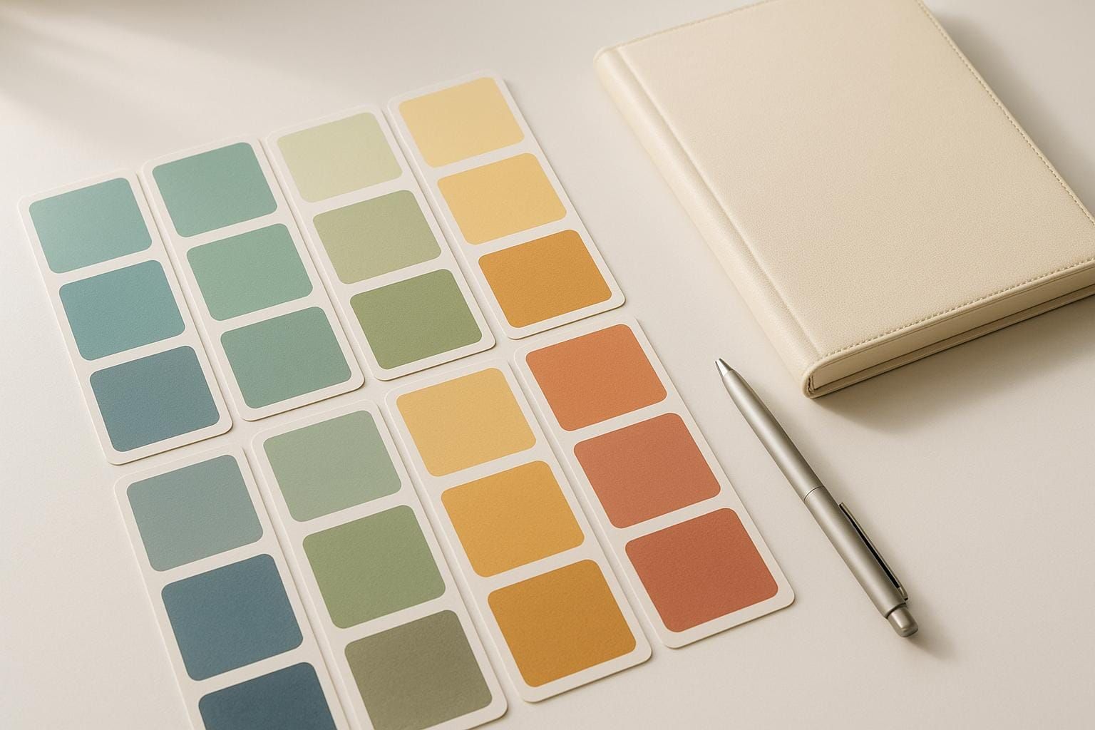
Comparing Different Palette Approaches
Once your palette has been refined through reviews and user input, it’s important to evaluate various strategies to maintain accessibility and aesthetic appeal. Each approach has its strengths and challenges, and understanding these can help you choose the best fit for your needs.
| Palette Approach | Accessibility Benefits | Potential Challenges | Best Use Cases |
|---|---|---|---|
| Monochromatic | Simplifies contrast management and reduces confusion for users with color blindness | Can lack visual variety and hierarchy | Minimalist designs, content-heavy sites |
| Analogous | Creates a harmonious, cohesive look | May reduce differentiation due to low contrast | Background elements, subtle UI components |
| Complementary | Offers high contrast and strong readability | Can feel overwhelming if overused | Call-to-action buttons, important alerts |
| Split-Complementary | Balances contrast without being too harsh, offering flexibility | More complex to manage and test | Dashboards, intricate interfaces |
| Triadic | Provides vibrant, balanced contrast across elements | Requires careful testing to maintain consistency | Creative brands, colorful applications |
For a straightforward solution, monochromatic palettes are a safe bet. For instance, Nike’s website uses a minimal palette of black, white, and gray, ensuring readability while keeping the focus on its products.
For more intricate needs, consider systematic approaches like the one developed by Envoy. Katie Riley, a Product Designer at Envoy, shared their experience:
"What we realized a little bit too late, however, was that brand color palettes and product color palettes are two very different things."
To address this, Envoy adopted a 10-grade system inspired by the U.S. Web Design System (USWDS). Their "magic number" method ensures accessibility by maintaining a 50-point difference between color grades for contrast ratios above 4.5:1, and a 40-point difference for ratios above 3:1.
Test your chosen palette across different devices and lighting conditions to ensure consistent performance. Factors like screen brightness, ambient lighting, and even the user’s age can affect how colors are perceived, making robust contrast a necessity.
Finding the right balance is key. As Prakash Nagarajan, General Manager of Marketing at Integra, aptly notes:
"A design can be beautiful and still be ineffective if it doesn't prioritize readability."
Whether you stick with a simple monochromatic scheme or opt for a more complex system, consistent testing and user feedback will ensure your designs remain both visually appealing and accessible over time.
Conclusion: Designing for All Users
Accessible color design isn't just about meeting legal or ethical standards - it’s about creating better experiences for everyone. In fact, accessible design can increase business performance by 78% and resonates with 39% of consumers, showing that accessibility and aesthetics go hand in hand.
Start by building a structured color system. Define your base colors - primary, secondary, neutral, and functional - ensuring they align with your brand identity. Then, create detailed color scales with at least 11 steps, ranging from light tints to dark shades. This method ensures you can maintain consistent contrast ratios across your entire design system.
For scalability, adopt semantic tokens. Instead of naming colors descriptively, like "blue-100", use functional names such as color-text-primary or color-button-danger. As Contentful’s design token documentation explains:
"Semantic tokens can refer to other tokens and encapsulate specific uses or guidelines, allowing designers and developers to define the role and proper application of design elements, leading to more maintainable and understandable designs."
This approach ensures your design system stays consistent across modes - whether it’s light, dark, or high-contrast themes - without sacrificing usability or breaking the visual flow.
Accessibility doesn’t stifle creativity; it amplifies it. As Stéphanie Walter aptly says:
"Colors aren't 'accessible' or 'inaccessible' on their own: it's all about how you combine them."
Take inspiration from real-world examples like Stripe, which revamped its color system to balance accessibility with visual appeal. They explained:
"Without digging deeper it would be easy to just accept the tradeoff that you need to choose between having accessible colors or colors that look good. In order to get both, we needed to rework our color system from the ground up."
This shows that accessibility and aesthetics can coexist seamlessly with thoughtful design.
Get started today by defining your base colors, incorporating semantic tokens, and testing your designs with actual users. As Kate Murphy wisely puts it:
"There is no wrong place to start when improving your accessible design skills. It's more important to find a place to get started."
FAQs
How can I create a color palette that meets accessibility standards?
To design a color palette that's easy for everyone to use, stick to the WCAG contrast guidelines. For most text, aim for a contrast ratio of at least 4.5:1. If you're working with larger text (14pt/18.66px or bigger), a ratio of 3:1 is acceptable. For even better accessibility (WCAG AAA standards), go for a contrast ratio of 7:1 for regular-sized text.
Be mindful of color combinations that might be hard to distinguish for users with visual impairments, like red and green or blue and yellow. Tools like contrast checkers can help you confirm that your color choices meet these standards. Following these steps ensures your website is more inclusive and easier to navigate for all users.
What are the best tools for creating and testing accessible color palettes?
When creating color palettes that are accessible, a variety of tools can help ensure your choices meet established accessibility standards. Some widely-used options include WebAIM Contrast Checker, Deque's Color Contrast Checker, and Coolors' Contrast Checker, all of which are great for evaluating color contrast. Additionally, tools like Venngage's palette generator and Color Safe can assist in designing color schemes that are both visually appealing and easy to use. These tools aim to strike a balance between good design and usability, making sure your work can be enjoyed by everyone.
Why should you test color palettes with users who have visual impairments?
Testing color palettes with users who have visual impairments is a crucial step in creating designs that are both accessible and easy to use. By assessing how colors function in practical situations, you can ensure that text remains readable, elements stand out clearly, and essential information is easy to navigate for everyone, including those with color blindness or low vision.
Choosing accessible colors enhances the user experience by minimizing frustration and making your design more inclusive. Using high contrast and clear visual distinctions allows all users to interact with your content more effectively, regardless of their visual capabilities.