
Variable Fonts in UX: Benefits and Challenges
Explore the advantages and challenges of variable fonts in UX, including their impact on performance, design flexibility, and accessibility.
Variable fonts simplify typography by combining multiple styles (like bold, italic, etc.) into one file, improving performance and flexibility. This article explains how they reduce file sizes, speed up websites, and enhance design responsiveness while addressing their challenges compared to static fonts.
Key Takeaways:
- Performance Boost: Variable fonts reduce font file sizes (e.g., 88% smaller in some cases) and cut page load times by up to 30%.
- Design Flexibility: They allow smooth adjustments like font weight and width for responsive designs.
- Accessibility: Users can customize text for better readability.
- Challenges: Require more testing and expertise to implement, and fallback strategies are needed for older browsers.
Quick Comparison:
| Aspect | Variable Fonts | Static Fonts |
|---|---|---|
| File Structure | Single file with all variations | Separate file for each variation |
| HTTP Requests | Fewer | More |
| Performance | Best for multiple styles | Better for minimal styles |
| Design Flexibility | High (customizable styles) | Limited to predefined styles |
| Browser Support | Supported by modern browsers | Universal compatibility |
| Accessibility | Dynamic adjustments supported | Fixed design characteristics |
| Implementation | More complex, requires expertise | Simple setup |
Bottom Line: Choose variable fonts for performance and responsive designs with multiple styles. Opt for static fonts for simpler projects with minimal typography needs.
Mandy Michael - Variable Fonts and Responsive Typography
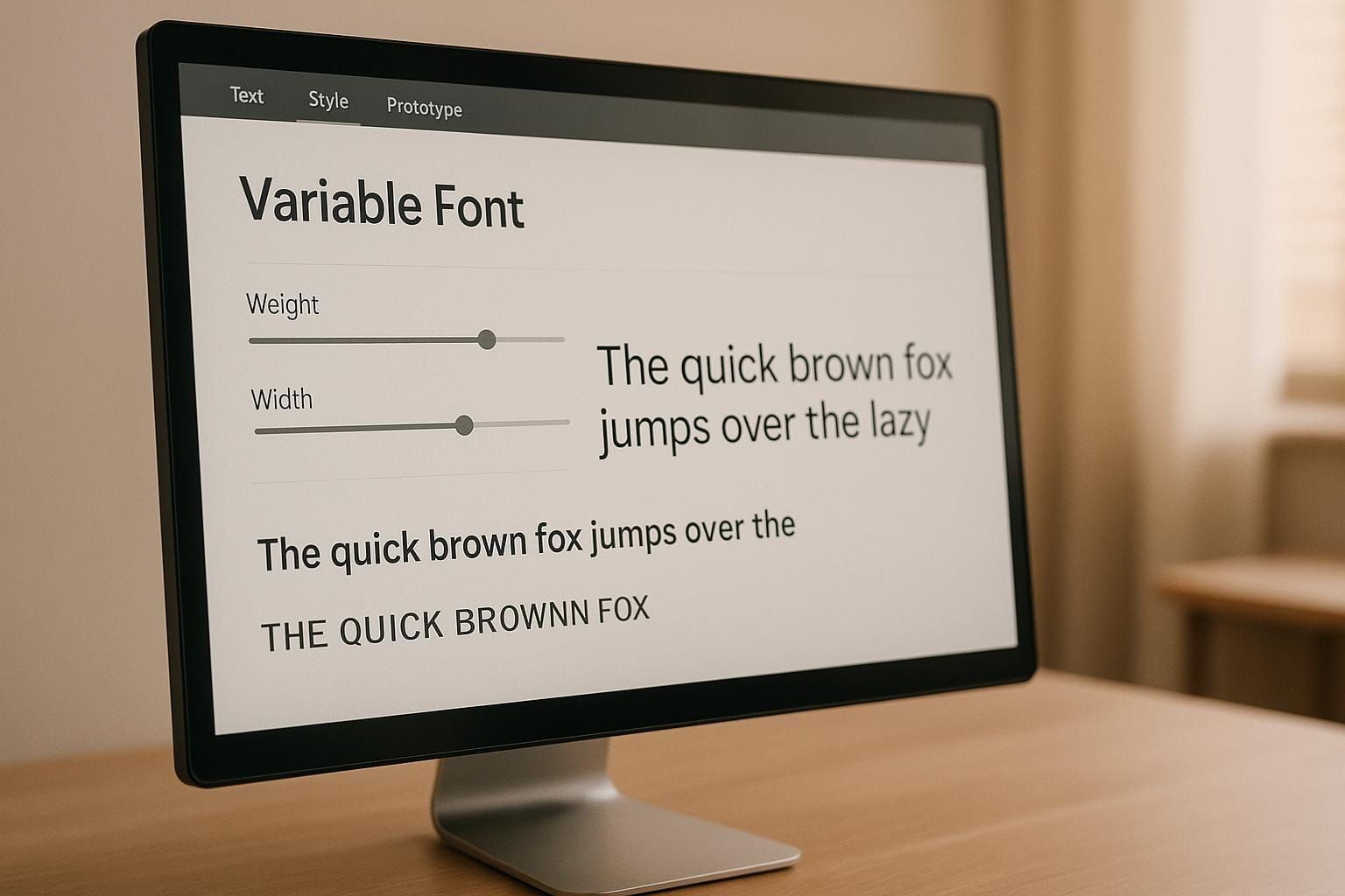
1. Variable Fonts
Variable fonts are revolutionizing web typography by combining all font styles - like regular, bold, and italic - into a single file. This approach offers a range of benefits that directly enhance both performance and design flexibility.
Performance Impact
One of the standout advantages of variable fonts is their impact on performance. Let’s break it down with an example: a single static weight of Source Sans Pro is 243KB, while all static weights combined amount to about 1,170KB. In contrast, the variable font version is just 405KB.
Variable fonts also reduce the number of HTTP requests, and thanks to efficient WOFF2 compression, they can be as compact as a single static font weight. Real-world results back this up: switching to a Roboto variable font cut page load time by 30% (from 700ms to 490ms) and halved the first contentful paint time (from 1.6 seconds to 0.8 seconds). Another example comes from an e-commerce site that reduced its font payload from 376KB to 89KB, which improved its Largest Contentful Paint (LCP) metric by 22%. These performance improvements not only speed up websites but also lay the groundwork for more dynamic and adaptable design systems.
Design Flexibility
Variable fonts shine when it comes to design flexibility. They allow for fluid typography that adjusts font weight, width, and optical sizing based on screen size or user interaction. This means designers can create responsive styles that adapt seamlessly as browser windows are resized. With adjustable axes for width and weight, text can perfectly fit its container, while optical sizing ensures headlines stay sharp and body text remains easy to read on any display.
A great example of this in action comes from Georgia’s digital services team. Back in 2017, they used CSS feature detection with @supports to integrate variable fonts across more than 40 websites, while still providing static font fallbacks for compatibility.
Accessibility Features
Variable fonts also bring accessibility to the forefront. They allow for dynamic adjustments to font characteristics, making it easier for users to customize text based on their needs, device capabilities, or viewing conditions. This adaptability ensures better readability for all users, including those with visual impairments who may require specific font weights or widths for optimal clarity.
Implementation Challenges
Of course, adopting variable fonts isn’t without its hurdles. Ensuring design consistency across all possible variations requires extensive testing at multiple interpolation points. Compatibility between different font masters also needs to be carefully managed. While modern browsers like Chrome, Safari, Edge, and Firefox support variable fonts well, fallback strategies are still necessary for older browsers.
Other challenges include managing non-linear scaling, ensuring proper rendering of diacritics and punctuation, and optimizing performance. Success in implementing variable fonts demands thorough testing across devices and browsers, as well as educating teams about the technology’s capabilities and limitations. While the switch to variable fonts can lead to better performance and more adaptable design systems, it’s not a simple plug-and-play replacement for traditional fonts.
2. Static Fonts
Static fonts have been the cornerstone of web typography for decades, offering a reliable and straightforward solution for projects with simpler design and performance needs. Unlike their dynamic variable font counterparts, static fonts operate with separate files for each style - regular, bold, italic, or bold italic - making them a familiar choice for many designers.
Performance Characteristics
Static fonts rely on individual files for every style, which means additional HTTP requests are required. For instance, a single static Roboto font variant in TTF format typically weighs around 165–175KB. When a project only requires basic typography - like standard text with occasional bold or italic styling - static fonts can actually load faster than variable fonts.
However, as the number of font files increases, so does the load time and HTTP overhead. Anna Monus explains:
"Ultimately, the performance trade-off of variable fonts depends on how these two metrics - the number of HTTP requests and the total size of font files - balance each other out."
In testing scenarios where only four static font variations were used, page load times outpaced those of the Roboto Variable Font. Yet, when the number of font files grows to 12 or more, static fonts begin to struggle under the weight of increased requests and file sizes. This is where variable fonts, which consolidate multiple styles into a single file, offer a clear advantage.
Design Limitations and Flexibility
Static fonts prioritize consistency over flexibility. Each style is predefined, with no room for interpolation or smooth transitions between styles. This rigidity can hinder responsive design efforts, as static fonts lack the adaptability offered by variable fonts.
That said, static fonts do have their strengths. Foundry designers meticulously craft individual styles, ensuring high-quality results that aren’t reliant on automated axes in variable fonts. Additionally, their fixed nature guarantees consistent rendering across different platforms and environments, without the complexities of managing interpolation.
Accessibility and Implementation
One of the key benefits of static fonts is their universal compatibility. Thanks to their simple file structure, they work seamlessly across a wide range of browsers, including those over 20 years old. This makes static fonts a dependable choice for projects requiring broad compatibility.
However, static fonts offer limited adaptability when it comes to accessibility. Users are restricted to the font characteristics provided by the designer, as dynamic adjustments aren’t possible. This means accessibility features need to be carefully planned and implemented in advance.
Implementation Requirements
Implementing static fonts is straightforward but requires careful organization. Each font variation must have its own @font-face declaration and file, which can lead to larger CSS files and more complex management as projects scale.
To optimize static fonts, using the WOFF2 format and subsetting can significantly reduce file sizes and improve performance. As Bram Stein advises:
"In fact, we think it is also time to proclaim: Use only WOFF2 and forget about everything else... WOFF2 is now supported everywhere. So, unless you need to support really ancient browsers, just use WOFF2."
Static fonts are best suited for projects with minimal font requirements, or those prioritizing broad compatibility and simplicity. For such cases, they remain a practical and effective choice, especially when the added complexity of variable fonts isn’t justified.
Advantages and Disadvantages
Expanding on earlier discussions about performance and design, let’s dive into the pros and cons of variable fonts compared to static fonts.
Performance and File Management
When it comes to handling multiple font weights and styles, variable fonts are a clear winner. They significantly reduce file sizes and cut down on HTTP requests. For instance, Google uses a variable version of the Oswald font on websites requiring multiple weights, serving it roughly 150 million times a day.
On the other hand, static fonts can shine in projects with minimal typographic needs. A single static font weight often loads faster than an entire variable font. But here’s the catch: if your project demands several weights or styles, the combined file sizes of static fonts can quickly balloon, slowing down performance. This is where variable fonts step in to save the day.
Design Flexibility and Creative Control
Variable fonts open up a world of possibilities for designers. They support CSS transitions and animations, allowing for seamless changes between font styles - something static fonts simply can’t do. This flexibility means designers can create custom styles and tweak typography to fit specific branding needs.
"Variable fonts allow us to be much more creative and intentional. They give us the ability to create a more compelling experience that's tailored to exactly what the user needs."
Static fonts, however, offer tried-and-true consistency. They’re crafted with precision by experts, ensuring reliable rendering across platforms. But this reliability comes at a cost: static fonts lack the dynamic adaptability that variable fonts bring to the table.
Implementation Complexity and Compatibility
Static fonts are straightforward to use and work seamlessly across all browsers, including older ones. Their simplicity makes them accessible to designers and developers with varying levels of technical expertise.
Variable fonts, while powerful, require a bit more effort to implement. Fortunately, modern browsers fully support them. A great example of overcoming these challenges is the State of Georgia's digital services team. They created a typographic system using variable fonts while still offering static versions for older systems. By leveraging CSS feature detection with @support, they successfully rolled out this system across over 40 sites visited by millions each month.
Accessibility and User Experience
Variable fonts bring a lot to the table in terms of accessibility. They allow for fine-tuning typography to meet user needs, and dynamic subsetting techniques can cut font file sizes by 60%. Additionally, the WOFF2 format offers up to 30% better compression compared to WOFF. These optimizations are especially helpful for users on slower internet connections and those requiring adjustments like stroke contrast or letter width to improve readability.
Static fonts, while consistent, don’t offer the same level of real-time customization. This highlights the importance of balancing performance, adaptability, and compatibility when deciding between the two font types.
| Aspect | Variable Fonts | Static Fonts |
|---|---|---|
| File Structure | Single file with all variations | Separate file for each variation |
| HTTP Requests | Fewer (consolidated styles) | More (multiple files) |
| Performance | Best for multiple styles | Better for minimal styles |
| Design Flexibility | High (custom styles & animations) | Limited to predefined styles |
| Browser Support | Supported by modern browsers | Universal compatibility |
| Implementation | More complex (requires expertise) | Simple and straightforward |
| Accessibility | Supports dynamic adjustments | Fixed design characteristics |
| File Size Efficiency | Up to 88% reduction with multiple styles | Larger combined file sizes |
Ultimately, the choice between variable and static fonts depends on the needs of your project. Variable fonts are perfect for design-heavy, performance-focused applications, while static fonts are a solid choice for simpler projects where minimal typography is enough.
Conclusion
Deciding between variable and static fonts isn’t a straightforward choice - it all boils down to the unique demands of your project, the skills of your team, and the expectations of your users.
Variable fonts are ideal for complex, design-heavy projects that require multiple weights and adaptable styles. They excel in responsive web environments where typography needs to seamlessly adjust across devices and screen sizes. If accessibility and customization are top priorities, variable fonts provide the versatility needed to fine-tune text for better readability and performance. As previously discussed, the benefits in terms of flexibility and efficiency can be substantial.
On the other hand, static fonts are a dependable option for simpler projects that only need one or two font styles. They’re especially suitable when your team is less familiar with variable fonts or when compatibility across all browsers is a must. Their straightforward setup makes them a stable choice for projects where ease of use and reliability outweigh the need for advanced typography features.
As type designer John Hudson has observed:
"This time, we may be cautiously optimistic that the technology will live up to its promise, as a widely supported and interoperable standard that provides benefit to users and opens the door to new forms of typographic expression." - John Hudson
For teams navigating this decision, start by assessing your typography needs. If your project requires more than two or three font styles, variable fonts are likely the better option for performance and design flexibility. Also, consider your team’s technical know-how and the browsers your audience uses. Keep in mind that improving accessibility and optimizing load times can have a direct impact on business outcomes - faster websites can boost conversion rates by up to 2.5 times.
Here are a few implementation tips for variable fonts:
- Use tools like Wakamai Fondue to inspect font files and Glyphhanger for subsetting to reduce file sizes.
- Always apply the
font-display: swapproperty to avoid Flash of Invisible Text (FOIT). - Thoroughly test your fonts across various browsers and devices.
- Start small - try variable fonts on a single project before integrating them into your entire design system. This lets you fine-tune your approach while balancing typography goals with team capabilities.
Typography continues to evolve, with variable fonts offering new possibilities for design flexibility and performance. By aligning your project’s typography needs with your team’s expertise, you can create a better user experience while enhancing design efficiency.
FAQs
How do variable fonts enhance website performance compared to traditional static fonts?
Variable fonts bring a notable boost to website performance by packing multiple font styles into a single file. This clever design reduces file size and cuts down on the number of network requests, which translates to faster page load times and a more responsive browsing experience.
Beyond performance, variable fonts offer incredible flexibility. They let you tweak typography elements like weight, width, and slant - all without needing separate font files. This means text can adapt seamlessly to different screen sizes and devices, ensuring a polished and consistent look for users everywhere.
What should designers consider when using variable fonts in responsive design?
When working with variable fonts in responsive design, it's important to focus on performance, flexibility, and usability. These fonts pack multiple styles - like weight, width, and slant - into a single file. The result? Faster page load times and lower bandwidth usage. This makes them a great choice for responsive web design, where text needs to adapt smoothly to different screen sizes and resolutions.
Another big advantage is optical sizing. This feature keeps text sharp and visually consistent, no matter the viewing conditions, which boosts readability and improves the overall user experience. To make the most of these benefits, designers should test how the fonts behave on various devices and ensure fallback options are in place for older browsers that might not support variable fonts.
How can designers ensure variable fonts work seamlessly and remain accessible across different browsers and devices?
To ensure variable fonts function seamlessly and remain accessible across different browsers and devices, designers should stick to a few essential practices.
First, always include fallback options by adding static font files in your CSS. This way, if a variable font isn’t supported, a standard font will automatically take its place. Use the @font-face rule to define multiple font formats, which helps improve compatibility across platforms.
Second, make it a habit to test your designs on a variety of browsers and devices. Regular testing can help you spot potential issues early. Tools like simulators can also mimic different environments, making it easier to identify and resolve problems before they affect users.
Lastly, ensure your designs are optimized for the latest operating systems. Older versions may not fully support variable fonts, so accounting for this will help maintain consistent performance and accessibility for all users. These steps go a long way in creating reliable and user-friendly typography.