
Color Contrast Checker for Accessible Design
Test color contrast for accessibility with our free tool! Check WCAG AA & AAA standards, get instant ratios, and ensure readable designs.

Ensure Readable Designs with a Color Contrast Checker
Creating a website that’s easy to navigate and read isn’t just about aesthetics—it’s about inclusivity. Many users, including those with vision challenges, rely on sufficient contrast between text and backgrounds to engage with content. That’s where a tool to test color accessibility becomes a game-changer for designers and developers alike.
Why Contrast Matters in Web Design
Poor contrast can make text blend into the background, frustrating users and potentially locking out a chunk of your audience. Accessibility standards like WCAG (Web Content Accessibility Guidelines) provide clear benchmarks to avoid this. By testing your palette, you ensure compliance with these guidelines while crafting a better user experience. Imagine a site where every button, headline, and paragraph pops just right—achieving that starts with the right tools.
Beyond Compliance: Building Better Experiences
Using a utility to evaluate text readability doesn’t just tick a box for regulations; it shows you care about who’s on the other side of the screen. Pairing hues thoughtfully can elevate your design, making it welcoming to all. Next time you’re tweaking a layout, take a quick check to see if your choices hold up. Small adjustments can transform how your work is perceived, ensuring no one’s left squinting or guessing.
FAQs
Why is color contrast important for web design?
Color contrast is key to making websites usable for everyone, especially folks with visual impairments. If text and background colors are too similar, content becomes hard to read, which can alienate users or even violate accessibility laws. High contrast ensures clarity, improves user experience, and helps you meet WCAG guidelines. Think of it as a small tweak with a big impact—both for inclusivity and for keeping your site professional.
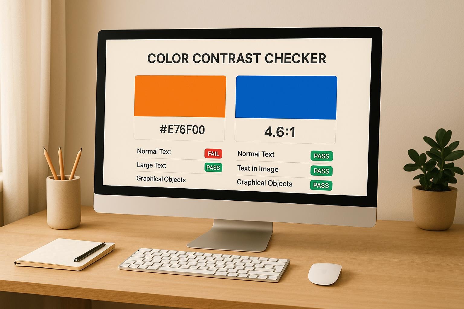
What are WCAG AA and AAA standards?
WCAG stands for Web Content Accessibility Guidelines, and they set the bar for making digital content accessible. AA is the mid-level standard, often the minimum for compliance, requiring a contrast ratio of at least 4.5:1 for normal text and 3:1 for large text. AAA is stricter, aiming for 7:1 for normal text and 4.5:1 for large text, ensuring even better readability. Our tool breaks it down so you know exactly where your colors stand.
Can I use different color formats with this tool?
Absolutely! Our Color Contrast Checker is flexible and accepts hex, RGB, and HSL formats for both foreground and background colors. Whether you’re copying a hex code from a design app or tweaking RGB values manually, the tool handles it seamlessly. Just pop in your values or use the color picker, and you’ll get instant feedback. It’s built to fit right into your workflow, no matter how you work with colors.