
Typography Scale Calculator for Perfect Harmony
Create harmonious font size scales with our free Typography Scale Calculator. Perfect for web and app design—try it now for pixel-perfect results!
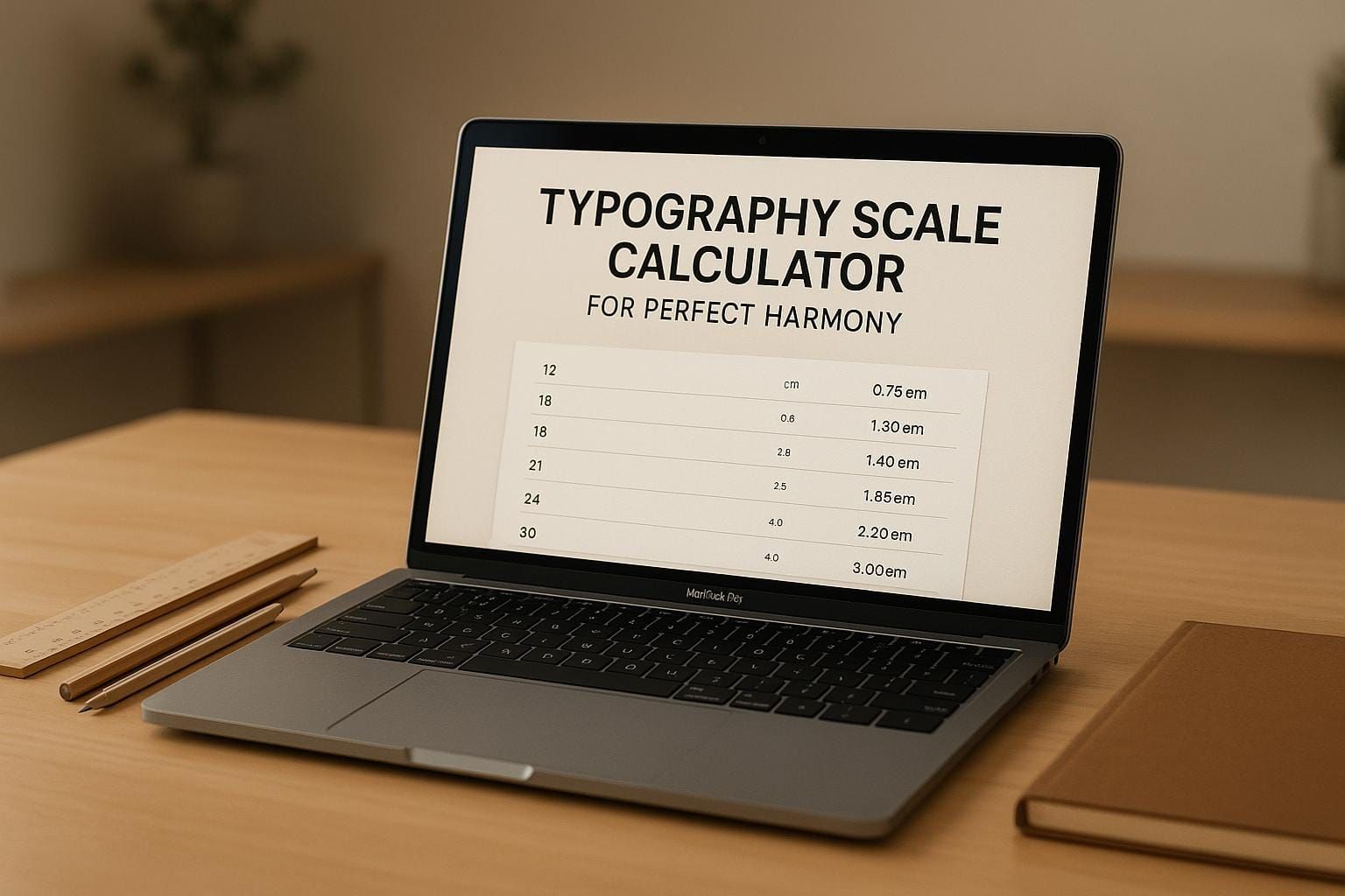
Master Your Design with a Typography Scale Calculator
Typography is the backbone of any great web or app design, but nailing the perfect hierarchy can be tricky. That’s where a tool like our font size scaling generator comes in. It simplifies the process of building a cohesive set of font sizes, ensuring your headings, subheadings, and body text work together seamlessly. Whether you’re a seasoned designer or just starting out, having a reliable way to create balanced scales can elevate your projects from good to unforgettable.
Why Typography Scales Matter
A well-crafted font hierarchy does more than just look pretty—it guides users through your content effortlessly. When sizes are mathematically proportional, the visual flow feels intuitive, keeping readers engaged. Instead of guessing which sizes pair well, you can use a dedicated calculator to generate precise values based on a base size and ratio. This approach saves time and reduces frustration, letting you focus on the creative aspects of your work.
Tips for Better Typography
Start with a base size that matches your audience’s needs—16px is a common default for readability. Experiment with different ratios to find the right contrast for your layout. And don’t forget to test your choices across devices to ensure consistency. With these steps, your designs will always leave a lasting impression.
FAQs
What is a typography scale, and why does it matter?
A typography scale is a set of font sizes that follow a consistent mathematical ratio, creating visual harmony in your design. Think of it like a musical scale—each note (or font size) works together to create a pleasing whole. It matters because inconsistent sizing can make your website or app feel cluttered or unprofessional. Using a scale ensures headings, body text, and captions all relate to each other, guiding the user’s eye naturally through your content.
How do I choose the right scale ratio for my project?
Choosing a scale ratio depends on the vibe you’re going for. A smaller ratio like 1.2 (minor third) gives subtle differences between sizes, perfect for minimalist or dense designs. A larger ratio like 1.333 (perfect fourth) creates more dramatic jumps, ideal for bold, hierarchical layouts. Play around with the presets in our tool to see what feels right—trust your instincts as a designer, and preview the sample text to get a real sense of the impact.
Why are rem units included in the results?
Rem units are super handy for responsive design since they’re relative to the root font size (usually 16px on browsers). Including them alongside pixels in our calculator makes it easier to implement your typography scale in CSS without extra math. If a user changes their browser’s default font size, rem ensures your design scales proportionally, keeping accessibility in mind. It’s just one more way to make your workflow smoother!