
CSS Breakpoints for E-commerce Layouts
Let content—not device labels—dictate breakpoints: use fluid grids, container queries, and keep navigation, filters, and checkout usable.

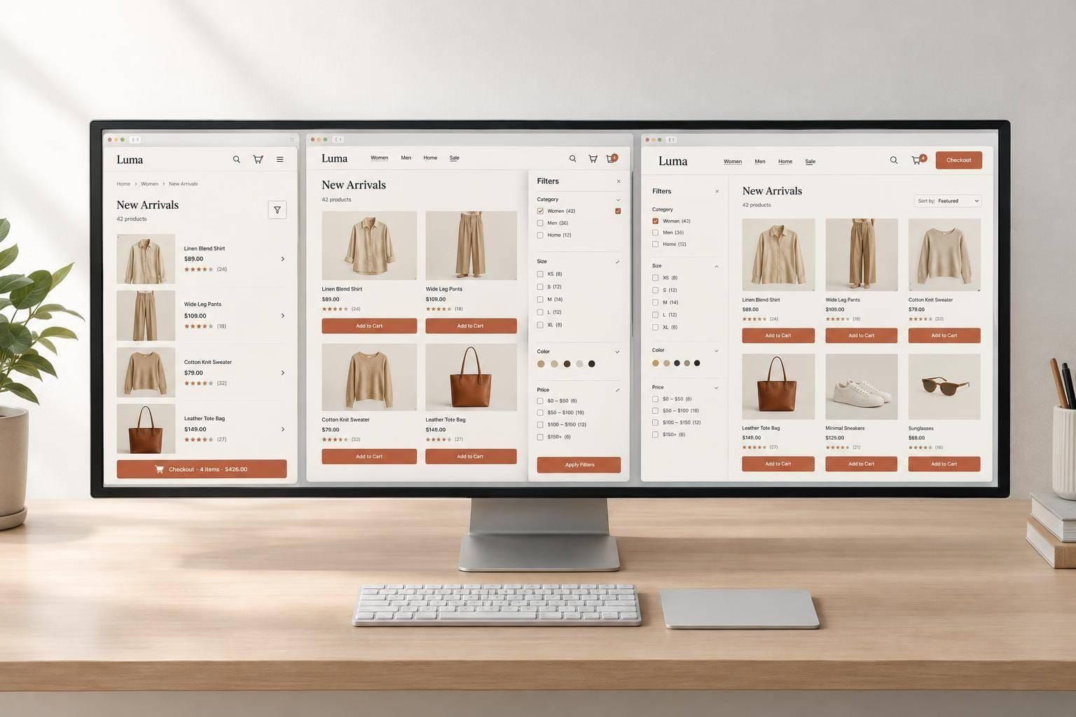
I set CSS breakpoints where shopping gets harder - not at preset device widths. Start with one column at 320 CSS pixels, then expand the viewport. When navigation crowds, product cards shrink too far, or checkout controls stop fitting, try flexible sizing before adding a breakpoint.
Here’s the approach I use:
- Choose queries by scope: viewport queries for page layouts; container queries for reusable components.
- Plan each component separately: headers, grids, filters, product details, and checkout may need different switch points.
- Keep shopping actions usable: preserve selections and form values, support keyboard and touch input, and leave zoom unrestricted.
- Test and document each change: check just below, at, and above each breakpoint, then test shopping flows on physical devices.
My rule: <u>fix the content-fit problem first</u>, then keep only the breakpoints the store needs. A familiar screen width isn’t a reason to change the layout.
Choose Width Ranges and Write Mobile-First CSS
Use the widths you recorded to set your first testing bands.
Use Common Width Ranges as Starting Points
Start with rough testing bands of 320–480px, 481–768px, 769–1,024px, 1,025–1,200px, and 1,201px+. Keep only the breakpoints your content needs.
| Method | Strengths | Risks | Appropriate use |
|---|---|---|---|
| Content-based planning | Accounts for text length, card width, navigation controls, and available container space | Requires testing and may lead to less familiar breakpoint values | Preferred for production layouts |
| Container queries | Fit reusable components to their available space | Require a query container | Cards and recommendation modules used in different page regions |
Start With Base Styles, Then Add Media Queries
Keep each component’s base styles and queries together. The grid below starts with one column, then switches to two and four columns. 40rem and 64rem are example thresholds - not defaults. Check card content, gutters, filters, and container width before using them.
.product-grid {
  display: grid;
  grid-template-columns: 1fr;
  gap: 1rem;
}

@media (min-width: 40rem) {
  .product-grid {
    grid-template-columns: repeat(2, minmax(0, 1fr));
  }
}

@media (min-width: 64rem) {
  .product-grid {
    grid-template-columns: repeat(4, minmax(0, 1fr));
  }
}
Add the viewport tag below and leave zoom unrestricted.
<meta name="viewport" content="width=device-width, initial-scale=1">
Use Flexible Grids Before Adding Queries
If cards only need to resize, start with a fluid grid. This pattern caps the grid at 75rem and keeps side gutters outside the tracks. auto-fit adds columns as space allows, while min(100%, 14rem) inside minmax() keeps the minimum track width from exceeding the available row.
.product-grid {
  width: min(100% - 2rem, 75rem);
  margin-inline: auto;
  display: grid;
  grid-template-columns:
    repeat(auto-fit, minmax(min(100%, 14rem), 1fr));
  gap: 1rem;
}
When the same component appears in different spaces, base its layout on container width rather than viewport width.
Use viewport queries for page-level changes, such as the header or checkout columns. Use container queries when a reusable card or recommendation module needs a different layout in a narrow slot. Set container-type: inline-size on a suitable wrapper, then query that container to adjust its descendants.
sbb-itb-124fdbf
Set Layout States for Shopping Components
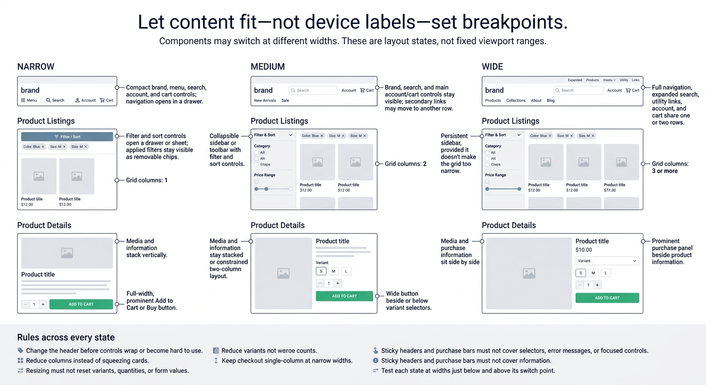
E-commerce Layout States: Narrow, Medium, and Wide
Once your width ranges are set, map them to component states. The header, grid, filters, and product details will shift at different widths. Along with checkout, these are the main layout changes to plan.
| State | Header | Grid columns | Filters | Product details | Primary action |
|---|---|---|---|---|---|
| Narrow | Compact brand, menu, search, account, and cart controls; navigation opens in a drawer | 1 | Filter and sort controls open a drawer or sheet; applied filters stay visible as removable chips | Media and information stack vertically | Full-width, prominent Add to Cart or Buy button |
| Medium | Brand, search, and main account/cart controls stay visible; secondary links may move to another row | 2 | Collapsible sidebar or toolbar with filter and sort controls | Media and information stay stacked or use a constrained two-column layout | Wide button beside or below variant selectors |
| Wide | Full navigation, expanded search, utility links, account, and cart share one or two rows | 3 or more | Persistent sidebar, provided it doesn't make the grid too narrow | Media and purchase information sit side by side | Prominent purchase panel beside product information |
Change the Header When Controls No Longer Fit
Change the header before controls wrap or become hard to use. Measure the brand, menu, search, account, cart, and required spacing together. Move utility links to a second row rather than squeezing everything onto one line.
Keep header height predictable, and make sure sticky headers don't cover content, search, or cart controls. Use a keyboard-operable menu button with aria-expanded. When a navigation drawer opens, move focus into it; when it closes, return focus to the trigger. Keep source order logical across layouts.
Choose Grid Columns by Card Width
Base column count on the grid's usable width after padding and sidebars. When space runs out, reduce columns instead of squeezing cards.
Check image proportions, long titles, badges, and Add to Cart buttons - not just the card shell. Sale prices, original prices, and crossed-out comparisons need room without crowding the purchase control. Stick with two columns longer if adding a third makes comparisons harder.
Reflow Filters, Product Details, and Checkout
Keep filters paired with sort controls. Expand a sidebar only when the cards still have enough room to use. Preserve applied-filter chips and selections, including when shoppers return from a product page. Give drawers clear Apply, Cancel, and reset actions.
When space runs out, stack product media and purchase information. Keep source order logical, and make sure variant labels and purchase actions aren't clipped.
Resizing must not reset variants, quantities, or form values. Stack cart rows into item blocks so the product, variant, quantity, price, and remove action stay together without horizontal scrolling.
Keep checkout single-column at narrow widths, with labels and validation messages beside their fields. If you use a sticky purchase bar, make sure it doesn't cover selectors, error messages, or focused controls. Test each state at widths just below and above its switch point.
Test and Maintain Breakpoints
Test Screen Widths and Breakpoint Boundaries
Once the layout states are set, test the widths between them, not just device presets. Use the matrix below, then resize slowly between rows. Treat each row as a boundary check for its matching breakpoint. Follow the shopping journey as you browse products, filter results, choose variants, add items to the cart, and complete checkout.
| Viewport width (CSS px) | State | Primary checks | Defects to record |
|---|---|---|---|
| 320 | Single-column mobile | Reflow, readable text, product-card width, checkout fields | Horizontal scrolling, clipped text, overlapping controls |
| 375–414 | Expanded mobile | Header controls, sale-price wrapping, cart and product actions | Crowded icons, narrow buttons, unexpected wrapping |
| 767 | Just below tablet breakpoint | Mobile-to-tablet transition | Premature column changes, broken navigation, uneven gaps |
| 768 | Tablet layout begins | Grid columns, filter controls, header state | Missing controls, oversized cards, layout jump |
| 769 | Just above tablet breakpoint | Boundary stability | One-pixel overflow, duplicate controls, inconsistent spacing |
| 1,024 | Large tablet or small desktop | Filters, product details, checkout structure | Narrow content regions, hidden actions |
| 1,279 | Just below desktop breakpoint | Header and grid transition | Crowded navigation, card compression |
| 1,280 | Desktop layout | Multi-column grid, full navigation, promotional areas | Incorrect max-width, excessive whitespace |
| 1,920 | Large desktop | Container limits, image quality, line lengths | Stretched content, oversized gaps, blurry imagery |
Use the same catalog states at every width: long names, sale prices, unavailable products, empty carts, and long validation messages. For each defect, record the width, browser, orientation, zoom level, content state, and steps to reproduce it. Fix blocked checkout and inaccessible actions before cosmetic spacing.
After the boundary checks pass, test the same flows on real devices.
Check Accessibility and Shopping on Devices
Where possible, use physical iPhone, Android phone, and tablet hardware in both portrait and landscape. Complete the full journey in a test environment: product listing → filter → product detail → variant selection → add to cart → cart review → checkout → validation correction → order completion.
Go beyond screenshots. Check image loading, text readability, touch targets, keyboard access, visible focus, and logical focus order.
Test browser zoom and text enlargement, including reflow at 320 CSS pixels without losing information or functionality, or requiring two-dimensional scrolling unless the content needs it. Try the on-screen keyboard in coupon, address, and payment fields. Make sure sticky headers and purchase bars don't hide focused controls, error messages, or submit actions. Repeat these checks after rotating the device and dismissing the keyboard.
Document and Review Each Breakpoint
Keep a breakpoint register for failed content-fit cases, including header states and grid transitions. Record the component, threshold, expected behavior, validation method, owner, and review date.
Share breakpoint thresholds across CSS and JavaScript. When scripts need to track a query, use matchMedia() and its change event.
Retest intermediate widths after changes to navigation, product content, promotions, filters, typography, or checkout fields. Add visual regression checks for boundary states, open drawers, empty carts, and checkout errors. Remove outdated overrides, turn every production breakpoint defect into a regression test, and update the register as layouts change.
Conclusion: Let Content Guide Breakpoints
Let shopping needs - not device labels - set your breakpoints. Start with mobile-first CSS and a usable single-column layout. Use fluid sizing for small width changes, then add min-width queries when the layout needs to shift. Keep search, filters, purchase buttons, and checkout usable with touch, keyboard, and zoom at every state and breakpoint boundary.
Use boundary test results to decide whether you need another breakpoint. Start with one category or product page and resize it from narrow to wide. Find the first content-fit problem that fluid sizing can't fix, then document the threshold, component, and fix. Test that choice before adding another breakpoint.
FAQs
How do I calculate breakpoints from product card widths?
Set breakpoints where product cards stop fitting comfortably - not by device labels. Widen the viewport and watch for cramped or misaligned content.
With grid-template-columns: repeat(auto-fit, minmax(280px, 1fr)), the browser automatically wraps cards when they no longer fit in the container. Add a media query only when needed to adjust the grid, spacing, or hierarchy - for example, when the layout feels cramped or text lines become too long to read comfortably.
Should I use rem or px for breakpoints?
Use rem instead of px for breakpoints so your layout can respond to users’ browser font size preferences. This supports accessibility and keeps scaling consistent.
Set breakpoints where your content needs a layout change to stay readable and organized - not at fixed pixel widths tied to specific device labels.
How do I handle breakpoints for longer translated text?
Avoid fixed-height containers and hidden overflow that can cut off text. Use responsive units like rem or vw for font sizes and spacing, and CSS clamp() to scale text fluidly. Skip nowrap so text can wrap naturally.
Test with localized content to check that the layout reflows without truncating text or forcing horizontal scrolling. Set max-width on content blocks in ch units to keep lines readable.