
Best Practices for Responsive Typography
Scalable, accessible typography guide: use rem/em and clamp(), build modular type scales, meet WCAG contrast, and test typography across devices.
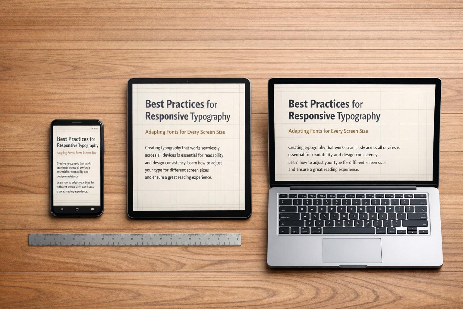
Responsive typography ensures text adjusts for readability across devices and screen sizes. By focusing on font size, line height, and scaling, it creates a better reading experience for everyone, including those with accessibility needs. Here's what you need to know:
- Relative Units: Use
remfor global scaling andemfor component-level adjustments. Avoid fixed units likepx. - Fluid Scaling: Combine
remandvwwith tools likeclamp()for dynamic font sizes. - Modular Type Scales: Establish consistent font sizes using ratios (e.g., 1.2 or 1.333) for visual harmony.
- Accessibility: Ensure text resizes up to 200% without breaking layouts and meets WCAG contrast standards (4.5:1 for small text).
- Testing: Check typography on multiple devices, zoom levels, and orientations.
Responsive typography isn’t just about resizing text - it’s about creating a smooth, readable experience for all users.
Responsive Typography Best Practices: Units, Ratios, and Accessibility Standards
Using Relative Units for Scalable Typography
Creating responsive typography hinges on using scalable units. Absolute units like pixels (px) are often avoided for font sizes because they don’t adapt to user browser settings. When users increase their default font size, text sized in pixels stays fixed, which can make reading difficult.
Relative units solve this problem by scaling proportionally. Among these, rem (root em) is the most widely used. It references the root <html> font size, which is typically 16px in modern browsers. To ensure accessibility, set the root font size as follows:
html { font-size: 100%; }
This setup ensures that 1rem matches the user’s preferred size, making your typography more adaptable.
For component-level spacing, em units are useful. However, keep in mind that nested elements using em can lead to compounded scaling.
Another option is viewport units (vw and vh), which represent 1% of the viewport’s width or height. While these units allow fluid scaling, using them alone (e.g., font-size: 5vw) can result in text that’s too small on mobile devices or too large on desktops. A better approach is to combine viewport units with rem using functions like calc() or clamp(). For example:
calc(1rem + 1vw)
This method ensures text scales gracefully while respecting user settings.
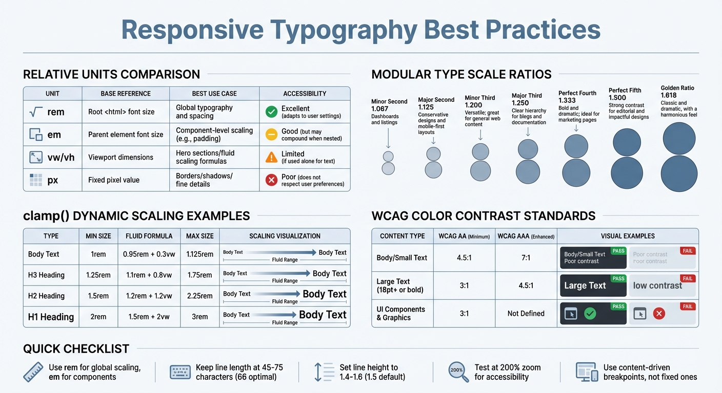
Comparison of Relative Units
Here’s a quick breakdown of how relative units perform in different scenarios:
| Unit | Base Reference | Best Use Case | Accessibility |
|---|---|---|---|
| rem | Root <html> font size |
Global typography and spacing | Excellent (adapts to user settings) |
| em | Parent element font size | Component-level scaling (e.g., padding) | Good (but may compound when nested) |
| vw/vh | Viewport dimensions | Hero sections, fluid scaling formulas | Limited (if used alone for text) |
| px | Fixed pixel value | Borders, shadows, fine details | Poor (does not respect user preferences) |
When to Use clamp() for Dynamic Scaling
The clamp() function is a powerful tool for creating fluid typography. It lets you define a minimum size, a preferred (fluid) size, and a maximum size, allowing your text to scale smoothly within defined limits. The minimum and maximum values act as boundaries, while the preferred value - often a mix of rem and vw - ensures the text adjusts dynamically.
For example:
font-size: clamp(1rem, 0.95rem + 0.3vw, 1.125rem);
This keeps body text between 1rem and 1.125rem, scaling fluidly in between without requiring multiple breakpoints.
When using clamp(), always set the minimum and maximum values in rem to maintain accessibility. Combining rem with vw for the preferred value ensures text responds both to viewport changes and user zoom. Maxwell Barvian notes, "If the maximum font size is less than or equal to 2.5 times the minimum font size, then the text will always pass WCAG SC 1.4.4."
Here’s an example of how to size different text elements dynamically:
| Type | Min Size | Fluid Formula (Preferred) | Max Size |
|---|---|---|---|
| Body Text | 1rem | 0.95rem + 0.3vw | 1.125rem |
| H3 Heading | 1.25rem | 1.1rem + 0.8vw | 1.75rem |
| H2 Heading | 1.5rem | 1.2rem + 1.2vw | 2.25rem |
| H1 Heading | 2rem | 1.5rem + 2vw | 3rem |
Browser support for clamp() has been strong since mid-2020, with coverage reaching 90.84% by late 2025. This feature simplifies CSS by reducing the need for multiple media query breakpoints, making it a go-to choice for fluid typography.
Building a Modular Type Scale
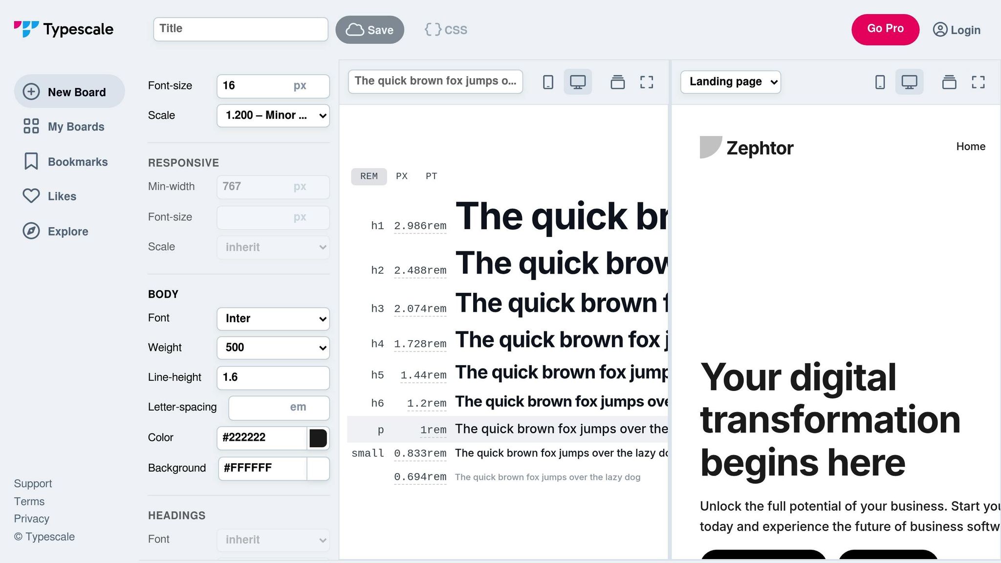
A modular type scale builds on the idea of scalable units, using consistent ratios to maintain a harmonious typographic structure. Instead of selecting random font sizes like 14px, 18px, and 24px, this method starts with a base size (commonly 16px or 1rem) and applies a fixed ratio to generate proportional sizes. Larger sizes for headings are created by multiplying the base size, while smaller sizes for captions and labels are achieved by dividing it. This ensures all text elements are proportionally related, creating a predictable and balanced visual hierarchy.
To keep things organized and avoid inconsistencies, define 6–8 distinct sizes with semantic names like sm, base, lg, and xl. As Drew Powers explains:
"A good type scale is flexible enough to fit the design, without allowing too many options that result in excessive variability".
For better accessibility and adaptability, use rem units rather than pixels. This respects user browser settings, such as zoom preferences, ensuring your typography remains user-friendly.
Choosing the Right Scaling Ratios
The ratio you choose plays a big role in defining the contrast between text sizes. Lower ratios like 1.2 (Minor Third) create subtle size differences, while higher ratios like 1.618 (Golden Ratio) result in more dramatic shifts. Ratios between 1.2 and 1.333 are ideal for establishing a clear hierarchy without overwhelming the layout. For marketing sites or landing pages, higher ratios like 1.5 (Perfect Fifth) are often used to make headings stand out, especially on larger screens.
Here’s a quick look at some common scaling ratios and their best applications:
| Scale Name | Ratio | Best Use Case |
|---|---|---|
| Minor Second | 1.067 | Dashboards and listings |
| Major Second | 1.125 | Conservative designs and mobile-first layouts |
| Minor Third | 1.200 | Versatile; great for general web content |
| Major Third | 1.250 | Clear hierarchy for blogs and documentation |
| Perfect Fourth | 1.333 | Bold and dramatic; ideal for marketing pages |
| Perfect Fifth | 1.500 | Strong contrast for editorial and impactful designs |
| Golden Ratio | 1.618 | Classic and dramatic, with a harmonious feel |
For responsive design, consider adjusting ratios based on viewport size. On smaller screens, a ratio like 1.2 prevents headings from becoming overly large, maintaining readability. For larger screens, increasing the ratio to 1.333 or higher adds drama and impact. Using the clamp() function ensures smooth transitions between ratios as the viewport changes, eliminating the need for manual breakpoints.
Tools for Building a Modular Type Scale
Several tools can simplify the process of creating a modular type scale:
- Type Scale (typescale.com): A visual calculator where you can experiment with different ratios and font pairings in real time.
- Utopia: Generates fluid type scales with
clamp(), allowing seamless transitions between ratios for mobile and desktop. - ClampGenerator: Specializes in fluid min/max viewport scaling, handling the complex math for you.
- Modular Scale (modularscale.com): Calculates sequences based on chosen base sizes and ratios.
These tools not only handle the math but also help avoid subpixel rounding errors, ensuring your typography looks consistent across browsers. Many of them even generate CSS custom properties, making it easy for developers to integrate the scale directly into stylesheets.
Improving Readability and Accessibility
Once you've established a modular type scale, the next step is to ensure your typography is easy to read and accessible. This involves fine-tuning elements like line length, line height, and color contrast. Afterward, refine your layout by optimizing line metrics and selecting complementary font pairings.
Optimizing Line Length and Line Height
For body text, aim for a line length of 45 to 75 characters per line, with 66 characters being the sweet spot. As Robert Bringhurst explains in The Elements of Typographic Style:
"The 66-character line (counting both letters and spaces) is widely regarded as ideal".
Lines that are too long or too short can disrupt the reader's flow, making the text harder to follow. Similarly, line height (or leading) should typically range from 1.4 to 1.6 times the font size. A default line height of 1.5 (150%) is a good starting point for clarity and comfort.
Once you've set these text dimensions, shift your focus to visual contrast to meet accessibility requirements.
Color Contrast and WCAG Compliance
Color contrast isn't just a design choice - it's a key factor in accessibility. According to WCAG 2.x standards, contrast is measured as the ratio between foreground text and background color, ranging from 1:1 (no contrast) to 21:1 (black on white). For standard body text, a minimum contrast ratio of 4.5:1 is required to meet WCAG Level AA standards. For larger text (18pt/24px or 14pt/18.7px bold), the minimum contrast drops to 3:1.
| Content Type | WCAG AA (Minimum) | WCAG AAA (Enhanced) |
|---|---|---|
| Body / Small Text | 4.5:1 | 7:1 |
| Large Text (18pt+ or bold) | 3:1 | 4.5:1 |
| UI Components & Graphics | 3:1 | Not Defined |
Font weight also affects readability - lighter fonts, especially at smaller sizes, need higher contrast to remain legible. Antialiased font smoothing can reduce contrast by up to 30% for light fonts, so use font-smooth: auto for text under 24px.
It's also important to avoid relying solely on color to convey information. For instance, 1% to 5% of males experience Deuteranopia (green blindness), which impacts their ability to perceive certain color contrasts. Enhance color cues with additional elements like icons, patterns, or text labels. Be cautious with problematic color combinations, such as pure red on black or unadjusted pure blue.
Once you've addressed contrast, the next step is selecting fonts that promote readability and pairing them effectively.
Choosing Legible Fonts and Pairing Them Effectively
Not all fonts are equally legible. A quick way to test a font's clarity is the IL1 test: check if it clearly distinguishes between uppercase "I", lowercase "l", and the number "1." Fonts that fail this test can cause confusion, especially in contexts like technical writing or form inputs. Similarly, check pairs like "b" and "d" or "p" and "q" to ensure clarity.
When pairing fonts, assign specific roles to each typeface. For example, use one font for headings and another for body text. Pairing a serif font with a sans-serif can create visual contrast and improve readability. Superfamilies like Merriweather and Merriweather Sans are excellent options because they’re designed to work together seamlessly.
Typography should feel invisible - it’s there to support the content, not distract from it.
For applications where performance is critical, consider system font stacks (like -apple-system or Roboto) to ensure fast load times and user familiarity. If using custom web fonts, include font-display: swap in your CSS, so text remains visible during font loading. Variable fonts are another smart choice, as they combine multiple weights and styles into a single file, reducing load times and offering more design flexibility.
Testing and Refining for Responsiveness
Once you've built a scalable and accessible type system, the next step is to test how it behaves across different devices and screen sizes. Even the most carefully crafted type system can run into problems when viewed on a small smartphone or an ultrawide monitor. That's why testing in real-world scenarios is so important.
Using Content-Driven Breakpoints
Breakpoints should be determined by how your content behaves. As BrowserStack puts it:
"A good rule is adding standard responsive breakpoints when the content looks misaligned".
This means adjusting your design when headings overflow, lines become too long, or layouts start to break down. Use relative units like em or rem for media queries to ensure your typography adapts smoothly to user font settings and browser zoom levels. A mobile-first approach, using min-width media queries, allows you to progressively improve typography as screen sizes increase.
These tweaks form the foundation for thorough cross-device testing.
Cross-Device Testing for Accessibility
While browser emulators are helpful, testing on actual devices uncovers issues you might miss - like touch-specific problems, rendering quirks, or performance hiccups. Tools such as Chrome DevTools and Firefox Accessibility Inspector are great starting points. For example, Chrome's Device Toolbar lets you emulate different viewports, and Firefox's Accessibility panel helps you check tabbing orders to ensure smooth navigation.
Testing at 200% zoom (Ctrl/Cmd +) is another critical step to confirm that text remains clear and readable without overlapping. Tools like Firefox's "Simulate" dropdown or Chrome's Rendering tab allow you to see how typography appears to users with color vision deficiencies, such as deuteranopia or protanopia. Additionally, switching between portrait and landscape modes should not distort text or disrupt layouts.
For more extensive testing, platforms like BrowserStack give you access to thousands of real devices. This ensures your typography delivers a consistent experience across the wide range of screens your users depend on.
Conclusion and Key Takeaways
Summary of Best Practices
Responsive typography is all about creating scalable, accessible text that adapts seamlessly across devices. Start by swapping absolute units like px for relative ones such as rem and em to respect user preferences. For fluid scaling, leverage CSS clamp() - for example, font-size: clamp(1rem, 2.5vw, 2rem) - to ensure text dynamically adjusts to different screen sizes.
A modular type scale based on mathematical ratios can help establish a consistent visual hierarchy. Whether you go with a Minor Third ratio (1.200) for subtlety or a Perfect Fourth (1.333) for a bolder effect, these ratios create harmony between headings and body text. As design.dev aptly notes:
"Typography should be invisible - users should read your content without noticing the typography itself".
Accessibility is another cornerstone of good typography. Keep line lengths manageable by setting max-width: 66ch, use unitless line heights of at least 1.5 for better readability, and avoid fixed heights on text containers to prevent issues when users increase font sizes. It's also critical to test at 200% zoom to ensure text remains legible and layouts don’t break.
Ditch fixed breakpoints in favor of intrinsic typography. By designing styles that adapt to the proportions of the text container instead of the viewport, you’ll future-proof your design. Lastly, thorough cross-device testing is essential to catch any inconsistencies and ensure a cohesive user experience.
Additional Learning Resources
If you’re keen to dive deeper into responsive typography and accessibility, DeveloperUX (https://developerux.com) offers a comprehensive UX Master Course. This course includes specialized modules on typography, focusing on how better text design can improve overall user experience. Whether you're a beginner or looking to fine-tune your skills, these resources can guide you toward creating designs that are both accessible and user-friendly.
FAQs
How do I pick clamp() min and max sizes?
To set up clamp() for responsive typography, start by defining a minimum size for smaller screens, such as 1rem, and a maximum size for larger screens, like 2rem. Between these, include a fluid value like 2.5vw to adjust the text size dynamically based on the viewport width. For instance, using font-size: clamp(1rem, 2.5vw, 2rem); allows your text to remain readable and adapt seamlessly across different device sizes.
When should I use rem vs em vs vw?
When it comes to font sizing, choosing the right unit can make a big difference in both flexibility and accessibility:
rem: Best for global font sizing since it scales based on the root font size, ensuring consistency across the entire project.em: Ideal for local, component-specific adjustments as it scales relative to the parent element, making it useful for nested elements.vw: Perfect for dynamic, viewport-based scaling, especially in fluid typography designs.
For an effective approach, try combining units. Use rem for setting base sizes and pair it with vw and the clamp() function for responsive scaling. This method strikes a balance between adaptability and readability.
How can I keep text readable at 200% zoom?
To make sure text stays readable at 200% zoom, use relative units like em, rem, or % for font sizes. These units allow the text to scale correctly when zoomed. Test your design by increasing the zoom level to 200% in a browser. Check that the content doesn’t overflow, overlap, or get cut off. This approach supports accessibility, especially for users with low vision or anyone who prefers larger text.