
Scaling UX for Global Audiences
Design scalable UX for diverse markets: localization, modular design systems, cultural patterns, testing, and readiness audits to boost conversions.
Over 90% of users abandon products after a poor localization experience. But when done right, UX localization can increase conversion rates by as much as 400%. Designing for global markets means addressing differences in language, reading patterns, cultural norms, and even color symbolism. For example, white represents purity in the U.S. but mourning in parts of Asia.
Key takeaways:
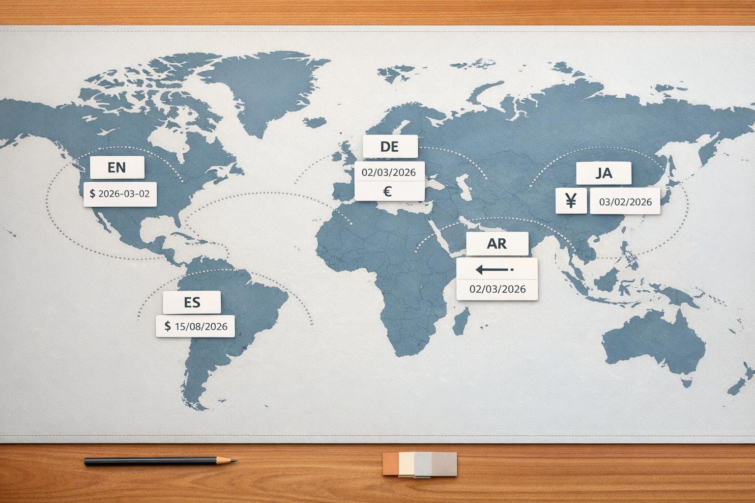
- Text and Layout: German text needs 30% more space, while Arabic requires right-to-left layouts.
- Color Choices: Red signals danger in the West but prosperity in China.
- Navigation Preferences: Dense layouts work in Japan, while minimalist designs suit the U.S.
- Trust Factors: Asian users value social proof; Europeans prefer certifications.
- Scalable Systems: Modular design systems balance global consistency with local flexibility.
Localization isn’t just translation - it’s about aligning design with user expectations across regions. IKEA Korea’s site tweaks boosted revenue by 29%, and Alconost’s Korean localization increased conversions by 700%. The lesson? Tailoring UX for diverse audiences drives measurable success.
How Culture Affects UX Design
Culture shapes how users perceive, navigate, and trust digital experiences. Recognizing these differences is key to creating UX designs that resonate across diverse markets. A design that feels intuitive in one region might confuse - or even offend - users elsewhere. Grasping these cultural nuances is the backbone of global UX design.
Color Meanings Across Different Cultures
Colors speak different "languages" depending on the cultural context. Take red, for example: in China, it symbolizes luck and prosperity, while in Western countries, it often signals danger or warnings. White, associated with purity and weddings in the US and Europe, is linked to mourning and funerals in many Asian cultures. Green, a symbol of nature in Western design, holds strong religious significance in the Middle East, particularly in Islamic traditions.
These distinctions matter. In the late 1980s, Canon, Nikon, and Fuji introduced disposable cameras in yellow, blue, and red for global markets. While the products performed well in the US and Europe, they flopped in Japan, where 60% of users expected cameras to be black or white. A seemingly small color choice derailed their success.
While colors set the tone, interaction patterns take cultural preferences further.
How Interaction Patterns Vary by Region
Navigation and interface preferences also differ by culture. High-context cultures, like those in China and Japan, gravitate toward dense, information-rich layouts with structured navigation. In contrast, low-context cultures, such as the US and Germany, prefer minimalist designs with flat navigation that encourages exploration.
Take Amazon India as an example. In late 2018, the company discovered that users weren’t engaging with the search function because they didn’t recognize the magnifying glass icon - it was mistaken for a ping-pong paddle. To solve this, Amazon added a Hindi text label alongside the icon, making it more intuitive. Similarly, Farfetch adapted its Chinese platform by introducing a WeChat login option, which users appreciated for its convenience over manual data entry.
Reading direction and layout also demand attention. For right-to-left languages like Arabic and Hebrew, interfaces need to be fully mirrored, including navigation menus, back buttons, and call-to-action placements. Text expansion is another factor - translating English into Italian, for instance, can increase text length by up to 300%. This calls for flexible design elements like scalable typography and adaptable containers.
But even with well-structured navigation and layouts, trust is the glue that holds user engagement together.
Building Trust with Regional Audiences
What builds trust varies widely across cultures. In Europe, users tend to rely on official certifications and privacy policies. Meanwhile, Asian audiences value social proof, such as testimonials and localized payment options.
Cultural attitudes toward uncertainty also play a role. Societies with high uncertainty avoidance prefer clear instructions and confirmation steps, while those with low uncertainty avoidance are more open to experimental designs. These patterns align with Hofstede's Cultural Dimensions framework, which examines societal approaches to hierarchy, individualism, and risk.
Building Flexible UX Architecture
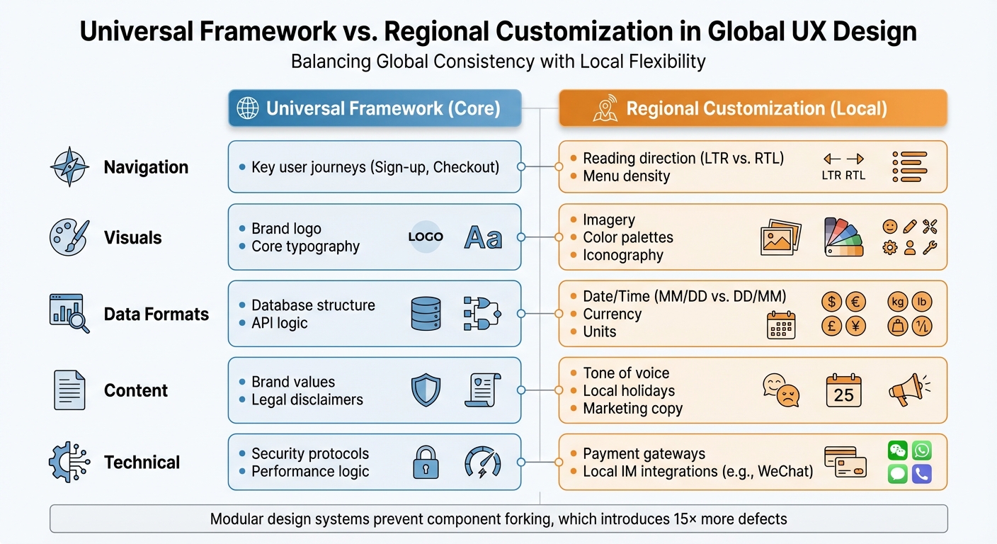
Universal vs Regional UX Design Elements: Global Localization Framework
Creating a flexible UX architecture means balancing consistency with the ability to adapt to local needs. A scalable system should include fixed core elements while allowing for regional adjustments. Without this kind of structure, teams often end up recreating components for each region, which leads to inconsistencies and delays. When design systems are too rigid, "forked components" are created - these introduce 15× more defects and take 124% longer to resolve. Additionally, teams without modular design practices lose between 30% and 50% of their productivity due to repeated work.
Universal Features vs. Regional Customization
To manage global and local needs, divide your product into two layers: a Universal Framework for core features (like sign-up and checkout) and an Inclusive Content layer for regional customizations (like language, symbols, and formats).
For example, Spotify kept its universal app structure intact but localized its visuals for the Diwali festival in India by brightening its typically dark interface to reflect the "festival of lights". Similarly, Airbnb went beyond simple translation in 2018 by adapting currencies, date formats, and right-to-left layouts. They also added a group booking feature for China, which resulted in conversion improvements of over 300%. These examples highlight how maintaining core functionality while tweaking presentation for regional expectations can make a big impact.
| Feature Category | Universal Framework (Core) | Regional Customization (Local) |
|---|---|---|
| Navigation | Key user journeys (Sign-up, Checkout) | Reading direction (LTR vs. RTL), Menu density |
| Visuals | Brand logo, Core typography | Imagery, Color palettes, Iconography |
| Data Formats | Database structure, API logic | Date/Time (MM/DD vs. DD/MM), Currency, Units |
| Content | Brand values, Legal disclaimers | Tone of voice, Local holidays, Marketing copy |
| Technical | Security protocols, Performance logic | Payment gateways, Local IM integrations (e.g., WeChat) |
Using Progressive Disclosure for Different User Levels
Once you've defined core and local elements, progressive disclosure can help tailor the user journey to different audiences. This method simplifies complexity by revealing only the information users need at a given time. It works especially well when catering to varying levels of user expertise across regions. For example, novice users benefit from guided walkthroughs and tooltips, while advanced users prefer quick access to settings and shortcuts.
Cultural context is also key. High-context cultures, such as China and Japan, often prefer dense information and may find overly simple interfaces ineffective. On the other hand, low-context cultures, like the United States and Scandinavia, tend to favor minimalist designs and direct cues. Conditional and staged disclosure can help address these differences. For instance, limiting disclosure levels to three helps prevent confusion. If more details are needed, reorganizing content into logical sections can keep things clear. Additionally, for languages like Arabic or Hebrew, mirroring layouts and progress indicators while keeping phone numbers and media controls left-to-right ensures usability. In regions with slower internet speeds, progressive loading can prevent delays when revealing content.
Setting Up Modular Design Systems
Modular design systems use a layered approach to balance global consistency with local flexibility. Typically, this includes four layers: Core (design tokens like colors, spacing, and typography), Product (functional components), Brand (visual identity and theming), and Custom (regional overrides). This structure ensures brand alignment while meeting the diverse needs of global users.
Design tokens serve as the foundation, acting as a single source of truth for values like typography and spacing. These tokens ensure consistency across platforms while allowing for regional adjustments. For example, a card component can adapt its layout for right-to-left languages without needing to be rebuilt. This approach prevents "component forking", which can waste an average of 2.5 hours per week per designer on rebuilding common UI elements. Modular systems also allow interfaces to adjust dynamically - for instance, using higher density layouts for Western apps or tweaking spacing for East Asian scripts.
| Token Category | Impacted by Theme | Impacted by Density | Impacted by Language |
|---|---|---|---|
| Typography | Font-family | Font size, Line height | Font-family, Size, Spacing |
| Color | Action, Status, Text | N/A | N/A |
| Size | Border size | Border radius, Icon size | Icon size |
| Space | N/A | Base spacing, Padding | Spacing |
It’s crucial to define which UI elements are "non-negotiable" (core brand identity) and which are "adaptable" (local details like date formats or icons). Flexible grid systems and text containers are also important, especially for languages like German, which often require 30% more space than English. Linking text layers to variables for font-family, size, and line height enables quick testing of multilingual layouts. Regular audits can identify "ghost variables" or forked components, helping ensure the modular system continues to meet regional needs.
Research Methods for Cross-Cultural UX
When designing for a global audience, understanding how users behave across different regions is a must. It’s not just about knowing where your users are - it’s about digging into the cultural and behavioral patterns that could lead to friction in your product. Combining cultural insights with adaptable design can help pinpoint where localized UX strategies need fine-tuning.
Segmenting Users by Behavior and Region
To create a truly user-centered experience, segmenting users by behavior rather than just geography is key. This approach uncovers how cultural differences shape interactions. For instance, consider factors like preferred devices, digital literacy, decision-making styles (trusting peers versus experts), or even external constraints like bandwidth or local regulations. A good example? French speakers in France and Quebec may share a language but behave very differently online due to their distinct cultural contexts.
Frameworks like Hofstede's Dimensions are helpful for understanding these differences. For instance, users in high-context cultures like Japan or China often prefer dense information and subtle nonverbal cues. On the other hand, low-context cultures such as the United States or Germany lean toward direct communication and simpler, more minimalist designs. These cultural preferences can influence everything from navigation styles to how much information users expect on a single screen.
"Intuitiveness is not a universal concept." - Lokalise
Instead of creating a persona for every market, consider adaptive personas that focus on cultural variables influencing user goals. Use cohort analysis to identify where users in specific regions face challenges during onboarding or other key moments. Testing with smaller regional groups before a full-scale launch can help uncover usability issues that might not translate well across cultures. And here’s the payoff: localized UX done well can boost conversion rates by up to 400%.
Using Cohort Tracking and Predictive Analytics
Behavioral cohort analysis groups users based on actions - like choosing a specific payment method - rather than demographics. This method highlights how users from different regions interact with features, helping to identify areas of cultural friction. For example, tracking key actions can reveal where certain regions experience drop-offs, providing insights into retention challenges.
Metrics like Task Success Rate, Net Promoter Score (NPS), and Customer Effort Score (CES) can help measure performance across regions. Predictive analytics, meanwhile, can flag early signs of churn within specific cohorts. Pairing these tools with session replays allows teams to spot and address issues like misunderstood icons or confusing layouts. For instance, "rage taps" or erratic navigation patterns can reveal cultural misunderstandings. Given that over 90% of users abandon mobile apps within the first 30 days, identifying these friction points early is critical.
These quantitative insights can guide the next step: qualitative usability testing.
Running Usability Tests Across Regions
When conducting usability tests internationally, cultural differences go far beyond language. Elements like colors, symbols, gestures, and navigation habits vary widely. On top of that, technical constraints like bandwidth, device preferences, and even region-specific browsers (e.g., Baidu, which handles 9.5% of Chinese mobile traffic) must be factored in.
Recruit participants who genuinely represent your target region’s diversity. Look beyond demographics and focus on behavior - like "shops online weekly" - since roles like "small business owner" can differ greatly between countries. And don’t rely on literal translations. Native speakers should handle translations to ensure phrases resonate culturally.
"One of the most prevalent misconceptions in international business expansion is the belief that successful localization is simply a matter of translating content into local languages and adopting local currencies." - Chui Chui Tan, International Growth Adviser
Remote moderated testing works well for international studies because it allows real-time adjustments and deeper cultural insights. Before diving into full-scale testing, run small pilot tests to catch potential cultural biases or confusing terminology in your scripts. Local language experts can review surveys and tasks to ensure they make sense to participants. Automating logistics - like handling multi-currency incentives and accommodating time zones - can also reduce participant no-shows and friction. And here’s a key stat: 87% of online shoppers are unlikely to buy from a site that’s only available in English. Clearly, culturally informed usability testing isn’t optional - it’s essential for global success.
Identifying and Fixing Scalability Problems
Even the most well-designed products can hit scalability snags when expanding globally. The trick is spotting these issues early - before they spiral out of control or frustrate users to the point of leaving.
Warning Signs to Watch For
Keeping an eye on key UX performance metrics can help you catch potential problems. Certain patterns often indicate that your user experience isn't scaling effectively. For instance, high abandonment rates during checkout might mean you're missing critical local payment options, like Pix in Brazil or AliPay in China. eBay learned this the hard way in Japan, where asking for credit card details during signup clashed with local preferences for privacy and risk aversion, forcing the company to exit the market.
An uptick in support tickets is another red flag. Complaints about basic data entry - like missing fields for local address formats, prefectures, or regional ID types - can signal that your UX is too rigid. Similarly, broken UI elements, such as overlapping text or buttons that get cut off, often reveal that your design hasn't accounted for text expansion or regional formatting.
Other warning signs include frequent user errors tied to mismatched date formats (e.g., MM/DD/YYYY vs. DD/MM/YYYY) or navigation patterns that don’t align with local user habits. High bounce rates paired with negative feedback about tone - like being too casual in more formal markets such as Japan or Germany - are another clue that your cultural adjustments may have missed the mark. Even layout preferences can vary: while Western audiences may prefer cleaner, minimalist designs, users in countries like China or Korea might interpret these as lacking detail or trustworthiness. These examples highlight the importance of designs that are both adaptable and culturally aware.
The good news? Fixing these problems can lead to major wins. When Alconost localized its website for South Korea, it saw a 30% drop in bounce rates and a sevenfold increase in key conversions. Similarly, IKEA Korea boosted revenue by 29% after tweaking its site’s structure - changing "Dining" to "Kitchen furniture" to better match local expectations.
Running Readiness Audits
Once you've identified potential issues, readiness audits can help ensure your UX is prepared to scale. These audits are designed to catch scalability problems before they escalate. Focus on four key areas: technical readiness, UI/UX flexibility, workflow ownership, and strategic alignment.
Start by checking that all UI strings are externalized (i.e., no hardcoded text) and that date, time, and currency formats adjust to local standards. For UI flexibility, make sure your layouts can handle text expansion and support Right-to-Left (RTL) languages like Arabic. Payment flows should include regional options like UnionPay or installment plans, and input fields should be tailored to local norms - such as adding a field for prefectures in Japan or allowing two last names for Spanish-speaking users.
"Localization failures often appear as UX bugs, not translation errors." – Kinga Pomykała, Content Creator, SimpleLocalize
To measure your readiness, rate each area on a scale of 1–5. A total score below 30 out of 82 suggests your product isn’t ready for translation yet. Beyond metrics, pay attention to recurring themes in user feedback to uncover friction points that data alone might miss. And remember, strong global UX localization can boost conversion rates by up to 400%. Addressing these areas lays the groundwork for a scalable, user-friendly global experience.
Building Your Global UX Strategy
Once scalability issues are addressed, the next step is crafting a solid global UX strategy.
To successfully scale UX for global audiences, you need a foundation that respects cultural differences while staying true to your brand. Start with internationalization (i18n) from the very beginning. This means developing a codebase capable of supporting multiple languages, date formats, and layouts. Hardcoding text or assuming a universal format like MM/DD/YYYY can lead to expensive redesigns later on.
Your strategy should strike a balance between global consistency and local adaptability. Decide which elements - such as your logo, brand voice, and core color palette - should remain consistent, and which can be tailored to local preferences. For instance, imagery, layout density, and payment methods might need to vary by region. This builds on the idea of modular systems that accommodate both universal features and regional tweaks. What feels "intuitive" in one market, like minimalist designs in New York, might not resonate in another, such as the information-dense layouts often preferred in parts of East Asia.
Ongoing research is key to keeping your strategy relevant as user behaviors shift. Combine qualitative methods, like ethnographic studies and user interviews, with quantitative analytics to better understand regional mental models. Keep an eye on metrics like task completion rates and error rates in specific markets to identify areas where cultural adjustments may be lacking. A great example is Airbnb’s entry into China. The company didn’t just translate its app - it also rebranded itself as "Aibiying" for easier pronunciation and integrated local payment options like Alipay and WeChat Pay. These changes helped significantly grow its market share.
Your design systems also need to account for technical nuances. Some languages can expand text by as much as 300% compared to English, which can heavily impact layouts. For right-to-left languages like Arabic and Hebrew, ensure that layouts mirror appropriately while keeping elements like phone numbers and media controls in their original orientation. These details are critical: poor localization can alienate up to 90% of users after just one bad experience.
Lastly, avoid launching globally all at once. Instead, phase your expansion by starting with pilot markets. Use these opportunities to learn, refine, and document key findings, including cultural nuances, technical requirements, and success metrics. Iterative testing and feedback are essential as you roll out to new regions. The effort pays off - effective global UX localization can increase conversion rates by up to 400%.
For more resources on creating scalable global UX strategies, visit DeveloperUX (https://developerux.com).
FAQs
How do I decide what stays global vs. what gets localized?
Deciding what to keep global and what to localize is all about finding the right balance between consistency and relevance. Key components such as functionality, navigation, and design principles are usually kept consistent across markets to maintain efficiency and a unified brand identity.
On the other hand, localization zeroes in on details like language, imagery, tone, and formats (think U.S. dollars or the MM/DD/YYYY date format) to align with local expectations. The goal is to adapt the elements that build user trust and engagement, while ensuring the core features remain uniform across regions.
What’s the fastest way to test UX across multiple countries?
Testing UX across multiple countries quickly requires tools designed for scalability and inclusivity. Usability testing platforms that offer access to a broad range of international participants - or even AI-based synthetic users - can provide rapid feedback.
Pairing remote testing with localized recruitment and tailoring tasks to fit regional contexts ensures the results are both fast and relevant. This method helps pinpoint usability challenges early, allowing products to be adjusted effectively for global audiences.
How can I prevent text expansion and RTL from breaking layouts?
When designing user interfaces, accommodating text expansion and right-to-left (RTL) scripts is crucial to maintaining a clean, functional layout. A flexible, responsive UI design is the key to handling these challenges effectively.
Here are a few techniques to consider:
- Dynamic Resizing: Ensure UI elements can adjust dynamically to fit longer translations without breaking the layout. This is especially important for languages that require more characters to express the same idea.
- CSS Logical Properties: Use properties like
directionandwriting-modeto support RTL layouts. These make it easier to align content correctly for languages like Arabic or Hebrew. - Native Speaker Testing: Collaborate with native speakers during testing to confirm both readability and layout stability. This step helps catch issues that automated tools might miss.
By combining these practices, you can create interfaces that work seamlessly across different languages and writing systems.