
How Accessible Search Improves E-Commerce UX
Accessible search unlocks better e-commerce UX and higher conversions with semantic HTML and keyboard navigation.

Accessible search transforms e-commerce by ensuring search tools work for everyone, including users with disabilities. It boosts usability and aligns with WCAG guidelines while driving revenue growth. Here's why it matters:
- High-Intent Shoppers: Users who search are 7–10x more likely to buy, contributing up to 80% of revenue despite being a smaller group.
- Accessibility Features: Screen reader compatibility, keyboard navigation, and clear labels make search easier for all users.
- Business Impact: Bauhaus Czechia improved search functionality in 2024, resulting in a 45% revenue increase.
- Key Practices: Use semantic HTML, logical tab orders, and ARIA roles to enhance functionality for assistive technologies.
Accessible search isn't just about compliance - it's a smart way to improve user experience and boost sales. Let’s explore how to make it happen.
Using Semantic HTML for Search Accessibility
Semantic HTML gives assistive technologies the context they need to understand and navigate page elements effectively. Built-in elements like <button> and <input type="search"> come with native keyboard accessibility, eliminating the need for extra JavaScript. Interestingly, a study of one million home pages found a 41% increase in errors when developers used ARIA instead of sticking to native semantic HTML. These native methods also help ensure clear labels and proper ARIA role implementations.
The <search> element, introduced in HTML5.3, adds a landmark that allows screen readers to jump directly to the search area using keyboard shortcuts. For e-commerce platforms where search results update dynamically without refreshing the page, wrapping both the input and results in a <search> element creates a clear, semantic container for the entire search experience.
Write Clear Labels and Use Proper Markup
While semantic HTML provides a solid foundation, clear labeling takes accessibility a step further by clarifying search intent for assistive technologies. Every search input should have a visible <label> linked to its corresponding id, making its purpose clear to screen readers. If the search is specific to a section, reflect that in the label text. For instance, "Search Electronics" is much more descriptive than a generic "Search."
Avoid using placeholder text as a substitute for labels. Placeholders often suffer from low color contrast and disappear as soon as users start typing. Instead, rely on <input type="search">. This element not only signals the field's purpose to browsers but also activates search-optimized virtual keyboards on mobile devices and includes a native clear button.
Apply ARIA Roles for Assistive Technologies
In cases where multiple search areas exist on a page - such as a site-wide search and a product-specific filter - ARIA roles can help differentiate them. Use aria-label to provide context, like aria-label="Site" for a global search and aria-label="Product filters" for a more specific one. Brian Treese, an accessibility-focused developer, emphasizes the importance of this approach:
"Search is no different. We want the browser or assistive technology to be able to understand as much as it can about the context surrounding the portions of our applications." – Brian Treese
For custom autocomplete components, follow the combobox pattern: assign role="combobox" to the input, role="listbox" to the suggestions container, and role="option" to individual suggestions. Use aria-controls to link the input to the results list and aria-expanded to indicate whether suggestions are visible. This setup ensures a seamless experience for all users.
sbb-itb-124fdbf
Building Keyboard-Accessible Search Features
Keyboard accessibility is a critical component of creating an inclusive search experience, complementing semantic HTML practices. With 7.5% of U.S. adults relying on keyboard navigation due to motor disabilities, it's essential to ensure that every interaction - typing a query, navigating filters, or selecting results - functions seamlessly without a mouse.
Create a Logical Tab Order
Keyboard navigation follows the order of the HTML source code, not the visual arrangement of elements. So, if you use CSS properties like flex-direction: row-reverse or absolute positioning to visually rearrange elements without updating the DOM, it can lead to a confusing experience for keyboard users. Stick to these principles:
- Use
tabindex="0"for custom elements that belong in the natural tab order. - Apply
tabindex="-1"for elements that require programmatic focus, such as new search results after clicking "Load more." - Avoid positive
tabindexvalues, as they override the natural flow and complicate maintenance.
For more intricate search interfaces with filters or toolbars, consider the roving tabindex pattern. This approach assigns tabindex="0" to one element at a time while others are set to tabindex="-1". Users can then navigate the group using arrow keys. To further enhance accessibility, include a "Skip to search" link as the first focusable element, allowing users to bypass repetitive headers.
Once the tab order is logical, ensure that keyboard users can clearly track their focus.
Design Visible Focus Indicators
As accessibility expert Sara Soueidan explains: "The focus indicator is to keyboard users what the mouse cursor is to mouse users". Removing the default browser outline with outline: none without providing a replacement can severely hinder navigation. WCAG 2.1 AA guidelines require focus indicators to have at least a 3:1 contrast ratio against the background, with a suggested thickness of 2px.
To improve usability:
- Use the
:focus-visiblepseudo-class to display focus indicators only during keyboard navigation, leaving the interface uncluttered for mouse users. - Implement a double-outline technique with a white inner line and black outer line to ensure visibility against any background.
- Add
outline-offsetto create space between the element and the focus ring, making it more noticeable.
These adjustments ensure focus indicators are both functional and visually clear. But visibility alone isn’t enough - users must also be able to escape any focused element effortlessly.
Avoid Keyboard Traps
Keyboard traps occur when users can navigate into an element but can't exit it using only the keyboard. WCAG 2.1.2 emphasizes: "If keyboard focus can be moved to a component using a keyboard interface, then focus must be movable away from that component using only a keyboard". Here are some common pitfalls to avoid:
- Avoid autocomplete widgets that capture the Tab key, preventing users from leaving.
- Don’t hide search bars with
opacity: 0, as this leaves invisible, focusable elements that can trap users.
When working with modal overlays, ensure they trap focus within the modal but allow users to exit using the Escape key. After exiting, return focus to the triggering element. To ensure your interface is free of traps, test it manually by disconnecting your mouse and navigating solely with Tab, Shift+Tab, and Escape. If infinite-scroll search suggestions prevent you from reaching the footer, you've inadvertently created a trap.
Making Autocomplete and Search Results Accessible
Autocomplete features are everywhere - showing up on 80% of e-commerce sites - but only 19% of these implementations get both design and accessibility right. That’s a big problem, especially considering that 10% to 40% of users rely heavily on search and contribute 40% to 80% of total revenue. To bridge this gap, combining proper ARIA attributes with user-friendly result organization is key.
Code Autocomplete Suggestions Properly
The backbone of an accessible autocomplete system lies in using the correct ARIA roles. Start by adding role="combobox" to the search input and role="listbox" to the container holding your suggestions . For individual suggestions, assign role="option" and ensure each has a unique ID. To tie everything together, use aria-autocomplete="list" on the input and link it to the results list with aria-controls . When suggestions are visible, set aria-expanded="true" and dynamically update aria-activedescendant to reflect the highlighted suggestion as users move through the options .
Keep the focus on the input field while users navigate the suggestions. Use aria-describedby to provide instructions like "Use up and down arrows to navigate, press Enter to select" . For VoiceOver users on Safari, you might also need a hidden aria-live="assertive" region to announce the active suggestion, as Safari doesn’t always handle aria-activedescendant changes well. Adobe’s React Aria team addressed this issue in 2021 by introducing a ComboBox component that uses a TreeWalker to apply aria-hidden to everything outside the search context when the menu is open, keeping screen reader users focused.
Finally, don’t overwhelm users with too many choices - show 4–8 suggestions on mobile and cap it at 10 on desktop.
Organize Search Results with Clear Headings
Once autocomplete suggestions are set up, focus on presenting search results in a way that’s easy to navigate. Use clear, categorical headings to group results by type, such as products, articles, or collections. This helps users know what to expect. Shopify offers a great tip:
"Use a heading to label product suggestions to help users anticipate the type of results they can expect. For example, use a 'Products' heading for product suggestions."
For scoped suggestions (e.g., "Sofa in Furniture"), use visual cues like indentation, italics, or color changes to distinguish them from general queries. If no results are found, guide users with helpful alternatives like "Did you mean…" suggestions, featured products, or related categories.
Make Typo-Tolerant Search Work with Screen Readers
Misspelled queries are a common challenge, yet 69% of e-commerce sites fail to provide useful suggestions in these cases. This often leaves users stuck on an unhelpful "No Results" page. To fix this, map frequent misspellings to valid suggestions and keep the autocomplete list visible even when typos occur. Use ARIA live regions or role="alert" to announce the number of suggestions available after a correction (e.g., "3 suggestions found for [corrected term]"). Ensure aria-expanded="true" remains active when suggestions are displayed . When a user selects a suggestion, copy it into the input field to trigger an announcement of the updated value .
Edward Scott from Baymard Institute highlights the importance of robust autocomplete systems:
"Brittle autocomplete features, which quickly break when obvious misspellings are entered, were observed to distract users... and autocomplete went from a very useful feature to a hindrance."
To avoid this, combine exact string matching with typo-tolerant algorithms like Levenshtein distance. Use exact matches first, then fall back on typo correction only when no matches are found .
Testing Search Features for WCAG Compliance
Testing ensures that search functionalities meet accessibility standards, especially when it comes to semantic HTML, ARIA attributes, and keyboard navigation. Automated tools like Lighthouse or WAVE can only identify 30% to 50% of accessibility issues, so manual testing is crucial. This is particularly important since 71% of screen reader users will leave an inaccessible website, representing a significant audience among the 8.1 million Americans who use screen readers and hold over $100 billion in annual purchasing power.
Test with Screen Readers
Screen readers rely on the "accessibility tree", which is generated from the HTML DOM. To ensure proper functionality, use semantic HTML and ARIA attributes. Test using popular screen reader and browser pairings like NVDA with Firefox, JAWS with Chrome or Edge, and VoiceOver with Safari. These combinations reflect real-world usage, with JAWS holding around 40% of the desktop screen reader market, NVDA at 30%, and VoiceOver between 15% and 36%.
When testing, confirm that every search input is labeled with a <label> or aria-label. Avoid relying on placeholder text, as it can disappear or be misinterpreted by assistive technology. For icon-only search buttons (e.g., magnifying glass icons), include an aria-label like "Search" to ensure accessibility. Use NVDA's Speech Viewer (Tools > Speech Viewer) to monitor real-time announcements and document errors. Verify that the search field switches to "Focus Mode" in NVDA or "Forms Mode" in JAWS for typing, and that "Browse Mode" allows navigation using shortcuts like 'F' to jump to form fields. Tools like the VoiceOver Rotor (VO + U) or NVDA's Elements List (NVDA + F7) can confirm the presence of the search landmark and input in the page summary.
Test the search bar by typing and listening for announcements about results or suggestions. To prevent SVG icons inside search buttons from receiving redundant focus, add focusable="false" to those elements. Once screen reader behavior is verified, ensure keyboard-only navigation aligns with this accessibility.
Check Keyboard-Only Navigation
Disable the mouse and navigate the search process entirely with the keyboard. Use Tab to move forward and Shift + Tab to move backward through interactive elements like search inputs, clear buttons, filters, and results. Confirm that the focus moves logically, typically following a top-to-bottom, left-to-right sequence. Ensure every element has a clear, high-contrast focus indicator, such as an outline or ring.
| Key | Action / Expected Behavior |
|---|---|
| Tab | Move forward to the next focusable element (input, button, link) |
| Shift + Tab | Move backward to the previous focusable element |
| Enter | Activate a search, follow a result link, or submit a form |
| Spacebar | Toggle checkboxes in filters or activate buttons |
| Arrow Keys | Navigate through autocomplete suggestions or filter groups |
| Escape | Close the search bar, suggestions list, or search modal |
Keyboard functionality must include the ability to activate all interactive controls using Enter or Space. Autocomplete suggestions should be navigable with arrow keys and selectable with Enter. Test the Escape key to ensure it closes suggestions, dropdowns, or modal overlays. Avoid keyboard traps - users should always be able to move focus away from the search component. If the search opens in a modal, focus must stay within the modal until it closes, after which it should return to the original trigger.
Review Contrast, Focus, and Operability
Use contrast checker tools to ensure text and icons meet minimum contrast ratios: 4.5:1 for normal text and 3:1 for large text or essential icons. Links in search results without underlines must still have a 3:1 contrast ratio compared to surrounding text. Replace outline: none with high-contrast focus indicators using :focus-visible (e.g., outline: 3px solid #3b82f6) to highlight elements for keyboard users.
Ensure the search input has a <label> with a for attribute matching the input's id. If the label is visually hidden, use a "visually-hidden" CSS class instead of display: none. For features like autocomplete or "load more" results, programmatically move focus to new content or status messages using aria-live="polite" or JavaScript's .focus() method. Include a "Skip to main content" link as the first focusable element, allowing users to bypass repetitive navigation and access the search bar or results quickly. Avoid positive tabindex values; use tabindex="0" for natural tab order and tabindex="-1" for elements focusable only via scripts, as positive values can disrupt navigation.
Accessible vs Non-Accessible Search: A Comparison
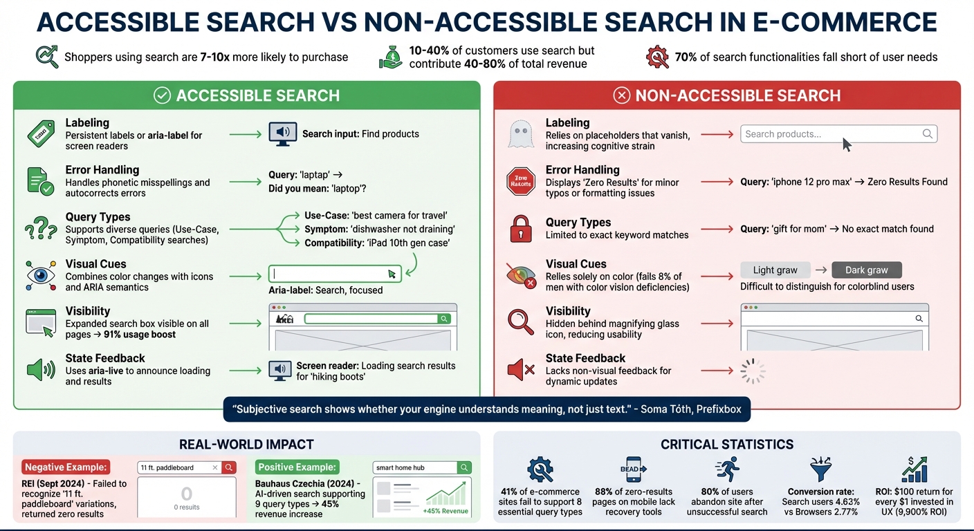
Accessible vs Non-Accessible E-Commerce Search: Key Differences and Impact
Accessible search isn't just about inclusivity - it directly impacts revenue. Did you know that shoppers using on-site search are 7-10 times more likely to make a purchase compared to those who just browse? Even though only 10-40% of customers use search, they contribute a whopping 40-80% of total revenue. Yet, despite its importance, about 70% of search functionalities fall short in meeting user needs.
| Feature | Accessible Search | Non-Accessible Search |
|---|---|---|
| Labeling | Uses persistent labels or aria-label for screen readers |
Relies on placeholders that vanish, increasing cognitive strain |
| Error Handling | Handles phonetic misspellings and autocorrects errors | Displays "Zero Results" for minor typos or formatting issues |
| Query Types | Supports diverse queries like Use-Case, Symptom, and Compatibility searches | Limited to exact keyword matches |
| Visual Cues | Combines color changes with icons and ARIA semantics for clarity | Relies solely on color, which fails users with color vision deficiencies (8% of men) |
| Visibility | Features an expanded search box visible on all pages, boosting usage by 91% | Tucks the search behind a magnifying glass icon, reducing visibility and usability |
| State Feedback | Uses aria-live to announce loading and results for screen reader users |
Lacks non-visual feedback for dynamic updates |
These differences highlight how accessible search improves not just usability but also business outcomes.
Real-world examples make the case even clearer. In September 2024, REI's search engine demonstrated what not to do - it failed to recognize variations like "11 ft. paddleboard" or "11 foot paddleboard", returning zero results because it only recognized "11' paddleboard". On the other hand, Bauhaus Czechia implemented an AI-driven search engine capable of handling all 9 major query types, leading to a 45% revenue increase in 2024.
The data paints a stark picture: 41% of e-commerce sites fail to support 8 essential query types, and 88% of zero-results pages on mobile devices lack recovery tools or helpful suggestions. When users hit a dead end, 80% abandon the site altogether. Accessible search bridges these gaps, handling abbreviations, symbols, and typos seamlessly. For instance, it ensures that "5in", "5 inch", and even "5"" all deliver the same results.
"Subjective search shows whether your engine understands meaning, not just text." - Soma Tóth, Digital Marketing and Growth Manager, Prefixbox
The financial benefits are undeniable. For every $1 invested in user experience, companies see a return of $100 - a staggering 9,900% ROI. Accessible search isn't just a tool; it's a game-changer for driving conversions and retaining customers.
Key Takeaways
Search accessibility isn't just a nice-to-have - it’s a game-changer for e-commerce revenue and customer experience. These highlights summarize the design principles covered in this article to help you create search features that truly work for everyone.
Shoppers with high intent are key revenue drivers, and making your search bar easily visible (instead of hiding it behind a magnifying glass icon) can boost usage by about 91%. To ensure your search is accessible, use semantic HTML with proper landmarks and labels so screen readers can easily identify it. Keyboard navigation should follow a logical tab order, include visible focus indicators that meet WCAG contrast ratios (at least 4.5:1 for normal text), and avoid any keyboard traps. For autocomplete, implementing aria-live="polite" ensures results are dynamically announced for screen reader users.
Your search engine should handle a variety of query types, such as abbreviations, symbols, or intent-based searches like "wedding gift" or symptom-driven queries. Surprisingly, 41% of e-commerce sites fail to support the eight essential search query types, and 50% can’t process non-product searches like "return policy". Adding typo-tolerant search and smart autocorrect can make a big difference, potentially increasing conversions by up to 24%.
Blank "no results" pages are a major turn-off - 80% of visitors leave the site after an unsuccessful search. Instead, offer helpful alternatives like spelling corrections, popular items, or related categories. Regularly validate your search design by testing with screen readers, keyboard-only navigation, and contrast ratio checks to ensure compliance.
Here’s a compelling stat: users who engage with search convert at nearly double the rate of those who browse (4.63% vs. 2.77%). By supporting newer search methods like voice input and image scanning, you can make your platform more inclusive and ready for the future.
FAQs
What’s the fastest way to make our search bar screen-reader friendly?
To make your search bar accessible for screen readers, ensure the input element is paired with a clear and descriptive label. Use semantic HTML, such as the <label> element, and connect it to the input using the for attribute and a matching id. The label should be brief but informative - something like "Search" works well, as it provides context without overloading users with extra details. This approach aligns with WCAG success criteria, enhancing the experience for screen reader users.
How do we make autocomplete work well with keyboard-only users?
To make autocomplete accessible for keyboard-only users, incorporate ARIA attributes such as aria-activedescendant, aria-autocomplete, aria-controls, and aria-haspopup. These attributes are essential for managing focus and ensuring assistive technologies can interpret suggestion lists effectively.
Here’s how to enhance usability:
- Enable navigation with arrow keys to move through suggestions.
- Use the Enter key to select a suggestion.
- Allow the Escape key to dismiss the list.
Specifically, aria-activedescendant highlights the current suggestion while keeping the input field focused. Additionally, aria-controls links the suggestions list to the input field, ensuring a seamless experience for users.
What manual tests should we run to confirm WCAG-compliant search?
To ensure a search feature meets WCAG standards, follow these steps:
- Test Keyboard Navigation: Make sure users can navigate and operate the search function entirely with a keyboard, without relying on a mouse.
- Check Screen Reader Compatibility: Verify that screen readers can properly interpret labels, instructions, and suggestions. This ensures accessibility for users who rely on assistive technologies.
- Review ARIA Roles: For any dynamic content, confirm that appropriate ARIA roles are implemented. These roles help assistive technologies understand and interact with the content.
- Assess Error Messages and Feedback: Ensure that any error messages, instructions, or feedback provided to users are clear and easy to understand.
- Evaluate Visual Contrast and Focus States: Confirm that all visual elements meet contrast requirements for readability. Additionally, interactive elements should have visible focus states to guide users effectively.
By addressing these areas, you can create a search feature that is accessible and user-friendly for everyone.