
Checklist for Accessible E-Commerce Checkout Design
Checklist of keyboard, form, payment, multi-step and testing practices to make e-commerce checkouts accessible and compliant.

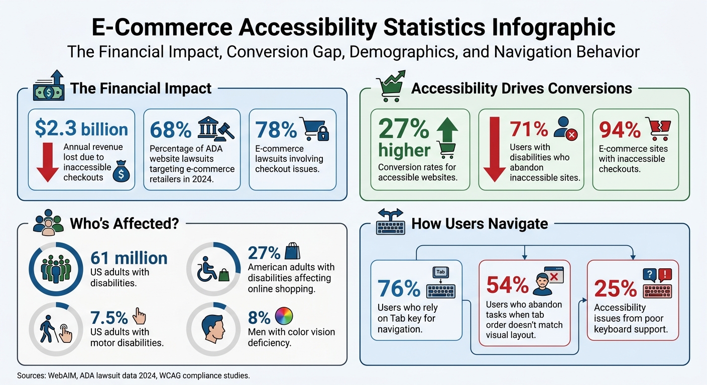
Did you know businesses lose $2.3 billion annually because customers with disabilities can't complete purchases on inaccessible e-commerce sites? Beyond lost revenue, legal risks are growing, with 68% of ADA website lawsuits in 2024 targeting e-commerce retailers. Accessibility isn’t optional anymore - it’s a requirement, especially with tightening regulations like the European Accessibility Act (effective June 2025) and updated U.S. compliance rules by April 2026.
Here’s the bottom line: accessible checkout design helps you avoid lawsuits, increase conversions, and improve the shopping experience for everyone. Accessible websites see 27% higher conversion rates, while 71% of users with disabilities abandon inaccessible ones. This checklist outlines actionable steps to make your checkout process user-friendly and compliant, focusing on:
- Keyboard Navigation: Ensure full keyboard operability, logical tab order, and visible focus indicators.
- Form Accessibility: Use proper labels, clear error messages, and mark required fields without relying on color alone.
- Payment Options: Label payment methods with text, test third-party tools for accessibility, and ensure smooth keyboard navigation.
- Multi-Step Design: Display clear progress indicators, maintain consistency across steps, and organize content with proper headings.
- Testing & Validation: Combine automated scans, manual usability tests, and assistive technology checks to identify and fix issues.
E-Commerce Accessibility Statistics: Revenue Impact and User Behavior
Keyboard Navigation and Focus Management
Keyboard navigation plays a crucial role in making the checkout process accessible. About 7.5% of U.S. adults live with motor disabilities that make using a mouse or other pointing device difficult. Additionally, 76% of users rely on the Tab key as their go-to method for navigating web pages. Failing to implement proper keyboard support could mean alienating a significant portion of your audience.
Enable Full Keyboard Navigation
Every interactive element in the checkout process must be fully operable with a keyboard. Stick to semantic HTML elements like <button>, <a href>, and <input> because they come with built-in keyboard functionality. Avoid using non-semantic elements like <div> or <span> for interactions unless you add proper keyboard event handlers.
"If you can use a native HTML element or attribute with the semantics and behavior you require already built-in, instead of adding ARIA roles, states, or properties to an element to make it accessible, then do so." - W3C
For custom components, make sure they’re accessible by using tabindex="0" to include them in the natural tab order. Use tabindex="-1" for elements that need to receive focus programmatically, such as error messages. Avoid positive tabindex values (e.g., tabindex="1") because they disrupt the natural flow. In fact, 34% of websites with positive tabindex values experience broken tab navigation.
Set Logical Tab Order
The tab order must align with the visual reading flow - typically left-to-right and top-to-bottom. Since the default tab sequence follows the order of elements in the HTML, ensure the code structure mirrors the on-screen layout.
Disruptions in tab order can be frustrating; 54% of users abandon tasks when the tab sequence doesn’t match the visual layout. For dynamic changes, like removing an item from a cart or highlighting an error, shift focus to the next logical step or summary to keep users oriented.
Show Clear Focus Indicators
Focus indicators are essential for showing which element is currently active. These are often displayed as a ring or border around the focused element. Avoid using outline: none or outline: 0 unless you replace them with a custom, high-contrast focus style.
Use the :focus-visible CSS pseudo-class to ensure focus indicators appear specifically for keyboard users. Make sure these indicators meet a minimum 3:1 contrast ratio against the background and are at least 2px thick. Adding an outline-offset of around 2px can also help prevent the focus ring from being hidden by the element's borders.
Prevent Keyboard Traps
Keyboard traps occur when users cannot navigate away from an element using Tab, Shift+Tab, or Escape. This is particularly problematic with third-party payment iframes, such as those from Stripe or PayPal, which can unintentionally trap users.
When using modal dialogs during checkout, trap focus within the modal to keep users focused on the task at hand. However, always allow Escape to close the modal and return focus to the button or element that triggered it.
sbb-itb-124fdbf
Form Fields and Error Handling
Clear forms and effective error management are crucial for creating an inclusive checkout experience. Forms are the backbone of any checkout process, yet they often become stumbling blocks for accessibility. A staggering 45.9% of the top one million homepages have missing or improperly associated form labels. This makes it one of the most common accessibility issues on the web. Without clear instructions or helpful error feedback, many of the 61 million adults in the United States with disabilities encounter unnecessary barriers when trying to complete their purchases.
Add Proper Labels to All Fields
Every input field should have a <label> tied to it using the for attribute. Placeholders alone aren’t enough; provide additional instructions using aria-describedby when necessary.
"When form labels are absent, users won't understand what data they need to enter. The absence of labels also prevents fields from receiving focus when read by screen readers." - Casandra Visser, Author, AccessibilityChecker.org
For related inputs like checkboxes or radio buttons, group them within a <fieldset> and use a <legend> to clearly define their purpose for screen readers. Additionally, ensure labels meet a contrast ratio of at least 4.5:1 against their background to align with WCAG 2.1 Level AA standards.
Mark Required Fields Clearly
Always indicate required fields in ways that don’t rely solely on color. Around 8% of men experience some form of color vision deficiency. Use text like "required" in the label or add an asterisk with an explanatory note in the form. Pair these visual cues with the HTML5 required attribute and aria-required="true" so that assistive technologies can communicate the field’s importance. If most fields in the form are required, mark optional fields instead to keep the design clean and user-friendly.
Write Clear Error Messages
Error messages should be straightforward and actionable. Instead of vague phrases like "Invalid input", be specific - say something like, "Password must be at least 8 characters." Display errors both as a summary at the top of the form and inline near the problematic fields.
Use the aria-describedby attribute to link error messages to the relevant input fields. Mark invalid fields with aria-invalid="true". To ensure users can quickly identify and fix errors, display messages inline and in a summary using role="alert" or aria-live="assertive". Include anchor links in the summary so users can jump directly to the problematic fields.
Once users correct the input, clear the error messages immediately. Trigger validation on "blur" (when users leave the field) rather than on every keystroke to avoid unnecessary interruptions. After errors are displayed, shift focus to the error summary or the first invalid field to guide users efficiently.
Move Focus to Errors
When validation fails after clicking "Place Order", automatically shift the keyboard focus to either the error summary at the top of the page or the first invalid field. This helps users quickly locate and resolve issues, ensuring the checkout process remains accessible and smooth for everyone.
Payment Method Accessibility
Payment options are a crucial part of the checkout process, yet they’re often designed with only visual users in mind. This oversight can create significant barriers for many individuals, particularly since 28.7% of US adults live with disabilities. Payment methods that rely heavily on logos or icons without accompanying text labels are a common source of frustration. It’s worth noting that e-commerce remains the leading category for ADA web accessibility lawsuits, with checkout flow issues frequently cited in these cases.
Label Payment Options with Text
To improve accessibility, every payment input should be labeled using a <label> element paired with a matching for attribute. Payment method options - like Credit Card, PayPal, or Apple Pay - should be grouped within a <fieldset> and given context through a <legend>. Avoid using placeholders as labels; they disappear once the user begins typing and aren’t consistently recognized by assistive technologies.
For fields requiring additional guidance, such as the CVV, leverage aria-describedby to link to concise instructions. For example: "3 or 4 digits on the back of the card". Additionally, card brand icons should include descriptive alt text (e.g., alt="Mastercard") or be marked as decorative using aria-hidden="true". On mobile devices, use the inputmode="numeric" attribute for card numbers and security codes. This triggers the numeric keyboard while remaining compatible with screen readers.
Check Third-Party Payment Accessibility
Third-party hosted checkout pages, like Stripe Checkout, generally ensure baseline accessibility. However, embedded solutions like Stripe Elements or Worldpay SDK require extra effort to implement proper labels, focus management, and error notifications. Since many payment gateways rely on iframes for security, ensure that keyboard focus can move seamlessly into and out of these frames without getting trapped.
Testing the payment flow with only the Tab, Space, and Enter keys can confirm whether focus indicators are clearly visible across all fields, including those within third-party iframes. Additionally, test embedded payment elements with both keyboard navigation and screen readers to verify correct focus behavior, clear labeling, and immediate error messaging. For express checkout options like Apple Pay or Google Pay, ensure these buttons have descriptive accessible names, such as aria-label="Check out with PayPal", and are fully operable via keyboard.
Design an Accessible Order Button
The final order button should use clear, actionable language that tells users exactly what will happen next. For instance, "Place Order - $289.43" is far more informative than generic terms like "Submit" or "Continue". Use bold, distinct colors for primary actions, and ensure the button maintains a visible focus state - such as a 2px solid outline that remains clear even at high zoom levels. Never remove focus outlines, as they are critical for navigation.
To enhance usability for screen reader users, implement ARIA live regions with role="status" or aria-live="polite" to announce processing states, such as "Processing payment, please wait". After the order is completed, shift the focus to the "Order Confirmed" heading to immediately notify users of success. Considering that 75% of people with disabilities have abandoned a purchase due to accessibility barriers, these adjustments are not just helpful - they’re essential for both inclusion and conversions.
Multi-Step Checkout Design
Structuring a multi-step checkout process can make a big difference in accessibility and usability. By breaking the process into smaller, manageable steps, you can reduce cognitive strain, especially when users can easily track their progress. This is critical, considering 78% of e-commerce accessibility lawsuits involve checkout issues, and 71% of users with disabilities abandon sites that aren't accessible. A well-designed multi-step flow can directly impact compliance and revenue.
Display Step Progress Clearly
A horizontal stepper is a great way to show progress. Label each stage (e.g., Information, Shipping, Payment, Review) and wrap the ordered list (<ol>) in a <nav> element with aria-label="Checkout progress". This setup helps assistive technologies communicate the number of steps and the user's current position. Use aria-current="step" for the active step, and visually differentiate the states: checkmarks for completed steps, bold or high-contrast colors for the active step, and muted styles for upcoming ones.
To improve user experience further, announce new steps with aria-live="polite" or by updating the page title (e.g., "Step 2 of 4: Shipping"). Shift keyboard focus automatically to the first form field or the main heading of the new step, so users don’t have to tab through the entire page again. For screen reader users, simplify their experience by marking decorative elements, like checkmarks or step numbers, with aria-hidden="true".
Keep Structure Consistent Across Steps
Consistency is key. Include a persistent order summary sidebar throughout all steps, showing cart items, subtotals, and taxes. This ensures critical information stays visible without requiring users to scroll. On mobile, consider collapsing the summary into a sticky accordion to maintain accessibility on smaller screens. Also, ensure users don’t lose previously entered information when navigating back to edit details.
Use clear, straightforward labels like "Shipping" or "Payment" instead of vague breadcrumbs. Avoid introducing unexpected steps late in the process, which can frustrate users. Allow users to revisit completed steps to make edits but restrict skipping ahead until the current step is validated. Finally, include a "Review" step where all entered data is summarized, with "Edit" links directing users back to specific sections for modifications.
Organize Content with Heading Hierarchy
Each step should start with a clear, top-level heading, such as <h1>Shipping Information</h1> or <h1>Payment Details</h1>. Divide the content into smaller, navigable sections using <h2> headings, and group related form fields within <fieldset> elements accompanied by descriptive <legend> tags. If form validation fails, direct focus to an error summary at the top of the page using role="alert". This summary should include links to the specific fields requiring correction.
Testing and Validation
Creating an accessible checkout process isn’t just about meeting legal requirements - it’s about improving user experience, reducing cart abandonment, and boosting conversions. Accessibility issues in checkout flows are a major concern, with 78% of e-commerce lawsuits focusing on checkout problems, leading to an estimated $2.3 billion in lost annual revenue each year. To address this, a combination of automated scans, manual testing, and assistive technology validation is key to identifying and fixing issues early.
Run Automated Accessibility Scans
Automated tools can identify up to 80% of common technical problems, such as missing form labels, poor color contrast, and keyboard traps. For e-commerce platforms like Shopify, TestParty is a specialized tool that scans checkout flows for these programmatically detectable issues. Additional tools like axe DevTools and the Chrome DevTools Accessibility Tab allow developers to inspect ARIA attributes and analyze the accessibility tree during the development phase.
It’s important to run these scans after every checkout update and integrate them into your CI/CD pipeline to catch regressions before they go live. However, automated tools alone aren’t enough - they can’t address more nuanced usability issues. That’s where manual testing comes in.
Perform Manual Usability Tests
Manual testing helps uncover issues that automation might miss, such as whether alt text is meaningful, if the focus order is logical, or whether ARIA roles are applied effectively. Start by completing a keyboard-only checkout to ensure users can navigate and make purchases without a mouse. Since about 25% of accessibility issues stem from poor keyboard support, this step is critical. Additionally, zoom in to 200% to confirm that the layout remains functional and readable.
Simulate errors by leaving required fields blank or entering invalid data to check if error messages are properly announced and provide clear guidance on how to fix the issue. If your checkout flow includes third-party payment widgets, consult their accessibility documentation to ensure they meet the necessary standards.
Test with Assistive Technologies
To ensure your checkout is accessible to all users, validate it using assistive technologies. On Windows, test with NVDA on Chrome or Firefox; on Mac and iOS, use VoiceOver with Safari; and on Android, try TalkBack. Research from 2025 highlighted that 94.8% of homepages had detectable WCAG failures, with low contrast text (79.1%) and missing alt text (55.5%) being the most common issues.
For mobile platforms, tools like Google Accessibility Scanner (Android) and Xcode Accessibility Inspector (iOS) can help verify that touch targets meet the recommended 44×44 pixel minimum size. Go through the entire checkout journey, from product selection to the final order confirmation, and don’t forget to audit third-party integrations - they often introduce accessibility barriers that might not originate from your platform. Regular testing ensures a smoother, more inclusive experience for all users.
Conclusion
Designing an accessible checkout process isn't just a nice-to-have - it’s a must. Every year, businesses lose an estimated $2.3 billion in revenue due to inaccessible checkout experiences. On the flip side, accessible sites see 27% higher conversion rates, while 71% of users with disabilities abandon sites that fail to meet their needs. These numbers highlight just how important it is to make accessibility a priority.
The strategies outlined in this checklist can transform your checkout process. By implementing features like clear labels, intuitive navigation, and helpful error messages, you’re creating a smoother experience for everyone. These changes don’t just benefit users with disabilities - they also make life easier for mobile shoppers, older customers, and even those dealing with slow internet connections. When you design with accessibility in mind, you improve the experience for all users.
Beyond improving usability, accessible design also shields your business from legal risks. With the rise in ADA lawsuits and the financial penalties that come with them, staying compliant is more important than ever. The upcoming European Accessibility Act, effective June 2025, adds another layer of urgency. And with 27% of American adults living with a disability that could affect their ability to shop online, the stakes are high.
Refining your checkout process isn’t just about compliance - it’s about staying competitive. Strive for WCAG 2.2 Level AA compliance to set yourself apart from the 94% of e-commerce sites that still have inaccessible checkouts. By making these updates, you’re not only meeting legal requirements but also positioning your business as a leader in the market.
FAQs
What are the fastest checkout accessibility fixes to ship first?
The fastest way to address accessibility issues is by tackling the basics: form labels, error handling, and keyboard navigation. Start by adding proper programmatic labels to forms, ensuring error messages are both visible and announced, and making sure the checkout process works seamlessly with just a keyboard. These updates are typically manageable within 4–8 hours using simple testing tools like screen readers and browser developer tools.
How do I make third-party payment iframes work well with keyboards and screen readers?
To ensure third-party payment iframes are accessible, pay attention to form labels, focus handling, and announcing dynamic content. Properly label input fields so assistive technologies can identify them. Make sure users can smoothly navigate focus in and out of the iframe without encountering barriers, and ensure changes like error messages are announced to assistive tools. Avoid creating unnecessary focus traps, and programmatically direct focus to the iframe or its interactive elements when it loads. Finally, conduct thorough testing with both screen readers and keyboards to confirm accessibility.
What’s the minimum testing I need to validate an accessible checkout?
To ensure a checkout process is accessible, focus on a few key areas:
- Form fields: Confirm that all form fields have accurate and descriptive labels.
- Error messages: Make sure error messages are clear, easy to understand, and linked to the appropriate fields.
- Keyboard navigation: Test that users can navigate the entire checkout process using only a keyboard.
- Focus management: Check that focus moves logically and intuitively, especially during transitions between steps.
- Dynamic content updates: Ensure changes in content are announced to assistive technologies.
- Visual indicators: Avoid relying solely on color to convey status or information.
For testing, use screen readers, keyboard-only navigation, and tools like WAVE to spot and address any accessibility issues. These steps will help create a smoother, more inclusive experience for all users.