
How to Design Effective In-App Surveys
Treat in-app surveys as part of the product: ask 1–3 focused, timed questions to get actionable feedback without disrupting users.


In-app surveys are one of the best ways to get real-time feedback from users while they’re actively using your app. Unlike email surveys, which often rely on fading memories, in-app surveys capture user opinions at the moment they matter most. With response rates averaging between 25% and 30%, they’re a powerful tool for improving user experience and refining product features.
Here’s what makes in-app surveys effective:
- Clear Goals: Focus on 1–3 specific questions tied to what you want to learn.
- Right Audience: Use behavioral data to target users based on their actions, like new users or those who’ve engaged with a feature multiple times.
- Perfect Timing: Trigger surveys after key actions or during natural pauses, like after completing a task or milestone.
- Simple Design: Keep surveys short (1–3 questions), mobile-friendly, and visually consistent with your design system resources.
- Actionable Insights: Analyze both response rates and open-ended feedback to identify trends and priorities.
Avoid common mistakes like overwhelming users with too many surveys, interrupting them at bad moments, or ignoring the feedback you collect. When done well, in-app surveys not only gather valuable data but also build trust with users by showing them their input leads to meaningful improvements.
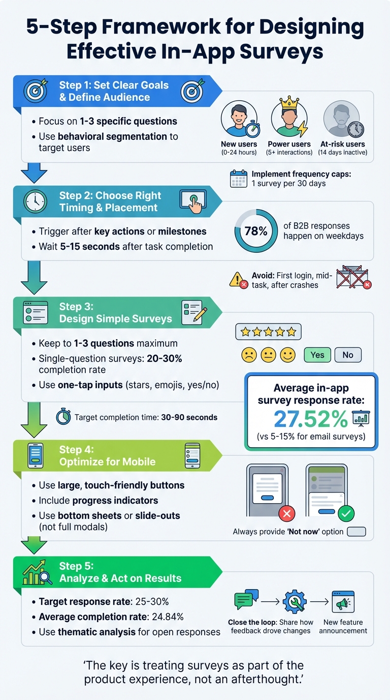
5-Step Framework for Designing Effective In-App Surveys
Set Clear Goals and Define Your Audience
When it comes to in-app surveys, success hinges on having clear goals and understanding your audience. Without these, you risk overwhelming users with irrelevant questions, leading to lower completion rates and unreliable data.
Start with a Clear Objective
The foundation of any effective survey is a specific goal. If you don’t define what you’re trying to learn, you’ll end up asking too many unrelated questions, which can frustrate users and dilute your insights. Instead, focus on 1–3 high-priority questions that address exactly what you need to know at that moment.
For example, is your goal to measure how well users are adopting a new feature? Or are you trying to identify pain points during onboarding? Each objective requires a unique approach, from question design to timing. A well-defined goal also prevents mistakes like "double-barreled" questions - those that combine two topics into one, such as "How satisfied are you with the speed and design?" If users give a low score, you won’t know which aspect they’re unhappy with.
The type of question matters, too. Use Likert scales (e.g., 1–5 ratings) to gauge sentiment or satisfaction, and yes/no questions when you need quick, actionable feedback. For instance, if you’re assessing product-market fit, target active users - those with at least three sessions per week over two weeks - and ask a focused question during a neutral moment, like when they load the dashboard. On the other hand, if you’re evaluating a new feature, wait until users have interacted with it at least twice to ensure their feedback is informed and meaningful.
Segment Your Audience for Relevant Insights
Once your goal is clear, the next step is identifying the right audience for your survey. Avoid sending generic, one-size-fits-all surveys to everyone. Instead, use behavioral segmentation to tailor questions to specific user groups based on their real-time actions. For example, you might target:
- New users who just completed onboarding within the last 24 hours
- Power users who’ve engaged with a feature five or more times
- At-risk users who’ve been inactive for 14 days
This approach ensures your questions feel relevant to each user’s experience, which leads to better insights and higher response rates.
Different user segments require different types of questions. For instance, new users are ideal for feedback on onboarding friction, while power users can provide valuable input on feature satisfaction or future product priorities. Asking new users about long-term loyalty (like Net Promoter Score) too early won’t yield reliable data - they haven’t had enough time to form a strong opinion.
To maintain healthy response rates (around 25–30%), implement frequency caps. Limit users to one survey every 30 days and introduce a "quiet period" of 7–14 days after they dismiss a survey. This avoids survey fatigue and ensures users remain willing to provide feedback when it matters most.
Choose the Right Survey Timing and Placement
Getting the timing and placement of your surveys right can make all the difference. When surveys appear at the wrong time, they can frustrate users and lead to low response rates. But when timed well, they capture honest, meaningful feedback when users are most engaged.
Time Surveys Based on User Actions
The best moments to trigger surveys are right after users complete key actions or milestones. Think about events like finishing onboarding, successfully exporting a file, or using a feature for the second time. Tying surveys to specific actions, like Onboarding_Checklist_Completed or Export_Success, ensures the feedback you gather is both timely and relevant.
"If you can only remember one rule, trigger in‑app surveys immediately after a user completes a relevant task or hits a milestone." – Refiner
That said, don’t interrupt users right at the moment of success. Give them a brief pause - about 5 to 15 seconds - so they can fully experience their accomplishment. Avoid placing surveys during frustrating moments, like a first login, in the middle of an active task, or after an app crash. Instead, look for natural pauses, such as between screens, during loading times, or at the end of a workflow.
For B2B apps, timing matters even more. Since 78% of survey responses happen on weekdays, aim to prompt users during business hours for the best results.
Once you’ve nailed the timing, the next step is to choose a survey format that fits seamlessly into the user’s experience.
Select the Best Survey Format and Location
The format of your survey should match the type of feedback you’re after. For critical insights - like understanding why users cancel or their reasons for exit intent - modal dialogs work best. These take over the screen and often see nearly double the response rates compared to subtle formats like corner widgets. Just be sure to use modals sparingly to avoid overwhelming users.
For less urgent feedback, like satisfaction scores (CSAT) or effort ratings (CES), slide-outs or bottom sheets are a better choice. They’re visible but don’t disrupt the user’s flow. Top or bottom banners can work for passive, non-urgent feedback, though they tend to have lower visibility. Embedded surveys, like a permanent feedback tab or feature rating widget, provide an unobtrusive option that blends into the app’s interface.
On mobile, placement is particularly important. Use bottom sheets or small banners that are easy to interact with and won’t block key navigation elements. Mobile sessions are often short, so it’s best to prompt surveys at the end of a session or right after a success moment - but never on the first app launch. Always give users the option to delay feedback with a “Not now” or “Ask me later” button. This small gesture helps maintain goodwill and increases the chances of future participation.
Design Simple and Engaging Surveys
Once you've nailed the timing and placement, the next step is creating surveys that are quick and easy to complete. A well-designed survey should feel like a natural extension of your app - not an annoying interruption. To achieve this, ensure your surveys are short, mobile-friendly, and visually aligned with your app's design. This seamless approach helps you gather insights effortlessly.
Use Short, Focused Questions
Keep your surveys concise - ideally, just 1–3 questions. Surveys with a single question often see completion rates between 20% and 30%, while longer ones tend to lose participants along the way. Each question should focus on one specific topic. For example, avoid combining unrelated elements like "speed and design" into a single question.
Use straightforward, conversational language. Instead of asking, "How much did you love this feature?" try something like, "How would you describe your experience?". Skip any technical terms or internal jargon; stick to the kind of language your users actually use. Present questions one at a time to create a smoother experience and prevent users from feeling overwhelmed.
Start with simple, one-tap inputs like star ratings, emojis, or yes/no options. These low-effort choices encourage users to engage. If you need more detailed feedback, save open-ended questions for the end and make them optional. Adding a brief explanation like, "30 seconds to help us prioritize new features", sets clear expectations and shows users why their input matters.
Design for Mobile Users
Mobile optimization is a must. Use large, easy-to-tap buttons and input fields designed for touchscreens rather than mouse clicks. If your survey has multiple questions, include a progress indicator (e.g., "Question 1 of 3" or a progress bar) to manage expectations and reduce the likelihood of users dropping off.
Ensure your survey looks great on any screen, whether it's a small phone or a large tablet. Responsive layouts are key. Always include a clear "Not now" option, giving users the freedom to skip if they're not ready to participate. Instead of using full-screen modals, consider bottom sheets or slide-outs, which let users see the app interface behind the survey. This approach keeps the context intact and makes the survey feel less intrusive.
Match Your App's Visual Style
Your survey should look and feel like a natural part of your app. Use your app's fonts, colors, and button styles to maintain a consistent design. If you're using a third-party survey tool, customize it with CSS to match your app's unique style.
"Native design feels safe, pop up styling feels like an ad." – Refiner
Keep the tone of your survey consistent with your app's voice. If your app uses a friendly, casual tone, don't switch to formal or corporate language in the survey. Keep the layout compact so users can still see the app in the background. This not only maintains context but also reduces the sense of being interrupted. When your survey blends seamlessly with your app, users are more likely to trust it and provide honest feedback. This thoughtful integration sets the stage for effective analysis later.
Analyze Survey Results for Useful Insights
Survey data becomes meaningful when it’s turned into insights you can act on. This involves keeping an eye on key metrics and digging into qualitative feedback to uncover the "why" behind the numbers. Together, these approaches give you a well-rounded understanding of what’s working and what needs improvement.
Monitor Key Metrics
Start by tracking performance metrics like Response Rate - calculated as submissions divided by unique views (not total impressions, which can skew results). Based on 2025 data from 1,382 surveys, the average in-app response rate is 27.52%, with a completion rate of 24.84%. If your response rate falls between 25% and 30%, you’re in a solid range.
Pay close attention to the Completion Rate as well. If more than 10% of users abandon the survey between the first and second questions, it could point to design issues. Another key metric is Time to Complete - aim for 30–90 seconds for a 2–3 question survey. If it takes much longer, it might signal user confusion or friction.
When measuring satisfaction, choose metrics that align with your goals:
- Net Promoter Score (NPS): Ideal for gauging long-term loyalty, with in-app response rates typically between 20%–30%, compared to 5%–15% via email.
- Customer Satisfaction Score (CSAT): Best for measuring satisfaction right after a specific interaction.
- Customer Effort Score (CES): Helps assess how easy or challenging users find your workflows.
As Refiner puts it:
"The 'why' is often more valuable than the number" – Refiner
You can also calculate a User Experience Impact Score by comparing engagement metrics between surveyed users and a control group. A healthy ratio is between 95% and 105%, ensuring your surveys don’t disrupt the user experience. Lastly, assess Response Quality by checking how many open-text responses exceed 10 characters. Well-crafted surveys usually hit a rate of 60%–80%.
These metrics set the stage for a deeper dive into qualitative feedback.
Review Open-Ended Responses
Open-text responses need a bit of cleaning before analysis. Remove incomplete entries, responses from users who select the same answer repeatedly (straightliners), unusually fast submissions, and any bot-generated content.
From there, use thematic analysis to organize feedback into categories. Assign short labels or "codes" to different themes. For example, group comments about navigation issues under "Navigation" and performance complaints under "Speed". Create a clear codebook with consistent definitions so that anyone reviewing the data applies the codes the same way. Avoid overlapping categories - combine similar labels like "efficient support" and "personalized service" into one, such as "Great Customer Service".
Sentiment analysis is another helpful tool. Classify responses as positive, negative, or neutral to gauge how users feel about specific themes. Gabriella Lopes, Product Designer at Maze, highlights this approach:
"A good characteristic of important themes is the frequency it's mentioned and the sentiment" – Gabriella Lopes, Product Designer at Maze
To connect feedback with user behavior, cross-reference survey themes with product analytics. For instance, if users complain about a particular feature, check whether those same users have higher drop-off rates in that area of your app. This kind of correlation helps you pinpoint whether specific issues are affecting overall performance. Don’t dismiss outliers, either - they can uncover new bugs or problems that haven’t yet reached a larger scale.
Finally, close the loop by letting users know how their feedback has influenced changes. This not only builds trust but also encourages future participation.
Common Mistakes to Avoid
Surveys can go wrong if you fall into familiar traps. Knowing these pitfalls can help you create surveys that users are more likely to complete while giving you reliable data.
Sending Too Many Surveys
Bombarding users with surveys can lead to feedback fatigue, where they either ignore your requests or develop negative feelings about your brand. For example, showing a survey every session might increase impressions, but it won’t boost response rates. Worse, stacking multiple surveys in one session can train users to dismiss pop-ups without even reading them, potentially driving them away.
To avoid this, set a cooldown period - 14 to 30 days is a good range, while Net Promoter Score (NPS) surveys may need 90 to 180 days. Progressive profiling, where you collect just one question per session, can also help reduce survey fatigue. If a user dismisses a survey, respect a quiet period of 7 to 14 days before trying again.
And remember, timing is just as important as frequency. Don’t let surveys interrupt critical moments.
Disrupting User Tasks
Nothing frustrates users more than being interrupted during a key task. Survey prompts that pop up during login or active workflows disrupt their focus and can lead to biased or rushed feedback. Full-screen modals that block essential controls are particularly annoying and often result in users dismissing the survey just to get back to what they were doing.
"If you can only remember one rule, trigger in‑app surveys immediately after a user completes a relevant task or hits a milestone." – Refiner
To avoid disrupting users, delay survey prompts by 5 to 15 seconds after they complete an action. Use less intrusive formats like slide-ins or bottom sheets for general feedback, and reserve full-screen modals for critical moments, such as during cancellation flows.
Ignoring Survey Results
Even if your survey design and timing are perfect, it won’t matter if you don’t act on the feedback. Ignoring survey responses can discourage users from participating in the future. On the other hand, showing users that their input leads to real changes builds trust and encourages them to keep providing feedback.
To make survey data useful, group feedback into themes - like navigation challenges, performance issues, or feature requests - and combine it with behavioral data to spot trends. Use tools like an impact vs. effort matrix to prioritize quick wins. Then, close the loop by communicating the changes you’ve made. In-app messages or release notes with phrases like "Thanks to your feedback, we simplified the sign-up flow" show users their voices are being heard. Without this follow-through, survey responses are just numbers in a spreadsheet.
Conclusion
Creating effective in-app surveys isn't about bombarding users with endless questions - it's about asking the right questions at the right time. By setting clear objectives, tailoring surveys to specific audience segments, and timing them strategically, you can gather feedback that's both relevant and actionable.
Keep the design simple. Stick to 1–2 concise questions that align with your app's look and feel. Surveys that feel natural and unobtrusive can achieve response rates in the range of 25% to 30%.
"The key is treating surveys as part of the product experience, not an afterthought." – CraftUp
But the real magic happens after you collect the data. Organize feedback into meaningful themes, prioritize changes using tools like an impact vs. effort matrix, and - most importantly - close the loop with your users. When you share updates like "You asked, we shipped", users feel heard and are more likely to engage with future surveys.
In-app surveys, when done well, turn guesswork into actionable insights that fuel product growth. Respecting your users' time and showing them how their input shapes your app can be the difference between feedback that gets ignored and feedback that drives meaningful change.
FAQs
How do I choose the best trigger for an in-app survey?
The ideal moment to present an in-app survey is when it's both timely and relevant to what the user is doing. For instance, prompt users shortly after they finish a task or hit a milestone. However, give it a slight pause - around 5 to 15 seconds - so it doesn’t feel intrusive. Instead of relying on random or time-based prompts, use event-based triggers like task completions or specific feature interactions. This way, feedback is gathered when users are most engaged and reflective.
How often should I show surveys without annoying users?
To keep users engaged and avoid frustration, it's important to time surveys thoughtfully. Show them after meaningful actions or milestones, ensuring they feel relevant. Adding a short delay - around 5 to 15 seconds - can help avoid disrupting the user's flow. Additionally, implement a cooldown period to prevent frequent prompts. The goal is to make surveys feel timely and non-intrusive, striking a balance between gathering useful feedback and maintaining a smooth, enjoyable user experience.
How do I turn open-ended answers into action items?
To turn open-ended answers into something you can act on, start by analyzing the qualitative feedback. Look for recurring themes, common issues, or valuable suggestions across the responses. Group similar feedback into categories to spot patterns and highlight the most frequent or impactful insights. These insights can then serve as a guide for making feature updates, refining processes, or planning targeted follow-ups.
Creating a scalable system for this analysis is key. A solid framework ensures that feedback doesn’t just sit in a spreadsheet - it gets transformed into meaningful changes that improve your product or service.