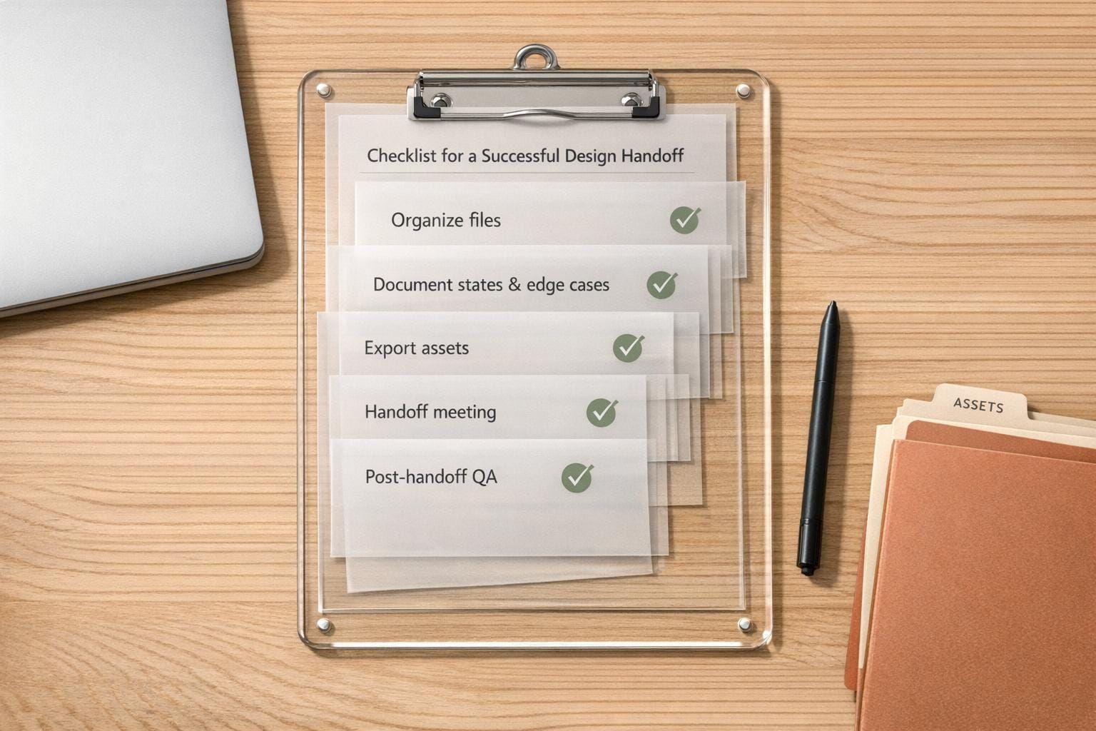
Checklist for a Successful Design Handoff
Organize files, document states and edge cases, export assets, run handoff meetings, and perform post-handoff QA.
A design handoff is the process where designers provide developers with all the necessary files, documentation, and context to bring a design to life without confusion or errors. A poorly executed handoff can lead to miscommunications, design inconsistencies, and wasted time. On the other hand, a clear and structured approach ensures developers can implement designs smoothly and accurately.
Here’s a quick breakdown of what makes a design handoff successful:
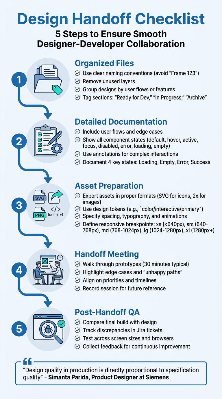
- Organized Files: Use clear naming conventions, remove unused layers, and group designs logically by user flows or features.
- Detailed Documentation: Include user flows, edge cases, and all component states (default, hover, active, etc.). Use annotations for complex interactions.
- Asset Preparation: Export assets in proper formats (e.g., SVG, 2x resolution images) and provide specifications for spacing, typography, and animations.
- Handoff Meeting: Walk through prototypes, highlight edge cases, and align on priorities and timelines.
- Post-Handoff QA: Compare the final build with the design, track discrepancies, and work with developers to resolve issues.
The goal is to deliver files and documentation so clear that developers can proceed with minimal questions while preserving design intent. A well-prepared handoff saves time, reduces errors, and ensures a polished final product.
5-Step Design Handoff Process Checklist
Preparing Before the Handoff
Getting ready for a successful handoff starts with careful preparation. A well-organized design file can save your team from spending extra time clarifying details and revising work that could have been addressed upfront. By laying the groundwork properly, you can ensure smoother communication and a more efficient implementation process.
Organizing Design Files and Layers
The first step is to use clear and descriptive naming conventions. Avoid generic labels like "Frame 123" or "Layer 1." Instead, opt for names that describe their purpose, such as "Checkout / Edit Address." Jake Albaugh, Developer Advocate at Figma, puts it well: "A name like 'Frame 123' connotes a generic div - a basic container with no inherent meaning - and asks a developer to interpret the intent of the layer".
Next, remove any unused layers or guides permanently to prevent confusion. Arrange your file into logical sections based on user flows, such as Login, Search, or Settings, and tag each section with statuses like "Ready for Dev", "In Progress", or "Archive." To make navigation easier, collapse layers before handing off the file. Keep a separate "sandbox" file for experiments to maintain a clean main project file.
Documenting User Flows and States
Once your design file is organized, focus on documenting user flows in detail. Each screen should account for four key states: Loading, Empty, Error, and Success. For interactive elements like buttons and input fields, make sure to show all possible states - default, hover, active, focus, disabled, and error - so developers clearly understand how they should behave.
Use interactive prototypes to link screens, which helps developers plan their code structure and allows product managers to visualize the user journey. Don’t forget to design for "unhappy paths" or challenging scenarios. Create a "worst-case" frame to show how the UI handles edge cases, like long names, missing profile images, or large price points. Add text annotations to explain complex interactions, such as back navigation, deep links, or warnings when exiting a form. For consistency, consolidate UI copy into a table that includes the type, context, and message details.
Preparing Assets and Specifications
With your files and flows ready, it’s time to finalize assets and specifications. Set export settings for icons (SVG format) and raster images (at 2x resolution) to make downloads straightforward for developers. Organize all assets into subfolders, such as icons, fonts, and images, and use design tokens (e.g., color/interactive/primary) instead of hardcoded hex values. This ensures developers can reference the correct variables in the codebase.
Be specific about dimensions, spacing, and typography. For example, include font family, weight, size, line height, and letter spacing, using whole numbers like 16px. For animations, provide precise details, including duration in milliseconds (e.g., 200ms) and easing functions like ease-in-out or spring, rather than just sharing a video demo. Lastly, clearly communicate your grid system - whether it’s an 8-point grid or based on Bootstrap - so developers can maintain layout consistency during implementation.
sbb-itb-124fdbf
Design Documentation Requirements
When documenting your design, the aim is to eliminate any ambiguity for developers. This step ensures that developers don’t have to make design decisions on the fly. As Simanta Parida, Product Designer at Siemens, puts it: "Design quality in production is directly proportional to specification quality". Essentially, this documentation serves as the bridge between organized design files and accurate developer implementation.
Visual Specifications and Style Guides
Start by using design tokens with clear semantic names like primary-600 or spacing-md. This ensures consistency throughout the codebase and simplifies global updates when needed. For typography, document every detail: font family, weight, whole-number sizes (e.g., 16px), line height, and letter spacing for each text style.
Explicitly define responsive breakpoints and describe how layouts, spacing, and typography should adjust at common widths:
- xs (< 640px)
- sm (640–768px)
- md (768–1,024px)
- lg (1,024–1,280px)
- xl (1,280px+).
For animations, specify key details like duration (e.g., 300ms), easing functions (e.g., ease-in-out or cubic-bezier), and which properties will transform (e.g., opacity, scale). Additionally, maintain a consistent spatial system - often based on an 8px grid - to define spacing, margins, and padding systematically.
Component States and Interactions
Building on the visual specifications, document how each component should behave in different interaction states: Default, Hover, Focus, Active, Disabled, Error, Loading, and Empty. For accessibility, include details like focus ring color, width, and offset to support keyboard navigation.
Timing is key for interactions:
- Hover transitions should take 200–300 milliseconds.
- Active states (clicks or taps) should provide immediate feedback within 100–150 milliseconds.
For disabled states, a good rule of thumb is using 40–60% opacity. Additionally, specify when error messages should appear, such as inline validation on blur or on submit. Organize component states using tools like Figma, employing consistent naming conventions like [Component] / [Variant] / [Size] / [State].
One standout example comes from Moladin, an Indonesian automotive marketplace. In 2021, the team adopted a "logic layer" approach using Miro to document workflows and behavioral logic. Under the leadership of Chief Product Officer Praz Perkasa, this process helped the team double their story points per sprint and achieve zero critical bugs in post-release deployments over two years.
Design Rationale and Decision History
Documenting your design rationale ensures a smooth handoff to developers, reducing the risk of misinterpretation and design debt. Without this context, developers may resolve undefined details under time pressure, leading to what Jenny Choi calls "Design Debt" - a buildup of small inconsistencies that make the product feel "off" to users.
To address this, create a dedicated document in tools like Confluence or Notion to record all team decisions and their reasoning. Link this document directly to project management tickets for easy access. Use text annotations within your design tool to clarify specific logic, such as back navigation, deep links, or form exit warnings. Edward Chechique, Product Designer, emphasizes the importance of collaboration:
"If you develop the solution with the developers, you will start to deliver the handoff right away because the team members will understand what to do from the first moment... They will understand the 'WHY'".
Also, document technical constraints and trade-offs, such as simplifying a feature due to time limitations. Maintain a feature status checklist to track what’s ready for development and what’s deferred, along with notes explaining any delays. This creates a single source of truth, helping to prevent disputes and reduce rework by resolving questions before coding begins.
Running an Effective Handoff Meeting
Once your documentation is ready, the handoff meeting becomes the bridge where design and development teams align on deliverables. This session works hand-in-hand with your detailed documentation to ensure all technical and user-flow specifics are crystal clear. Typically, 30 minutes is enough to cover the key information developers need. The focus here should be on technical implementation rather than revisiting finalized design decisions.
Walkthrough of Prototypes and User Flows
Kick things off by explaining how to navigate your design tool. Show developers how to extract assets and access specifications - this should take about 5–10 minutes. Then, walk through the interactive prototype. Use hotspots to connect screens and illustrate the user journey, helping developers map out their coding approach.
Don’t skip the "unhappy path" - the scenarios where users encounter errors or take unexpected actions. Address these alongside the ideal flow, and highlight edge cases for user inputs and error handling. Use text annotations (Shift + T in Figma Dev Mode) to clarify complex logic, such as back-navigation rules or deep linking, which might not be obvious from the prototype alone.
Once all flows and edge cases are covered, shift the discussion to priorities and timelines.
Alignment on Priorities and Timelines
Use this time to discuss technical feasibility. It’s better to address potential challenges now, rather than after development begins. Tie this conversation back to your organized design files and specifications, making it easier for developers to assess what’s achievable within the project’s constraints. If a design isn’t technically feasible, explain the reasoning behind it. This allows developers to suggest alternatives that maintain the user experience goals.
Edward Chechique, Product Designer, advises:
"Try to make the handoff only to share the information you and the developers have agreed upon so there is no surprise and everyone will know what to do before you deliver the assets."
Keep a feature status checklist handy. Use it to track what’s ready for development and what’s delayed, along with notes explaining any hold-ups. Once priorities and timelines are clear, establish communication channels for ongoing collaboration.
Establishing Communication Channels
Create clear methods for addressing questions during development. Record the handoff session so developers can revisit the walkthrough as needed.
To minimize follow-up meetings, use inline annotations for clarity. For interactions too complex to explain with static screens, embed short Loom videos or voice notes directly into the handoff file. Lastly, set up a "Design QA" process. This involves reviewing builds and logging issues as Jira tickets, ensuring accountability for accurate implementation.
Post-Handoff Follow-Up and Quality Checks
As Bilal Mohammed, Product Designer, puts it:
"As designers, we are the guardians of execution and thus equally responsible for the air bubbles that might exist in the finished product."
After handing off designs, the focus shifts to three key areas: quality review, resolving discrepancies, and gathering feedback.
Design QA and Implementation Reviews
Before launch, dive into the staging environment to compare the actual build with your final prototype. Join sprint demos to stay updated and catch issues early. Test specific scenarios - like navigating from the homepage to checkout - to ensure everything works as planned. Check that design details, such as spacing and typography, align with documented specifications. Test across various screen sizes and browsers to spot any responsiveness issues. Pay close attention to elements like hover states, form validations, transitions, and inline error messages. If you notice any discrepancies, document them right away.
Tracking Discrepancies and Resolving Issues
Log every inconsistency in a Jira ticket, using your handoff checklist as the ultimate reference for what was agreed upon. Be sure to distinguish actual errors from quirks caused by platform differences - like font rendering variations between macOS and Windows - to avoid unnecessary back-and-forth. Jenny Choi highlights the risk here:
"Every detail left undefined during handoff gets resolved by someone - usually the developer, under time pressure, without design input."
Even small inconsistencies can pile up, creating design debt that subtly undermines the user experience. Once discrepancies are resolved, take note of lessons learned to avoid repeating the same mistakes.
Collecting Feedback and Continuous Improvement
Engage directly with developers to understand if any design elements were unclear or if additional details were needed. After each project, revisit your documentation to improve handoff templates and address recurring technical requirements upfront. Maintain a list of previously overlooked edge cases or states, and incorporate them into your "Definition of Ready" checklist. As Edward Chechique points out:
"I believe that the designer has a 100% responsibility to deliver accurate information and any error can affect the product and the developer's time and create rework."
Conclusion
A successful design handoff goes far beyond simply passing along files - it's about fostering shared responsibility for the final product. When you follow a checklist that includes organized files, documented edge cases, clear specifications, collaborative meetings, and thorough post-handoff QA, you minimize the risk of small errors that can disrupt the user experience.
The transition from designing individual screens to creating comprehensive systems - complete with states, logic, and edge cases - represents a significant step forward in the design process. This approach ensures that your handoff document becomes the ultimate source of clarity, bridging gaps between product, design, and engineering teams. It’s the go-to reference that keeps everyone aligned and ensures your creative vision is faithfully executed. Tools like Figma Dev Mode and Zeplin can further streamline this process by automating specifications, making it easier to address issues as they emerge.
Remember, handoff isn’t a one-and-done task - it’s an ongoing process. Open communication, regular audits of the implementation, and continuous refinement of your workflow ensure that each handoff improves over time. As a designer, you play a critical role in protecting the user experience from the earliest concept stages to the final product.
At DeveloperUX, we’re firm believers that a well-executed handoff enhances the entire product design lifecycle. Use this checklist as your guide to ensure every detail is accounted for, from initial design to launch.
FAQs
What’s the minimum a design handoff needs?
The bare minimum for a successful design handoff is clear and thorough documentation that enables developers to implement the design without needing additional clarification. This means including essential elements like:
- Design specifications: Details on dimensions, spacing, typography, and colors.
- Visual assets: Exported images, icons, or other graphical elements in the required formats.
- Behavior documentation: Clear explanations of how interactive elements should function.
- Design rationale: The reasoning behind specific decisions to help developers understand the intent.
The ultimate aim? Developers should be able to confidently build the design as intended without needing to ask a single follow-up question.
How do I document edge cases and “unhappy paths”?
When preparing handoff materials, make sure to include edge cases and 'unhappy paths' alongside the ideal or 'happy path' scenarios. These could cover things like user mistakes, disabled states, or any deviations from the perfect flow. By outlining these scenarios clearly, you help developers anticipate and handle less-than-ideal situations effectively. This not only cuts down on back-and-forth questions but also results in a more thorough and accurate implementation.
What should I check during post-handoff design QA?
When conducting post-handoff design QA, focus on a few key aspects to ensure everything is on point:
- Pixel-perfect alignment: Check that every element on the design matches the intended layout precisely. Even small misalignments can affect the overall polish of the final product.
- Consistency in design elements: Make sure fonts, colors, spacing, and other design components are uniform throughout. Inconsistencies can lead to a less cohesive user experience.
- Properly labeled and included assets: Verify that all assets are present, correctly labeled, and ready for developers to use without confusion.
- Clear specifications and interactions: Ensure that all annotations and interactions are detailed and easy to understand. This helps developers implement the design as intended.
- No missing details: Double-check for anything that might be overlooked, like incomplete annotations or missing states for interactive elements. These gaps can cause delays or miscommunication during development.
Paying attention to these factors helps streamline the process and ensures the final product aligns with the design vision.