
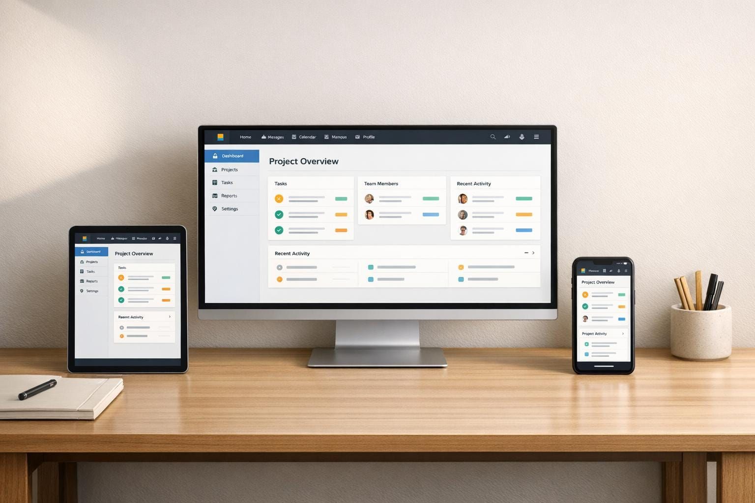
Improving Multi-Platform Navigation for Internal Tools
Unify navigation across desktop, mobile, and tablet to reduce cognitive load, scale features, and improve accessibility and performance.
Poor navigation wastes time and frustrates users. It’s a common problem in internal tools, especially as businesses grow and add more platforms. Employees often face inconsistent navigation styles, cognitive overload, and scalability issues, reducing productivity and engagement.
Key insights:
- Consistency matters: Unified navigation across devices boosts satisfaction by 70%.
- Scalability is critical: Tools with cluttered menus see a 20% drop in engagement.
- Small changes, big impact: Atlassian’s unified sidebar system reduced inefficiencies, with only 2.7% of users reverting to the old design.
To fix this, focus on:
- Building clear, concise navigation structures (5–8 main items).
- Tailoring layouts for desktop, mobile, and tablet use.
- Using progressive disclosure to simplify complex systems.
- Testing navigation early and regularly.
- Prioritizing accessibility and performance for all users.
Bottom line: Streamlined, user-friendly navigation transforms tools into productivity boosters, not barriers.
Common Navigation Problems in Internal Tools
Inconsistent Navigation Across Devices
Switching between desktop, mobile, and tablet versions of internal tools can be a frustrating experience for employees. Navigation patterns often differ drastically - desktop interfaces might rely on hover states and precise mouse clicks, while mobile designs need larger touch targets (at least 48x48 pixels) to accommodate finger taps. These differences force users to adapt repeatedly, such as learning to swipe on iOS but tap on Android.
The numbers back this up: user satisfaction jumps by 70% when interface elements are consistent across platforms, and 85% of users prefer uniform layouts across apps within the same suite. Yet, many internal tools fall short. For example, one team might design a top navigation bar for desktop while another opts for a bottom tab bar on mobile, leaving employees unsure where to find key features. Before Atlassian introduced unified navigation in January 2025, they identified 23 major inconsistencies across their product suite, which added daily friction for users. These inconsistencies don’t just disrupt physical interaction - they also increase mental strain.
Cognitive Overload from Poor Information Architecture
When navigation is disorganized, employees waste time guessing where features are located instead of accessing them intuitively. This guessing game eats into working memory and adds unnecessary mental load. If users can’t answer basic questions like "Where am I?" or "What’s next?", they quickly become mentally fatigued.
Consider these stats: 69% of users abandon tasks due to confusing interfaces, and poor navigation increases bounce rates by 35% while cutting engagement by 45%. Tools with cluttered menus - those exceeding seven items - see a 20% drop in engagement compared to streamlined designs. Even worse, hiding primary navigation options behind hamburger menus can reduce conversion rates by 20%. As Shrinithi Vijayaraghavan from CometChat explains:
"The issue isn't the user, it's the cognitive effort your product is demanding."
As products expand, these problems only grow, revealing deeper scalability issues.
Scalability Problems in Growing Internal Tools
Navigation that works for five features often breaks down when a tool grows to 25 features. A once-simple horizontal menu bar may evolve into an unwieldy system of overflow dropdowns, burying critical features out of sight. This forces teams to cram items into limited space or rely on nested menus, both of which frustrate users.
The issue becomes even more complex when different product teams create custom navigation systems to meet short-term goals. This fragmented approach leads to bloated codebases, making even minor updates costly and time-consuming. Atlassian faced this challenge but successfully unified navigation across six products, including Jira and Confluence, between October 2024 and January 2025. The results were striking: only 2.7% of 30,000 users across 250 organizations opted to revert to the old system, far exceeding the typical 5% opt-out rate for major changes. As Anant Jain from Designpixil puts it:
"The sidebar structure you built for 5 features becomes unwieldy at 25."
Together, these issues - device inconsistency, cognitive overload, and scalability challenges - hamper productivity. A unified, scalable navigation system is no longer optional for modern internal tools; it’s a necessity.
sbb-itb-124fdbf
How to Design Scalable and Consistent Navigation Systems
Creating a navigation system that can grow and remain user-friendly requires a solid foundation to address inconsistency, reduce cognitive overload, and accommodate future expansion.
Building Strong Information Architecture
Good navigation starts with understanding how users think. Techniques like card sorting help reveal how users naturally group features, while tree testing ensures they can find what they need in your proposed structure - before any coding begins. These methods prevent the common mistake of organizing navigation around internal departments or technical structures, which forces users to adopt an unfamiliar model.
Keep primary navigation concise, focusing on 5 to 8 items. Exceeding this limit makes it harder for users to grasp the overall structure of your tool. Anything beyond core workflows should be placed in secondary menus or contextual areas, avoiding clutter in the main navigation.
A great example comes from Lambda SCS, which revamped their OptiFlow platform in March 2026. They improved breadcrumb logic and replaced a cluttered action panel with dropdown menus that revealed options progressively. They also added multiple entry points in the top-level navigation and included contextual tips in empty states. These changes made complex data journeys manageable, even for users unfamiliar with the system.
Once the structure is in place, it’s important to tailor navigation patterns to fit the specific platform.
Adapting Navigation Patterns for Different Platforms
While the core structure should remain consistent, the design must adapt to different platforms. For desktop, sidebars are ideal when there are six or more sections. They provide ample vertical space, making them perfect for tools that require displaying dense information like dashboards and data tables. In contrast, top navigation works better for simpler tools with fewer sections, though it can quickly become cramped as features expand.
On mobile, bottom navigation bars are crucial for primary actions. Research shows that 68% of mobile users expect critical actions to be easily accessible at the bottom of the screen. To improve tap accuracy, touch targets should be at least 48x48 pixels. For secondary actions, hamburger menus are effective, but be cautious - hiding important options in these menus can reduce conversion rates by 20%.
Atlassian provides an excellent case study. In October 2024, they unified navigation across six products, including Jira and Confluence, by shifting product navigation from the top bar to a sidebar. This redesign replaced hundreds of custom components with just three reusable ones: a menu button, a flyout menu, and an expandable menu. This streamlined approach eliminated 23 major inconsistencies across their suite. As the Atlassian Design Team explained:
"Consistency doesn't mean everything has to be identical. There has to be a balance between consistency and flexibility."
For deeper hierarchies, breadcrumbs are essential when navigating three levels or more. Breadcrumb trails help users move "up" and maintain context, with 96% of users finding them helpful for understanding their location within complex systems. To avoid confusion, ensure that navigation labels match page headers exactly.
Beyond adapting layouts, progressive disclosure can make complex navigation systems easier to use.
Using Progressive Disclosure to Reduce Complexity
Progressive disclosure helps manage cognitive load by showing users only what they need at each step. Instead of overwhelming users with every option upfront, secondary features can be revealed through expandable menus or flyouts when needed. This keeps the interface clean while ensuring advanced functionality is still accessible.
Features like "Starred" and "Recent" sections allow users to quickly access frequently used pathways without adding clutter.
The key is to balance simplicity with discoverability. New users should find it easy to complete core tasks, while experienced users benefit from shortcuts that speed up their workflows. When done well, progressive disclosure creates a navigation experience that feels intuitive for everyone.
Testing and Improving Navigation Systems
After setting up a scalable structure, thorough testing ensures that your navigation system works well for users across different platforms. Testing helps you understand if the structure aligns with how users think and lets you address issues early - when fixes are still affordable.
Prototyping and Wireframing for Early Feedback
Start with low-fidelity wireframes to outline user flows. Then, use tools like Figma or Adobe XD to create clickable prototypes that simulate interactions.
At this stage, tree testing is a powerful tool. Conduct tree tests after card sorting but before moving to high-fidelity designs. A success rate higher than 85% means the structure supports tasks effectively, while rates below 60% indicate the need for significant changes. These early tests confirm whether your architecture can support scalable navigation across devices.
Running User Testing and Analytics Reviews
Test your prototype with real users to uncover potential issues. First-click testing is particularly revealing - users who make the correct first click are two to three times more likely to complete their tasks successfully. If users frequently choose the wrong option initially, it’s a sign that labels or category placements need adjustment.
Create realistic tasks, like "Find where to update your billing information", to evaluate the logic of your navigation rather than just label recognition. For more reliable data, aim to involve at least 30 to 50 participants.
Pair user testing with analytics path analysis to pinpoint areas where users backtrack or abandon tasks. This data-driven approach can highlight friction points that might not surface in moderated user sessions. These findings help reduce cognitive overload and frustration by aligning navigation with actual user behavior.
Success Rate Table:
| Success Rate | Meaning | Action Required |
|---|---|---|
| 85%+ | Task is well-supported | No changes needed; focus on other areas |
| 70–84% | Some friction exists | Review paths; consider label adjustments |
| 50–69% | Navigation issues present | Reorganize categories and test new labels |
| Below 50% | Major findability problem | Restructure branches entirely |
Refining Navigation for Cross-Platform Breakpoints
Once user behavior is validated, refine the design to ensure smooth transitions across platforms. For example, adapt complex desktop layouts like sidebars into mobile-friendly formats such as bottom navigation bars or hamburger menus. Ensure touch targets on mobile meet the 48×48 pixel minimum for better tap accuracy.
Design clear visual feedback for different states - default, hover, active/selected, and focus - to help users stay oriented on any device. Also, make sure critical features aren’t hidden in collapsed menus, as 68% of mobile users expect key actions to be easily accessible via bottom navigation.
To avoid "structural drift", where adding new features over time leads to chaotic navigation, conduct regular tests every 6 to 12 months. As AtheosTech wisely notes:
"The most expensive mistakes in product design are the ones you code before you test".
Accessibility and Performance in Navigation Design
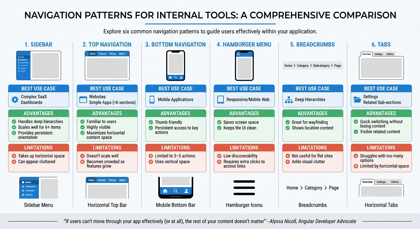
Navigation Pattern Comparison: Pros, Cons, and Best Use Cases for Internal Tools
After refining navigation through testing, the next step is ensuring it meets both accessibility and performance standards. A well-designed navigation system should simplify user interaction while accommodating everyone, including the 1.3 billion people worldwide - about 16% of the population - who live with significant disabilities. Accessibility isn’t just a bonus; it’s a necessity. At the same time, slow or inefficient navigation can drive users away. In fact, 67% of top mobile ecommerce sites were rated as having "mediocre" or "poor" navigation performance in 2025 benchmarks.
Applying Accessibility Standards
Accessibility starts with the basics. Use semantic HTML like <nav>, <ul>, and <li> to clearly define navigation for assistive technologies. Interactive elements should be fully usable via the keyboard: the Tab key to navigate forward, Shift+Tab to go backward, and Enter or Space to activate links or buttons.
ARIA labels are essential for communicating navigation behavior. For example:
- Use
aria-expandedto indicate whether a menu is open or closed. - Apply
aria-controlsto link buttons with the menus they open. - Add
aria-current="page"to highlight the active page for screen readers.
Include a "Skip to main content" link at the top of the page, visible only on focus, so keyboard users can bypass repetitive navigation links. For hidden menus, the inert attribute can remove them from the tab order, preventing users from accidentally navigating into invisible elements.
Icons should always be paired with text labels to avoid confusion, especially for new users. Highlight the active page using more than just color - bold text or underlines work well for those with color blindness. As Ellis Pike explains:
"Accessible navigation is not just about permanent disabilities. It helps people with temporary or even situational needs too".
With accessibility in place, the focus shifts to ensuring that navigation is fast and responsive across all devices.
Optimizing Performance Across Devices
Speed is crucial for effective navigation. Techniques like server-side rendering (SSR) or static site generation (SSG) (with tools like Next.js or Nuxt.js) can pre-render navigation HTML, reducing the Time to First Byte (TTFB). Lightweight assets like SVG icons or sprites should replace heavier fonts or images to minimize HTTP requests.
To improve load times, implement code splitting and lazy loading with tools such as the Intersection Observer API. These methods ensure that only necessary navigation scripts and secondary menu items load upfront. Critical CSS for above-the-fold navigation elements can also prevent render-blocking and speed up the First Contentful Paint (FCP). Compression tools like Brotli or Gzip further reduce asset sizes, and service workers can pre-cache static navigation data for faster repeat visits.
For mobile users, touch targets should be at least 48×48 pixels for easy interaction. Features like skeleton loaders or immediate visual feedback on taps can make the interface feel more responsive, even during background processing. Navigation should load in under two seconds to maintain user engagement. For example, Atlassian improved performance and consistency by replacing hundreds of custom elements with just three reusable components.
Navigation Patterns: Pros and Cons
Different navigation patterns work better in different contexts. The right choice depends on factors like platform, complexity, and user behavior. Here's a breakdown of popular patterns:
| Navigation Pattern | Best Use Case | Advantages | Limitations |
|---|---|---|---|
| Sidebar | Complex SaaS, Dashboards | Handles deep hierarchies; scales well for 6+ items; provides persistent orientation. | Takes up horizontal space; can appear cluttered. |
| Top Navigation | Websites, Simple Apps (<6 sections) | Familiar to users; highly visible; maximizes horizontal content space. | Doesn't scale well; becomes crowded as features grow. |
| Bottom Navigation | Mobile Applications | Thumb-friendly; persistent access to key actions. | Limited to 3–5 actions; uses vertical space. |
| Hamburger Menu | Responsive/Mobile Web | Saves screen space; keeps the UI clean. | Low discoverability; requires extra clicks to access links. |
| Breadcrumbs | Deep Hierarchies | Great for wayfinding; shows location context. | Not useful for flat sites; adds visual clutter. |
| Tabs | Settings, Related Sub-sections | Quick switching without losing context; visible related content. | Struggles with too many options; limited by horizontal space. |
As Alyssa Nicoll, Angular Developer Advocate, aptly states:
"If users can't move through your app effectively (or at all), the rest of your content doesn't matter".
Conclusion
Tackling the challenges of multi-platform navigation requires thoughtful design and thorough testing. To improve user experience across devices, addressing issues like inconsistencies, cognitive overload, and scalability is essential.
Great navigation works quietly in the background, allowing users to focus on their tasks without disruption. When navigation falters, even the most advanced features become inaccessible. A well-crafted navigation system is what transforms a tool from merely functional to genuinely enjoyable.
The strategies discussed - such as robust information architecture, platform-specific customization, progressive disclosure, thorough testing, and meeting accessibility standards - aren't just theoretical concepts. They are proven methods. For example, Atlassian successfully unified its navigation components, and by January 2025, an impressive 97.3% of users opted to stick with the new system rather than reverting to the old one.
Achieving consistency means striking the right balance between uniformity and flexibility. The aim is to build a familiar framework that adapts seamlessly to different platforms and user needs - whether that means using sidebars for intricate dashboards, bottom navigation for mobile apps, or clear visual hierarchies that work across all devices.
FAQs
How do we choose between a sidebar, top nav, or bottom nav?
When deciding on navigation placement, consider the number of items, how users scan the page, and the platform's context. Top navigation is ideal if you have fewer than five items, offering a clean and straightforward layout. For five to ten items or more intricate designs, side navigation provides better organization. On mobile devices, bottom navigation is often preferred, making key sections easily accessible with one hand. Always align your choice with user habits and platform standards to create a smooth, user-friendly experience.
What’s the best way to test navigation before building it?
One of the smartest ways to test navigation before diving into development is by using tree testing. This approach lets you assess how easily users can locate information within your navigation structure - without the influence of visual design elements.
Here’s how it works: After organizing your navigation structure (often through something like card sorting), you conduct tree testing before moving on to high-fidelity design. It’s a simple but effective way to catch potential issues early.
For reliable results, aim for a success rate of at least 80%, and involve around 50 participants in your testing. This ensures you gather enough data to make informed decisions about your navigation.
How can we keep navigation consistent without blocking platform-specific UX?
To maintain consistent navigation across different platforms while respecting each platform's unique user experience, rely on a unified design system. This system should include shared components, interaction patterns, and style guidelines. At the same time, allow room for platform-specific adjustments, such as tailored gestures or visual tweaks.
Incorporate familiar navigation patterns - like sidebars or tabs - that can seamlessly adapt to the conventions of each platform. Regular usability testing is key to ensuring the navigation remains intuitive and aligns with user expectations, even as platform-specific features change over time.