
Typography Generator
Create responsive type scales, preview headings and body text, and copy clean CSS for desktop and mobile typography in seconds.
Responsive Typography Generator
Build a type system that feels consistent
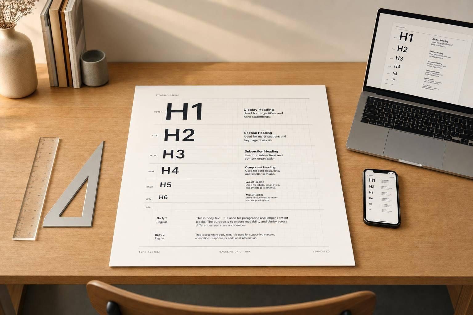
A well-made typography generator helps you do more than pick a nice font. It gives you a practical way to shape hierarchy, improve readability, and keep headings, body text, and interface copy visually consistent across screens. With desktop and mobile controls, you can test different base sizes and scale ratios without manually recalculating every text level.
Preview sizes, spacing, and hierarchy instantly
This tool makes it easy to explore modular scales such as minor second, major second, minor third, major third, and perfect fourth. You can adjust line height, font weight, letter spacing, paragraph spacing, and text transform, then see the results update in a live preview. That instant feedback is especially useful when you’re comparing serif, sans-serif, and monospace styles or checking how a curated font choice performs in a full system.
Get clean values you can actually use
The generated output includes H1 through H6, body, small text, and caption values in both px and rem, along with tidy CSS snippets. Whether you're refining a design system, styling a landing page, or testing a new type scale calculator, this typography generator helps you move faster while keeping your text clear, structured, and easier to implement.
FAQs
How does the typography generator calculate each text size?
The tool starts with your chosen base font size and multiplies it by the selected scale ratio to build a consistent hierarchy. Larger heading levels step up from the base size, while smaller supporting text like captions and small text scale down. Showing both px and rem makes it easier to use the results in modern design systems and responsive layouts.
Why are separate desktop and mobile controls important?
Type that feels balanced on a large screen can feel oversized or cramped on a phone. Separate desktop and mobile settings let you fine-tune the base size and scale ratio for each context, which helps preserve hierarchy without sacrificing readability. It’s a practical way to build a responsive type system that actually works across devices.
Can I use this tool to create CSS for a full design system?
Yes. The tool is designed to help you define the core text styles that most interfaces need, including headings, body text, smaller supporting text, and UI copy. Once you’ve settled on sizes, spacing, and weights, you can copy the generated CSS snippets and use them as a starting point for your site, app, or component library.