Font Pairing Converter for UI
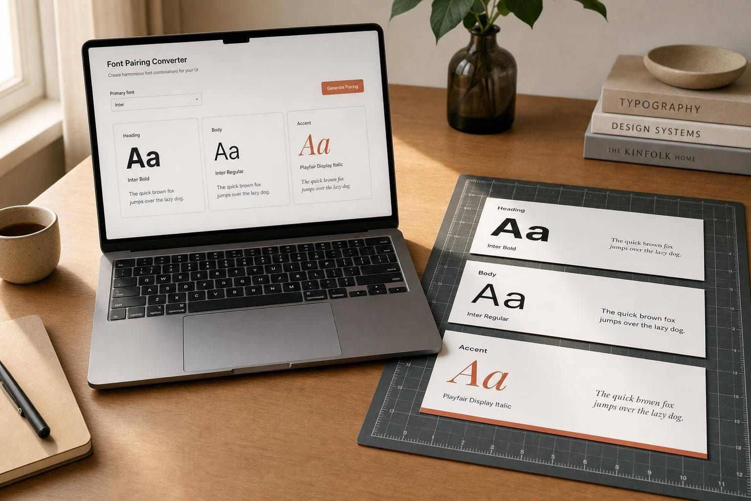
Find readable, stylish font pairings for UI projects. Enter a primary font and get smart matches for headings, body text, and accents.

Smarter Typography Choices for Digital Products
Choosing type for an interface is rarely just about taste. A good Font Pairing Converter for UI helps designers create hierarchy, maintain readability, and give screens a more polished feel without spending hours testing combinations by hand. When you start with a primary font, the next challenge is finding supporting styles that complement it instead of competing for attention.
Built for Readability and Visual Balance
This tool suggests font combinations for headings, body text, and accents using practical design logic. It leans into pairings that feel clear on screens, work well at common UI sizes, and create enough contrast to guide the eye naturally. That makes it useful for landing pages, mobile apps, dashboards, and design systems alike.
A Faster Way to Explore UI Typography
Instead of scrolling through endless font lists, you can compare curated matches with sample previews and see how they work together in context. A thoughtful Font Pairing Converter for UI saves time while helping you make typography decisions with more confidence. If you’re refining a product interface or starting a new visual system, strong font matching can shape the entire experience.
FAQs
How does the tool decide which fonts pair well together?
The suggestions are based on practical UI typography principles rather than random matching. The tool looks for a healthy balance between contrast and harmony, so a heading font may add personality while the body font stays easy to read at smaller sizes. It also favors well-tested interface fonts that perform reliably across digital products.
Can I use this tool even if I’m not a typography expert?
Absolutely. You don’t need a deep background in type design to get useful results here. Start with a font you already like, and the tool will surface combinations that are more likely to feel balanced, readable, and visually consistent in a real interface.
Are the suggested font pairings meant for websites only?
Not at all. While the pairings are especially useful for web and app interfaces, they can also help with dashboards, SaaS products, mobile designs, prototypes, and design systems. The focus is on digital readability and clean visual hierarchy, which applies across many UI contexts.