
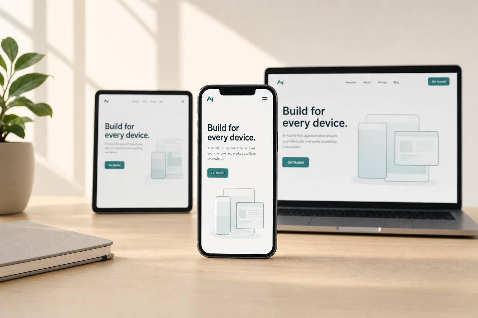
Responsive Design with Mobile-First Approach
Mobile-first responsive design: prioritize core mobile tasks, use fluid layouts, optimize performance and accessibility, and test on real devices.
Most web traffic now comes from phones, so I start with mobile first and build up. That means I keep the first screen focused, write base CSS for small screens, add min-width breakpoints only when content starts to strain, and treat speed and accessibility as part of the first pass - not cleanup later.
Here’s the short version:
- Responsive design changes the layout as screen space changes.
- Mobile-first decides what shows up first on the smallest screens.
- I keep mobile pages focused on core tasks like finding, comparing, buying, or messaging.
- I add space and layout changes only when content needs it, not because of a device name.
- I use fluid units, flexible media, and tools like Grid, Flexbox,
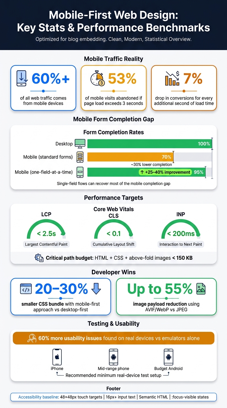
clamp(),srcset, and@container. - I keep performance tight because 53% of mobile visits are lost if a page takes more than 3 seconds to load.
- I build for touch and keyboard use from the start, with 48×48 px targets, clear focus states, and semantic HTML.
- I test on actual phones because device labs find more issues than emulators alone.
A few numbers make the case fast: mobile accounts for over 60% of web traffic, mobile form completion is about 30% lower than desktop, and one-field-at-a-time flows can improve completion by 25% to 40%.
My takeaway: mobile-first sets priority, responsive design handles layout changes, and testing shows whether the system still works when people use it on actual devices.
Mobile-First Web Design: Key Stats & Performance Benchmarks
Plan the experience from small screens upward
Identify core mobile tasks and usage contexts
Start with the jobs people need to do on mobile: find, compare, buy, or message. Most mobile users are trying to get something done, not wander around. They want info, they want options, or they want to send a message and move on.
The physical side matters too. Put primary actions in the lower reach zone, where thumbs can get to them without a stretch. Move low-use items to the top corners. Those tasks should decide what gets space on the first screen.
Prioritize content and navigation for limited space
Once you know the main tasks, rank every piece of content on the page. A content priority matrix helps keep that process clear and consistent:
| Priority | Content Type | Visibility Strategy |
|---|---|---|
| Must Show | Essential content & primary CTA | Visible immediately without scrolling |
| Should Show | Supporting context & secondary info | Accessible via short scroll |
| Can Show | Supplementary features | Added at tablet/desktop breakpoints |
| Don't Show | Non-essential clutter | Removed from the experience entirely |
After the hierarchy is set, do the same thing with navigation. Hidden hamburger menus reduce feature discoverability by 50% compared to visible navigation. That’s a steep drop. Use visible primary navigation, then tuck secondary actions behind progressive disclosure.
Create mobile-first wireframes and breakpoint rules
Start wireframes at a small mobile width. That limit is the whole point. It forces hard choices early, before the layout gets padded with extra stuff.
Then expand only when the content starts to break: long lines, cramped spacing, or awkward hierarchy.
From there, apply the same rules to layouts, type, and components that need to scale.
sbb-itb-124fdbf
Design layouts, type, and components that scale across screens
Build fluid layouts with content-based breakpoints
Keep the mobile content order in place. Then add space without changing what matters most.
Use CSS Grid and Flexbox with relative units like %, fr, rem, and vw instead of fixed pixel widths. That gives your layout room to grow and shrink without falling apart. For example, grid-template-columns: repeat(auto-fit, minmax(280px, 1fr)) lets columns show up or drop away on their own, without relying on a single media query.
It also helps to cap extra-wide containers so text stays easy to read on large screens. Long line lengths wear people out fast. And when you set breakpoints, base them on the content itself, not on a device label. If lines get too long, media feels cramped, or spacing starts to look off, that's your signal.
@container takes this one step further. It lets components react to the width of their parent instead of the full viewport, which gives you much tighter control when a module appears in different parts of a layout.
Once the layout scales well, the next job is type and UI patterns. That's where day-to-day usability either holds up or starts to slip.
Use readable type and spacing on every viewport
Set body text at 16–20px and keep line height between 1.4–1.6. That range tends to read well across phones, tablets, and desktops. Use clamp() to scale type more smoothly, so it doesn't jump awkwardly at set breakpoints.
Spacing should follow the same idea. Use rem or % for padding and margins so spacing grows with the layout instead of staying stuck at one size.
Adapt common components across devices
Common components need the same kind of tuning. Apply the same scaling logic to navigation, forms, cards, and tables. One version almost never works cleanly at every screen width.
A few patterns tend to work well:
- For navigation, start with a bottom tab bar on mobile, then expand it into a horizontal menu on desktop.
- For forms, mobile completion rates are already 30% lower than desktop on average, and showing one field at a time in key flows can increase completion rates by 25% to 40%.
- Trigger the right keyboard when people need to type by using
inputmode="numeric"orinputmode="email"on the matching fields. - On mobile, turn tables into stacked cards with labeled values.
That last point matters more than it seems. A full table may look fine on a laptop, but on a phone it can turn into a tiny, sideways mess.
Implement mobile-first responsive design in code
Once the layout system is set, the next step is turning it into CSS, speed rules, and accessibility defaults that hold up in production.
Start with base mobile styles and layer upward
Start with base styles for the smallest screens, then layer in upgrades for larger screens with min-width media queries. That approach keeps the core CSS lean. Instead of writing for desktop first and then stripping things away, you build up only where the content needs more room.
That matters for file size too. Mobile-first CSS can cut bundle sizes by 20% to 30% compared with desktop-first approaches.
Keep base styles outside media queries and aim them at the smallest common screens. Add breakpoints when the layout starts to strain, not because a certain phone or tablet exists. Use relative units for spacing, sizing, and layout so the interface scales more naturally. For images, use srcset, sizes, and <picture> so people get the right file size and format for their screen.
Treat performance as part of the user experience
Speed isn't a side task. Your code choices shape how fast the page feels, and that changes how people behave.
Here’s the blunt version: 53% of mobile visits are abandoned if a page takes longer than 3 seconds to load, and every extra second cuts conversions by 7%.
Set a tight critical-path budget for HTML, critical CSS, and above-the-fold images. Then keep trimming where it counts:
- Compress images with AVIF or WebP. They can cut image payloads by up to 55% compared with JPEG.
- Inline critical CSS so the first screen renders sooner.
- Lazy-load below-the-fold media.
- Split JS bundles so users don't pay for code they don't need right away.
A slow page is like a store with a stuck front door. People don't stand there and admire the architecture. They leave.
Build accessibility into the foundation
The foundation isn't done until accessibility is built in. This works best when it's part of the system from day one, not a cleanup job later.
Interactive elements need a minimum touch target of 48×48px with at least 8px of spacing between them. Semantic HTML - using <nav>, <main>, <button>, and proper heading order - gives screen readers and keyboard users a clear path through the page without extra hacks.
Use :focus-visible instead of removing focus outlines. That keeps focus states visible for keyboard users without adding visual noise for mouse users. If someone is sensitive to motion, @media (prefers-reduced-motion: reduce) lets you tone down or turn off animation for that group without changing the experience for everyone else.
A few other details matter more than they seem:
- Keep color contrast strong.
- Set input text to at least 16px so iOS doesn't auto-zoom form fields.
- Use
inputmodeon form inputs to help surface the right keyboard on touch devices.
These are small calls in code, but together they make the product easier to use across screens, input methods, and assistive tools. Shared system rules help keep those patterns steady.
Test across devices and refine the system
Test layouts, interactions, and performance on real devices
Once your layout and component system are set, test them on real devices.
Browser DevTools are a good place to start. They help you check breakpoints and debug CSS. But they can't fully mimic touch delay, GPU behavior, or the way iOS Safari renders fonts. Real-device testing finds about 60% more usability issues than emulators alone.
A simple setup works well:
- One current iPhone
- One mid-range Android
- One budget Android device
That budget phone matters more than many teams expect. It's often the device that shows JavaScript slowdowns and memory limits your development machine hides.
Test in both portrait and landscape too. Rotation can shove the on-screen keyboard over a key form field or break a layout that looked fine a minute earlier.
For network testing, use Chrome DevTools throttling or WebPageTest to mimic slow 4G or 3G. Your critical path - HTML, CSS, and above-the-fold images - should stay under 150 KB.
Use usability findings and analytics to guide iteration
Use what you find to improve user flows, not just patch bugs.
After launch, look for friction in your data. Pay close attention to mobile bounce rates, form completion rates, and conversion paths. Also track field-level drop-offs, rage taps, and slow interactions.
For performance, keep your eye on three Core Web Vitals targets:
- LCP under 2.5 seconds
- CLS under 0.1
- INP under 200 ms
Use Search Console Mobile Usability and CrUX to spot issues seen by actual users, like tap errors, layout shifts, and slow interactions.
Then feed those findings back into your component library. If a nav pattern hides content, change it. If a button gets mis-tapped, give it more space. Iteration should come from what users are showing you, not what the team guesses.
Conclusion: The core rules of responsive mobile-first design
Mobile-first responsive design is both a UX approach and a technical practice.
It starts with the main tasks users need to finish on small screens. From there, you build outward. Add layout complexity, richer navigation, and more content only when the screen has room for it. Breakpoints should appear where the content starts to strain, not where a certain device happens to sit.
Performance and accessibility are not last-step polish. They belong in the base layer: lean CSS, optimized images, semantic HTML, and touch targets people can actually use all need to be there before the first breakpoint goes in.
Mobile-first sets priorities. Responsive design expands on them. Testing checks whether they still work across devices. That's the baseline for building web experiences that work.
FAQs
When should I add a breakpoint?
Add a breakpoint when your content needs the layout to shift. A good signal is when text starts feeling too wide to read well, or when elements look cramped and crowded. Don’t base breakpoints on device sizes alone.
Use as few breakpoints as you can. Start with a mobile-first setup, then add breakpoints with min-width media queries as the viewport gets larger.
How do I choose what to show first on mobile?
Create a content priority matrix for each page so you can rank elements by how much they matter to the user’s main task. Put essential content and primary actions first, so people can see them above the fold.
Use this framework:
- Must show = essential content and primary actions
- Should show = supporting context that can appear after a scroll
- Can show = extra elements for larger breakpoints
- Don’t show = remove it entirely
A simple matrix like this helps you make hard calls. If something doesn’t help the user take the next step, it probably doesn’t belong at the top of the page.
What should I test on real phones first?
Test on physical mobile devices, not just browser DevTools emulation. Emulators can miss key issues like touch latency, GPU behavior, and font rendering.
Start with at least one low-to-mid-range Android phone and one iPhone or iPad. Testing on actual devices surfaces more usability problems and helps you confirm that your layout holds up on lower-end hardware, not just in desktop emulation.