
8 Best Practices for Primary Navigation Design
Clear labels, short menus, familiar placement, visible active states, and accessible responsive markup for fast, predictable site navigation.

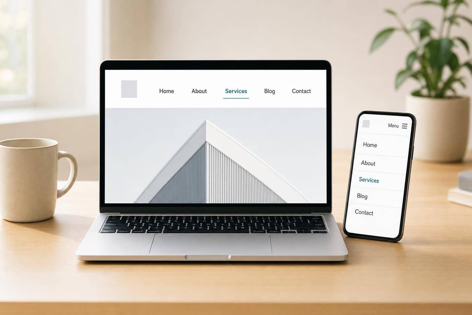
Most people decide how easy a site feels in seconds - and the main navigation does a lot of that work.
If I had to boil this article down, I’d say this: primary navigation should help people find key pages fast, understand the site structure, and know where they are at all times. In practice, that usually means clear labels, 5–7 top-level links, familiar placement, visible active states, mobile-friendly behavior, semantic markup, strong visual hierarchy, and consistent patterns across pages.
Here’s the short version:
- I should use plain labels people understand right away
- I should keep the main menu to about 5–7 items on desktop and 3–5 on mobile
- I should place navigation where people expect it, usually at the top of the page
- I should show the current page with a visible state and
aria-current="page" - I should make mobile menus work with tap, not hover
- I should use proper HTML like
<nav>, lists, links, and buttons - I should keep touch targets at least 48×48 px
- I should keep labels, order, and behavior the same across the site
A few numbers stand out: users may spend only 6.5 seconds looking at navigation before deciding what to do, and many sites work best when the main menu stays short. So the goal is simple: make the menu easy to scan, easy to use, and steady on every page and device.
What Good Primary Navigation Should Do
Primary navigation has three core jobs: help people reach key destinations, show how the site is organized, and keep them oriented as they move around. Those goals shape the eight practices below.
Help Users Find Key Destinations Fast
Good navigation cuts friction. People move faster when labels match what they already expect instead of internal company jargon. If a menu says what users think it will say, they can scan it and act without second-guessing.
Keeping top-level items to 5–7 links makes menus easier to scan and helps avoid decision paralysis. Sticky headers can also make repeat navigation faster, since the menu stays within reach as users move down the page.
Once people can find the menu items they need, the next step is making the structure easy to grasp.
Make Site Structure Easy to Understand
Navigation doesn’t just move people from page to page. It also shows them how the site is built.
A flat hierarchy helps here. Keeping menus to no more than two levels lets users reach what they need in fewer clicks or taps. Labels should stay plain and specific. For example, "Tax Planning" says far more than "Solutions," and "Web Design" is much clearer than "Services." Put the most important items first, and place the main CTA last.
That kind of clear hierarchy sets up the visual signals that help users stay oriented.
Keep Users Oriented Across Pages and Devices
Orientation matters on every page. Users need to know where they are at any moment, especially on sites with several layers of content. Active states handle this visually, and the aria-current="page" attribute handles it programmatically for screen reader users.
Placement matters too. When navigation appears in the same spot across the site, users build spatial memory. At that point, they stop thinking about how to navigate and simply do it. The pattern should also stay consistent across desktop and mobile, even if the layout shifts to fit the screen.
These goals lead directly into the eight practices below.
sbb-itb-124fdbf
1. Use Clear, Concise Labels
The words in your main navigation should tell people where they'll land right away. Strong labels line up with how users think, so they can predict what sits behind each link. Once your menu structure is in place, the labels need to make every destination plain at a glance.
Findability
Use specific, user-facing labels instead of abstract or internal terms. When a label is vague, people have to stop and guess. When it’s specific, they can move with less friction. Since users scan navigation fast, each label should be easy to understand on sight.
| Vague or Internal Term | Clear, User-Facing Term | Why It Works |
|---|---|---|
| Hub, Studio, Center | Orders, Reports, Dashboard | Literal terms describe the task |
| Resources | Documentation, Templates, Support | "Resources" is too broad and can mean several unrelated things |
| Toys & Games (shown as T&G) | Toys & Games | Acronyms can confuse people who do not know the shorthand |
That kind of clarity also helps people who use screen readers and other assistive tools.
Accessibility
Don’t rely on icons alone in primary navigation. Text labels are easier to understand, easier to scan, and more accessible than icons by themselves.
A simple way to check your labels is to test them with a real task, like finding billing history. If users pause, second-guess themselves, or click the wrong item, the label needs work. Rename the link.
Clear labels tend to work best when the top-level menu stays short.
2. Limit the Number of Top-Level Items
A shorter menu is easier to scan and sort out. When people land on a site, they spend an average of 6.5 seconds looking at the navigation before deciding whether to stay or leave. That’s not much time. A short primary nav helps people see the site’s structure almost at once.
Scanability
Once the menu grows past 7 items, scanning slows down and choosing gets harder.
Findability
After the menu is short, the next step is deciding which destinations earn a top-level spot. Fewer items force clearer priorities. Links like Log In, Help, Account, and FAQ usually work better in utility navigation, the footer, or a submenu.
For large sites, progressive disclosure helps. Show only the top 2–3 levels in the main menu, then let users go deeper after they reach the right section.
Accessibility
Fewer links also mean fewer tab stops for keyboard and screen reader users. On mobile, it helps to keep primary destinations to 3–5 items.
Those priorities also shape where the navigation belongs on desktop and mobile.
3. Place Navigation Where Users Expect It
Users show up with habits. And those habits shape where they look first. If your navigation sits in a familiar spot, people can get straight to the content instead of wasting time trying to find the menu.
Findability
After you’ve made labels clear and trimmed the menu down, placement becomes the next signal users lean on. On desktop, people expect a horizontal navigation bar at the top of the page, inside the header.
There’s a pattern most people know by heart: the logo goes in the top left and links to the homepage, while utility links like Search, Login, and Cart sit on the right. On many sites, the top right also carries a contact or call-to-action button. In fact, about 55% of marketing websites put one there.
Scanability
People often scan pages in an F-pattern. They look across the top first, then move down the left side. That’s a big reason top-bar navigation works so well: it sits right where the eye tends to land first.
That familiar placement does one more job too. It helps users remember where the menu is from page to page.
Orientation
Keeping navigation in the same place lowers the mental effort. Users don’t have to relearn the layout each time they move to a new page. Use the same menu location across the site so no one has to hunt for it.
Accessibility
Use semantic <nav> markup and add a clear aria-label so screen reader users can jump to the main menu without moving through the whole page first. On smaller screens, the layout may shift, but the same logic should still hold.
4. Show the Current Location
Make the current page easy to spot so users know where they are right away.
Once someone opens the menu, the active state should point to their current location with no guesswork.
Orientation
Use a clear active state - like color, bold text, an underline, or a background fill - to make the current item stand out. If someone is on a child page, mark the parent item too so they can see the section path at a glance.
If your site has three or more levels, breadcrumbs give users a second path back to higher-level pages.
Accessibility
Add aria-current="page" to the active link so screen readers can announce the current page. Style [aria-current="page"] directly so the visual state and the code stay in sync. And don’t rely on color alone - pair it with an underline, heavier text, or a border. When the menu shifts on mobile, keep those same cues in place there too.
5. Design for Responsive Behavior
Once the hierarchy is clear and people can tell where they are, the next job is simple: make the navigation work on smaller screens. Responsive navigation changes how the menu appears, not how the site is organized. A desktop menu that’s merely shrunk down for mobile isn’t responsive.
Findability
Show only the destinations people use most in a bottom bar or a pinned header. Put the rest inside a collapsed menu. Sticky headers can help too, since they keep key links within reach while people scroll.
But that setup falls apart fast if touch targets are too small or the menu controls are hard to open.
Accessibility
Menus should open with a tap or click. Don’t depend on hover. Every tappable element should be at least 48×48 pixels so people don’t hit the wrong thing by accident.
For markup and behavior, a few details matter:
- Use
aria-expanded="true/false"on collapsible menus. - Make sure pressing
Esccloses an open menu and sends focus back to the button. - Label the hamburger icon with the word "Menu".
The pattern may shift from one device to another, but the aim stays the same: fast access with as little friction as possible.
| Device | Pattern | Max Visible Items | Input |
|---|---|---|---|
| Desktop | Horizontal Bar / Mega Menu | 5–7 | Click |
| Tablet | Horizontal Bar / Hamburger | 5–7 | Tap |
| Mobile | Bottom Bar / Hamburger | 3–5 | Tap (48px target) |
Test mobile menus on real devices, not emulators.
6. Build Accessible Navigation Markup
Responsive patterns only hold up when the HTML underneath them does its job. That means using semantic markup that screen readers, keyboard users, and other assistive tools can understand.
Landmarks
Wrap primary navigation in <nav>. If the page has more than one navigation region, tell them apart with aria-label or aria-labelledby. Put links inside <ul> and <li> elements so the menu is exposed as a list.
Orientation
Use aria-current="page" on the active link. That way, assistive tech can announce the current page.
Accessibility
Use <a> for navigation links and <button type="button"> for submenu toggles.
Hide collapsed menus with hidden or display: none. Don’t leave invisible links focusable.
Each ARIA attribute has a specific job. Use the right one for the right element.
| ARIA Attribute | Purpose | Use On |
|---|---|---|
aria-current="page" |
Marks the active page link | <a> |
aria-expanded |
Shows whether a dropdown is open or closed | <button> |
aria-label |
Names a landmark or icon-only button | <nav> or <button> |
aria-hidden="true" |
Hides decorative icons from screen readers | <span> or <svg> |
If you remove list bullets with list-style: none, add role="list" to preserve list semantics in VoiceOver.
Once the structure is semantic, visual hierarchy can make the navigation easier to scan.
7. Use Strong Visual Hierarchy
Once your menu structure is set, visual hierarchy helps people scan it fast. It uses weight, color, spacing, and contrast to show what matters most.
Findability
Put the most important link first and the main CTA last. Then style that CTA as a button with clear contrast.
After that, spacing and text weight do a lot of the heavy lifting. They make the menu easier to read without forcing people to slow down.
Scanability
Leave 40–50 px between navigation links to make items easier to scan and tap. Use bold for primary links and regular weight for anything secondary so the hierarchy feels clear at a glance. If an item opens a submenu, add a chevron (▾) next to the label.
Orientation
People should be able to tell where they are right away. Use color, weight, or an underline to mark the current section, but don’t let that treatment overpower the rest of the menu.
Accessibility
Every interactive navigation control needs a visible focus state, and touch targets should be at least 48 by 48 pixels so users don’t hit the wrong item by mistake. Those cues also need to stay easy to see when the menu shifts shape on mobile.
8. Keep Navigation Consistent Across the Site
Once labels, layout, and accessibility are set, consistency is what holds the whole system together. It lets people move through your site without having to learn the menu all over again on each page.
Findability
Use one label for each destination across the entire site. If a page is called one thing in the header, it shouldn't show up with a different name somewhere else.
Also, always link the site logo back to the homepage. People expect that behavior, and they use it to stay oriented.
Scanability
Keep the order of navigation items the same, even on deeper pages or in mobile views. When items jump around, users have to stop and think. When they stay put, people can rely on what they already learned and move faster.
Orientation
Inconsistent navigation throws people off. The active state styling should stay the same from page to page and across devices.
Accessibility
Name the main <nav> landmark the same way on every page, such as "Main Navigation". The tab order should match the visual order so keyboard users can move through the menu in a way that feels predictable.
When the pattern stays steady, users can move through the site without re-learning the menu.
Desktop vs. Mobile Navigation Patterns
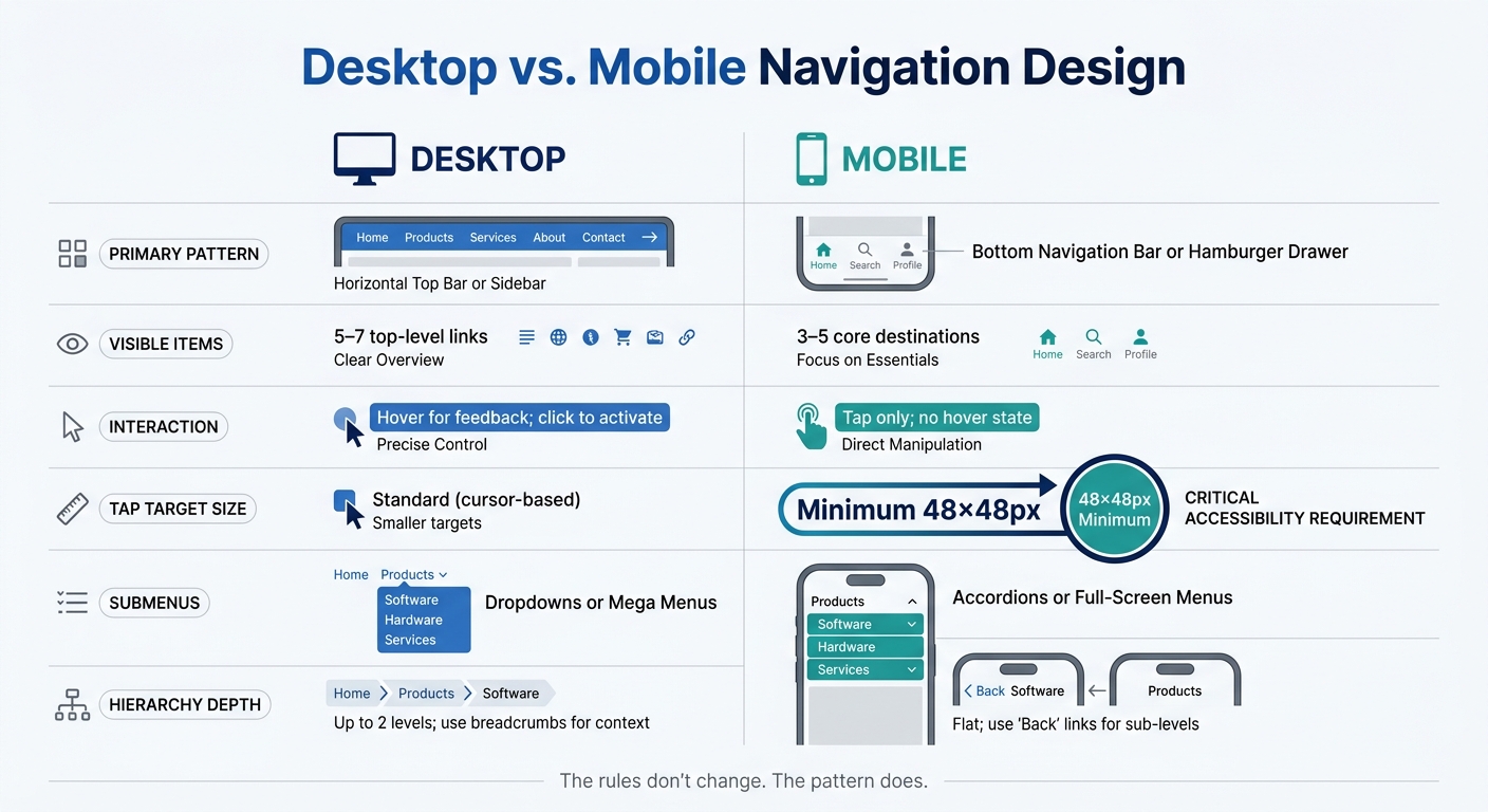
Desktop vs. Mobile Navigation Design: Key Differences at a Glance
The rules don’t change. The pattern does.
Desktop and mobile aren’t just two screen sizes. They reflect two different ways people use a menu. The big shifts come down to visibility, touch behavior, and how submenus open.
Placement and Visibility
Desktop and mobile need different menu setups. On desktop, you can keep primary links out in the open. On mobile, most links usually sit behind a drawer or a bottom bar.
On desktop, a horizontal top bar works well for sites with about 5–7 primary sections. More complex dashboards and admin panels often lean on a vertical sidebar instead. Which one makes sense depends on how many sections the site has and how often users jump between them.
On mobile, it’s common to hide secondary links inside a drawer. Bottom bars are a good fit for frequent actions because they stay within thumb reach. Keep 3–5 core destinations visible in the bottom bar, then move the rest into a secondary drawer or a More menu.
Spacing and Interaction Targets
Desktop can lean on hover. Mobile can’t. It runs on taps, and that changes sizing in a big way.
Use tap targets that are at least 48×48 px. Anything smaller leads to more mis-taps. Also, don’t depend on the hamburger icon by itself. Adding a visible Menu label next to the icon makes it clearer for people who may not know what the icon means.
Disclosure and Menu Depth
How people open submenus matters just as much as where the menu sits. Desktop menus often use dropdowns or mega menus. Mobile menus usually work better with accordions or full-screen menus.
Don’t make a parent menu item act as both a link and a dropdown trigger at the same time. That split-button setup creates confusion. A cleaner approach is to let the parent open the submenu, then place an Overview link as the first child item.
Summary:
| Feature | Desktop | Mobile |
|---|---|---|
| Primary Pattern | Horizontal top bar or sidebar | Bottom navigation bar or hamburger drawer |
| Visible Items | 5–7 top-level links | 3–5 core destinations |
| Interaction | Hover for feedback; click to activate | Tap only; no hover state |
| Tap Target Size | Standard (cursor-based) | Minimum 48×48px |
| Submenus | Dropdowns or mega menus | Accordions or full-screen menus |
| Hierarchy Depth | Up to 2 levels; use breadcrumbs for context | Flat; use "Back" links for sub-levels |
Conclusion
Good primary navigation cuts friction. That usually comes down to a few simple things: clear labels, a short menu, familiar placement, visible current-state cues, responsive behavior, accessible markup, a strong hierarchy, and consistency.
These may seem like small interface decisions. But they shape how people move through a site. When the menu works well, users find what they need, keep going, and come back later without hassle. When it doesn’t, the signs are hard to miss. People bounce back to the homepage over and over, search for basic pages like “pricing” or “contact,” or send support messages asking, “Where do I find...?” That’s a clear sign the menu is getting in the way.
The best primary navigation feels clear, predictable, and easy to use on any device.
FAQs
How do I choose which pages belong in primary navigation?
Prioritize the main things people come to your site to do, along with the sections they visit most often. Keep your primary navigation to 5 to 7 high-level categories, and use analytics or top site tasks to choose labels that are clear and specific.
Got more than 7 sections? Group them under broader parent categories. And if those items still don’t fit together in a way that makes sense, that’s a sign your information architecture may need another look.
When should I use a hamburger menu instead of visible links?
Use a hamburger menu mainly on mobile, when horizontal navigation doesn’t fit or when you have more than four to five primary destinations.
Avoid it on desktop. Hidden navigation makes pages harder to scan, adds friction, and can hurt SEO.
Don’t use a hamburger menu to cover up poor information architecture. If mobile users only need three to five key destinations, a visible bottom tab bar is often a better and more accessible choice.
How can I test whether my navigation is easy to use?
Before development, run task-based usability tests with five users and ask them to find specific items. This is one of the easiest ways to spot navigation problems early. If people keep picking the wrong labels, your information architecture or labeling probably needs work.
After launch, use GA4 path explorations to see where users click, what they skip, and where they drop off. And test on physical mobile devices, not just browser previews. A layout that looks fine in a desktop browser can feel clunky on an actual phone.