
Breadcrumb Navigation for Mobile UX
Use short, location-based breadcrumbs on deep mobile pages; prefer collapsed or parent-only trails, 44×44 px taps, and semantic HTML.

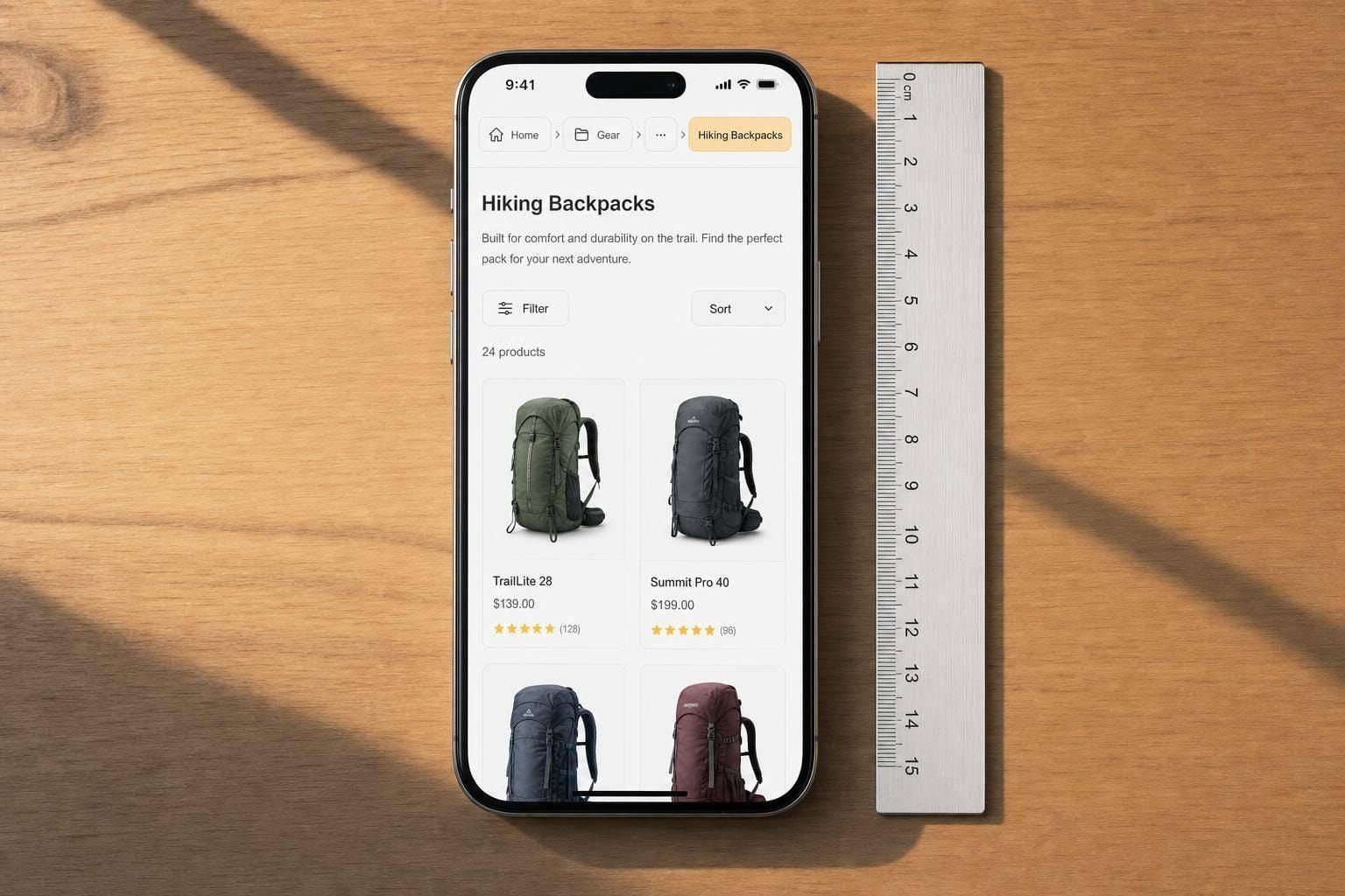
Most mobile breadcrumb trails fail for one simple reason: they show up where they aren’t needed, or they take up too much space where they are. I’d keep them for deep site structures, use the lightest pattern that still shows the path, and make every tap easy to hit.
Here’s the short version:
- Use breadcrumbs on mobile when pages sit 3+ levels deep
- Skip them on shallow sites and step-by-step flows like checkout or sign-up
- Use location-based breadcrumbs in most cases
- Use parent-only or collapsed trails when space is tight
- Keep labels short, don’t let trails wrap, and use truncation when needed
- Make taps at least 44 × 44 px with 16 px text
- Show the current page as text, not a link
- Build with semantic HTML using
<nav aria-label="Breadcrumbs">and an<ol> - Test three things on phones: finding location, moving up one level, and recovering from the wrong branch
One stat stands out: only 35% of mobile product pages use breadcrumbs, compared with 80% on desktop. That gap matters because mobile menus are often hidden, so users who land deep from search may not know where they are.
If I had to sum up the whole article in one line, it would be this: keep mobile breadcrumbs short, hierarchical, visible, and easy to tap.
Decide When to Use Breadcrumbs on Mobile
Breadcrumbs support primary navigation. On mobile, use them when people need a fast way back through a deep hierarchy. They help, but they don't replace your main navigation. The key factor is depth, not screen size by itself.
Use Breadcrumbs for Deep Hierarchies, Not Shallow or Linear Flows
Use breadcrumbs when the hierarchy is deep enough that going back becomes a hassle. If content sits three or more levels down - like Home > Electronics > Laptops > Gaming Laptops on an e-commerce site - breadcrumbs give people a quick way to move up a level.
They also help a lot when someone lands on a deep page from search or another deep link. In that case, the user doesn't have browsing history on your site, so the back button won't do much. A breadcrumb trail gives instant context and a clear route upward.
When to skip them: If your site has only one or two category levels, breadcrumbs usually add clutter without doing much good. Skip them on shallow sites and in linear flows. For shallow category sites, use a highlighted menu state. For checkout, registration, or onboarding, use a stepper instead.
If the trail makes sense, the next move is picking the breadcrumb type that matches the page.
Choose the Right Breadcrumb Type
There are three breadcrumb types: location-based, attribute-based, and path-based. In most cases, go with location-based breadcrumbs. Use attribute-based breadcrumbs only for filtered commerce flows. Avoid path-based breadcrumbs on mobile.
| Breadcrumb Type | Best Use Case | Best Mobile Use |
|---|---|---|
| Location-Based | Deep hierarchies, informational sites | High - standard for wayfinding |
| Attribute-Based | E-commerce, filtered search results | Medium - useful for specific niches |
| Path-Based | Dynamic apps with unique user journeys | Low - redundant to the back button |
Location-based breadcrumbs show the site's fixed structure, not the user's click history. That matters on mobile. If someone arrives from search, they haven't moved through your category tree, so a path-based trail may be empty or point in the wrong direction. Attribute-based breadcrumbs can work well on e-commerce sites where filters like size or color shape the route, but they need careful handling so they don't overcrowd a small screen. Path-based breadcrumbs rarely earn their space on mobile.
If breadcrumbs make sense here, the next step is picking the smallest mobile pattern that still keeps the hierarchy clear.
sbb-itb-124fdbf
Structure Breadcrumbs for Small Screens
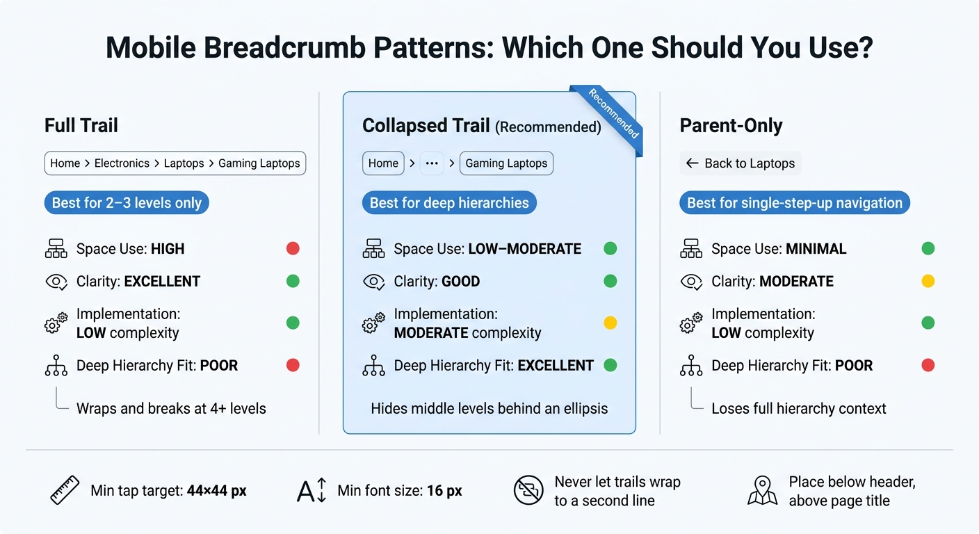
Mobile Breadcrumb Patterns: Which One Should You Use?
Pick a Mobile Pattern: Full Trail, Collapsed Trail, or Parent-Only
Choose the lightest pattern that still makes the parent-child path clear. In plain terms: use the smallest option that still keeps the hierarchy intact.
| Pattern | Space Use | Clarity | Implementation Complexity | Deep Hierarchy Fit |
|---|---|---|---|---|
| Full Trail | High (risks wrapping) | Excellent | Low | Poor - best only for shallow hierarchies |
| Collapsed Trail | Low to moderate | Good | Moderate (requires toggle/menu) | Excellent |
| Parent-Only | Minimal | Moderate | Low | Poor - loses hierarchy context |
A full trail works best when you only have two or three short levels. Once you get to four or more levels, it usually wraps and the trail starts to fall apart. The collapsed trail avoids that mess by hiding the middle levels behind an ellipsis.
The parent-only pattern is the leanest option. Think of a simple ← Back to Laptops link. It fits e-commerce product pages nicely when people mostly want to go one step up. The trade-off is simple: you lose the full hierarchy.
Handle Responsive Behavior and Truncation
Once you pick the pattern, define how it should act on small screens.
Don’t let mobile breadcrumbs wrap onto a second line. Keep the breadcrumb structure semantic in the HTML, even if the mobile view turns it into an overflow menu or a parent-only link.
When labels get long, truncate them with an ellipsis instead of letting them wrap. If the most useful part sits at the end of the label, like a product model name, cut the middle instead of the end. Horizontal scrolling can work as a fallback for long trails, but only when you show a clear cue, like a fading edge or an arrow, so people can tell more items sit off-screen.
Use a house icon for Home only if the accessible label still includes the text. The current page should be plain text, not a link, and you can style it with bold or muted text.
Place Breadcrumbs Below the Header and Above the Page Title
Once the structure is set, placement should stay predictable.
Put breadcrumbs directly below the header and above the page title. Keep that spot the same across templates so users know where to look every time. If the last breadcrumb repeats the H1, remove it.
Design Touch-Friendly and Readable Mobile Breadcrumbs
Use Readable Labels, Clear Separators, and a Visible Current State
Once you’ve picked the breadcrumb pattern, the next step is tightening the small details that make it work on mobile.
Keep breadcrumb labels short, and match them to the destination page label. If a label is vague, people can’t tell where a tap will lead until after they press it. That’s where confusion starts. Separators should be added with CSS ::after, or marked aria-hidden="true" so screen readers skip over them. The last item should be plain text, not a link, and it should look different - using bold text or another color - to show “you are here”.
Once the hierarchy is easy to scan, each item also needs enough room for a finger tap.
Meet Mobile Tap Target and Spacing Requirements
Use 44 × 44 px touch targets, 16 px text, non-clickable current text, and aria-hidden separators. That 16 px minimum also helps prevent iOS from zooming in on tap.
Use Horizontal Scrolling for Long Trails
A horizontally scrollable breadcrumb row keeps the component at a fixed height and lets users swipe through deeper levels without taking up more vertical space. Add a visual cue - like a fading edge or a subtle arrow - so people can tell there’s more content off-screen. And if an item sits under more than one parent category, show just one canonical path.
Next, check that the markup holds up with assistive tech and real mobile gestures.
Implement Accessibility, Test Usability, and Wrap Up
Build Semantic Breadcrumbs That Work With Assistive Technology
Once you’ve picked the pattern, check the markup. Use a <nav> landmark with aria-label="Breadcrumbs" and place the trail inside an <ol>. That gives screen reader users a clear landmark and helps assistive tech read the trail as an ordered path.
Set the last item to aria-current="page" and show it as plain text, not a link. Keep the focus order logical, and make sure the focus indicator stays visible for keyboard and switch users.
| Accessibility Requirement | Implementation Technique | Common Mobile Issue |
|---|---|---|
| Identify landmark | <nav aria-label="Breadcrumbs"> |
Missing label makes it hard to find via screen reader |
| Current location | aria-current="page" on last item |
Users can't tell if the last crumb is a link or active page |
| Keyboard access | Visible focus indicators | Focus lost or invisible during tabbing |
| Text contrast | WCAG AA (4.5:1) | Light gray breadcrumbs unreadable in bright sunlight |
Test Wayfinding, Backtracking, and Error Recovery on Mobile
Good markup helps, but it doesn’t tell you whether people can find their way on a phone. Test three mobile tasks: identify the current section, move up one level, and recover from a wrong branch. Deep-link a participant straight to a product page and ask them to name the current section and find related categories without using the main menu. Then ask them to move up the hierarchy using only the breadcrumb. After that, send them to the wrong product branch from a search result and see whether they can recover to the correct parent category.
Track:
- Task completion rate
- Task completion time
- Tap error rate
- Backtracking success rate, comparing breadcrumb use with the browser’s native back button
Also pay attention to repeated taps on the current page label. If people keep tapping it, the label probably looks too much like an active link.
Conclusion: Keep Breadcrumbs Short, Hierarchical, and Easy to Tap
Keep breadcrumbs semantic, short, and easy to tap. Then check them with mobile task tests.
FAQs
Do mobile breadcrumbs replace the back button?
No. Mobile breadcrumbs and the back button do different jobs.
Breadcrumbs show where someone is in the site's structure. The back button takes them to the previous screen in their session history.
That means breadcrumbs can help people move to parent pages or top-level categories with less friction. But the back button is still the familiar option for going back one step.
They work best together, not as replacements.
What’s the best breadcrumb pattern for very deep pages?
On mobile, screen space runs out fast. That’s why a full breadcrumb trail often doesn’t work well on deep pages. And once breadcrumbs wrap onto multiple lines, things get messy in a hurry.
A better move is to keep the path short and clean. You can:
- Use an overflow menu to reveal the full path
- Show only the immediate parent page as a back link
That way, the interface stays tidy while users can still move up the page hierarchy without friction.
How do I make mobile breadcrumbs accessible?
Wrap breadcrumbs in a nav with aria-label="Breadcrumb". Then use an ordered list to show the path in the right sequence.
For the current page, use aria-current="page" on a non-clickable element. And don’t rely on color alone to show where someone is.
Touch targets should be at least 44×44 pixels with enough space between them. If the breadcrumb trail gets long, add skip links, use meaningful title attributes, and make sure the whole thing works well with a keyboard, including visible focus indicators.