
Progress Bars vs Steppers in Checkout Flows
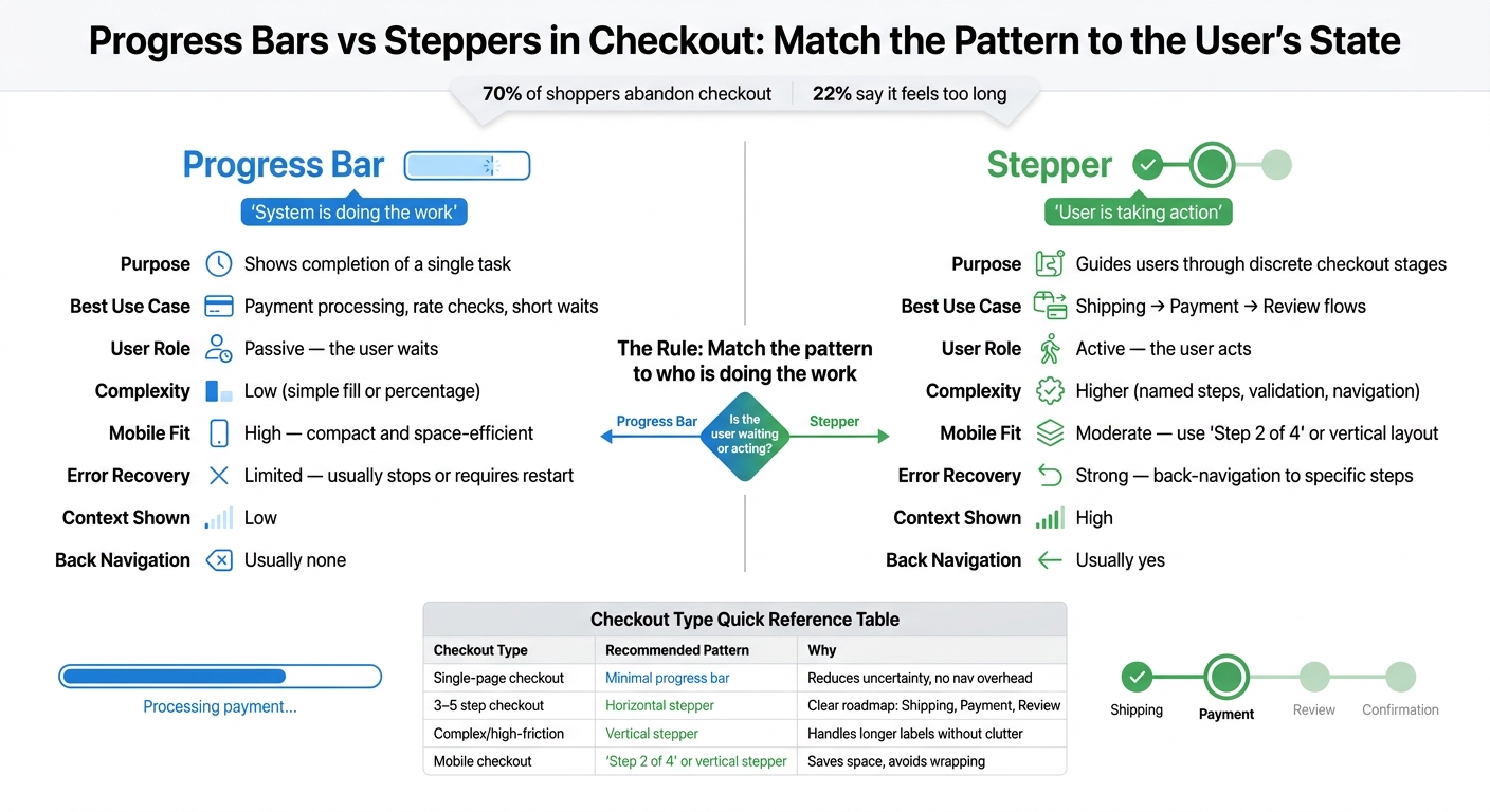
Use steppers for user-driven checkout stages and progress bars for system wait time - match the indicator to who's doing the work.
If I had to sum it up in one line: use a stepper for user steps, and use a progress bar for system wait time.
That’s the core choice. In checkout, people drop off fast when the flow feels long or unclear. About 70% of shoppers abandon checkout, and 22% say it feels too long or too hard. So if I show the wrong progress pattern, I add confusion at the worst part of the buying journey.
Here’s the simple breakdown:
- Progress bars answer: “Is the system still working?”
- Steppers answer: “Where am I in checkout, and what comes next?”
- Single-page checkout can use a small loading bar for short wait states
- Multi-step checkout usually needs a stepper with labels like Shipping, Payment, and Review
- Mobile checkout often works better with “Step 2 of 4” or a vertical step list
- Never mix both unless each one has a different job
If I use a progress bar to show a step-by-step checkout, I send the wrong signal. It makes a user task feel like system work. And if I use a stepper for a short payment-processing wait, I add UI that doesn’t help.
The rule is simple: match the pattern to who is doing the work. If the shopper is acting, use a stepper. If the shopper is waiting, use a progress bar.
Quick Comparison
| Criteria | Progress Bar | Stepper |
|---|---|---|
| Main job | Shows task progress | Shows checkout stages |
| Best for | Payment processing, rate checks, short waits | Shipping → Payment → Review flows |
| User role | Waiting | Taking action |
| Context shown | Low | High |
| Back navigation | Usually none | Usually yes |
| Mobile fit | Strong | Better in compact form |
| Error handling | General status only | Can point to one step |
| Good step count | Not for steps | Best at 3 to 6 steps |
So when I design checkout, I don’t ask, “Which pattern looks better?” I ask, “Is the user waiting, or moving through steps?” That question usually gives me the right answer fast.
sbb-itb-124fdbf
Progress bars in checkout flows
Use a progress bar only when the system is doing the work and the shopper has to wait. Think payment authorization or a ZIP-based shipping check. In those moments, the UI should show activity without asking the user to do anything else. That’s also what decides whether the bar should be determinate or indeterminate.
A determinate bar fills based on actual progress. Use it when the system can tell how much work is left. An indeterminate bar uses motion to show that the system is busy when the timing isn’t known, like a payment API call. And one rule matters here: never show a percentage unless progress can be measured.
Strengths of progress bars
Progress bars are compact. They don’t need extra labels, nav controls, or other UI pieces that pull focus away from the form. That small footprint makes them a good fit for mobile, where screen space is tight and horizontal steppers can wrap or get squeezed.
For short, system-controlled waits, a progress bar does the job well. It shows that the system is working and gives the user some sense of when it may finish. That can lower uncertainty, give a small sense of control, and make the end feel a bit closer.
Weaknesses of progress bars
That same simplicity is also the limit. A progress bar doesn’t tell users how many steps remain, what they’ll need to enter next, or where they are in the full checkout flow. It also gives them no way to go back and fix mistakes before submission.
Put simply, progress bars fit single-task, system-controlled moments. They fall apart when used in place of step navigation. If you use one to stand in for a multi-step checkout, you’re showing the wrong thing. Once checkout turns into a series of user actions, use a stepper instead.
When the user is moving through steps rather than waiting, the pattern should change.
Steppers in checkout flows
When shoppers move through required checkout steps, a stepper gives more context than a plain progress bar.
In checkout, steppers show people where they are, what’s left, and what each step asks for. In many U.S. e-commerce flows, that usually means stages like Shipping, Payment, Review, and sometimes Confirmation.
The labels do a lot of work here. Shipping tells users to get their address ready. Payment tells them a card is coming next. But vague labels like Stage 2 or Fulfillment make people stop and think. That small pause adds friction.
Strengths of steppers
The biggest win is expectation setting. Seeing Step 2 of 4 makes the process feel finite instead of open-ended.
Steppers also make back-navigation easier without losing entered data. If a shopper gets to Payment and then decides to change their shipping address, a well-made stepper should let them go back, edit the address, and return without clearing the rest of the form. That helps build trust.
There’s also a practical upside for teams: separate steps make it easier to spot where people drop off.
Weaknesses of steppers
The tradeoff is visual overhead. A stepper needs labels, state markers, and navigation controls that a simple form doesn’t.
That’s why steppers can feel like too much on a one- or two-step checkout. In that case, the added UI may create more work than it removes.
They can also go wrong fast if the step count changes midway through the flow. If a hidden step suddenly appears later - like an account-creation screen inserted between Payment and Review - trust takes a hit right away. Shoppers should see the full count from the first step, and that count should stay fixed.
Too many steps causes its own problem. A good range is about 3 to 6 steps. Beyond that, the step list starts to feel like extra baggage.
Stepper layouts for desktop and mobile
On desktop, the standard pattern is a horizontal stepper across the top. It lets users see the full path at a glance without scrolling.
Each step should show a clear state:
- A checkmark for completed steps
- A highlighted indicator for the current step
- A muted label for upcoming steps
Mobile is tighter, so the layout needs to be simpler. Horizontal steppers with full labels often get cut off or wrap on smaller screens, which makes them harder to scan.
The practical fix is usually one of these:
- A vertical stepper
- A compact Step 2 of 4 label
The key question is whether the checkout is a waiting state or a user-driven sequence.
Progress bars vs steppers: a direct comparison for checkout design
Progress Bars vs Steppers in Checkout Flows: Which Pattern to Use
Once you define both patterns, the choice gets pretty simple: match the pattern to the user's state. Progress bars work best when the system is doing the work. Steppers work best when the shopper is moving through the checkout.
System wait vs user steps
When a shopper clicks Place Order and the system starts processing payment, a progress bar is the better fit. At that point, the shopper isn't making choices. They're waiting. So the interface should show activity, not navigation.
Now switch to a different moment. A shopper going from Shipping to Payment to Review is moving through a user-led sequence. They have to make decisions, enter details, and check what comes next. A stepper fits that flow better because it lays out the path and helps the shopper keep their place.
How each pattern handles errors and user control
Error handling makes the difference even clearer. Progress bars often show a generic error state and don't give the shopper much room to recover. Steppers can point to the exact step that failed.
That means a single step can show an error state right where the issue happened. The shopper can go back to Payment, fix the problem, and keep going without losing their Shipping information.
Pros and cons table
| Feature | Progress Bars | Steppers |
|---|---|---|
| Purpose | Shows completion of a single task | Guides users through discrete stages in a multi-step flow |
| Best Use Case | System-driven wait states, like payment processing | User-driven checkout flows like Shipping → Payment → Review |
| User Involvement | Passive: the user waits | Active: the user acts |
| Complexity | Low: a simple visual fill or percentage | Higher: named steps, validation states, and navigation logic |
| Mobile Fit | High: compact and space-efficient | Moderate: often needs a compact format like "Step 2 of 4" |
| Error Recovery | Limited: usually stops or requires a restart | Strong: supports back-navigation to specific steps |
Choosing the right pattern and using both together
Matching the checkout type
Once the difference is clear, the choice mostly comes down to the flow and the device. Pick the pattern based on checkout length, form complexity, and screen size.
| Checkout Type | Recommended Pattern | Why |
|---|---|---|
| Single-page checkout | Minimal progress bar | Reduces uncertainty without adding navigation overhead |
| 3–5 step checkout | Horizontal stepper | Gives shoppers a clear roadmap through stages like Shipping, Payment, and Review |
| Complex, high-friction checkout | Vertical stepper | Handles longer labels and more detailed guidance without cluttering the UI |
| Mobile checkout | Compact text indicator ("Step 2 of 4") or vertical stepper | Saves screen space and avoids wrapping on small screens |
There’s a simple gut check here: can someone glance at the indicator and understand it almost instantly? If not, it’s doing too much. If a flow runs longer than 6 steps, simplify it or break it into smaller sub-flows. A shopper should read the indicator in one second and know where they are, what’s next, and how much remains.
Using both patterns without creating confusion
Sometimes both patterns belong in the same checkout. That can work well, but ONLY if each pattern has a separate role.
Use the stepper for stage navigation. Use the progress bar for system work, like card verification or recalculating totals.
That split matters. If both elements seem to describe the same thing, shoppers can get mixed up fast. The stepper should map the checkout flow. The progress bar should show that the system is still working.
Summary
The rule is simple: match the pattern to who is doing the work. Progress bars fit system-driven work. Steppers fit user-driven movement through stages. The strongest checkout flows match the pattern to who is in control at that moment.
FAQs
When should I switch from a progress bar to a stepper?
Use a stepper when your checkout spans multiple distinct screens or stages. It gives users clear milestones and makes the path ahead easier to follow.
A progress bar fits shorter, simpler flows. For more complex checkouts, a stepper does more: it shows the current stage, what’s already done, and how many steps are left.
What if my checkout has only two steps?
Even when checkout has only two steps, a clear progress indicator still matters. It lowers user stress and shows how much work is left.
For a two-step checkout, keep it simple: use "Step 1 of 2" or a minimal horizontal stepper. The point is to show where users are now and reassure them that the finish line is close.
How do I combine both patterns without confusion?
Use progress bars and steppers together, not as rivals. A labeled stepper can show where the user is now and what comes next. Then a progress bar, or a simple step count like “2 of 4,” gives a fast read on how much is left.
Keep the total number of steps the same from start to finish. If the checkout happens on one page, skip the stepper and use section-based checkmarks instead. Also, don’t place breadcrumbs close by. That can make the layout feel crowded and send mixed signals about navigation.