
Font Pairing in UX: Serif and Sans-Serif Strategies
Practical rules for pairing serif and sans fonts in UX: two families, role-based use, size testing, tokens, and WCAG checks.
If I had to boil this down to one rule, it’s this: use serif and sans-serif fonts for different jobs, not for decoration. In most products, I’d keep sans-serif for UI text like buttons, labels, forms, and tables, and use serif for headlines or long reading sections where tone and reading flow matter more.
Here’s the short version:
- Use only two font families
- Give each font a fixed role
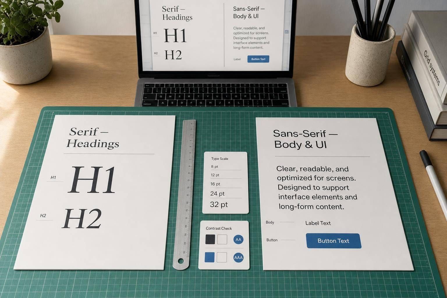
- Match x-height and general feel
- Test small sizes first: 14px, 16px, and 32px+
- Check
I,l, and1in UI text - Use display serifs only at large sizes
- Turn font choices into design tokens
- Test on phones, laptops, Windows, iOS, and Android
- Confirm body text contrast hits WCAG AA: 4.5:1
A few numbers stand out. One study cited in the article says sans-serif settings helped dashboard task speed by about 12%. Another says serif fonts were rated as more authoritative and trusted by some readers. That tells me the split is simple: sans-serif helps action-heavy screens, while serif can shape tone in reading and brand moments.
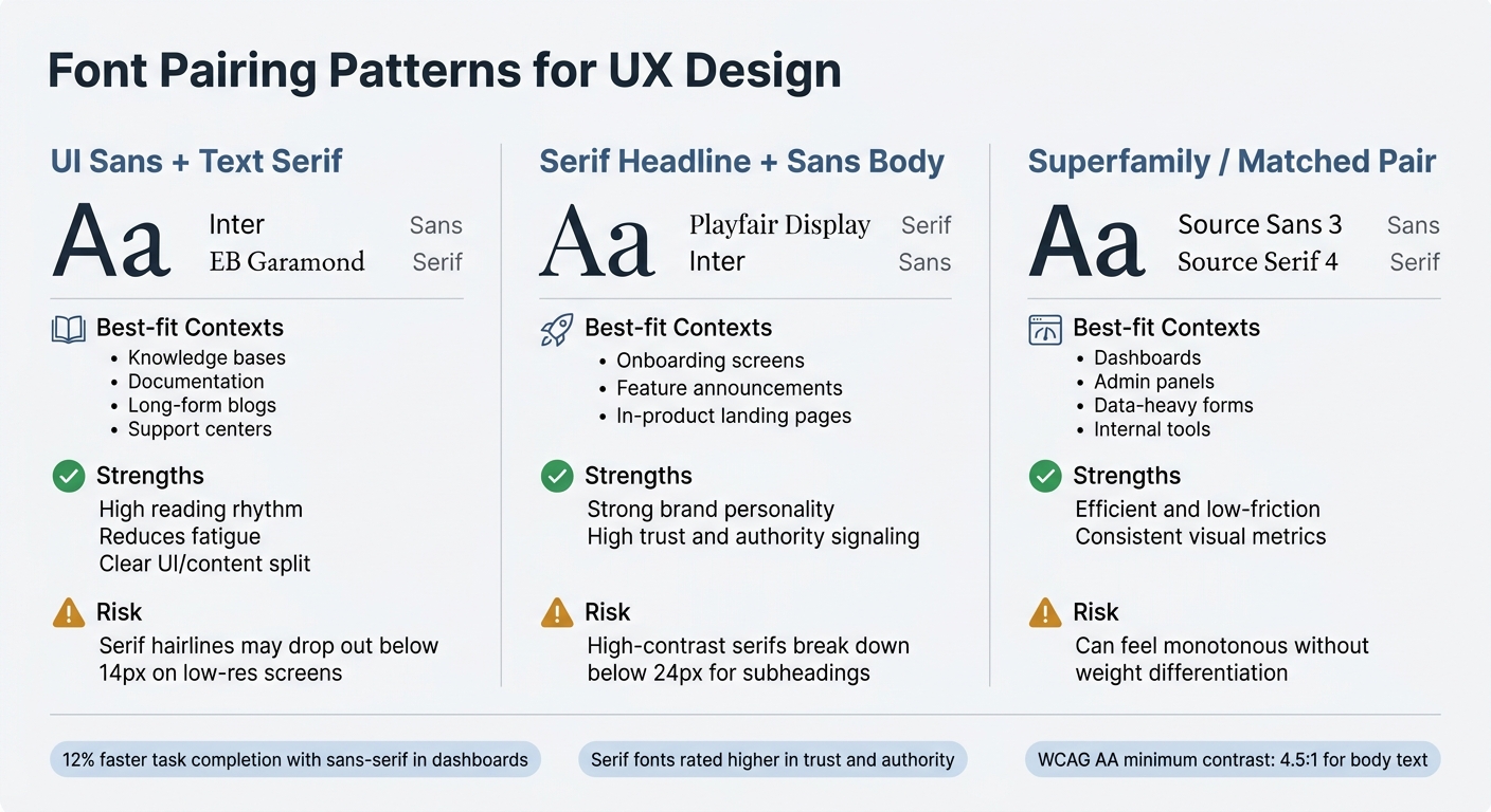
If I were choosing a pairing pattern, I’d use one of these three:
| Pattern | Best use | Main watch-out |
|---|---|---|
| UI Sans + Text Serif | Docs, support, learning, long-form reading | Serif text can get weak below 14px |
| Serif Headline + Sans Body | Onboarding, promos, in-product marketing | Display serifs can fail below 24px |
| Matched Pair / Superfamily | Dashboards, admin tools, forms | Can feel too similar without weight contrast |
So the main takeaway is simple: pick a pair that makes hierarchy easy to scan, keeps body text easy to read, and stays steady across the product. Everything else - tokens, sizes, weights, and testing - should support that.
Core Rules for Pairing Serif and Sans-Serif Fonts
Once the roles are clear, the next step is simple: pick a pair that looks deliberate at every size.
Use two font families: one for brand-led text, like headlines and key brand moments, and one for interface text, like UI, body copy, and controls. Bringing in a third family usually just adds noise.
Balance contrast and harmony to avoid visual conflict
The strongest pairs usually differ in one main way: serif vs. sans-serif. When the fonts also clash in mood, width, and weight at the same time, things can start to feel messy instead of well chosen.
The first thing to check is x-height. It’s the most useful gut check. If two fonts have a similar x-height, they tend to sit well together at the same size, without one looking off. Put both fonts at the same size and compare the lowercase letters. If the lowercase heights fight each other, you’ll end up tweaking sizes over and over.
Stroke contrast matters too. A high-contrast serif - one with sharp thick-to-thin shifts - usually works best with a low-contrast, neutral sans-serif. That gives you a clear sense of hierarchy without making the two styles compete for attention.
Assign fonts by interface role, not personal preference
Use the serif for editorial and brand moments. Use the sans-serif for navigation, controls, forms, tables, and alerts. That split gives people a fast signal about the kind of content they’re looking at.
If you want to use a sans-serif in dense UI, run the I/l/1 test. Check that uppercase I, lowercase l, and the number 1 are easy to tell apart. This is a big deal in forms, data tables, and anywhere people need to read IDs, codes, or numbers without slowing down.
| Interface Element | Recommended Category | Reason |
|---|---|---|
| Mobile labels | Sans-serif | Clean strokes stay crisp at small sizes |
| Charts & data tables | Sans-serif | Cuts visual noise and can improve task completion speed by about 12% |
| Forms & controls | Sans-serif | Functional, precise, and modern feel |
| Notifications | Sans-serif | High legibility for quick scanning |
Match the font pair to product context and brand tone
The pair should match the kind of trust signal the product needs. For internal tools and forms, a single superfamily - such as Source Sans and Source Serif - is often the cleanest option because the faces share the same design DNA.
Serifs tend to add trust in healthcare, legal, and financial products. Neutral sans-serifs fit analytics and developer tools, where speed and precision matter.
Once the pair fits the product’s tone, turn it into a system and test it in real UI. This approach is central to how we Learn UX to build more cohesive products.
sbb-itb-124fdbf
Pairing Patterns for Common UX Scenarios
Font Pairing Patterns for UX: Comparison Guide
Most UX font pairings fall into three practical patterns. Once you’ve set each typeface’s job, pick the pattern that fits the product in front of you.
UI sans-serif plus text serif for content-heavy products
This setup works well for knowledge bases, documentation, long-form blogs inside apps, support centers, and learning products. The sans-serif handles navigation, buttons, labels, and controls. Then the serif takes over when the user shifts into reading mode.
Serifs support sustained reading and can reduce fatigue in dense editorial content. Screen-friendly serif options like Newsreader, Fraunces, and Lora tend to work well for body text. A dependable starting pair is Inter + EB Garamond: Inter for the UI shell, EB Garamond for reading mode.
If the product needs more brand feel than deep reading support, flip the hierarchy.
Serif headline plus sans-serif body for marketing surfaces inside products
Onboarding screens, feature announcement modals, and in-product landing pages have a different job. They need to make an impression fast and guide the user toward an action. In those moments, a serif headline can add authority and visual weight without getting in the way of the interface.
Playfair Display + Inter is a common version of this pattern in SaaS. Playfair handles the H1 and hero text, while Inter carries the supporting copy and body text. There’s one plain constraint here: display serifs like Playfair are made for large sizes. Take them below 24px for subheadings, and those thin strokes start to fall apart.
Use serifs for headline moments. Keep sans-serifs on UI, body copy, and data.
If the workflow is dense, it’s usually better to dial things back.
Single superfamily or closely matched pair for dashboards and forms
When contrast starts to slow people down, a matched pair is the safer move. In dashboards and forms, speed matters more than personality.
The cleanest option is a superfamily - font families built from the same base design. Source Sans 3 + Source Serif 4 is a dependable pick because both faces share the same proportions and x-height, which keeps visual conflict low when they sit near each other. In this setup, serif works best for large numeric highlights, while sans-serif should handle data cells, labels, and fields.
| Pattern | Best-Fit Contexts | Strengths | Small-Size Risks |
|---|---|---|---|
| UI Sans + Text Serif | Knowledge bases, documentation, long-form blogs, support centers | High reading rhythm; reduces fatigue; clear UI/content split | Serif hairlines may drop out or shimmer below 14px on low-resolution screens |
| Serif Headline + Sans Body | Onboarding, feature announcements, in-product landing pages | Strong brand personality; high trust and authority signaling | High-contrast serifs become unreadable if used for subheads below 24px |
| Superfamily / Matched Pair | Dashboards, admin panels, data-heavy forms, internal tools | Efficient; low-friction; consistent metrics | Can feel visually monotonous if not differentiated by weight |
How to Build Font Pairing into a UX Workflow and Design System
Audit current typography and define font roles
Once you’ve picked a pairing pattern, put it into the system in a way people can actually use. Start by mapping what’s already in the product. Review the main interface elements - headings, body copy, labels, buttons, charts, and transactional screens - and note which typeface is doing which job.
This step helps you spot two common problems fast: one font doing too many jobs, and messy hierarchy caused by uneven sizes and weights. If everything starts to look the same, users feel it right away, even if they can’t explain why.
In data-heavy products, check that 1, I, and l are easy to tell apart. That sounds small, but it matters a lot when people are scanning tables, forms, or dashboards. The aim is a repeatable hierarchy, not random font picks from screen to screen. If the roles still feel fuzzy, the pair isn’t ready for the system.
Turn pairing decisions into tokens, styles, and components
Next, turn the role split into reusable tokens. The decision shouldn’t live in someone’s head or in a one-off mockup. It needs to live in tokens that both designers and developers can point to. Map each font role to a named token, along with its full set of properties: family, weight, size, line height, and letter spacing.
| Token Name | Role / Usage | CSS Implementation |
|---|---|---|
text-h1-display |
Hero headings, marketing surfaces | font-family: 'Playfair Display'; font-weight: 700; font-size: 3rem; |
text-body-prose |
Long-form content, articles | font-family: 'Lora'; font-size: 1.125rem; line-height: 1.7; |
text-ui-label |
Buttons, navigation, form labels | font-family: 'Inter'; font-weight: 500; font-size: 0.875rem; |
text-caption |
Small metadata, image captions | font-family: 'Inter'; font-size: 0.75rem; line-height: 1.6; |
A few implementation choices make this hold up better in production:
- Use
remunits for type sizing. - Use
clamp()for responsive sizing. - Use
font-display: swapso text doesn’t disappear while the font loads. - Keep a clear weight gap, like 700 for headings and 400 for body text.
That gap does a lot of work. It makes hierarchy easier to read at a glance without forcing you to lean on extra styling.
Prototype and document the pairing in real flows
After you’ve turned the pair into tokens, test it in real flows. A font pairing can look great in a specimen and still fall apart on an actual product screen. That’s where the weak spots show up.
Before locking it into the system, test the pair in three places: a landing page hero, a long-form article, and a product UI with buttons and inputs. Those three contexts will show you hierarchy, rhythm, and readability very fast.
If you’re working inside a shared design system, document each font’s role, where it can be used, and where it can’t be used right next to the tokens. That makes the pairing easier to apply and much harder to misuse.
Accessibility, Testing, and Final Font Selection
Check readability across sizes, contrast levels, and devices
Once the pairing is set in tokens, test it on actual screens before you lock it into the design system. That step matters. A pair that looks good in Figma can fall apart on a phone, an older laptop, or a low-quality display.
Check the pair at three key sizes: 14px for mobile menus, 16px for standard body text, and 32px and above for headings. Display serifs often start to break down below 18px and can become tiring to read.
For body text, set line height between 1.4 and 1.6. Keep line length around 60–75 characters per line. Then confirm the color contrast meets WCAG AA's minimum ratio of 4.5:1 for body text. It also helps to test on Windows, iOS, Android, and older devices, because font rendering can shift more than you'd think.
Test pairings with users and product metrics
Test the pair where people will actually use it. Internal design approval isn't enough. Run task-based tests with real content, not lorem ipsum, and measure completion time, comprehension scores, and error rates. Placeholder copy hides problems. Actual headings and live data tend to expose them fast.
A simple test log can keep this process grounded. For each candidate pair, note:
- tested sizes
- issues found
- pass/fail status
Use the squint test too: if hierarchy disappears when you blur your eyes, the pair is too close. Headings should feel clearly stronger than body text, not just a little different.
Conclusion: Choose pairs that strengthen hierarchy and reduce friction
The goal of font pairing in UX isn't originality. It's clarity. A serif and sans-serif pair earns its spot in a design system when it makes hierarchy easy to scan, keeps body text comfortable to read, and stays steady across every surface in the product.
Keep the system tight: two fonts, clear role separation, and decisions locked into tokens that both designers and developers can use.
FAQs
How do I choose which font gets the UI role?
Think of typography as a system, not just a font match.
A simple way to do that: let one font do the expressive work in headings like H1–H3, and let the other handle body text with a neutral, easy-to-read style.
In most cases, sans-serif fonts work best for UI elements, body copy, and data-heavy dashboards. They tend to feel clean and stay readable when the screen gets busy. Serif fonts are often a better fit for headlines or brand-led moments, where you want more personality.
The key is contrast. If the two fonts feel too close, the hierarchy gets muddy. Aim for a clear difference in weight, scale, or classification so each part of the page has a clear job.
What should I do if my serif looks weak on mobile?
If your serif looks faint or gets tough to read on mobile, the font may not be built for small-screen body text. That happens a lot with thin strokes, which can start to fall apart at 16px or smaller.
A better pick is a serif with a larger x-height and open apertures. Those details help letters stay clear when space gets tight. If the text still feels too light, use a sans-serif for body copy instead.
And don't guess. Test it at 14px and 16px on mobile to see how it holds up in actual use.
When is a superfamily better than a high-contrast pair?
A superfamily often works best when you want a polished look in a clean, balanced design system.
Its weights, styles, and optical sizes are built to work together. That makes hierarchy easier to set up without visual clashes or awkward pairings. Sticking with one family can also lead to cleaner results, since you can separate text levels with size, case, and weight instead of leaning on contrast between type classifications.