Color Palette Generator
Create balanced color palettes from any HEX color or from scratch. Build branding, UI, and accessible color schemes in seconds.

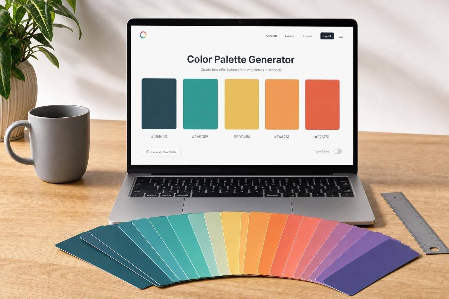
Color Palette Generator for Better Design
Build palettes that look good and work hard
A strong Color Palette Generator helps you move from a single idea to a usable system of colors. Whether you're shaping a brand identity, refining a landing page, or planning a mobile interface, it’s not enough for colors to look attractive on their own. They need to work together, guide attention, and stay readable across real design situations.
Designed for branding, UI, and visual projects
This tool lets you start with a HEX color or generate a scheme from scratch, then build around harmony models like monochromatic, analogous, complementary, triadic, and more. You can also explore softer pastel sets, muted combinations, bold palettes, or an accessibility-focused layout for interface work. Because each swatch includes HEX, RGB, and HSL values, it’s easy to move from inspiration to implementation.
Practical color structure, not just random swatches
A thoughtful color palette generator should do more than output pretty squares. This one suggests roles like primary, secondary, accent, background, and text, so the palette feels immediately useful. With adjustable hue, saturation, lightness, warmth, and color count, plus the option to lock favorites while regenerating, you get a flexible system for real creative work. For teams that care about readability, the color palette generator also checks common contrast pairings to support more accessible UI decisions.
FAQs
How does the palette generator create matching colors from one starting color?
The tool converts your starting HEX color into HSL, which makes it easier to adjust hue, saturation, and lightness in a predictable way. From there, it applies standard color harmony rules such as analogous, complementary, triadic, or tetradic relationships. That means the palette isn't random—it follows patterns designers already use to create balance, contrast, and visual consistency.
What makes the accessible UI palette option different?
The accessible UI palette mode is built for practical interface use, not just visual harmony. It looks at contrast ratios between likely text and background combinations and tries to keep them aligned with common WCAG guidance where possible. That gives you a more usable starting point for buttons, surfaces, body text, muted text, and accents, especially when readability matters as much as style.
Why would I lock colors before regenerating a palette?
Locking is useful when one or two colors are already decided, like a brand primary, a background tone, or an accent you love. Instead of rebuilding everything from scratch, you can preserve those swatches and let the tool explore new options around them. It's a simple way to refine a palette without losing the parts that already work.