
Fluid Typography and Font Pairing Techniques
Use clamp(), variable fonts, and serif–sans pairing for readable, responsive type; keep body ~65ch and support 200% zoom.
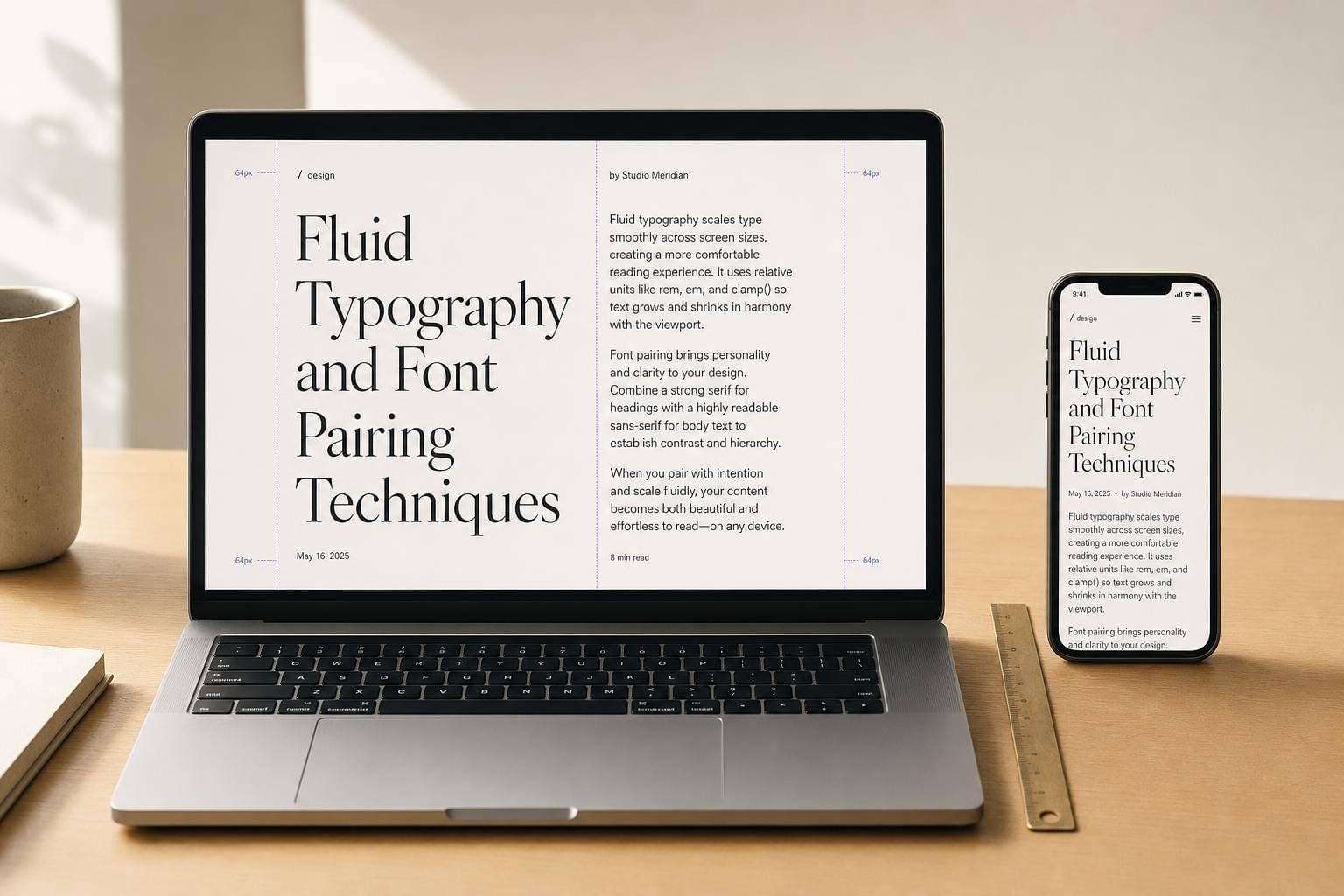
Typography drives most of what people see on a page, and it has to work from a 375px phone to a 2,560px+ desktop. If I had to sum up the article in one line, it’s this: use clamp() for fluid sizing, pair fonts as part of the same system, keep body text around 65ch, and test 200% text resize.
Here’s the short version:
- Breakpoint-based type is easy to control, but sizes jump at set screen widths.
- Pure
vwtype scales smoothly, but it can get too small, too large, and may not respect text zoom. clamp()-based type gives fluid scaling with min and max limits, which helps keep type in a safe range.- Variable fonts change more than size. They can shift weight, width, and optical size in one font file.
- Serif + sans pairings give strong heading/body contrast.
- Single-family or superfamily systems keep proportions aligned and often cut setup work.
- Line length still matters: body copy should stay near 45–75 characters per line, with
max-width: 65chas a common rule. - Accessibility matters: text should still work at 200% resize.
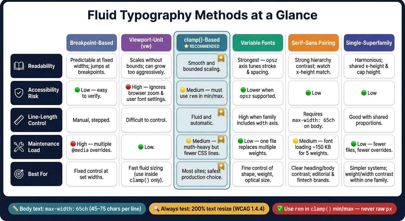
Fluid Typography Methods: Side-by-Side Comparison Guide
Quick Comparison
| Approach | Best For | Main Risk | What I’d Watch |
|---|---|---|---|
| Breakpoint-based | Fixed control at set widths | Jumps between breakpoints | Too many media-query overrides |
Viewport-unit (vw) |
Fast fluid sizing | Poor zoom behavior, no limits | Tiny text on phones, huge text on large screens |
clamp()-based |
Smooth scaling with bounds | Bad math or tight caps | Use rem in min/max values |
| Variable fonts | Fine control of shape and size | Setup and testing | opsz, wght, loading, CLS |
| Serif–sans pairing | Clear hierarchy and tone contrast | Visual drift across sizes | X-height match and body readability |
| Single-family / superfamily | Shared proportions and simpler control | Less category contrast | Weight, width, and optical-size contrast |
If you want the short answer: clamp() is the safest pick for most sites, serif–sans pairs give stronger contrast, and variable families give you more control with fewer font files. The rest comes down to how much control, contrast, and font-loading weight you want.
sbb-itb-124fdbf
1. Breakpoint-Based Responsive Typography
Breakpoint-based typography uses media queries to change font sizes at set viewport widths. It’s easy to test because you can check each breakpoint one by one.
With paired fonts, though, there’s a catch. Heading-to-body ratios can shift all at once at each breakpoint. The main problem isn’t the jump by itself. It’s how that jump changes the relationship between the two fonts.
Near breakpoints, fixed sizes can make headings look a little out of sync. Spacing gets tighter, but the type stays the same. When you’re pairing fonts, that effect gets stronger. The ratio between heading and body text changes in how it feels, even though the typefaces haven’t changed at all.
Hierarchy Stability
Large type ratios are harder to keep steady across breakpoints. A Perfect Fourth (1.333) ratio can create a clearer sense of hierarchy on desktop, but that same ratio on mobile can make heading levels feel too close to each other. At that point, weight and spacing have to do more of the work.
That’s where fixed breakpoints can trip you up. They change the perceived balance between paired fonts, so a heading-body contrast that feels clear on one screen may flatten out on another.
Once that hierarchy starts to drift, reading comfort becomes the next limit.
Legibility Across Viewports
On large screens, fixed body text - say, 16px - can look too small under large display headings, especially if the content container is too wide. Line length can easily stretch past 120 characters, which goes beyond the recommended 45–75 characters per line. A simple fix is to set max-width: 65ch on content blocks to keep the measure in check.
System Maintenance and Brand Consistency
Breakpoint-based systems tend to build up typography debt when teams patch near-breakpoint issues with one-off overrides. Systems like Shopify Polaris and IBM Carbon deal with this by setting separate type specs for different viewport contexts instead of piling on media query overrides.
That matters more than it may seem. Each extra override makes paired typography less steady across screen sizes, and it makes the system harder to review later. Fix one edge case with another media query, and you may create two more at nearby widths. That means more complexity, more edge cases, and code that’s harder to maintain. In practice, it helps to keep one override rule per breakpoint when possible.
Use rem instead of px so user font settings still apply. That keeps the base size tied to user choice, not buried as a technical detail.
This step-by-step control is predictable, but it also leaves gaps between breakpoints. Fluid typography tackles that by scaling type continuously instead of in fixed jumps.
2. Viewport-Unit Fluid Typography
Pure vw does scale without breakpoints. But on its own, it doesn't stay in a safe range for readable type.
Hierarchy Stability
Without limits, vw sizing gets out of hand fast. A 4vw heading lands at about 12.8px on a 320px phone screen and 102.4px on a 2,560px monitor, which can eat up far too much vertical space. If different heading levels all scale at the same vw rate, they can start to look too similar. At that point, an h2 can end up looking almost the same as an h3.
Legibility Across Viewports
The bigger problem is accessibility. Pure vw units don't react to browser zoom or a user's font-size settings. If someone bumps up their browser text size, the viewport width in CSS pixels stays the same, so the text doesn't grow with it. That can create trouble under WCAG 2.2 1.4.4 when text can't scale to 200% without content loss.
As Adrian Roselli notes,
vwcan block 200% text resizing.
The usual fix is simple: use vw only as the fluid part inside clamp(). For example, clamp(1rem, 2vw + 0.5rem, 1.5rem). The rem minimum keeps user text settings in play, while vw still handles the fluid scaling.
Once the scale has no limits, the type pairing starts to drift too.
Pairing Consistency
For serif–sans pairings, vw keeps the same relative proportions as the viewport changes. That helps the hierarchy hold together across screen sizes.
Implementation Tradeoffs
Raw vw is easy to write, but it falls apart at the edges. If you need to guard against accessibility issues or layout overflow on very small or very large screens, you need clamp(), and that means a bit more math. Tools like Utopia.fyi can generate the fluid slope calculations for you, which cuts down the manual work.
There's also a layout issue to watch for. If only headings scale fluidly while body text stays fixed, large screens make the mismatch obvious: oversized headings beside paragraphs that haven't changed. Fluid type works better when headings and body text share the same start and end points.
That's why clamp() is the stronger fluid pattern. It keeps the smooth scaling of vw while stopping the small-screen and large-screen extremes.
3. Clamp()-Based Fluid Type Scales
clamp() gives you fluid type with guardrails. You set a minimum size, a preferred value, and a maximum size. The text can scale between those limits without getting too small or too large. It’s stable enough for production use. The big win here is control: you keep the fluid feel without letting type run wild.
Hierarchy Stability
Take a heading like clamp(2.25rem, 1.5rem + 2.5vw, 3.75rem). It stays between 2.25rem and 3.75rem, which helps headings stay readable and balanced across common viewport widths. Because the scale changes continuously, the visual hierarchy shifts more smoothly as the screen changes size. On mobile, heavier font weights can help keep that hierarchy clear without adding extra breakpoints. In plain terms, the relationship between headings and body text stays steadier.
Legibility Across Viewports
Those size limits also help protect legibility. Use rem for the minimum and maximum values so user font-size settings still work as expected. For the preferred value, mix a viewport unit with a fixed unit such as rem - for example, 0.94rem + 0.21vw - so text still scales the right way during browser zoom. That part matters more than it may seem at first glance. If you cap text too tightly, users can lose 200% zoom scalability.
Brand Expression
clamp() also gives display text and hero text more room to breathe on large screens without taking over smaller layouts. For example, clamp(3rem, 1.5rem + 5vw, 6rem) scales from 3rem on the low end to 6rem on the high end. That makes serif–sans pairings easier to keep in balance across viewports, instead of letting that relationship drift at arbitrary breakpoints. It’s a cleaner way to keep a type system feeling intentional.
Implementation Tradeoffs
To build a proportional scale, use the slope formula: (maxSize - minSize) / (maxViewport - minViewport) to calculate the vw coefficient. That gives you a more predictable scale, which helps when you’re tuning serif–sans pairings across breakpoints and devices. It also helps to store the scale as design tokens so updates stay in one place. When two typefaces need to stay visually balanced, that kind of consistency saves a lot of trial and error.
4. Variable-Font Fluid Typography
Where clamp() handles size, variable fonts change the shape of the type itself.
That takes fluid typography a step past simple scaling. With one file, you can adjust weight, width, and optical size, which helps type look more even across different viewport sizes. These axes also help paired fonts stay visually balanced as text scales.
Hierarchy Stability
On smaller screens, headings can start to lose their punch as they shrink. Shifting weight along with size helps keep contrast in place and makes hierarchy easier to spot.
When weight changes with size, the same typeface can hold hierarchy and readability with more consistency.
Legibility Across Viewports
The optical-size axis (opsz) helps with legibility by tuning stroke thickness, spacing, and x-height to match the rendered size. In plain English, small text looks cleaner, and large text looks more polished. It also helps headings and body text stay in sync as the viewport changes.
Brand Expression
Variable fonts give you tighter control over weight, width, and optical size without loading separate font files. That makes brand expression more precise while keeping the type system consistent.
Of course, that extra control only pays off if the font file still loads efficiently.
Implementation Tradeoffs
One variable font can take the place of several static files, which cuts requests and can improve performance. Subsetting to Latin characters can shrink file size by 60% to 80%.
A few setup details matter here:
- Use
font-display: swapwithsize-adjust,ascent-override, anddescent-overridein your@font-facerules to prevent Cumulative Layout Shift (CLS) during the font swap. - If you pair variable fonts with
clamp(), check that text can still scale to 200% to meet WCAG 1.4.4.
That same level of control helps when you pair typefaces, too, since weight and texture are easier to keep balanced as size changes.
5. Serif–Sans Font Pairing Systems
Pairing a serif with a sans-serif is one of the steadiest ways to build visual hierarchy in a fluid type system. As fluid scales get smaller, font category contrast starts doing more of the heavy lifting. Size shifts alone stop being enough to signal hierarchy. Once the scale tightens, the heading face and body face have to carry more of that job.
Hierarchy Stability
When Playfair Display sits above body text set in Source Sans Pro, readers can tell what's a heading without a huge jump in size. The serif/sans split makes the relationship clear on its own. On smaller viewports, pushing heading weight from 600 to 700 adds one more layer of contrast without eating up extra vertical space.
Legibility Across Viewports
Sans-serifs like Inter and Source Sans Pro tend to hold up better at small sizes, where serifs can lose edge detail, especially on lower-resolution displays. A pairing like Inter + Merriweather uses each family where it works best: the serif handles display and heading roles, where tone matters more, and the sans handles longer reading, where clarity matters most.
In serif–sans systems, measure matters just as much as the font pick itself. Even a strong pairing can fall apart in a container that's too wide. Keep body text at max-width: 65ch to keep line length near the readable range.
Brand Expression
Serifs often suggest authority, heritage, and trust. That's one reason fintech and editorial brands use them in display type. Sans-serifs feel more modern and technical. A good pairing lets a brand speak in both voices at once: tone in the headline, clarity in the body. But that only works if the two families load well and share proportions that feel like they belong together.
Implementation Tradeoffs
The biggest downside of a serif–sans system is font loading. Five static weights can add about 150 KB to your network payload. Variable-font versions cut that payload and roll multiple files into one. It's also smart to check x-heights early. If the x-heights don't line up, the pairing can feel off, even when both fonts look strong on their own.
When hierarchy leans on one family instead of two, the pairing approach shifts.
6. Single-Superfamily and Variable-Family Pairing Systems
When serif–sans contrast starts to fall apart under fluid scaling, a one-family system can keep hierarchy inside a shared framework. The logic changes a bit here. Instead of relying on two separate families to create contrast, you build hierarchy with weight, width, and optical size inside the same family.
Hierarchy Stability
Single superfamilies like IBM Plex - with Serif, Sans, and Mono variants - share metrics such as x-height, cap height, and baseline alignment. Because those styles use the same proportions, hierarchy holds together better as the scale tightens on smaller viewports. They’re also less likely to clash during fluid transitions.
Variable families push that idea further. You can shift weight to keep heading-to-body contrast in place as fluid size ratios compress on smaller screens. Static font files just can’t give you that kind of continuous control.
Once hierarchy is steady, the next limit is simpler: how well does the same family read at both tiny and huge sizes?
Legibility Across Viewports
The opsz axis keeps stroke weight and spacing tuned to size, which helps readability from small captions to large display text.
Brand Expression
Superfamilies let you create contrast without visual mismatch. Variable families keep headings and body copy in one visual voice. That tradeoff becomes most obvious when you look at performance and setup.
Implementation Tradeoffs
Variable families often load lighter than multi-file systems. One variable file can stand in for several static weights, which cuts payload and makes loading simpler. If you want to keep file size down, strip unused axes. For example, if you’re not using the slant axis, remove it. That can bring a variable font file under 45 KB.
The comparison below shows where each system has the edge.
| Feature | Single-Superfamily | Variable-Family |
|---|---|---|
| Visual Contrast | High (Serif vs. Sans) | Moderate to High (Weight/Width variation) |
| Performance | Multiple files unless variable | Single file, 45–80 KB |
| Mobile Adaptation | Requires size/weight overrides | Programmatic wght and opsz adjustment |
| Scaling Behavior | Harmonious but fixed styles | Fluid interpolation at sub-pixel levels |
The choice comes down to which UX result matters most: contrast, control, or performance. The next step is to weigh each system against the outcome you want most.
Tradeoffs and Pros and Cons by UX Outcome
Every fluid typography method in this article fixes a real issue. But each one comes with a catch. The best choice depends on the UX result you care about most.
| Approach | Readability | Line-Length Control | Accessibility Risk | Maintenance Load |
|---|---|---|---|---|
| Breakpoint-Based | Predictable at fixed widths, but can jump at breakpoints | Manual, stepped | Low; easy to verify at breakpoints | High; multiple @media overrides |
| Viewport-Unit | Scales without bounds; can grow too aggressively on large screens | Difficult to control | High; ignores browser zoom and user font settings | Low |
| Clamp()-Based | Smooth and bounded | Fluid and automatic | Medium; must use rem to avoid WCAG failure |
Medium; math-heavy but fewer CSS lines |
| Variable-Font | Strongest with opsz |
High when the family includes wdth |
Lower when opsz is supported |
Low; one file replaces multiple static weights |
The biggest UX concern here is accessibility. And raw vw is the main trouble spot. It can block 200% text scaling, which makes it the riskiest option from an access standpoint.
Pairing adds another layer. Serif–sans pairs usually create the strongest contrast, while single-family systems are easier to maintain. A single-family setup cuts file count and reduces override work, which can save a lot of hassle later.
That said, pairing won't save a layout with poor measure. If the content container gets too wide, reading starts to feel like a game of tennis. Keep body copy between 65ch and 75ch on wide screens.
In day-to-day use, line length and unit choice do most of the heavy lifting. Pairing strategy then helps shape hierarchy, measure, and brand tone with a lighter touch.
Conclusion
Across the systems above, your pairing strategy should match the fluid scale method. clamp() works well for serif–sans systems, variable fonts make sense for variable-family systems, and single-superfamily setups usually work best with simple breakpoints or subtle clamp() scales.
From there, keep the build simple and tokenized. Use CSS custom properties, rem-based clamps, and a 65ch content width so the system stays easy to manage and pleasant to read.
Then test it at actual device widths. Check mobile, tablet, and desktop sizes, and make sure 200% text resizing works at each one.
When scale, pairing, spacing, and measure line up, typography starts to work as one responsive system instead of a pile of screen-by-screen fixes.
FAQs
How do I calculate a good clamp() scale?
Use clamp(min, preferred, max) to set a minimum size, a fluid middle value, and a maximum size.
For accessibility, put the minimum and maximum in rem. Then use a preferred value that mixes rem and vw so the size scales smoothly across screen widths. For example:
font-size: clamp(1rem, 0.95rem + 0.3vw, 1.125rem);
If you don't want to do the math by hand, tools like Utopia or ClampGenerator can generate the values for you.
When should I choose a serif–sans pair over one family?
Choose a serif–sans pair when you need a clear visual hierarchy and stronger guidance through the content. That contrast adds interest and helps readability by pairing a serif’s more classic authority with a sans-serif’s clean, modern tone.
Use a single family when consistency matters more. That can work well too, as long as you use different weights and styles to build hierarchy without juggling multiple typeface systems.
How do I test typography for 200% zoom?
Check that your typography still works at 200% zoom without breaking the layout or making text hard to read. Since browser zoom usually scales from the root font size, it helps to use relative units like rem instead of fixed pixel values.
If you're using fluid type with clamp(), set both the minimum and maximum values in rem. Then test on different devices and at different zoom levels to make sure the text stays readable and looks consistent.