
Checklist for Designing Typographic Hierarchies
A practical checklist to map text roles, set readable type scales, enforce hierarchy with tokens, and test typography across devices.

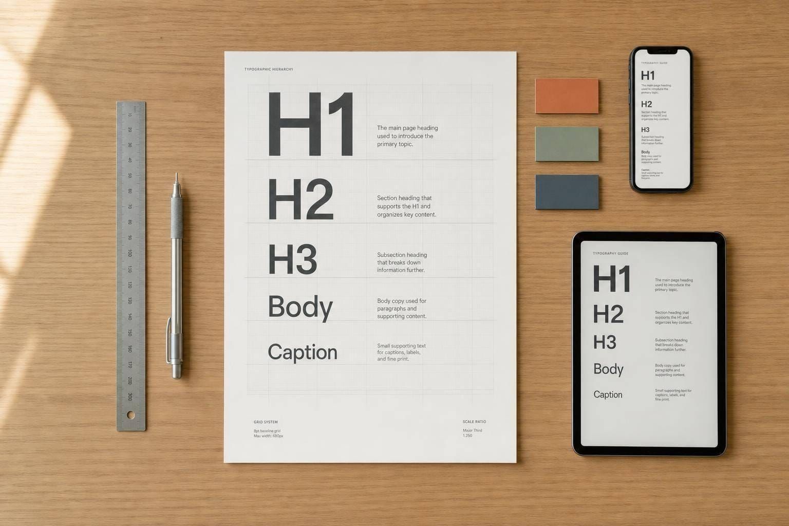
A type system works when people can scan a page fast, read it with less effort, and know what matters first.
I’d boil this checklist down to four things:
- Map every text role before styling anything
- Set a clear scale with readable sizes, line height, and line length
- Use weight, contrast, and tokens to keep rules consistent
- Test on live screens at zoom, in grayscale, and across mobile and desktop
Here’s the short version: start body text at 16px or 18px, keep running text at 14px+, aim for 45–75 characters per line, and make heading steps large enough to see at a glance - about 20%–25% between nearby levels. Then check contrast against WCAG 2.2: 4.5:1 for normal text and 3:1 for large text.
If I’m reviewing hierarchy, I’m not asking, “Does this look nice?” I’m asking: Can people scan it? Can they read it? Does it still work at 200% zoom, in dark mode, and with final copy instead of filler text? That’s the whole point.
This article lays out that review process in a simple way, so you can check your typography before handoff or release.
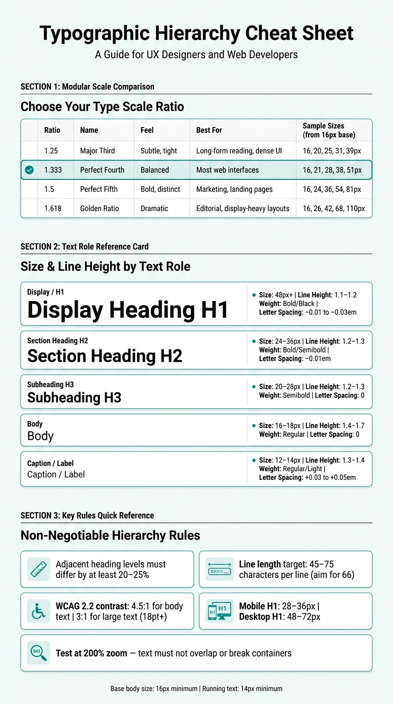
Typographic Hierarchy Cheat Sheet: Sizes, Weights & Contrast Rules
1. Map content to text roles and semantic levels
Before you touch font size or font weight, take stock of every text element in the interface. That list becomes the starting point for the type scale you build next.
List every text type used in the interface
A full inventory goes past page titles and body copy. It should include section headings, subsections, captions, form labels, helper text, error messages, and small bits of UI copy like timestamps (Aug. 3, 2026, 3:30 PM) and prices ($1,250.00). These details are easy to miss early on, but they show up all over live screens and need clear roles like any other text.
Assign roles such as Display, Heading, Body, Caption, and Label
Once you have the full list, assign each text type a text role - not a visual style. The role answers a simple question: what job does this text do? Use these roles as your base system.
| Role | Purpose | Common Content | Semantic Tag |
|---|---|---|---|
| Display | Main entry point | Page titles, hero headlines | <h1> |
| Heading (H2) | Splits the page into major sections | Section titles | <h2> |
| Heading (H3) | Splits major sections into smaller parts | Subtopics | <h3> |
| Body | Main information meant for reading | Paragraphs, lists | <p>, <li> |
| Caption | Supporting detail for media | Image descriptions, bylines | <figcaption> |
| Label | Helps users move through forms and actions | Form labels, button text | <label>, <span> |
| Micro / Legal | Timestamps, footnotes, legal text | Secondary details | <small> |
Check heading order and visual-to-semantic alignment
Each page should have one H1. Use H2 for major sections, H3 for subdivisions, and keep going in order without skipping levels. Screen readers depend on heading order, and skipped levels can disrupt navigation. If a heading looks too big or too small, fix it in CSS instead of swapping the tag.
The H1 should get the strongest visual treatment. When visual hierarchy and semantic level drift apart, people and assistive tech get mixed messages.
Once roles and heading order are in place, set sizes and line heights for each level. Next, map those roles to size, spacing, and line length.
sbb-itb-124fdbf
2. Build a consistent type scale, spacing, and line length system
Set a base body size and choose a modular scale
Start with 16px body text. If you're designing for long-form reading or an older audience, 18px is often a better pick. And for running text, stay at 14px or larger. From there, turn the text roles from Section 1 into a scale you can use across the page.
A modular scale makes that job much easier. For most interfaces, 1.333 (Perfect Fourth) is a solid default. Round sizes to whole pixels, and try to keep each page to three or four distinct text levels so the hierarchy stays clear.
| Ratio | Name | Feel | Best For | Sizes from 16px Base |
|---|---|---|---|---|
| 1.25 | Major Third | Subtle, tight | Long-form reading, dense UI | 16, 20, 25, 31, 39px |
| 1.333 | Perfect Fourth | Balanced scale | Most web interfaces | 16, 21, 28, 38, 51px |
| 1.5 | Perfect Fifth | Bold, distinct | Marketing sites, landing pages | 16, 24, 36, 54, 81px |
| 1.618 | Golden Ratio | Dramatic | Display-heavy, editorial layouts | 16, 26, 42, 68, 110px |
Map sizes and line heights to each text role
Once the scale is set, map sizes and line heights to each role from Section 1. For most web interfaces, this is a good place to start:
| Text Role | Recommended Size | Line Height |
|---|---|---|
| Display / H1 | 48px and above | 1.1–1.2 |
| Section Heading (H2) | 24–36px | 1.2–1.3 |
| Subheading (H3) | 20–28px | 1.2–1.3 |
| Body | 16–18px | 1.4–1.7 |
| Caption / Label | 12–14px | 1.3–1.4 |
Body text needs the most room to breathe. 1.4 to 1.7 is the sweet spot, with 1.5 to 1.6 working well for longer reading sessions.
Headings should sit tighter. Once you go past 1.3, large headings can start to feel loose and disconnected. Captions are a little different. They usually need slightly more space than designers expect, because small text with tight line height tends to look fine in a mockup but feels harder to read on screen.
Check size contrast, spacing rhythm, and line length
A type scale only works if people can spot the hierarchy fast. Adjacent heading levels should differ by at least 20%–25%. A gap of 1–2px usually isn't enough to signal a clear step down.
Spacing matters just as much. Give headings more space above than below. That simple rule helps each heading feel tied to the content that follows, not the block that came before.
Then check line length. It's one of those details people skip, and it has a big effect on readability. Aim for 45–75 characters per line, with 66 as a strong target. In CSS, clamp() is a handy way to let your type scale shift between breakpoints without hard jumps at fixed widths.
Once size and spacing are in place, use weight, contrast, and tokens to lock the hierarchy down.
3. Apply hierarchy with weight, contrast, and design tokens
Limit typefaces and define weight rules by role
This is where a type scale stops being a nice idea and starts acting like a system.
Stick to one font family, or two at most, to keep things consistent and cut page load time.
After you choose the family, assign weights by role and stay consistent. Display text and H1 usually work best in Bold or Black. H2 and H3 tend to work well in Semibold or Bold. Body text should usually stay Regular, while captions and labels can use Light or Medium.
For long-form copy, skip Medium or Bold. It makes paragraphs feel heavy and harder to read. Italics and uppercase can help with secondary cues like bylines, metadata, or labels, but use them lightly.
Check contrast and avoid relying on color alone
Once the weights are set, make sure the hierarchy still works without color.
WCAG 2.2 sets the minimum bar: 4.5:1 contrast ratio for normal body text and 3:1 for large text, which means 18 pt or larger, or 14 pt bold.
A simple test helps here: view the interface in grayscale. If H2 and H3 start to look the same, or body copy blends into captions, then the hierarchy is leaning too much on color.
Low-contrast text can be fine for content that isn't central, like timestamps or helper text. But primary headings and body copy should never depend on color alone to show rank.
Translate hierarchy into semantic typography tokens
Next, turn the hierarchy into semantic typography tokens.
Use primitive tokens for raw values and semantic tokens for roles. For each semantic token, define four fields: size, line height, weight, and letter spacing .
| Semantic Token | Size | Line Height | Weight | Letter Spacing |
|---|---|---|---|---|
text-display |
48–72px | 1.2 | Bold / Black | −0.01 to −0.03em |
text-heading-xl |
36–48px | 1.2 | Bold | −0.01em |
text-heading-md |
28–36px | 1.3 | Bold / Semibold | 0 |
text-body-base |
16–18px | 1.5–1.6 | Regular | 0 |
text-caption |
13–15px | 1.4 | Regular / Light | +0.03 to +0.05em |
text-label-sm |
11–12px | 1.4 | Medium / Bold | +0.05em |
As a rule of thumb, use negative letter spacing for display text and large headings. Use positive tracking for small labels .
After the rules are in place, test them on actual screens and across breakpoints.
4. Test the hierarchy in real screens and at real breakpoints
This is where the system gets pressure-tested on actual screens, at actual breakpoints. In other words, it’s the check that the hierarchy you built in Sections 1–3 still works when people use the interface the way they normally would.
Run quick visual hierarchy checks
Start with a few fast visual checks. They’re simple, but they tell you a lot.
The fastest one is the squint test. Squint at the screen and scan it. If the H1 and primary call-to-action still stand out, your top-level content is still doing its job. If the whole page melts into one flat block of text, the separation between levels isn’t strong enough.
Run a grayscale pass too. The hierarchy should still read even without color doing extra work.
Then do a five-second scan. A user should be able to spot the page purpose, the main sections, and the primary action within five seconds, without reading every line. That’s a good gut check for how the page reads under normal conditions.
Also make sure the H1 and primary CTA sit on the main reading path.
If any of this falls apart, go back and adjust weight, spacing, or scale.
Test accessibility, zoom, and responsive behavior
Next, review the interface at 200% zoom. Text shouldn’t overlap, and containers shouldn’t break apart.
For responsive scaling, use CSS clamp() so font sizes shift fluidly between breakpoints instead of jumping from one size to another. A common range moves an H1 from 48–72px on desktop down to 28–36px on mobile, while body text stays at a 16px baseline across devices.
Mobile usually needs a simpler system. When space gets tight, it often helps to reduce the number of heading levels. Many layouts drop from five distinct levels to three so the reading path stays clear on smaller screens.
After that, compare the same hierarchy with real content across devices.
Replace placeholder copy with real content and compare viewports
Placeholder copy hides problems. Real copy brings them out fast.
Swap in the final text before review, then compare the interface side by side on mobile, tablet, and desktop. Look for wrapping, spacing, and overflow issues. The main targets are below:
| Feature | Mobile (320–767px) | Desktop (1,024px+) |
|---|---|---|
| H1 Size Range | 28px – 36px | 48px – 72px |
| Heading Levels | 2–3 distinct levels | 4–5 levels |
Also test the interface in real states, not just the neat static version. Check hover, disabled, error, and dark mode. A hierarchy can look solid in a light-mode mockup, then fall apart as soon as an error message shows up or the user switches to dark mode.
Conclusion: A practical review checklist for stronger typographic hierarchy
Use this checklist as a repeatable review process, not a one-time fix.
Taken together, these four checks turn typography into a process you can use again and again: map content to text roles and semantic levels, build a controlled type scale with consistent spacing, apply contrast and design tokens, and test it all on real screens with real content.
Clear typographic hierarchy makes content easier to read and easier to scan. When those choices live in tokens, teams can keep new screens in line without stopping to rethink every text decision.
For teams that want to use this system the same way across projects, one resource can help. For deeper guidance on type systems, see DeveloperUX's Master Course on UX, including the Type module.
FAQs
How do I choose the right type scale ratio?
Choose a ratio that gives your type sizes a steady, pleasing rhythm. Start with a body text base, usually 16px, and scale headings plus smaller text from that point.
Common options include 1.200 for a subtle shift, 1.333 for a balanced feel, and 1.618 if you want more contrast. On content-heavy pages, a 2–3x gap between headings and body text often feels right. Use the scale as a guide, not a hard rule.
When should I use 18px body text instead of 16px?
Use 18px body text when 16px feels a bit too small for comfortable reading - especially for long-form content, older audiences, or scripts with more visual detail, like Arabic or CJK.
It can also work better on larger screens or next to big display headings, where 16px can start to look undersized by comparison.
How do I keep typographic hierarchy consistent across breakpoints?
Use fluid CSS values instead of fixed pixel sizes. That way, type scales smoothly as the viewport changes instead of jumping from one hard breakpoint to the next.
A simple way to do that is with clamp() and a modular scale. In plain English, you set a minimum size, a flexible middle value, and a maximum size. The result feels much more natural across screen sizes.
You should also define text hierarchy in your design system. Set up tokens for:
- font family
- font weight
- line height
- spacing
Use rem units for type sizing so text respects the user’s browser settings. And keep the hierarchy tight: three or four levels is usually enough. Apply those same levels the same way across pages so headings, body text, and supporting text always feel consistent.