
Top AI Heatmap Tools for UX Designers
Compare 9 AI heatmap tools for UX designers—predictive maps for pre-launch and session-based heatmaps after launch across web and mobile.

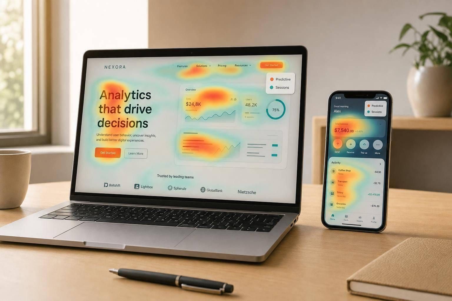
If I need one simple takeaway, it’s this: use predictive heatmaps before launch, and use session-based heatmaps after launch. That split helps me cut through the noise fast.
In this guide, I’m looking at 9 tools that help UX teams study clicks, scroll depth, cursor movement, taps, and friction signals like rage clicks and dead clicks. Some tools also use artificial intelligence to predict visual attention from static designs, which helps before any page gets traffic.
Here’s the short version:
- Hotjar: good for pre-launch prediction and post-launch behavior review
- Microsoft Clarity: simple heatmaps plus AI summaries and friction flags
- Crazy Egg: strong click segmentation by source, device, and audience
- Smartlook: web and native mobile heatmaps in one place
- FullStory: built for teams that want issue ranking tied to conversion and retention
- Mouseflow: friction scoring, form drop-off signals, and many heatmap views
- Contentsquare: enterprise choice for tying UX issues to revenue
- Attention Insight: pre-launch visual attention checks for designs and mockups
- Lucky Orange: dynamic heatmaps for SPAs, menus, pop-ups, and modals
A few points matter most when I compare these tools:
- Timing: before launch vs. after launch
- Coverage: web only vs. web + iOS + Android
- Friction signals: rage clicks, dead clicks, errors, rapid scrolling
- Workflow fit: landing pages, funnels, mobile apps, forms, or enterprise journeys
- Cost: free plans, volume-based pricing, or custom quotes
Heatmaps show the pattern. Recordings show the reason. So if I see a hot spot or drop-off, I use that clue to decide what to test or fix next.
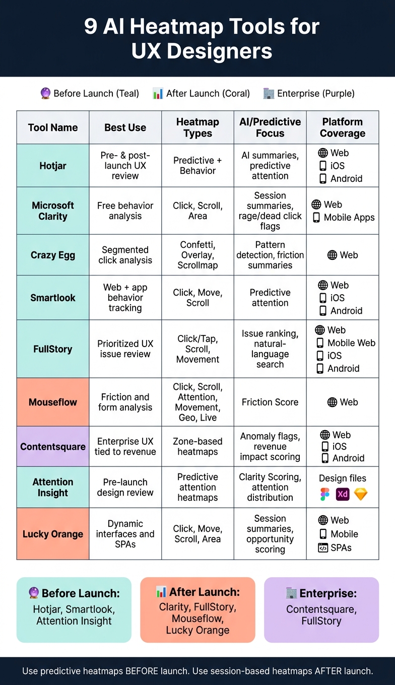
9 Best AI Heatmap Tools for UX Designers: Side-by-Side Comparison
Quick Comparison
| Tool | Best use | Main heatmap type | AI/predictive focus | Platform coverage |
|---|---|---|---|---|
| Hotjar | Pre- and post-launch UX review | Predictive + behavior heatmaps | AI summaries, predictive attention | Web, iOS, Android |
| Microsoft Clarity | Free behavior analysis | Click, Scroll, Area | Session summaries, rage/dead click flags | Web, mobile apps |
| Crazy Egg | Segmented click analysis | Confetti, Overlay, Scrollmap | Pattern detection, friction summaries | Web |
| Smartlook | Web + app behavior tracking | Click, Move, Scroll | Predictive attention | Web, iOS, Android |
| FullStory | Prioritized UX issue review | Click/Tap, Scroll, Movement | Issue ranking, natural-language search | Web, mobile web, iOS, Android |
| Mouseflow | Friction and form analysis | Click, Scroll, Attention, Movement, Geo, Live | Friction Score | Web |
| Contentsquare | Enterprise UX tied to revenue | Zone-based heatmaps | Anomaly flags, revenue impact scoring | Web, iOS, Android |
| Attention Insight | Pre-launch design review | Predictive attention heatmaps | Clarity Scoring, attention distribution | Design files, browser extension |
| Lucky Orange | Dynamic interfaces and SPAs | Click, Move, Scroll, Area | Session summaries, opportunity scoring | Web, mobile experiences |
If I’m picking fast, I’d group them like this:
- Before launch: Hotjar, Smartlook, Attention Insight
- After launch: Clarity, FullStory, Mouseflow, Lucky Orange
- For enterprise teams: Contentsquare, FullStory
- For budget-minded teams: Clarity, free plans from Hotjar, Smartlook, and FullStory
That’s the core decision set. From there, it comes down to where your product lives, how much traffic you get, and whether you need design prediction, live session analysis, or both.
sbb-itb-124fdbf
What AI Heatmaps Add to UX Research
Standard heatmaps show grouped click and scroll behavior from live sessions. AI heatmaps go a step further: they can spot friction on their own and predict where attention will go before a page even launches. That split matters. One type helps you study what users did. The other helps you check a design before anyone touches it.
One of the biggest gains is automated friction detection. These tools can flag rage clicks and dead clicks, which makes it easier to catch frustration, broken elements, and misleading affordances early. Rage clicks often suggest slow page response or touch targets that are too small. Dead clicks usually point to elements that look clickable but aren’t.
Predictive heatmaps take a different path. They use eye-tracking models to estimate where people will focus on static designs or wireframes. In plain English, that means you can test visual hierarchy in Figma during the design phase instead of waiting until after launch to see what went wrong.
Here’s the main difference:
| Feature | Standard Heatmaps | AI-Enhanced Heatmaps |
|---|---|---|
| Data Source | Real user interactions from live sessions | Predictive models trained on eye-tracking data |
| Timing | Post-launch or during live testing | During the design or prototyping phase |
| Friction Detection | Manual analysis of patterns | Automated detection of rage/dead clicks |
| Setup | Requires tracking code and live traffic | Works on static images or design files |
Heatmaps and session recordings are not the same thing. Heatmaps show the what - grouped trends across many sessions. Recordings show the why - the context behind one person’s struggle. A good rule of thumb is simple: use heatmaps to spot drop-off points, then watch recordings to see what caused them.
With that distinction clear, the tools below show how these features play out in actual use.
1. Hotjar

Hotjar works well when you need predictive heatmaps before launch and behavior analysis after launch. It brings heatmaps, recordings, and AI insights into one place, which makes it easier to check a design early and then spot friction once traffic starts coming in.
Heatmap types
Hotjar’s predictive heatmaps estimate attention on static designs, which helps designers review visual hierarchy before launch.
AI insight features
Hotjar’s AI summaries, survey analysis, and automated reports help teams spot session patterns, sentiment, and points of friction faster.
Web/mobile coverage
Hotjar covers desktop, tablet, and mobile web. For mobile work, it also supports native iOS and Android apps through an SDK.
That makes it a good fit for teams that want one tool for both website and app analysis.
2. Microsoft Clarity
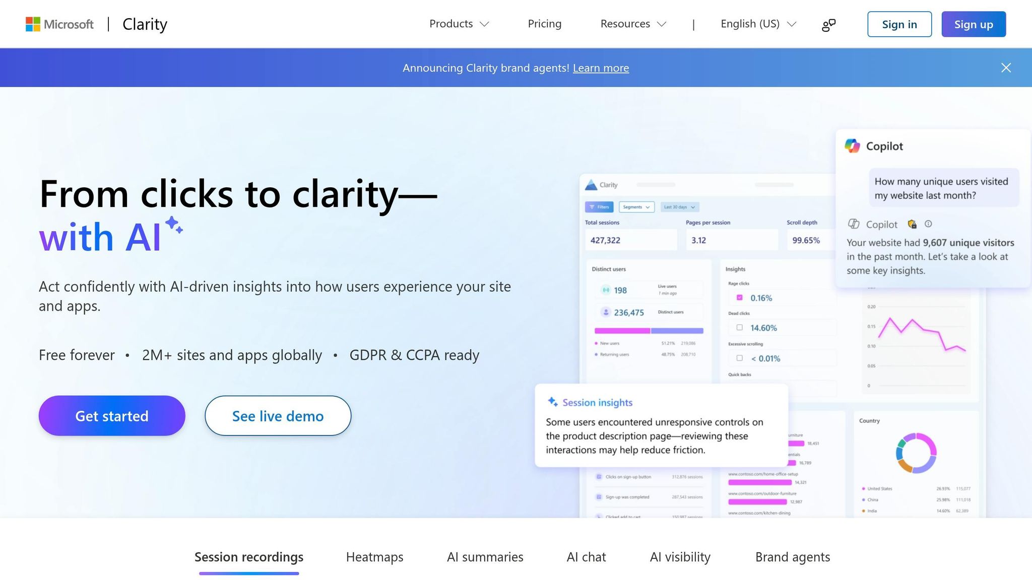
Microsoft Clarity brings together Click, Scroll, and Area heatmaps with AI session summaries. It’s a good fit if you want simple heatmaps plus automatic friction detection in the same tool.
Heatmap types
Clarity gives you three heatmap views: Click, Scroll, and Area. Area heatmaps show engagement across set parts of a page. Click heatmaps track where users click on desktop or tap on mobile, which helps you spot dead clicks and rage clicks fast. Scroll heatmaps show how far people make it down a page, so you can tell if key content is getting skipped.
That makes it easier to find broken CTAs, confusing links, and sections that users never even see.
AI insight features
Clarity Copilot sums up session recordings in plain language. It also flags rage clicks, dead clicks, and unusual scrolling.
Web/mobile coverage
Clarity works on websites and native mobile apps. It is also GDPR- and CCPA-ready.
3. Crazy Egg
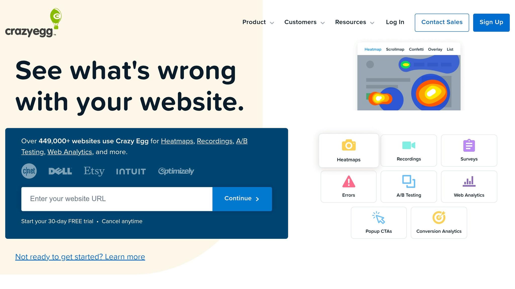
For teams that want to slice behavior by audience or traffic source, Crazy Egg gives you a different view. It combines segmented heatmaps with automated pattern detection, which helps teams sort through UX issues faster.
Heatmap types
Crazy Egg includes Confetti, Overlay, and Scrollmap reports. Confetti color-codes clicks by segment, such as source, search term, or device. Overlay shows click percentages by element. Scrollmap shows how far users get down a page before interest starts to fade.
That segmentation works hand in hand with automated pattern detection, so you’re not just seeing clicks - you’re seeing who clicked and how those groups behave.
AI insight features
Its Insights engine flags rage clicks, ignored elements, and other high-friction patterns, then summarizes them so teams can prioritize fixes faster.
Web/mobile coverage
Crazy Egg supports desktop, tablet, and mobile browsers. It also includes responsive view toggles, which makes it easier to compare interactions across screen sizes.
4. Smartlook

Smartlook is a good fit for teams that want heatmaps for both websites and native mobile apps.
If your product lives in the browser and on mobile, Smartlook gives you the same kind of behavior data across both. That’s the big draw here.
Heatmap types
Smartlook offers click, move, and scroll heatmaps for web and mobile. On desktop, move heatmaps show cursor paths. Scroll heatmaps show how far users make it before they drop off.
That makes Smartlook useful for reviewing live user behavior and for checking early design ideas before you go too far down the road.
AI insight features
Smartlook’s AI predictive attention heatmaps estimate where users will focus before usability testing. For UX designers, that can help check layout choices earlier.
Web/mobile coverage
Smartlook supports web and native mobile apps, including iOS and Android. Its heatmaps work across all of those surfaces.
Pricing fit
The free plan works for small sites. Paid tiers are a fit for startups and SMBs.
5. FullStory
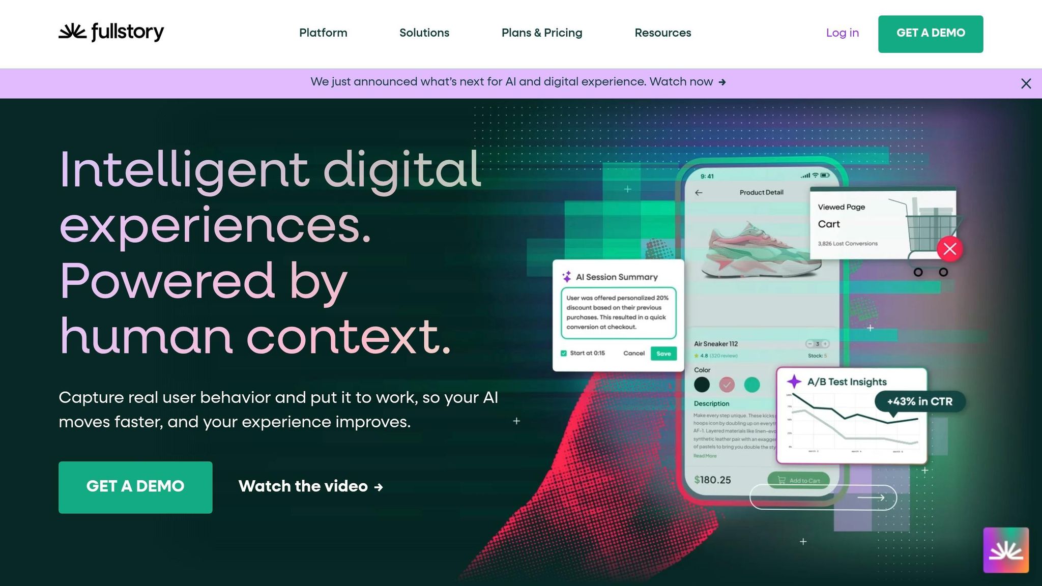
FullStory is built for teams that need more than raw heatmaps. It adds automated prioritization and a broader view of the user experience, with heatmaps tied to conversion and retention.
Heatmap types
FullStory's Engagement Heatmaps include click/tap, scroll, and movement maps. These are generated automatically for captured pages and screens.
AI insight features
FullStory automatically flags Rage Clicks, Dead Clicks, Error Clicks, and Thrashed Cursors. It also ranks issues with Top Opportunities based on estimated impact on conversion and retention. On top of that, natural-language search lets teams query behavior data without SQL.
That matters because raw session data can get messy fast. FullStory does some of the sorting for you, so teams can spend less time digging and more time fixing what may be hurting signups, sales, or retention.
Web/mobile coverage
FullStory covers web, mobile web, iOS, and Android in one platform. Mobile capture requires SDK integration, and Autoscreen groups screens into logical clusters.
Pricing fit
FullStory offers a Free Edition with limited sessions. Paid plans are volume-based, so it's smart to estimate your monthly session volume before you buy.
If you want similar behavior analysis but with a different workflow, the next tool takes a lighter-weight approach.
6. Mouseflow
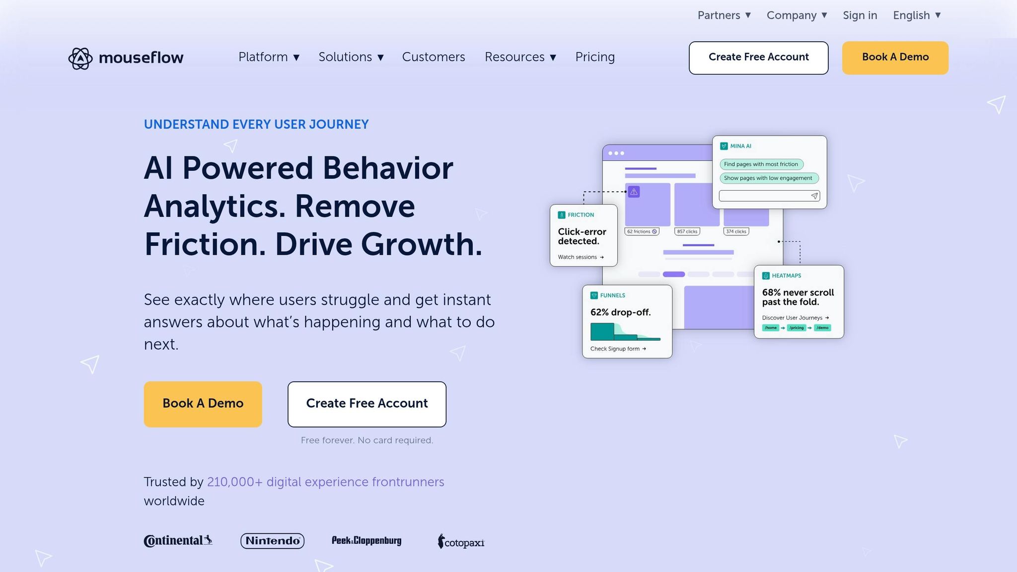
Mouseflow is a good fit for teams that want fast friction scoring and form-level insight across web experiences.
Heatmap types
Mouseflow includes several heatmap views, each aimed at a different part of user behavior.
- Click heatmaps show where people click, including clicks on elements that aren't interactive
- Scroll heatmaps show how far visitors make it down the page
- Attention heatmaps show where user focus tends to cluster
- Movement heatmaps track cursor paths across the page
- Geo heatmaps break activity down by location
- Live heatmaps show behavior as it happens
That mix gives teams a quick read on what users notice, where they get stuck, and what they ignore.
AI insight features
Mouseflow uses a Friction Score to rate each session and bring frustrating moments to the surface fast.
It also flags behavior tied to poor user experience, such as rage clicks, mouse-out events, rapid scrolling, and form fields that cause users to drop off. If you're trying to spot trouble without digging through every session by hand, that can save a lot of time.
Web/mobile coverage
Mouseflow is built mainly for web analytics. It covers desktop and mobile sites, responsive layouts, and SPAs.
7. Contentsquare
For enterprise teams, the big draw here is simple: Contentsquare connects UX friction to revenue. It links user behavior with conversion and revenue data, so teams can see where people get stuck and what that friction may be costing them.
Heatmap types
Contentsquare stands out for its Zone-Based Heatmaps. Instead of laying a heat overlay across the whole page, it splits the page into individual elements and shows how each one affects conversions and revenue. That makes it easier to decide what to fix first. It also makes the revenue signals easier to use.
AI insight features
CS Insights flags behavior anomalies, Impact Quantification estimates revenue impact, and Struggle Score brings friction signals to the surface, such as rage clicks, repeated refreshes, and back-and-forth navigation.
Web/mobile coverage
Contentsquare covers both web and native mobile apps through iOS and Android SDKs. That gives teams one view across web and native app experiences.
Pricing
Contentsquare uses custom pricing. There’s no public USD pricing listed, which keeps the product focused on large teams.
8. Attention Insight
For pre-launch validation, Attention Insight looks at visual attention before any live traffic shows up. It’s a pre-launch heatmap tool that predicts where people are most likely to focus on wireframes, mockups, and live pages.
Heatmap types
Attention Insight creates predictive heatmaps that show which parts of a design are most likely to draw attention. That makes it useful for checking visual hierarchy before launch. If you want to see whether the headline stands out or the CTA gets lost, this is the kind of check it’s built for.
AI insight features
It also includes Clarity Scoring, which measures how clear and easy to understand a design is, along with attention distribution, which shows how visual attention is spread across different elements on a screen.
Web/mobile coverage
It works with Figma, Adobe XD, and Sketch. You also get a Chrome extension plus JPG/PNG uploads for reviewing web and mobile designs. In plain English: it’s a fast option for design reviews when session data doesn’t exist yet.
9. Lucky Orange
After pre-launch prediction, this tool shifts the focus to live user behavior on changing interfaces. Lucky Orange is a strong fit for live products with menus, modals, and SPAs. That matters because static-page heatmaps can miss what happens after the page loads. Use it to spot interaction failures in interfaces that change on the fly.
Heatmap types
Lucky Orange offers Dynamic Heatmaps with Click, Move, Scroll, and Area maps. These maps work on dynamic UI elements like menus, pop-ups, drop-down menus, and single-page applications (SPAs). Click maps show clicks on dynamic elements, including nonclickable controls. Move maps show cursor paths and attention clusters. Scroll maps show how far down the page users make it.
AI insight features
The platform includes AI Session Summaries that turn user behavior into plain-language takeaways. It also shows Opportunity Scores, which rank friction points based on conversion impact. Pair that with Element Analytics, which gives detailed interaction data for specific buttons, menus, and forms, and it becomes much easier to see where users get stuck.
Web/mobile coverage
Lucky Orange supports web and mobile experiences, including SPAs and other dynamic pages.
AI Heatmap Tools Side-by-Side Comparison
Use this comparison to trim down your shortlist based on how your team works.
The biggest divide comes down to predictive analysis vs. session-based analysis.
| Comparison area | Example | What it helps with |
|---|---|---|
| Predictive attention analysis | Attention Insight | Predict attention before launch |
| Session-based behavior analysis | FullStory | Identifying friction from live sessions |
A simple way to think about it: predictive tools help before something goes live, while session-based tools show what people do after launch.
So if you're working on pages, flows, or designs that haven't shipped yet, predictive tools can help you spot likely attention patterns early. Once the experience is live, session-based tools can help you find friction from actual user sessions faster.
From there, line up those strengths with your team's traffic levels, platforms, and research goals.
How to Pick the Right Heatmap Tool for Your Workflow
Use the comparison above to cut the list down. This section turns those differences into practical workflow choices. The main split is simple: use predictive heatmaps before launch, and use live behavior data after launch.
Start with timing. If you're reviewing a page or flow before it goes live, use predictive tools during design review. If the product is already live, session-based tools are the better fit because they show friction in actual user behavior. Tools like FullStory can surface friction fast.
If your team works across mobile and web, put cross-platform tracking near the top of your list. Rage clicks and mistaps often point to touch targets that are too small.
Form and funnel work needs a different view. In that case, look for tools with field-level heatmaps and drop-off tracking. That makes it easier to see where users leave a flow and which fields slow them down.
For enterprise journeys, focus on journey mapping, privacy controls, and integrations. Figma export and browser-based access can speed up iteration. And if you're looking at script-based tools, make sure the setup matches your engineering capacity.
Use this quick filter to match the tool to the job.
| Workflow | Evidence Type Needed | What to Prioritize |
|---|---|---|
| Pre-launch design review | Visual attention forecasting | Predictive AI heatmaps |
| Conversion optimization | Live behavior data | Click maps |
| Mobile app analysis | Cross-platform recordings | Rage-click and mistap detection |
| Form & funnel diagnostics | Drop-off and field-level data | Funnel tracking, field heatmaps |
| Enterprise journey mapping | Journey mapping | Privacy, integrations, Figma export |
DeveloperUX Resources for Acting on AI UX Data
When a heatmap shows where people get stuck, the next step is figuring out what to fix first. That’s where these DeveloperUX resources come in.
The Master Course on UX explains how AI and predictive analytics shape interface choices. In plain terms, it helps you sort out whether friction comes from hierarchy, navigation, or overall flow.
DeveloperUX also has free tools that work well alongside heatmap analysis. The Usability Score Calculator measures task success, time on task, and error rate on a 0–100 scale. The User Journey Map Planner lays out friction across the full path, touchpoints, and emotions, so you can see why users drop off.
If you spot a red flag, use the table below to move to the next step without wasting time.
| Red Flag in Heatmap Data | Recommended DeveloperUX Resource |
|---|---|
| Users ignoring primary CTA buttons | Typography for Developers Course |
| High rage-click rates or looping navigation | Guide to Simplified Menu Structures |
| Drop-offs before key actions | UX Design Principles Checklist |
| Low engagement on large desktop screens | Responsive Design & Desktop Optimization Guide |
For hierarchy problems, start with the UX Design Principles Checklist.
Conclusion
After comparing the tools, the choice comes down to fit, timing, and cost.
Use predictive tools before launch. Use behavioral tools after launch.
Start with a free plan, then pay only if the tool earns its place in your process. Test first. Commit later.
The point isn't to collect more data for the sake of it. The point is to make clearer design decisions. Pick the tool that fits your workflow, then use what it tells you.
FAQs
When should I use predictive heatmaps instead of session-based heatmaps?
Use predictive heatmaps early in the design process to estimate where people will look and to check layout choices before you run live usability tests.
After launch, switch to session-based heatmaps to study actual user behavior, including clicks, movement, and navigation paths. Predictive heatmaps can flag possible friction in prototypes, while session-based heatmaps give you hard data to fine-tune the interface and see whether users scan the page the way you expected.
Which heatmap tool is best for mobile apps and websites together?
Maze is a strong pick for teams that want one tool for both mobile apps and websites. It brings together heatmaps, task analysis, and automated reporting in one place.
It also connects with popular design tools, which makes it easier to check user interaction patterns and click behavior across platforms. That can help teams create a more consistent design experience.
How do rage clicks and dead clicks help me find UX issues faster?
Rage clicks usually show that people are getting frustrated. In most cases, that happens because the UI is confusing or a control is broken or unclear. Dead clicks usually mean someone tried to interact with something that looks clickable, but nothing happens.
When you pair these signals with heatmaps, session recordings, and other behavior data, you can spot high-friction areas fast and decide which UX issues to fix first.