
How ARIA Impacts Assistive Tech Interoperability
Valid ARIA doesn’t ensure consistent screen reader behavior — use native HTML, align roles/states, and test real browser+AT pairings.


Valid ARIA does not guarantee that assistive tech will work the same way across browsers. I’d sum it up like this: ARIA can label a widget, but it cannot make the widget behave right. And once a browser maps that ARIA into an accessibility API, screen readers may announce different things in different setups.
Here’s the short version:
- I should use native HTML first because browsers handle semantics and keyboard support better there.
- If I build a custom widget, I need to keep role, state, and keyboard behavior in sync.
- I can’t stop at automated checks because tools often catch only about 40% of accessibility barriers.
- I need to test actual browser + screen reader pairings like Chrome + NVDA, Safari + VoiceOver, and Firefox + JAWS.
- I should treat focus handling, live region announcements, selected states, and expanded/collapsed states as high-risk areas.
- For release decisions, I need a shared support matrix with expected vs. observed behavior.
A few patterns tend to fail most often:
- Dialogs: focus may not move in, stay trapped, or return to the trigger
- Comboboxes: expanded state may not be announced the same way
- Tabs: selected state may be read unevenly
- Live regions: updates may arrive late or not at all
- Custom menus: keyboard movement and item announcements may break
| Area | What I expect | What can go wrong |
|---|---|---|
| Native HTML | More stable browser mapping | Fewer cross-pairing issues |
| Custom ARIA widgets | Correct role + keyboard support + state updates | Parts drift out of sync |
| Automated testing | Fast first pass | Misses many issues |
| Manual AT testing | What users will hear and do | Takes time, but finds the gaps |
Bottom line: if I want fewer accessibility bugs, I should use less ARIA, lean on native elements, and test the combinations my users depend on before release.
The problem: inconsistent behavior across browser and assistive technology pairings
This mapping gap often leads to uneven behavior across browser and assistive technology pairings. In plain English, the same ARIA pattern may work one way in one setup and another way somewhere else.
Common symptoms users and teams notice
A lot of these gaps stay out of sight until teams test with actual assistive tech. That’s when the cracks start to show: missed announcements, focus not returning after dialogs close, and controls that still fail keyboard use even when the ARIA looks valid.
Automated tools can catch part of this problem. But they don’t catch all of it, which is why real assistive tech testing is still required.
Where ARIA issues show up most often
Custom widgets are usually the riskiest area. Menus, tabs, comboboxes, dialogs, tree views, and live regions all depend on exact role and state support. And that support can shift from one browser and assistive technology pairing to another.
Modal dialogs are another frequent pain point. A custom dialog may fail to keep focus inside the modal, or it may not return focus to the trigger after closing. The result can also change depending on whether the browser supports native <dialog> or has to fall back to custom scripts.
The biggest problems tend to hit critical user flows, such as:
- e-commerce checkouts
- search interfaces
- multi-step forms
That’s where small ARIA gaps can turn into major user friction.
Expected vs. observed behavior: a side-by-side comparison
Here’s what this looks like in practice:
| ARIA pattern | Expected behavior | Observed result |
|---|---|---|
role="combobox" with aria-expanded |
Announces expanded or collapsed state when toggled | State change may not be announced consistently |
role="dialog" with focus management |
Focus enters the dialog and returns to the trigger on close | Focus may not stay trapped or return reliably |
aria-live="polite" status message |
Announces a status update after current speech finishes | Update may be delayed or missed |
role="tab" with aria-selected |
Announces which tab is selected | Selection state may be conveyed inconsistently |
| Custom menu or dropdown navigation | Keyboard users can move through items predictably | Navigation and item announcements may break across pairings |
sbb-itb-124fdbf
The cause: how browser mappings and ARIA patterns create interoperability gaps
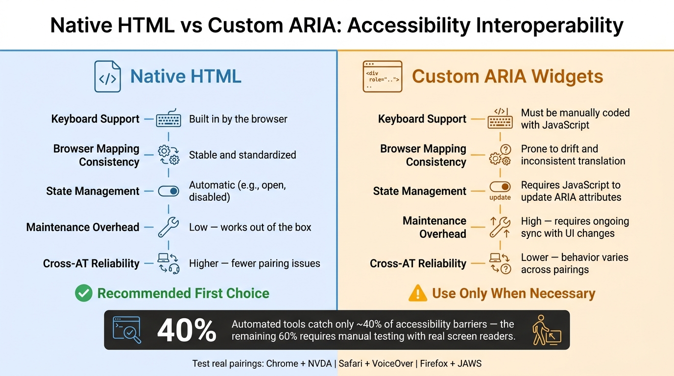
Native HTML vs Custom ARIA: Accessibility Interoperability at a Glance
How browsers translate ARIA into accessibility API calls
Those uneven announcements and focus failures often start in the browser mapping layer. Browsers turn ARIA into calls to platform accessibility APIs, and screen readers read that output - not your raw markup.
That’s where things begin to go sideways. If one browser maps an ARIA role or state in a different or partial way compared with another browser, assistive tech can get different signals. So yes, your ARIA can be perfectly valid and still lead to broken output. The gap sits in the translation layer, not in the markup itself.
ARIA features that frequently drift out of sync
aria-expanded and aria-selected tend to break down when visual changes and ARIA state updates stop matching. Something may look expanded or selected on screen, while the screen reader still announces the old state. That leaves people working from stale information.
aria-controls and aria-describedby bring a different issue. These attributes connect one element to another, but not every browser and assistive tech pairing follows that connection or announces the linked content.
Live regions (aria-live) are also known for inconsistency. Timing and reliability can vary across browser and screen reader pairings, especially when JavaScript-driven UI updates don’t stay in step with the related ARIA state changes. When timing drifts, people hear stale feedback - or nothing at all.
And when keyboard behavior doesn’t back up what an ARIA role is signaling, users get a promise the component can’t keep.
Why native HTML usually interoperates better than custom ARIA
Native elements like <button>, <input>, <details>, and <dialog> have a big edge: their semantics and keyboard behavior are built into the browser. Their accessibility mappings are standardized, so they tend to behave more consistently across browser-and-AT pairings.
A custom component built from a <div> with role="button" starts from a very different place. You need explicit ARIA roles, JavaScript keyboard handling, and state management just to get to the same baseline.
You can see that gap pretty clearly when native and custom widgets are compared side by side.
| Feature | Native HTML | Custom ARIA |
|---|---|---|
| Keyboard support | Built in by the browser | Must be manually coded with JavaScript |
| Browser mapping consistency | Stable and standardized | More prone to drift and inconsistent translation |
| State management | Automatic, such as open or disabled |
Requires JavaScript to update ARIA attributes |
| Maintenance overhead | Low - works out of the box | High - requires ongoing sync with UI changes |
Custom components do give teams more styling freedom, and that’s a big reason people use them. But that freedom comes with a real interoperability cost.
The solution: use less ARIA, pick correct patterns, and test real combinations
Start with native HTML before adding ARIA
A lot of accessibility issues start in the browser-to-API translation layer. So the fix is often simpler than people expect: start with native HTML.
Native HTML already comes with the semantics, keyboard support, and accessibility mappings most components need. If a native element does the job, use it. Don’t add ARIA just because you can. In practice, less ARIA used with care often works better than ARIA added everywhere.
Align roles, states, and keyboard behavior with the intended widget
If you do need a custom component, the role has to match how the component acts, not just how it looks.
A button-like control needs role="button" and support for both Enter and Space. A modal needs role="dialog", focus moved into it when it opens, focus kept inside while it’s active, and focus returned to the trigger when it closes.
Adding a role without the matching keyboard behavior is worse than leaving the role out. It sets the wrong expectation for people using assistive tech. ARIA states also need to stay in sync with what the widget is actually doing.
Use ARIA-AT and APG support data to guide implementation
Once the pattern is set up the right way, check it against the browser and screen reader pairings your users depend on.
The ARIA Authoring Practices Guide (APG) lays out the expected keyboard behavior and ARIA patterns for common widgets. ARIA-AT adds another layer: it shows test results for how those patterns hold up across browser and assistive tech combinations, including JAWS, NVDA, and VoiceOver.
Tools like axe DevTools and WAVE are helpful for spotting obvious problems. But they usually catch only around 40% of total accessibility barriers. The other 60% has to be found through manual testing with real screen readers on real devices. For critical flows like payment processing and multi-step forms, manual testing is not optional.
A practical testing workflow and key takeaways
How to run an interoperability test pass
If you want to check interoperability, you have to test actual browser and assistive tech pairings. There’s no shortcut around that.
Start by writing down the expected name, role, and state before you test. Then focus on the browser and screen reader combinations your users depend on most. That usually means pairings like Chrome with NVDA, Safari with VoiceOver, and Firefox with JAWS.
For each pairing, run the tasks that matter most: open, use, close, and tab away. As you go, record what the screen reader actually announces and compare it with what you expected. That side-by-side check is where mismatches show up.
For modals, pay close attention to the three focus checks that tend to break first:
- Focus moves into the modal when it opens
- Focus stays inside while the modal is active
- Focus returns to the trigger when the modal closes
After you fix an issue, test that same pairing again. Otherwise, it’s easy to think the problem is gone when you’ve only shifted it somewhere else.
What to include in a support matrix
Put every result into one shared matrix so the team can compare failures across pairings without digging through scattered notes. It also gives you a clear way to decide whether a component is ready to ship.
Include the state you tested for each result:
- Default
- Hover
- Focus
- Active
- Disabled
- Loading
- Error
- Success
| Pattern Name | Browser / AT | Expected Behavior | Observed Result | Severity | Release Status |
|---|---|---|---|---|---|
| Modal Dialog | Chrome / NVDA | Focus moves into the modal; dialog announced | Focus remained on trigger button | Critical | Blocked |
| Tab Component | Safari / VoiceOver | Arrow keys switch tabs; selected state announced | Tabs switch but state not announced | High | In Progress |
| Accordion | Firefox / JAWS | Space/Enter toggles state; expanded/collapsed announced | Works as expected | N/A | Ready |
| Custom Select | Edge / Narrator | Alt+Down opens list; focus moves to first option | List opens but focus lost to page footer | Critical | Blocked |
The Severity and Release Status columns are what make this table useful during release review. If a critical flow is blocked, the component shouldn’t ship.
Conclusion: what teams should carry forward
Teams should treat interoperability as a release gate, not a box to tick at the end. ARIA can improve semantics, but it doesn’t promise the same behavior across assistive technologies. Native HTML usually cuts down on variation because the browser handles the semantics and behavior for you. When you do need a custom component, keep the roles, keyboard behavior, and ARIA states aligned.
Automated tools are a solid first pass, but they catch only around 40% of total accessibility barriers. The rest comes from manual testing with actual screen readers. A shared support matrix helps turn that work into a process the team can repeat, instead of a one-off audit.
FAQs
Why doesn’t valid ARIA guarantee consistent screen reader behavior?
Valid ARIA is a good start. But it doesn't promise the same screen reader experience everywhere.
Here's why: browsers, operating systems, and assistive tech don't all handle ARIA the same way. One setup may announce an attribute just as you expect. Another may skip it, change the wording, or handle it in a way that feels off to the user.
That gap matters. Code that seems fine in one environment can act very differently in another.
Automated tools have limits too. They can catch only 20% to 40% of accessibility barriers, which means they miss a lot of what people run into in practice. So if you want to know what the experience is actually like, you still need manual testing.
That means testing on real devices, with different screen readers, and checking how the interface behaves from a user's point of view.
When should I use native HTML instead of ARIA?
Always prioritize native HTML over ARIA. If HTML already gives you the meaning and behavior you need, use that instead of adding ARIA roles, states, or properties.
Native controls come with built-in keyboard support and the browser behavior people expect. That makes them work better with assistive tech, too. Use ARIA only when native HTML falls short, such as with dynamic UI parts that don’t have a matching HTML pattern.
Put simply: no ARIA is better than bad ARIA.
How do I test browser and screen reader combinations?
Prioritize manual testing on real devices with standard setups. Why? Because automated tools catch only about 40% of accessibility issues.
For web testing, check your experience in Chrome, Firefox, Safari, and Edge. For mobile, test with VoiceOver (iOS) and TalkBack (Android).
A few simple habits make this work much better:
- Reset devices to their default settings
- Use dedicated test accounts
- Record test sessions so you can catch navigation or announcement inconsistencies
That last step matters more than it seems. A recorded session can help you spot small issues that are easy to miss in the moment, especially when screen readers behave a little differently from one browser or device to another.