NLP in UX: Cognitive Accessibility Tips
UX guidelines for NLP interfaces: use plain language, one-step prompts, flexible input, clear errors, and assistive-tech support.

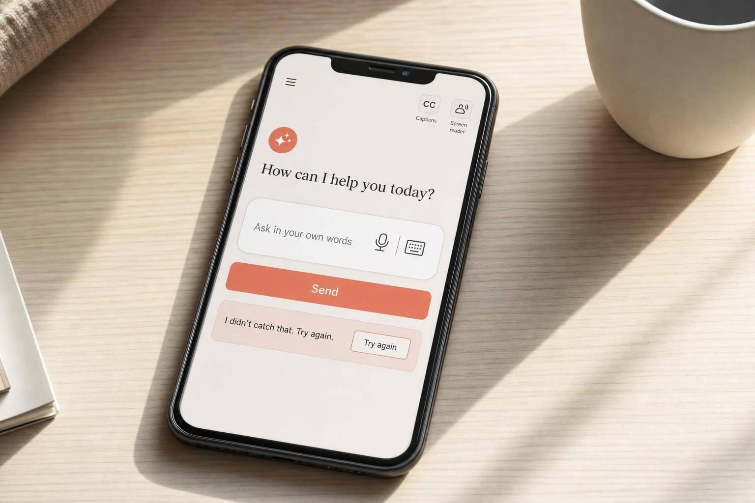
If people have to guess what to type, remember too many steps, or fix vague errors, NLP adds work instead of removing it. I’d keep the focus on five things: plain language, one step at a time, flexible input, clear error recovery, and solid assistive-tech support.
Here’s the short version:
- Around 13.9% of U.S. adults live with a cognitive disability
- NLP UX should lower mental effort, not add to it
- Prompts work better when they ask for one thing at a time
- Replies should use short sentences, common words, and scannable structure
- Errors should say what went wrong and what to do next
- Users should be able to reply by text, speech, or buttons
- High-risk actions should include review, confirmation, and undo
- Chat and voice flows should work with keyboard, screen readers, and live regions
- Testing should look at confusion, pauses, rewording, and drop-off, not just task completion
In other words: I’d design NLP flows so people can read them fast, follow them without holding too much in memory, and recover without stress. That means steady labels, visible progress, input help, examples near fields, and replies that do not wander.
A simple way to check your UX:
- Can the user understand the prompt right away?
- Can the user see the next step without guessing?
- Can the user fix mistakes without starting over?
- Can the user use the flow with a keyboard or screen reader?
That’s the core of the article: make NLP easier to read, easier to predict, and easier to recover from.
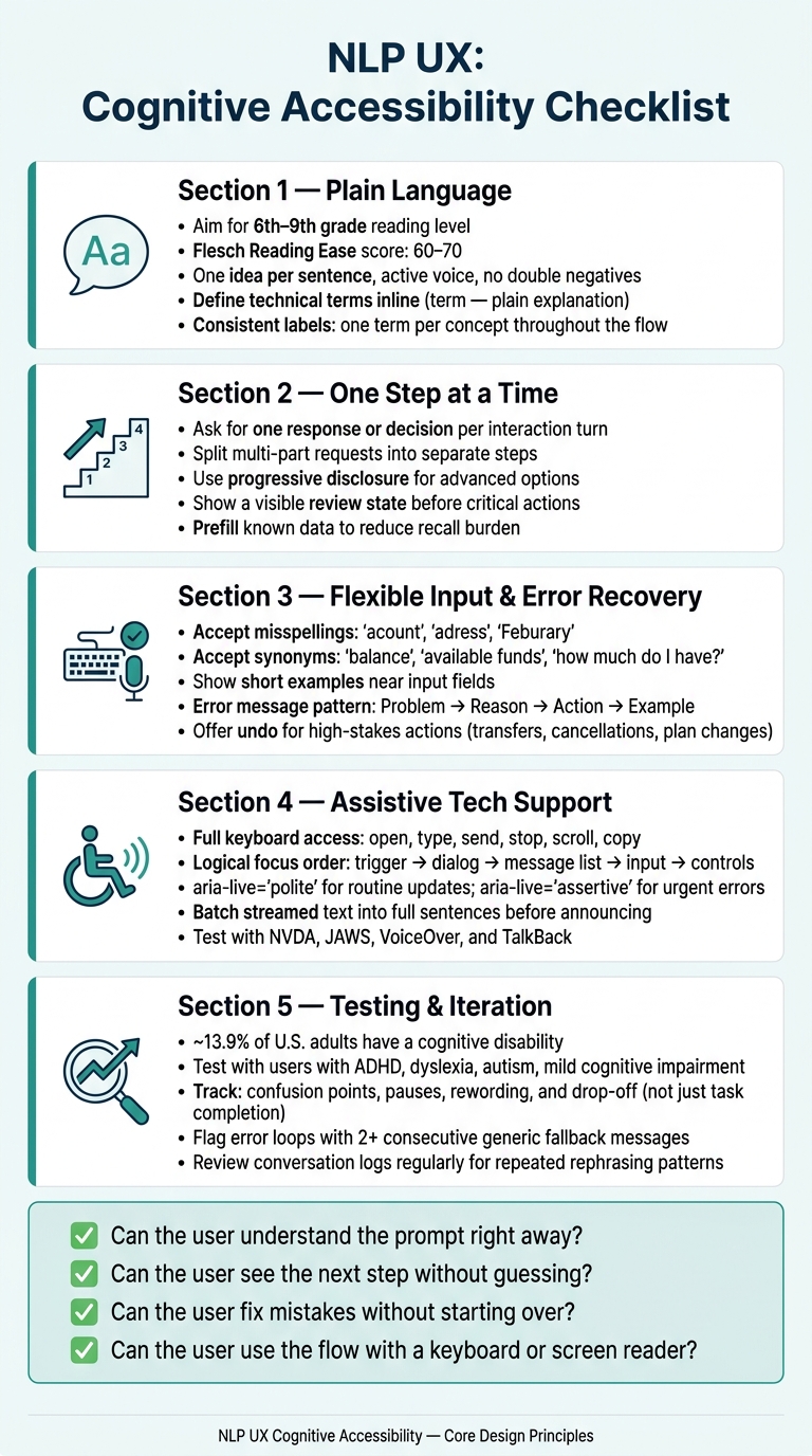
NLP UX Cognitive Accessibility Checklist
Core Checklist: Design Rules Before You Build
These rules keep NLP flows readable, predictable, and easy to recover from. If the structure breaks here, better microcopy won't save it later. Set up clarity, predictability, and recovery before launch.
Write Clear Language in Prompts, Labels, and Replies
Use common words. If you need a technical term, define it right there or add a tooltip. Keep sentences short: one idea at a time, no nested clauses, no double negatives, and stick to active voice.
Aim for an 8th- to 9th-grade reading level for general content, run a readability check before shipping, and test the copy with real users.
This gets even more important when each step asks for only one thing.
Keep Interactions Focused and Predictable
Ask for one response or one decision per step. Split multi-part requests into separate turns. If a chatbot asks for the departure city, arrival time, and nonstop preference in the same message, users have to hold too much in their heads at once.
Keep navigation, button labels, and response formats consistent across the flow. WCAG's Predictable guidelines spell this out clearly: focus or simple data entry should not trigger a context change. If the system auto-completes or makes a suggestion, tell the user first, show what changed, and make undo easy.
Clear interaction design also means giving people more than one way to answer.
Support Text, Speech, and Visual Reinforcement
When people can move between text, speech, and visual cues, they have less to keep in working memory. Support typed input, speech input, and quick-reply buttons so users have more than one way to respond.
Pair text with simple icons only when the icons make the meaning clearer.
Show on-screen transcripts for speech flows so users can read while they listen.
Let users choose a mode, then keep that mode consistent.
Checklist for NLP Content and Microcopy
Once the flow is predictable, tighten the words users read and hear.
Plain Language, Reading Level, and Scannable Structure
Use plain, scannable language in prompts, labels, and replies. For system-generated text, aim for a 6th- to 8th-grade reading level and check it with a readability tool like Flesch-Kincaid before release. A Flesch Reading Ease score of 60–70 helps cut working-memory strain. Start with the action or outcome, then add context only if users need it.
For longer NLP responses, make the structure do some of the work. Put a short summary first. Then add a bulleted list of steps or key points. If there’s extra information, place it in an expandable More details section. The goal isn’t just shorter copy. It’s copy that people can scan without getting lost.
If your team uses automated simplification, have a UX writer check the result. Shorter text can still drift away from the original meaning, and that’s where things start to go sideways.
Terminology, Numbers, and US Formatting
Use familiar terms first. If you have to use a term from finance, healthcare, or another specialized field, define it inline with this pattern: term - plain explanation. Write abbreviations in full the first time, like Annual Percentage Rate (APR), then use APR after that.
Stick to one label for one concept across the whole flow. If the same thing is called account, profile, and workspace in different places, users have to stop and translate. That adds recall strain, especially for people with memory or attention challenges.
Use en-US formatting all the way through:
- September 4, 2026 in readable text and 09/04/2026 in compact fields
- $1,299.00 for prices
- 1,000.50 for general numbers
- behavior, personalization, color, organization for U.S. spelling
- imperial units and °F when the product context calls for them
This kind of consistency matters more than it may seem. When dates, prices, and numbers keep changing format, users have to parse them again each time. Bake these rules into prompt templates so the output stays steady.
Error Messages That Explain What Happened and What to Do Next
When users make mistakes, the message should help them recover, not make them read more.
Each error message needs to answer two questions: what went wrong and what should the user do now. Generic errors do neither. A stronger version looks like this:
We couldn't use this date. Enter a future date, such as September 4, 2026.
That message is specific, calm, and gives one clear next step with a local example.
Keep the tone focused on the system, not the user. This format doesn't work here points to the problem without sounding like blame. Skip ALL CAPS, long paragraphs, and piles of errors shown at the same time. Place the message as close as possible to the field or step that caused the issue.
When numbers are involved, be exact. Enter a number between 1 and 24 is much clearer than Invalid quantity. For NLP systems, use one fixed pattern: problem, reason, action, example.
sbb-itb-124fdbf
Checklist for Interaction Flow and Accessibility Support
Microcopy matters. But it doesn't do the whole job. If a flow has too many steps, moves too fast, or breaks keyboard access, people may still get stuck. Once the wording is clear, the interaction itself needs to feel easy to finish.
Step Size, Timing Control, and Memory Support
Keep each step small and self-contained. Ask for one thing at a time. For example, confirm a shipping address before showing delivery options, not both at once. Use progressive disclosure to show advanced filters or secondary options only after the user finishes the first step.
Before any critical action, show a visible review state. Prefill known data when you can, make reused fields easy to spot, and keep voice or chat menus to just a few choices per step. A simple "repeat" or "main menu" option can save a lot of friction.
Don't force people to react fast. Avoid auto-scrolling, expiring sessions, and status messages that vanish on their own. Make time limits adjustable to at least 10× the default, or let users extend them with one simple action. Status messages such as "Assistant is responding" should stay visible until the user dismisses them.
Flexible Input and Recovery from Imperfect Language
People don't type in perfect sentences, and they shouldn't have to. Treat messy input as normal. Accept common misspellings like "acount", "adress", and "Feburary", along with synonyms such as "balance", "available funds", and "how much do I have?" Partial phrases like "change plan" or "update address" should work too.
Short examples near the text field help set the tone. Something like Try: "Show my upcoming bills" or "Change my shipping address." gives users a clear starting point. And when the system can't interpret an input, the reply should be specific and low-blame:
"I didn't understand that. Try 'shorten this paragraph' or 'rewrite for 6th-grade reading level.'"
If the input is ambiguous, ask one clarifying question. Then offer quick-reply buttons so users don't have to type the whole thing again. Keep the original input visible in the UI so they can edit it instead of starting from scratch. For high-stakes actions like transfers, cancellations, and plan changes, add a confirmation step - "Confirm transfer of $250.00 from Checking to Savings" - plus an undo option. That extra pause can lower stress and prevent mistakes.
Keyboard, Screen Reader, and Live Region Behavior
Cognitive access also depends on how the interface takes input and announces what changed. Every conversational UI action should work by keyboard: open, type, send, stop, scroll, and copy. Focus order needs to follow a logical, visible path - trigger → chat dialog → message list → input → controls like "Send" and "Stop." Users should be able to see focus at every step.
For screen readers, mark the chat container with the right landmarks and roles. Give each interactive element a clear accessible name, such as aria-label on icon-only buttons like "Send" or "Attach file." Structure messages as a list so they are announced in order. Test with NVDA, JAWS, VoiceOver, and TalkBack to make sure behavior stays consistent across tools.
Live region setup matters more than it may seem at first glance. Use separate live regions for status updates and new content. Set aria-live="polite" for routine updates, and use aria-live="assertive" only for urgent errors. Set aria-relevant="additions" so screen readers announce only new content, not the full response every time it changes.
If your interface streams text, don't send partial fragments into the live region. Batch updates until a full sentence is ready. Hearing half-finished sentences again and again can overwhelm screen reader users. It's also smart to let users turn off auto-announcements and give them a keyboard shortcut to re-read the last complete response when they choose.
Testing, Iteration, and Closing Checklist
Test Against Cognitive Accessibility Criteria, Not Just Task Completion
Once the flow is built, test more than whether someone eventually finishes the task. The bigger issue is whether they can understand what’s happening and recover on their own.
A task that gets completed after several confused attempts is still a bad experience. Cognitive accessibility testing looks at different signals: what confused users, where they paused, and where they misread the interface.
Review each NLP flow against three core ideas: clarity, predictability, and recovery. Check whether users can restate the prompt, spot the next action fast, move forward without depending on memory from the previous screen, and recover from mistakes without having to start over.
W3C guidance recommends testing with people who have cognitive and learning disabilities, including ADHD, dyslexia, autism, and mild cognitive impairment, as part of the core process. Keep sessions shorter. Use plain-language tasks. Offer remote or in-person formats. And pay participants fairly through accessible methods such as prepaid cards, which removes one more barrier to taking part.
Use Analytics and Content Review to Improve Prompts Over Time
Then turn to usage data to see where the flow still falls apart.
After launch, conversation logs become one of your main testing tools. Look for repeated rephrasing, where users ask the same question in several ways within a short window. Track flows that stop after a complex prompt or a dense response. Flag error loops where the system returns generic fallback messages two or more times in a row.
Those patterns point to the prompts, responses, or recovery steps that need work. In plain terms, they show which examples, error messages, or dense replies are causing people to reread, hesitate, or give up.
A regular review helps. UX writers, product managers, and accessibility specialists can look at the top confusion patterns together and stay close to what users are dealing with. For each trouble spot, review the exact copy, make specific edits, and then watch whether error rates and abandonment drop after the change. Document each cycle - the change, the reason, and the result. That record helps teams learn over time and cuts down on regressions when new features ship.
Conclusion: The Checks That Matter Most
Use what you learn to keep refining prompts, flow, and recovery.
Start with the basics that matter most:
- Plain language
- Predictable steps
- Tolerant input
- Clear recovery
- Assistive-tech support
Cognitive accessibility should not be treated like a final audit. It works best when it is built into NLP features from the first draft of a prompt.
FAQs
How do I prioritize NLP accessibility fixes first?
Start early. Build accessibility into the design process from day one instead of treating it like a last-minute fix.
Put critical user flows first. Use confidence-based language detection, and don’t rely on hard yes-or-no triggers. If the system isn’t sure, say so. Then give people a clear way forward, like a language switcher or a handoff to a human.
After that, test the work by hand on real devices. Pay close attention to screen readers and voice tools, because that’s where small issues often show up fast. Make sure languages are declared correctly, keep semantic microcopy consistent, bring in users with disabilities, and review each locale on its own terms.
What should I test with users beyond task completion?
Go beyond simple task completion. Test for cognitive accessibility in everyday conditions, not just in a controlled setup.
That means checking how well the experience works with:
- Screen readers
- Voice recognition
- Keyboard navigation
- Unclear or incomplete inputs, including how the system shows confidence scores and when it hands things off through escalation paths
It also helps to review readability and clarity in tougher viewing conditions, like screen glare or low or uneven lighting.
And the testing group should reflect the people who will use the product: users with disabilities and people from different cultural groups.
When should NLP ask a clarifying question?
NLP should ask a clarifying question when the system isn’t sure how to read the user’s input. That matters most when confidence scores drop below a set threshold. Instead of guessing and sending the user down the wrong path, the system can pause and ask for a little more detail.
Clarifying questions also help with recovery. Along with human handoffs and fallback language pipelines, they keep the experience on track, protect trust, and give users a better chance of getting where they need to go.