
How Real-Time Feedback Improves UX Design
Collect short in-app feedback at natural pauses, tag responses with behavior data, and prioritize fixes by frequency and severity.

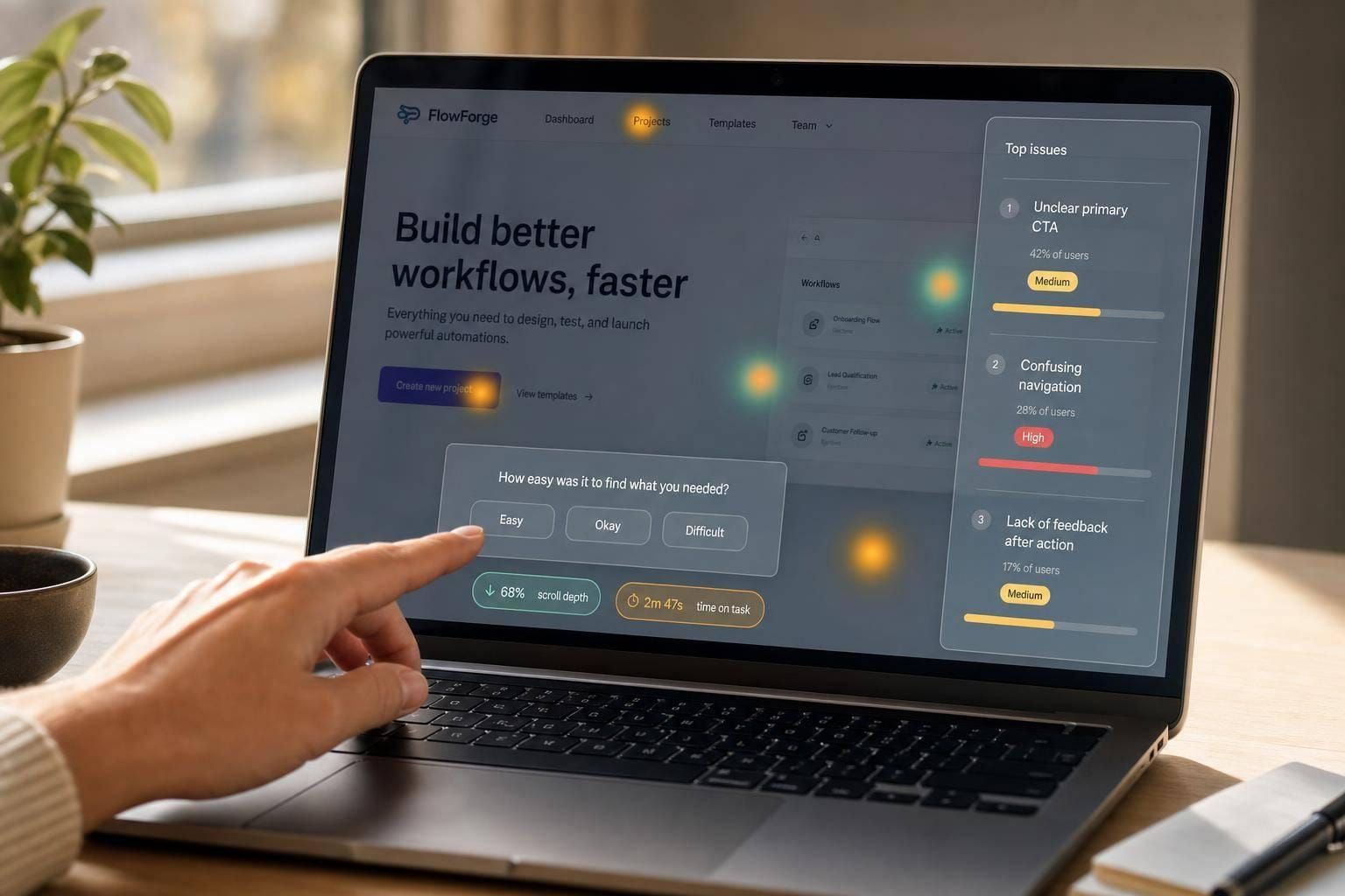
The short answer: real-time feedback helps me fix UX problems while the user still remembers what went wrong. Instead of waiting days for survey results, I can ask right after onboarding, checkout, support, or cancellation and tie each response to a clear owner and metric.
Here’s the core idea in plain English:
- Ask at the right moment: after a task or at a pause point, not during a high-focus step
- Keep prompts short: usually 1 question or 2–3 questions max
- Limit prompt frequency: no more than once per session and about every 7–14 days per user
- Tag each response with context: screen, flow, device, session, and timestamp
- Prioritize by pattern: look at frequency, severity, and user behavior data together
- Check results after changes: use metrics like completion rate, drop-off, error rate, or CSAT
In other words: I don’t just collect feedback. I build a loop for it. I decide what to ask, who handles it, what metric should move, and how I’ll check whether the fix worked.
A few numbers stand out. Short in-app surveys can get 70–80% higher response rates than long forms. And simple frequency rules - like one survey every 7–14 days - help cut survey fatigue.
What this article shows is simple: real-time feedback works best when I keep it short, place it in context, connect it to behavior data, and act on it with a clear process.
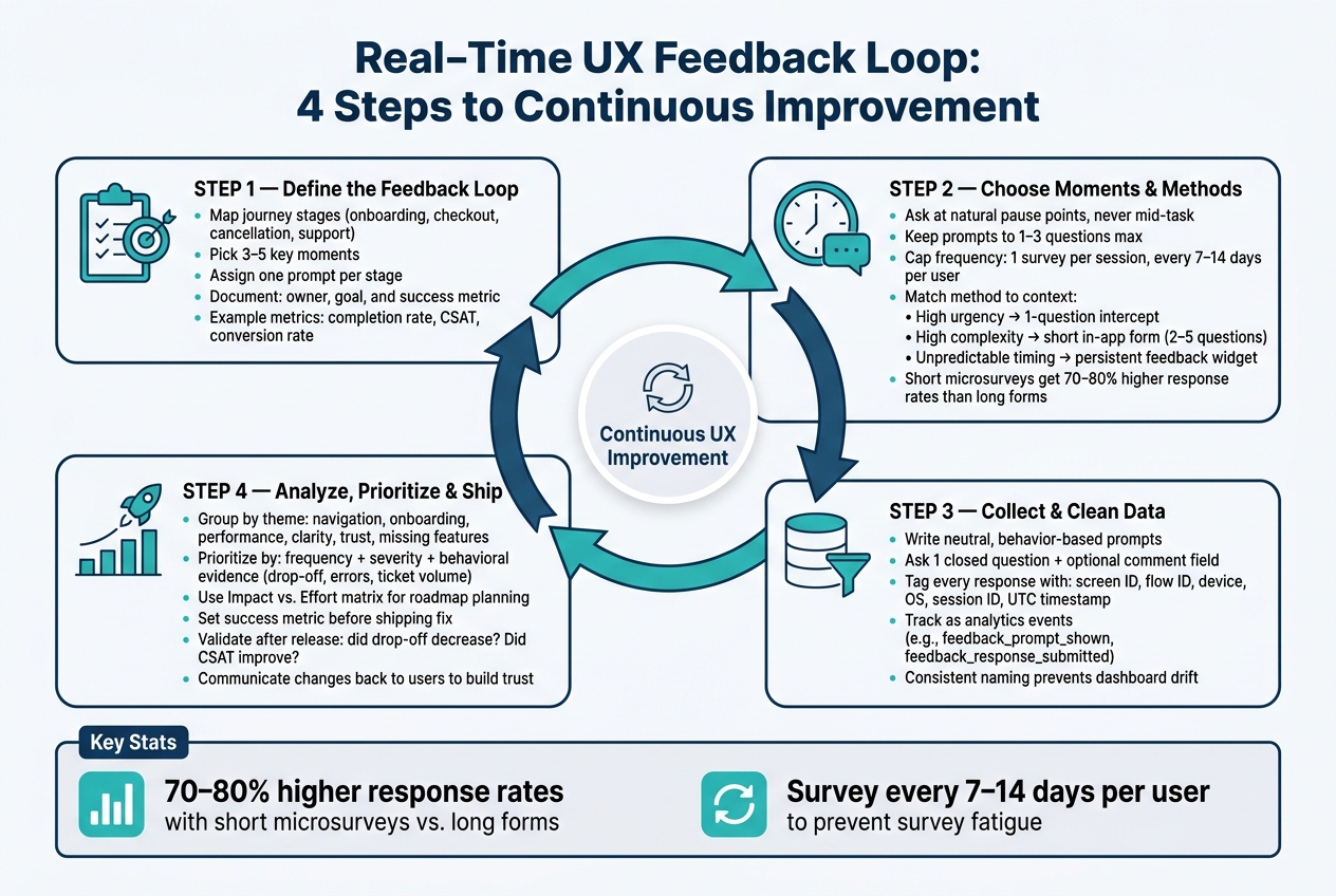
Real-Time UX Feedback Loop: 4 Steps to Continuous Improvement
Step 1: Define the feedback loop before you start collecting
A lot of teams skip this part. They add a feedback widget, read a handful of responses, and then... nothing. The issue usually isn't lack of feedback. It's lack of ownership and follow-through.
So set up the loop first. Decide who owns each response, what happens next, and how you'll measure success. In plain English: map the handoff from prompt to owner to metric before you collect anything.
That’s what turns user feedback into actual design changes. You gather input, make a change, measure what happened, and do it again. Without that loop, feedback just piles up in a backlog that nobody touches. Once the loop is in place, you can tie it to the moments that matter most.
Before you collect even one response, document these four things for each feedback point:
- the journey stage you’re targeting
- the signal you want to capture
- who owns the response
- the metric you’ll use to judge whether the change worked
Map feedback to key moments in the user journey
Not every screen needs a prompt. Focus on the moments where friction hurts most: onboarding, account setup, exploration, checkout, feature completion, support resolution, and cancellation.
Start small. Pick 3–5 moments and assign one feedback point to each. For every stage, define the main user goal, the key tasks, and the spots where things are most likely to go wrong.
It helps to think of this as a sequence, not a pile of prompts. Onboarding first, then checkout, then cancellation. Each prompt should add context to what the last one showed you.
Use one prompt per stage. For example:
- a post-onboarding micro-survey after first login
- a prompt during checkout if someone pauses on the payment step
- a one-click reason selector at cancellation
Set one clear goal for each feedback point
Every prompt needs a job. Feedback is a tool, not the finish line. The finish line is something like lower abandonment or better task completion.
When each feedback point is tied to a measurable outcome, a lot gets easier. You know what to ask, who should own it, and how to tell if the change helped.
Document each feedback point in one line:
| Journey Stage | Prompt / Response Type | Owner | Goal | Success Metric |
|---|---|---|---|---|
| Onboarding | 2-question micro-survey: ease score plus open text | UX Lead | Reduce first-session drop-off | Onboarding completion rate (%) |
| Checkout | Single CSAT plus optional comment | Checkout PM | Increase conversion | Conversion rate (%), CSAT average |
| Cancellation | One-click reason plus open text | Product Manager | Identify UX-related churn | % citing usability issues |
| Support resolution | Was this answer helpful? yes/no | Support Lead | Reduce repeat tickets | First contact resolution rate (%), help center success rate |
This setup keeps the loop tight. It also makes weak feedback points easy to spot. If you can’t name the goal or the metric, that prompt probably shouldn’t be live yet.
sbb-itb-124fdbf
Step 2: Choose the right moments and methods for in-context feedback
Once your loop and goals are set, the next call is when and how to ask. Get the timing right, and the prompt feels like part of the job. Get it wrong, and people skip it without a second thought.
The main rule is simple: ask at natural pause points, not in the middle of critical work. Show prompts after a task is done, after someone uses a feature for the first time, or after a support exchange ends. Stay out of login, checkout, forms, and any flow where an interruption adds friction or risk.
Use short prompts during or right after tasks
Timing matters. Brevity matters too. In-app microsurveys limited to 2–3 questions can lead to 70–80% higher response rates than longer forms.
Each method fits a different job. The best choice depends on the metric you set in Step 1.
| Method | Best Use | Timing | User Effort | Interruption Level |
|---|---|---|---|---|
| In-product prompt | Quick sentiment on a specific feature or task | During or immediately after use | Very low (1–2 taps) | Low–Medium |
| Post-task microsurvey | Task satisfaction after key flows | Immediately after task completion | Very low | Low |
| Feedback widget | Always-on channel for ad-hoc comments or bug reports | User-initiated | Low–Medium | Very low |
| Triggered survey | Event-based feedback (errors, upgrades, downgrades) | Right after a defined product event | Low–Medium | Medium |
| Live chat rating | Support quality assessment | After chat or ticket resolution | Very low | Very low |
| Exit-intent prompt | Understand abandonment and exit reasons | At page exit or close behavior | Low | Medium |
| In-app short form | Rich context on complex workflows or advanced features | After a major milestone or repeated use | Medium | Low–Medium |
Build every prompt so it’s easy to dismiss. One click is enough. No guilt-heavy copy. No extra questions when someone exits. Non-modal patterns like toasts, slide-up panels, or small inline cards usually work better than blocking pop-ups. The point is to keep the interaction light so it helps the experience instead of getting in the way.
Match the method to the user's situation
Not every moment needs the same format. The right method depends on three things: task complexity, urgency, and where the user's attention is. And yes, the prompt type still needs to line up with the goal and metric from Step 1.
A one-question intercept works well when urgency is high and attention is low. The user is finishing up and moving on, so you need to be quick. A short in-app form with 2–5 questions fits better after a complex, multi-step workflow, when the user has enough context to say something useful. A persistent feedback widget makes sense in tools where tasks vary a lot and it’s hard to predict when someone will want to comment. It stays there in the background without stopping the work.
High urgency: one question. High complexity: short form. Unpredictable timing: feedback widget.
There’s one more rule that’s worth being strict about: frequency capping. Show no more than one survey per user every 7–14 days, never more than one per session, and suppress prompts after a user responds or dismisses. Survey fatigue is real. If you show too many prompts, people tune out fast.
Once the prompt is live, the next step is cleaning and connecting the responses.
Step 3: Collect feedback in context and keep the data clean
Once your timing and collection method are set, the quality of your feedback comes down to two things: the prompt itself and the data attached to each response.
Feedback is only useful if you can tie it back to a specific step in the journey and a clear behavior pattern. Each response should connect to the stage and owner already set in your feedback loop.
Write short prompts that produce usable answers
Keep it simple: ask one neutral closed question, then add an optional comment field.
For example, you might ask: "How easy was it to choose a shipping option?" with a 5-point scale, followed by an optional "What made it easy or hard?"
That format works because it gives you two things at once:
- A clear rating you can sort and compare
- Extra detail that helps explain the score
Wording matters more than people think. If the prompt sounds leading, the answers will lean that way too. A question that sneaks in praise can nudge users toward a positive response, which makes the data less useful when you're trying to spot real problems.
Stick with neutral, behavior-based language. "Did anything prevent you from finishing this step?" works. "You didn't have any issues completing this step, right?" does not.
The point isn't to confirm your hunch. It's to see the full range of user experiences, including the messy parts.
Use plain U.S. English too. Terms like "Sign in", "billing address," and "shipping option" are clear and familiar.
Attach feedback to product and behavior data
A response gets much more useful when it's tied to the right screen, flow, and user behavior.
Attach these details to each response:
- screen ID
- flow ID
- device
- operating system
- UTC timestamp
- session ID
- key behavior data
That extra context turns a vague complaint into something your team can act on. Instead of seeing "this was confusing," you can connect the issue to a specific screen, device type, or point in the flow.
The simplest way to keep this clean is to track feedback as an event in your analytics system. Set up event types like feedback_prompt_shown and feedback_response_submitted, and make sure every event uses the same property names and the same naming rules.
If naming starts to drift, things get messy fast. Filters become harder to manage, and dashboards stop being dependable.
With clean, tagged responses, you can sort feedback by theme and severity. Once those responses are tagged the right way, the next move is grouping them by theme and impact.
Step 4: Analyze, prioritize, and ship the right UX changes
Clean feedback is only the starting point. Before it turns into a fix list, you need to group it, score it, and use a clear rule for what gets built.
Group feedback by theme, severity, and frequency
Tag each response by theme - navigation, onboarding, performance, clarity, trust/safety, or missing features - to spot patterns that keep showing up. Focus on themes, not isolated feature requests, so one comment doesn't pull the backlog off course. Then use the owner and success metric from Step 1 to rank each theme.
A blocking issue that shows up again and again should beat a cosmetic complaint. To check whether the pattern is real, compare those scores with drop-off, errors, and ticket volume in product usage data.
Don't let one loud complaint drive the whole call. A sharply worded comment can sound urgent, but if behavior data doesn't support it, it's likely an outlier. The better approach is simple: let frequency, severity, and behavioral evidence decide.
Then use the lightest framework that fits the decision:
| Framework | Best for | How it works | When to use it |
|---|---|---|---|
| Impact vs. Effort | Roadmap planning | Plots user impact against implementation cost | Choosing among many candidate fixes; finding quick wins |
| Severity vs. Frequency | Problem triage | Combines how badly an issue blocks users with how often it occurs | Usability reviews, identifying critical failures before optimizing for efficiency |
In plain English: ship the fixes that help a lot of users without taking a huge amount of work. Push back or cut work that's expensive and unlikely to matter much.
Validate updates and close the loop
Before you ship a fix, decide what success means. Pick one or two metrics tied to the original problem - task completion rate, form drop-off, error frequency, or CSAT - so you have a baseline to measure against after release.
After the update goes live, run a short validation cycle. Check the same metric you set before shipping and see what changed. Did drop-off go down? Did support tickets about that issue shrink? Did new feedback stop pointing to the same friction? If the metric moves in the right direction, keep the fix. If it doesn't, go back and look at the root problem again.
And when a change came straight from user feedback, tell people. A short in-app note or release update that says what changed because users asked for it can build trust and make people more likely to share feedback next time.
Conclusion: Build a repeatable real-time feedback process
Real-time feedback works best when you treat it like a repeatable UX loop: define it, collect it in context, fix what matters, validate the result, and do it again.
Start small and prove the loop works before you expand it. Pick one user journey - onboarding, checkout, or a core feature. Add a focused prompt, then connect the responses to behavioral data. Make one measurable improvement, validate it, and move to the next touchpoint.
Consistency matters more than scale. What you need is the right feedback at the right moment, with enough context to act on it.
For readers who want to deepen their UX practice, DeveloperUX offers structured resources and a Master Course on UX.
That’s how real-time feedback becomes steady UX improvement.
FAQs
How do I start a real-time feedback loop with a small team?
Start by building feedback into your current workflow. Use shared, cloud-based tools so comments stay linked to the exact design people are reviewing.
Set a clear goal for each review session. Mix live reviews with async feedback, spell out when input is due and what kind of input you need, and keep the whole process documented in one shared place.
It also helps to use tools that pull ratings and comments into one view. That way, teams can track product performance and decide what to do next without digging through scattered notes.
What metrics should I track after making a UX change?
Track both hard numbers and what people say.
- Performance: task completion rate, time on task, error frequency
- Business: support ticket volume, sprint goal achievement, design cycle time
- Product and sentiment: conversion funnel data, session duration, feature adoption, NPS, CES, and recurring pain points in feedback
How can I collect feedback without annoying users?
Use methods that fit smoothly into the user flow, like in-app widgets or post-task surveys, so you collect feedback while the experience is still fresh.
Keep prompts short and low-friction. Don’t interrupt routine tasks. Try to keep surveys under 7 to 8 minutes, and always include an opt-out. Your request should be clear, neutral, and easy to act on.