
Typography's Role in Visual Hierarchy
Typography organizes what readers see first—use size, weight, spacing, and contrast to create clear, accessible visual hierarchy.

Most people judge a page in seconds, and text does a lot of that work. If your type scale, spacing, and contrast are clear, people can scan the page, spot the main points, and move with less effort.
Here’s the short version:
- Size shows priority first
- Weight and spacing help separate levels
- Headings should match the page structure
- Color should support hierarchy, not carry it alone
- Body text usually works best at 16px to 18px
- Secondary text should usually stay at 14px or more
- WCAG 2.2 sets contrast targets at 4.5:1 for body text and 3:1 for large text
- Clear text structure can improve reading completion by 58%
- Poor readability is a common reason users leave, with 67% citing reading difficulty in one source
If I had to boil it down to one idea, it’s this: typography is how I show what matters first, what comes next, and what belongs together. When that order is clear, the page feels easier to use.
A few rules stand out:
- Keep text styles to three or four main levels
- Use one steady scale, such as 1.25, 1.333, or 1.414
- Keep heading order in HTML correct, even if I change the look with CSS
- Test the layout in grayscale, on mobile, and at 200% zoom
- Turn type choices into design tokens so they stay consistent
This article explains how I use typography to shape reading order, support scanning, and keep content readable across screens.
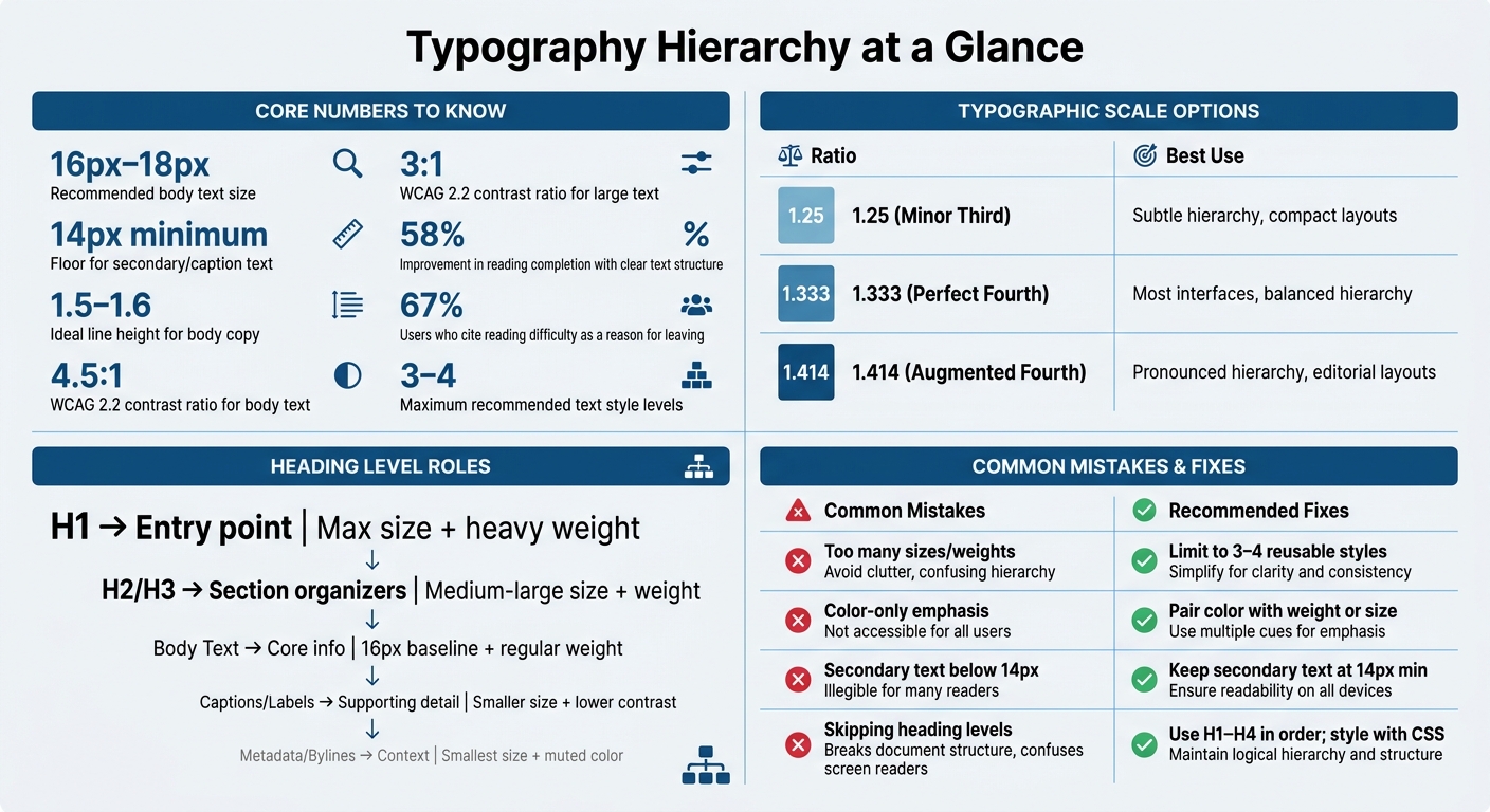
Typography Hierarchy: Key Rules, Numbers & Common Mistakes
The Core Typographic Variables That Create Hierarchy
Type size and scales for clear priority
These settings turn structural hierarchy into something people can scan and read.
Size creates the first layer of priority. Bigger text signals importance before anyone reads a single word, so the jump between levels needs to be clear enough to show that a new level has started.
A common starting point for web body text is 16px, though 18px is often a better fit for long-form reading. From there, heading sizes can scale up with a steady ratio. The Perfect Fourth (1.333) works well for most interfaces. Use 1.25 for a softer system, 1.333 for most layouts, and 1.414 when you want hierarchy to feel more pronounced.
Pick one scale and stick with it across headings and body text.
Keep it to three or four text levels. Go beyond that, and the page often starts to feel noisy instead of organized.
Weight, line height, and letter spacing
Size sets the level. Weight, line height, and spacing fine-tune it.
Weight is a simple way to add emphasis without changing size. A bold heading that matches the body text size will still feel more important. But contrast is the whole game here. If too much body text is bold, that signal fades fast. Use weight with restraint.
Line height shapes text density and reading comfort. Body copy usually works best around 1.5–1.6 line height. Tighter spacing makes text feel denser and less inviting, while more open spacing gives primary content room to breathe.
Letter spacing can help headings and labels. A slight increase often works well for headings and all-caps labels.
Used well, these settings make the main reading path clear at a glance.
Spacing and contrast as grouping signals
Spacing and contrast should back up the hierarchy that size has already set.
Whitespace shows section breaks and ties related text together. The space above a heading tells readers a new section is starting, and more space often points to a bigger structural break. When two elements sit close together, people read them as connected. When space separates them, they feel distinct.
Use contrast as support, not as the only signal. Darker text tends to pull focus first, while lighter text falls back. But contrast alone isn't enough, because it can fail in grayscale and for people with color vision deficiencies. Test the hierarchy in grayscale. If the reading order falls apart, add more contrast through size or weight.
These cues make grouping easier and help users scan the page faster.
sbb-itb-124fdbf
Applying Typographic Hierarchy to UX Content Structure
Typography works best when its visual levels line up with the page's semantic structure.
Matching H1 to H4 with semantic HTML
Once your type scale and spacing are set, the next move is to map those styles to actual content roles. Typography shouldn't just look organized - it should be organized all the way down to the HTML.
Each heading level has a clear job. The H1 is the page's main entry point. H2s split the page into major sections. H3s break those sections into subtopics through size, weight, and spacing. H4s handle smaller supporting details inside those subtopics.
Never skip heading levels just to get a certain look. If an H3 feels too large in a given layout, change its size with CSS - don't jump from H2 to H4. Skipping levels hurts screen reader navigation and weakens SEO. Visual styling needs to follow semantic order.
| Text Level | Role | Primary Visual Signals |
|---|---|---|
| H1 | Entry point, dominant focus | Maximum size + heavy weight |
| H2 / H3 | Content organizers | Medium-large size + weight + spacing |
| Body Text | Core information | Baseline size (16px) + regular weight |
| Captions / Labels | Supporting detail | Reduced size + lower color contrast |
| Metadata / Bylines | Contextual info | Smaller size + muted color |
After headings, set the supporting text levels that carry detail without fighting for attention.
Designing body text, labels, captions, and metadata
Body text is the baseline. Use 16px for standard interfaces and 18px for long-form reading. Every other text level on the page either moves above or below this anchor.
Supporting text - labels, captions, metadata, bylines - should step back visually without becoming hard to read. You can do that with a smaller size, lower contrast, or a different but readable style. WCAG 2.2 requires a minimum contrast ratio of 4.5:1 for body text and 3:1 for large text.
This shows up most clearly in dense layouts. When labels are too small or too faint, people slow down or miss them. The goal is a clear gap between primary and secondary text, not making secondary text disappear.
Once text roles are clear, headings become tools for scanning, not decoration.
Using headings to improve scanning and navigation
Clear heading patterns help users move through content fast. When headings look distinct and stay consistent, people can jump to the section they need without reading every line between them. Distinct headings let users scan, jump, and return without rereading the page.
Responsive, Accessible, and Systematic Typography
A typographic hierarchy has to work on mobile, tablet, and desktop without falling apart. It also needs to stay easy to read for different people in different reading conditions.
Responsive hierarchy across breakpoints
Your type system should survive screen-size changes without losing its sense of order.
Setting separate type sizes at every breakpoint sounds fine at first, but it gets messy fast. It’s hard to maintain, and it can throw off the size relationships between heading levels. A cleaner way is to use fluid typography with CSS clamp(). That lets text scale between a set minimum and maximum based on viewport width. For example, font-size: clamp(1.75rem, 4vw, 3rem) stops an H1 from getting too big on a phone or too small on a large monitor.
It also helps to use one modular scale, such as the Perfect Fourth (1.333), so heading levels keep the same proportions across screen sizes. On smaller screens, show fewer hierarchy levels when possible and keep the focus on the ones people need most. The goal is simple: keep the scale proportional, but never at the cost of readability.
Accessibility rules for readable hierarchy
Size and weight alone won’t make hierarchy accessible if the contrast is weak. WCAG 2.2 requires a 4.5:1 contrast ratio for normal body text and 3:1 for large text.
WCAG 1.4.12 Text Spacing matters too in production interfaces. Text should keep its layout at 1.5 line height, 0.12em letter spacing, and 0.16em word spacing. That’s a good stress test. If the reading order still makes sense using only size and weight, the hierarchy is doing its job.
Building typography rules into a design system
Once the hierarchy reads well, bake it into shared rules so it stays consistent.
The most dependable way to keep hierarchy in place is to encode type decisions as design tokens. Tokens like heading-xl and body-base can store font size, weight, line height, and spacing in one spot. Change the value once, and it updates everywhere. That cuts down on the drift that shows up when designers and developers tweak things page by page.
A practical token set should map straight to content roles. For example:
heading-xlcan use a larger fluid scale and a bold weightbody-basecan stay at the 16px baseline
Those choices should reflect the hierarchy set earlier in the design process. The difference now is that they live as system rules, not one-off edits.
Common Typography Mistakes That Weaken Hierarchy
A type system can look fine at first glance and still fall apart in use. The usual reason? Teams pile on styles, or they ignore semantic structure. The mistakes below show what goes wrong, why it matters, and how to fix it.
Using too many font sizes and weights
When a design uses five or more font sizes or weights, it starts to feel noisy. Nothing stands out because too many things are trying to stand out at once.
A better move is to limit the system to three or four reusable text styles. Each level should look clearly different from the next, not just a tiny step apart.
Relying on color alone for emphasis
Color should support hierarchy, not do all the heavy lifting. If emphasis disappears in grayscale, in print, or for people with color-vision differences, the system isn't doing its job.
If the reading order falls apart without color, use weight, size, and spacing to make structure clearer.
Making secondary text too small to read
Shrinking secondary text too much is a common slip. Once it drops below 14px, readability takes a hit on most screens.
That 14px mark is the practical floor. Go below it, and the text starts working against the user instead of helping them.
Breaking semantic order for visual effect
This one causes trouble fast. Skipping heading levels may look fine on screen, but it breaks screen reader navigation.
Keep H1–H4 in order, then adjust the visual size with CSS if needed. That way, the page keeps its structure without giving up the look you want.
The table below turns these patterns into quick review checks.
| Mistake | Impact on UX | Recommended Fix |
|---|---|---|
| Too many sizes/weights | Users can't identify priority | Limit to 3–4 reusable styles |
| Color-only emphasis | Fails in grayscale and for color-vision differences | Pair color with weight or size changes |
| Small secondary text | Text becomes unreadable below 14px | Keep secondary text at 14px minimum |
| Breaking semantic order | Disrupts screen reader navigation | Use H1–H4 in order; style with CSS |
How to Review and Test Typographic Hierarchy
After you set the type scale, the next step is simple: see if it still works in a real layout. A type system can look fine in a style guide and fall apart on an actual page. Before launch, check whether the hierarchy built from size, weight, spacing, and semantic order still feels clear.
Run a quick scan test
Look at the screen for a few seconds without reading the text. On that first glance, you should spot the page title, section headings, and primary actions from size and weight alone. If those elements don't stand out right away, the hierarchy is too weak.
Then test the layout in grayscale. This is a fast way to see whether the reading order still makes sense when color disappears. If the page becomes hard to scan, the system relies too much on color instead of structural contrast.
That first pass should tell you one thing fast: do size and weight alone guide the eye in the right order?
Check hierarchy at mobile and desktop sizes
Hierarchy needs to stay clear at every screen width. An H1 should still feel dominant on mobile, even after it scales down.
Check the same hierarchy at common desktop and mobile sizes:
| Element | Desktop | Mobile | Line Height |
|---|---|---|---|
| H1 (Display) | 48px – 72px | 28px – 36px | ~1.2 |
| Body Text | 16px – 18px | 16px | 1.5 – 1.6 |
On mobile, keep the number of visible heading levels low. People scan fast on small screens, and limited vertical space leaves less room for extra layers. In practice, that means showing only the heading levels users need to move through the page.
Validate accessibility and zoom behavior
Test contrast, 200% zoom, and heading order. Verify contrast at the published ratios, then test 200% zoom and reflow. Text should reflow cleanly without overlapping or disappearing. Also check a screen reader to make sure heading order stays sequential, from H1 through H4.
Conclusion: Principles for Strong Typographic Hierarchy
Typography is structure. It shows readers what matters first, how ideas relate, and where their eyes should go next. Size, weight, spacing, and contrast can either support that order or make everything feel flat.
A clear hierarchy cuts effort and makes scanning easier.
Key takeaways for designers and developers
Start by defining each text role, then map those roles to a consistent scale. Keep semantic HTML aligned with visual size, and build the system into tokens.
Use one scale, such as the Perfect Fourth (1.333), so each size step feels steady and predictable.
Match visual styling to semantic HTML. If an H3 looks too large, fix it with CSS instead of jumping to an H4 just to get a smaller size. That can break screen reader navigation and weaken document structure. Visual styling and semantic order should move together.
Then bake typography into your design system. Tokens like heading-md or body-base make hierarchy rules reusable and consistent across components and pages.
Strong typographic hierarchy turns content structure into faster reading, clearer scanning, and a better UX.
FAQs
How do I choose the right type scale?
Start with a base body size of 16px. For most users, that’s a solid place to begin if readability is the goal.
Then pick a ratio based on the look you want:
- 1.2 for subtle size changes
- 1.333 for a balanced scale that works in many layouts
- 1.5 or 1.618 for bolder, display-heavy designs
Use that ratio to size headings and captions in proportion to the base text. After that, round values to whole pixels to keep things clean and consistent.
When should I use 16px vs. 18px body text?
Start with 16px for body text. That’s the default size that works well in many cases.
Move to 18px when 16px feels a bit cramped, especially for long-form content, older audiences, or visually dense scripts like Arabic or CJK.
18px can also feel better on larger screens, where 16px may seem small next to big headings. In both cases, use relative units like rem so the text respects accessibility needs and browser settings.
How can I test typography for accessibility?
Check contrast ratios against WCAG standards. Body text should hit at least 4.5:1, and large text should reach 3:1.
Then zoom to 200% and see what happens. Text should still be easy to read, it shouldn’t overlap, and the layout should stay in shape.
It also helps to run a grayscale test or even a quick squint test. That’s a simple way to check whether visual hierarchy depends too much on color. If everything blends together once color drops out, that’s a red flag.
Don’t stop at one screen, either. Test on real mobile, tablet, and desktop devices. Emulators help, but nothing beats seeing how a page feels in your hand or on an actual monitor.
For the build itself, use semantic headings and fluid, rem-based typography. That gives content a clearer structure and helps text scale more cleanly across screen sizes.