Best Practices for B2B Collaboration UX Design
Keep B2B collaboration in-context: define roles and scopes, show permissions and audit trails, secure sharing, accessible and fast.


If collaboration happens outside the product, the UX is failing. My main takeaway is simple: keep comments, approvals, sharing, and history inside the workflow, make permissions easy to see, and make every action traceable.
Here’s the article in plain terms:
- I start by defining roles, scope, and workflows before any screen design
- I keep collaboration tied to the item, project, or workspace where the work happens
- I make permissions, comments, mentions, and notifications easy to understand
- I show activity history for day-to-day use and audit logs for review and compliance
- I make approval steps visible, including status, owner, due date, and escalation path
- I lock down external sharing with view-only access, named recipients, and expiration dates
- I check for WCAG 2.1 AA, keyboard use, screen reader support, and visible focus states
- I test for scale with targets like sub-500 ms for common actions and under 2 seconds for heavier tasks
A few numbers stand out. The article notes that 94% of external shares were inactive, 46% went to personal inboxes, and 75% of buyers ask for proof of accessibility at least most of the time.
In short: I treat B2B collaboration UX as a mix of access control, in-context communication, auditability, accessibility, and performance - not just chat added to a screen.
1. Define collaboration roles, scope, and workflows first
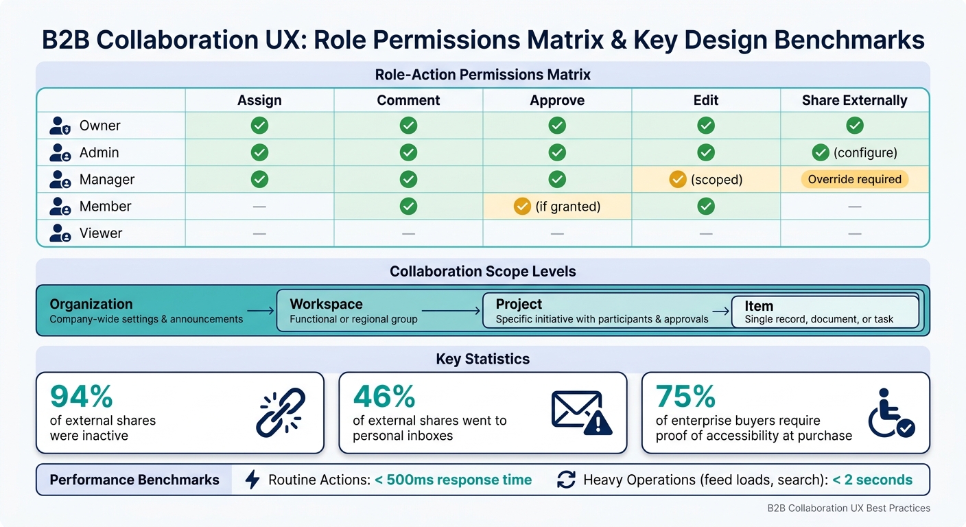
B2B Collaboration UX: Role Permissions Matrix & Key Design Benchmarks
Designing screens before you map the work is like drawing a floor plan before you know how people move through the building. It looks fine on paper, then falls apart the moment teams start using it.
Map tasks to clear user roles
Start with a plain question: who can do what, where, and in which workflow?
A lot of B2B apps begin with the same three roles: Admin, Member, and Viewer. That’s a decent starting point, but most teams need a bit more range. In practice, it often helps to add Owner, who handles billing and top-level settings, and Manager, who runs team workflows, assigns tasks, asks for reviews, and approves items within a defined scope.
The key is to define roles by responsibility and risk, not by job title. A “Manager” in one company may need fewer controls than a “Lead” in another. What matters is the level of access tied to the work.
From there, build a permissions matrix for each collaboration action: assign, comment, approve, edit, share, and export. For every role-action pair, decide if that action is allowed, limited, or blocked. Say a Manager can share items inside the company, but external sharing needs admin approval. That kind of rule shouldn’t live in someone’s memory. Put it in the matrix.
That matrix becomes the source of truth for both UI guardrails and product docs.
| Role | Assign | Comment | Approve | Edit | Share Externally |
|---|---|---|---|---|---|
| Owner | ✓ | ✓ | ✓ | ✓ | ✓ |
| Admin | ✓ | ✓ | ✓ | ✓ | ✓ (configure) |
| Manager | ✓ | ✓ | ✓ (scoped) | ✓ | Override required |
| Member | - | ✓ | ✓ (if granted) | ✓ | - |
| Viewer | - | - | - | - | - |
Viewers can only access the actions their scope allows.
Once the roles are set, the next step is just as important: define where each role can act.
Separate organization, workspace, project, and item-level collaboration
Scope confusion is where trust starts to crack, especially when sensitive data is in play.
You need to separate four levels of collaboration:
- Organization: company-wide settings and announcements
- Workspace: a functional or regional group
- Project: a specific initiative with its own participants and approvals
- Item: a single record, document, or task
This sounds simple, but it has a big effect on day-to-day use. A small label beside a comment box that says “Visible to: Project team” can stop someone from sharing something with the wrong audience. That’s the kind of detail people notice only after a mistake happens.
A good default is the smallest scope that still lets the task get done. If someone wants to broaden access, make that a clear, deliberate action.
Then pressure-test the model against actual work, not guesses made in a planning doc.
Validate flows against real team processes
Your permissions and scope model has to match how teams work in the wild. Not how you think they work. Not how the org chart says they work.
Talk to cross-functional users and map real workflows. Look at how they review contracts, hand off support tickets, or escalate incidents. Then turn that into workflow diagrams that show actors, steps, dependencies, and handoff points.
Pay close attention to timestamps, deadlines, and audit records. These details matter more than teams often admit at first. Use MM/DD/YYYY and 12-hour time with AM/PM, and show the time zone when people work across regions. Relative time stamps like “2 hours ago” are great in busy views because they’re fast to scan. But for compliance-sensitive records, the full timestamp should always be available in the detail view.
And if approvals are still happening over email, the workflow isn’t finished.
sbb-itb-124fdbf
2. Make permissions, communication, and visibility clear
Once roles and scope are set, the next step is to make access easy to see in the UI. Permissions, comments, and history should show people what they can do, where they can do it, and what changed.
Use simple role and permission models
Turn your role matrix into UI states people can understand at a glance. Keep the role set small, tie each role to real job duties, and show whether an action is allowed, blocked, or limited by scope.
Group permissions into plain categories such as Members, Content, Settings, Approvals, and Audit. Then make those states obvious in the interface. Don’t lean on a lock icon by itself. Say it plainly with copy like Only Admins can change this setting or Commenting allowed. Approvals blocked. That matters most during invites and role changes, when people are already trying to figure out what’s going on.
Design in-context comments, mentions, and notifications
After access is clear, keep discussion tied to the work itself. Comments should live on the exact object, field, or decision they refer to, not in some generic side panel. Threaded discussions with visible author identity, timestamps, reply targets, and open/resolved states make it much easier to track what happened and what still needs attention.
@Mentions should add a clear visual token and send alerts through the channels each person picked, whether that’s in-app, email, or a connected collaboration tool. Mentions and alerts should follow the same scope as the item they point to. Notification settings should also be adjustable by event type and channel, so someone can get email for approvals, in-app alerts for direct mentions, and nothing for low-priority status updates. That level of control keeps notifications useful instead of turning them into background noise.
Show activity history in a format teams can scan quickly
Teams also need a fast way to catch up without opening every item one by one. Use the activity feed for recent context and the audit log for compliance. A strong activity feed answers three things right away: who did what, when, and on which item. Show the actor, action, object, workspace or project context, and timestamp without forcing an extra click. When the same event happens over and over, group or aggregate it so the feed stays readable.
- Activity feed: catch-up and recent context
- Audit log: compliance and admin review
3. Build for trust: approvals, audit trails, and secure sharing
Once permissions and activity feeds are set up, the next step is trust. People need to see that decisions are tracked, changes can be followed, and sensitive data won’t end up with the wrong person by mistake.
Make approval workflows explicit
Every approval flow should show the current status, step owner, due date, and escalation path in one place. A status model like Draft → Pending Review → Approved → Rejected works well because it matches how finance and legal teams already talk about their process. Use the same terms teams already use.
For multi-level approvals, like any request over $25,000.00 that needs both manager and finance sign-off, the UI should show whether steps happen in sequence or at the same time. It should also be obvious when one step is holding up another. A small workflow stepper or timeline on the main record view usually does the job without crowding the screen. That way, anyone opening the record can see what happens next and who needs to act, without sending a follow-up message. Put the workflow right on the record so people don’t have to leave the task just to figure out the next step.
Treat audit history as part of the main UX
Once approval status is visible, users also need a tamper-resistant record of every change. Show key compliance events on the record they belong to. An audit trail should show who did what, when, to which record, and why it was allowed.
Filters like show only approvals or show only permission changes help keep the feed usable when a record has dozens of events. In many team workflows, record-level history is enough. Field-level auditing matters when a single field holds regulated or business-critical data. For example, it should log that an amount changed from $20,000.00 to $25,000.00, not just that someone edited the record. Timestamps should use US formatting, such as Sep 16, 2026, 3:45 PM. Audit logs should also be read-only for reviewers and protected from tampering through restricted access.
The last trust check is how data leaves the workspace.
Protect external sharing and sensitive data
External sharing is where overexposure often happens. 94% of external shares were inactive, and 46% went to personal inboxes. That’s a flashing warning sign.
Set external access to view-only by default, require named recipients, and add expiration dates. Sharing dialogs should state exactly what someone can access. For sensitive records, consistent en-US number formatting matters more than it seems. Values like $25,000.00 and 12,500 units are clear. Mixed regional formats can lead to real mistakes, especially when someone is reviewing a budget figure or contract amount outside the company.
A review screen that lists all active external collaborators and links makes access cleanup part of the normal workflow, not a scramble after the fact.
4. Support accessibility, performance, and power-user efficiency
After permissions and audit trails, the last check is simple: can people use these collaboration features fast, at scale, and without friction? If secure workflows are slow or hard to use, the whole thing falls apart. A locked-down system that people struggle to operate isn't much of a win.
Meet accessibility requirements across collaboration features
Accessibility should be the starting point for every collaboration feature, with WCAG 2.1 AA as the target. That applies to every interactive element on the screen: comment inputs, approval buttons, filter dropdowns, and notification menus. Each one needs to work with a keyboard alone, and keyboard behavior needs to feel predictable. Focus indicators should stay easy to see, with at least a 3:1 contrast ratio. WCAG 2.2 also adds rules such as Focus Not Obscured, which means sticky headers or floating toolbars can't sit on top of the focused element.
Screen readers become even more important when the interface updates on the fly. Use ARIA live regions so comments, approvals, and permission errors are announced without forcing focus to jump around. Use aria-live="polite" for routine confirmations like 5 items approved. Use aria-live="assertive" for errors that need attention right away. Status messages also became their own WCAG success criterion, 4.1.3 at Level AA, which shows how much accessible feedback matters in dynamic apps.
Balance dense workflows with progressive disclosure
Once every control works, the next job is making packed screens easy to scan. Start with the information people need first, then let them open the rest. In practice, that means showing the actor, action, object, and timestamp up front, while tucking extra detail behind expansion.
For approval queues, show only the fields that drive a decision: status, owner, dollar amount such as $45,000, and due date. Then let users drill in when they need more. For people working through heavy queues all day, small speed gains add up fast. Bulk actions help. Quick filters like Due this week or My approvals help too. Keyboard shortcuts can shave off even more time, like J/K to move up or down lists, F to open filters, and / to focus search for high-volume work.
Test performance at enterprise scale
A screen can look clean and still struggle once usage spikes. That's why collaboration features need to be tested under enterprise load, not just in a tidy demo setup. Aim for sub-500 ms response times for routine actions, and keep heavier operations like large feed loads or cross-workspace search under 2 seconds. Load tests should match what big teams do in the wild: large datasets, concurrent users, different time zones, and bulk approvals. Tools like k6 or JMeter are a solid fit here.
It also helps to track p95 and p99 latency for collaboration endpoints, not just averages. Why? Because averages can hide the painful moments. What people remember is the lag that shows up right before a deadline or during a release window.
A few trade-offs are worth checking during design reviews:
- Compact layouts and icons-only buttons help power users scan faster, but they can shrink tap targets and make actions less clear for low-vision users. Use accessible names and tooltips every time.
- Infinite scroll can feel smooth, but it makes keyboard movement and screen reader position harder to track. For audit logs and compliance views, paginated lists with a Load more control are usually the safer choice.
- Progressive disclosure keeps busy screens easier to handle and makes focus behavior more predictable, even if it adds one extra click. That's often the better default for mixed-role teams reviewing approvals and comments.
Conclusion: A short checklist teams can use in product reviews
B2B collaboration UX should make teamwork feel predictable and easy to trace.
Key points to carry into design and development reviews
Once roles, permissions, trust, accessibility, and performance are defined, use this review as a last pass to catch gaps before release. It works best when teams use it across the full product cycle: discovery, prototyping, implementation, and QA. That gives product, design, and engineering one shared standard before anything ships.
Review each collaboration feature against these six checks:
| Question | What to check |
|---|---|
| Is the role clear? | Users can tell who can view, edit, approve, or share. |
| Is the scope clear? | Scope is clear at the org, workspace, project, and item levels. |
| Are permissions simple? | Permissions use plain role names. |
| Is communication in context? | Comments, mentions, and approvals stay tied to the work itself. |
| Are approvals and audit trails visible? | Reviewers can trace who did what, when, and why. |
| Is the experience accessible and performant? | Keyboard, screen reader, and enterprise-scale performance all pass. |
Accessibility now shapes enterprise buying decisions too. According to Level Access, 75% of respondents said their organizations require proof of accessibility at least most of the time when purchasing digital products, and 31% said they always require it. In plain English: accessibility is now a procurement requirement for enterprise buyers.
FAQs
How do I choose the right collaboration roles?
Start with user research. Map how people actually work, what they own, and where they get stuck instead of leaning only on job titles. A title can look neat on paper, but it often misses how the work gets done day to day.
Then define roles by job function and follow the principle of least privilege. That means people should get access only to the tools, files, and actions they need to do their jobs, nothing more.
In design systems, that often means setting up roles like contributors, maintainers, and approvers. Those labels make responsibilities easier to understand and help avoid messy overlap.
Roles also need regular review. People switch teams, pick up new tasks, or stop owning certain work. If roles don’t change with those shifts, access gets sloppy and harder to manage.
What belongs in an activity feed versus an audit log?
An activity feed is a user-facing stream of recent interactions and updates. It helps teams stay in sync on what’s moving, what changed, and who did what.
An audit log is a secure technical record used for compliance and security investigations. It tracks details like who accessed information, when it happened, permission changes, and actions such as downloads or forwarding.
How can I make external sharing safer by default?
Use smart defaults that apply the strictest settings based on the data type and the recipient. DLP tools can scan for sensitive information, like credit card numbers or proprietary code, then block sharing or ask for extra approval.
Use progressive disclosure so people see the basic options first, with advanced settings there when they need them. Add context-aware warnings and clear visual cues so users know the protection level before they share.