
User Journey Mapping Tools: Trends in 2026
Overview of 15 journey mapping tools in 2026—how they use AI, live behavior data, governance, integrations, and pricing.


Here’s the short answer: in 2026, user journey tools split into four main groups, and your best pick depends on whether you need to map journeys, study behavior, or run journeys across teams and channels.
I’d narrow the article down like this:
- Dedicated journey platforms: UXPressia, Smaply, Custellence, TheyDo
Best for teams that want structured maps, ownership, and review rules. - Canvas and diagram tools: Miro, FigJam, Lucidchart
Best for early workshops, draft flows, and design handoff. - Behavior and product analytics tools: Contentsquare, Fullstory, Quantum Metric, Mixpanel, Amplitude, Hotjar
Best for seeing what users do after launch, with event data, session replay, and heatmaps. - Enterprise journey suites: Adobe Customer Journey Analytics, Genesys Cloud CX
Best for large companies that need cross-channel data, access control, and live CX workflows.
The big trend is simple: static journey maps are fading. Teams now want maps tied to live data, AI-assisted drafts, and shared ownership. In this list of 15 tools, the gap is clear:
- Canvas tools are strong for prompt-based drafting
- Mapping platforms are strong for governance
- Analytics tools are strong for post-launch behavior data
- Enterprise suites are strong for scale, control, and cross-channel data
Pricing also follows that split:
- UX and design teams: about $12 to $22 per user/month
- Product and growth teams: free to $2,000+/month
- Enterprise and CX teams: custom pricing
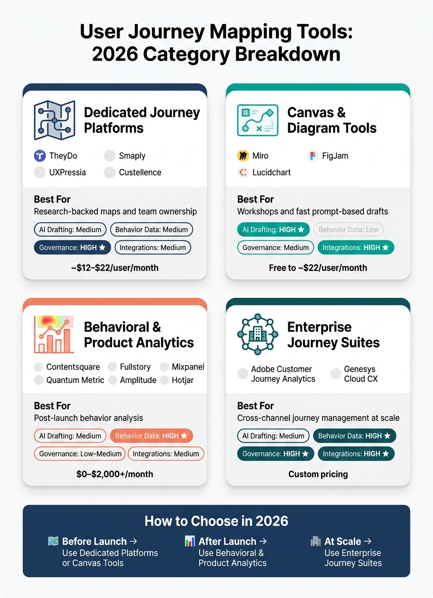
User Journey Mapping Tools Compared: 2026 Category Guide
Quick Comparison
| Category | Best For | AI Drafting | Behavior Data | Governance | Integrations |
|---|---|---|---|---|---|
| Dedicated journey platforms | Research-backed maps and team ownership | Medium | Medium | High | Medium |
| Canvas and diagram tools | Workshops and fast drafts | High | Low | Medium | High |
| Analytics-first tools | Post-launch behavior analysis | Medium | High | Low to Medium | Medium |
| Enterprise journey suites | Cross-channel journey management | Medium | High | High | High |
If I were choosing today, I’d use one simple rule: pick by stage. Use mapping tools before launch, analytics tools after launch, and enterprise suites when many teams, channels, and systems are involved.
sbb-itb-124fdbf
1. UXPressia
UXPressia sits squarely in the journey-mapping category. It's structured, research-led, and built for cross-functional teams. It works best for teams that want research-backed journey maps that stay connected to live product data.
AI-Assisted Mapping and Live Data Integration
UXPressia's AI assistant turns interview transcripts, survey results, and notes into draft journey maps and personas based on uploaded research. It also pulls live data from Mixpanel, Amplitude, and Google Analytics into map cells, so teams can line up qualitative stages with usage data in a single view.
Journey Governance
UXPressia organizes work in Workspaces, tracks changes with Version History, and supports Presentation Mode and PDF export for sharing with stakeholders.
Integration Breadth
UXPressia also connects with UX, CRM, analytics, and service design workflows, which helps keep journey maps tied to the rest of the CX stack.
Next is Smaply, which takes a similar journey-mapping approach but puts the emphasis a bit more on structure and collaboration.
2. Smaply
Smaply leans less on research-heavy mapping and more on day-to-day journey governance. In 2026, it presents itself as a journey management platform, not just a mapping tool. That shift matters. Teams aren’t only building static maps anymore - they’re managing living journey systems that change over time.
Behavioral Data Depth
Smaply’s Live Data lanes show metrics like bounce rate, conversion rate, and NPS right next to each journey step. That puts hard numbers and team notes in the same place, which makes the map far more useful during reviews and planning.
Journey Governance
With Journey Hierarchies, teams can connect micro-journeys to a macro-journey. In plain English: you can see how smaller interactions fit into the larger customer path, which helps when many teams own different parts of the experience.
Integration Breadth
Its integrations help keep Live Data lanes tied to analytics and CRM systems. That connection makes it easier to keep journey maps current instead of letting them sit untouched after the first draft.
3. Custellence
By 2026, Custellence has moved beyond being just a visual mapping tool. It now leans into journey management.
In practice, it sits in the middle ground between visual planning and day-to-day journey work. That’s the sweet spot: structured mapping with enough data to keep each journey tied to actual evidence.
AI-Assisted Mapping
Custellence uses AI to draft maps, while Data Lanes help connect those maps to metrics. AI Lanes and AI-generated building blocks can turn briefs or research files into draft journey steps, pain points, and possible solutions.
That said, the process isn’t fully hands-off. Human editors still review and approve the map, which helps teams keep the output on track.
Behavioral Data Depth
Data Lanes can layer metrics like drop-off rates and task completion times onto each journey step. But the level of detail is still lighter than what you’d get from analytics platforms.
So where does that leave Custellence? It works well for teams that want structure and light data in one place without jumping between too many tools.
4. TheyDo
TheyDo is a journey management platform, not just a mapping tool. That difference matters. Instead of starting with a map and stopping there, TheyDo puts governance and ownership at the center. It helps teams manage journeys across owners, over time, and through change.
AI-Assisted Mapping
TheyDo's Research-to-Journey (R2J) engine takes in unstructured data like user interview transcripts, support tickets, and survey responses. From there, it generates draft journey steps, flags pain points, and suggests opportunities. For research-heavy teams, that cuts down on manual synthesis. And that synthesis is a big deal, because the platform connects those insights to journey structures that people actually own.
Behavioral Data Depth
Teams can pull real-time behavioral metrics like drop-off rate, conversion rate, and frequency from tools such as Amplitude and Mixpanel into specific journey steps. TheyDo then pairs interview and support insights with those metrics. In plain English, it links what users do with what they say, and ties both back to the team members responsible for each part of the journey.
Journey Governance
TheyDo organizes journeys into a clear hierarchy of Domains, Boards, and Journeys. That setup helps large teams avoid journey silos. It also uses Journey Owner and Opportunity Owner roles to assign clear accountability across the platform.
Integration Breadth
TheyDo connects analytics, CX, and workflow systems so journey work stays aligned and actionable.
Next is Miro, which swaps journey governance for a more open collaborative workspace.
5. Miro
Miro changes the comparison a bit. Instead of a governed journey system, it gives teams an open, workshop-style canvas.
It’s a collaborative canvas tool, not a dedicated journey platform. So it works best for teams that need to map ideas fast and do it together. In 2026, Miro can generate journey maps and user flows from text prompts. It also offers direct Figma export, which cuts down the distance between a workshop and the design phase.
That makes Miro a strong fit for early-stage ideation, but not for structured journey governance.
That workshop-first model leads into the next canvas tool.
6. FigJam
After Miro’s open canvas, FigJam keeps the workshop-style approach but connects it more closely to Figma. It works best for teams that already live in Figma. The main draw here isn’t journey oversight. It’s fast mapping inside the Figma workflow and a smoother handoff to design.
AI-Assisted Mapping
Tools like UX Pilot can generate user flows and journey maps from a text prompt, then export them into FigJam for editing and cleanup. That can cut down the time spent on early draft work.
Behavioral Data Depth
FigJam can also help with early validation. Through tools like UX Pilot, teams can generate predictive attention heatmaps that show where people are likely to focus before usability testing starts.
Journey Governance
Version history and real-time collaboration make it easy for stakeholders to review journey maps together. That’s useful for shared feedback and iteration. But it doesn’t give teams the formal ownership model you’d expect from a full journey platform.
Integration Breadth
External flows, wireframes, and layouts can be imported into FigJam for team review and updates. If your team already uses Figma, the move from journey map to UI design stays in one workflow. This transition is often supported by various design system resources that bridge the gap between mapping and prototyping.
Lucidchart shifts the comparison away from canvas-based collaboration and toward diagram-first documentation.
7. Lucidchart
Lucidchart is a diagram-first tool. Lucid AI can build a journey map skeleton from a text prompt and suggest common next steps in familiar flows.
Behavioral Data Depth
Lucidchart supports data-linked diagrams, which means teams can pull in live metrics from sources like Salesforce or Google Sheets and place that data on top of journey steps. In plain English: it adds business context to the map, not user-behavior analysis. It can color-code stages or add labels, but it does not show how users move through the experience.
If your team needs heatmaps or session replays, you’ll still need a separate analytics tool.
In 2026, Lucidchart works well for teams that need a clear journey map fast, with a bit of business-data context. It sits in the middle between diagramming and business context, but it doesn’t cover live behavioral analysis.
8. Contentsquare
Lucidchart helps teams map journeys on purpose. Contentsquare works from the other direction. It rebuilds journeys from live user behavior.
That puts it in a different bucket from the diagramming tools covered so far. It also fits the 2026 move toward AI-driven tools that turn raw behavior into journey views.
AI-Assisted Mapping
Contentsquare uses machine learning to group sessions into Sunburst-style diagrams and flow maps. Instead of relying on manual tagging, it clusters real sessions into journey paths and surfaces friction scores that flag drop-off points on their own.
Behavioral Data Depth
It records clicks, hovers, scrolls, swipes, and form fills without tags or cookies. It also tracks signals like hesitation time, scroll rate, and rage clicks.
When a journey map shows a clear drop-off, teams can drill into session replays to see the exact issue behind it. That might be a broken button, a slow load, or a confusing UI.
Privacy and Compliance
Its cookieless model makes behavior mapping at scale easier to roll out in privacy-sensitive settings.
Integration Breadth
Contentsquare connects with analytics, experimentation, and voice-of-customer systems. So journey insights can move straight into testing and VoC workflows.
That changes the comparison. Instead of mapped journeys first, the focus becomes behavior-first analysis.
9. Fullstory
Fullstory auto-captures user interactions, so teams can study behavior without manual tagging. It still takes a behavior-first approach, but puts the focus on automatic capture and session replay. In plain English, that makes it a good fit for teams that want steady, session-level proof of what users did, not just mapped flows.
Capture and Friction Analysis
Fullstory uses auto-indexing to record every user interaction at the DOM level. It flags friction signals like rage clicks, dead clicks, and cursor thrashing inside journey views. Teams can also go back and replay past sessions to see exactly where users drop off and what happened right before it.
Integration Breadth
Fullstory connects with analytics, experimentation, and CX tools, which helps teams use it across the rest of their stack.
10. Quantum Metric
Quantum Metric sits closer to enterprise journey operations than session replay.
Once you move past plain session-replay tools, Quantum Metric puts the spotlight on journey performance and governance across large teams.
AI-Assisted Mapping
Quantum Metric uses its proprietary AI, Felix, to map journeys from session data. It spots the most common conversion paths and shows where users stray or drop off. It also flags slow tasks and API failures.
Behavioral Data Depth
Autocapture logs clicks, scrolls, swipes, and form fills. In the Quantified Journey view, it also tracks API response times and JavaScript errors.
That data feeds into a governance layer built for KPI alignment and access control.
Journey Governance
For enterprise teams, Quantum Metric offers a Visible Measures framework that standardizes customer journey KPIs. Product, Marketing, and Engineering teams can line up around shared definitions of success and friction. The platform also includes granular Role-Based Access Control (RBAC), with permissions managed across business units and regions.
11. Mixpanel
Mixpanel is built around event-based behavioral analytics. It helps teams track what users do across web, iOS, and Android. Unlike tools that start with a visual map, Mixpanel works from event data first and then builds the journey view from there. Where Quantum Metric leans toward enterprise journey operations, Mixpanel puts the spotlight on product analytics and action-level insight.
AI-Assisted Mapping
Mixpanel Spark uses event data to suggest journeys and funnels. It can also suggest relevant flows based on user milestones it detects.
Behavioral Data Depth
Mixpanel tracks individual actions and ties them to rich event attributes. Teams can segment journeys by product, source, device, or region.
The Flows report, along with Identity Merge, stitches sessions across web, iOS, and Android. Signal reports connect specific behaviors to conversion outcomes. And retention analysis supports N-day, unbounded, and custom bracket models.
Journey Governance
Lexicon helps keep event taxonomies clean, so journey analysis stays consistent across teams. It centralizes event naming, descriptions, and data health. It also runs automated audits for duplicates, naming drift, and stale data.
On top of that, it supports RBAC and SSO integration, so only authorized users can change the event taxonomy.
Integration Breadth
Mixpanel’s Warehouse Native architecture lets it read from and write back to cloud warehouses like Snowflake, BigQuery, and Databricks. It also offers 100+ integrations across CDPs, marketing tools, and CRMs such as Segment, Braze, and Salesforce.
That makes Mixpanel a strong fit for teams that want journey insight from product data rather than a separate mapping workspace.
12. Amplitude
Like Mixpanel, Amplitude starts with event data. But it goes a step further by turning raw behavior into journey maps on its own. That lines up with the 2026 move toward data-backed journey systems that don't force teams to map every flow by hand.
AI-Assisted Mapping
Amplitude AI groups event data into Pathfinder maps and shows the paths users most often take to reach a goal. It also uses root-cause analysis and anomaly detection to point out looping behavior and unexpected drop-offs. That helps teams find friction fast, especially when users drift away from the paths most likely to convert.
Behavioral Data Depth
Amplitude tracks clicks, swipes, and page views along with event metadata. Its Journeys feature shows how users move through a product and automatically spots Golden Paths - the sequences most likely to lead to conversion.
Journey Governance
Amplitude Data acts as a central tracking plan and gives teams a single source of truth. It lets product, marketing, and other teams define, manage, and enforce data schemas so everyone works from the same event definitions. As new events and reports get added, the tracking plan helps keep journey maps accurate.
That makes Amplitude a strong fit for teams that want automated path discovery and shared measurement standards.
13. Hotjar
Hotjar shifts the comparison back to qualitative diagnosis. It uses heatmaps, recordings, and surveys to show why journeys stall. That makes it a good fit when teams need context along with behavioral proof.
AI-Assisted Mapping
Hotjar AI pulls together session recordings and survey feedback into journey maps, surfacing friction points without manual tagging. So the team can spend more time on journey-map synthesis and less time building flows by hand.
Behavioral Data Depth
Hotjar takes a visual-first approach to journey analysis. Its Frustration Signals surface rage clicks and u-turns, while high-engagement areas in heatmaps show where attention gathers on a page. Hotjar tracks clicks, scrolls, and cursor movement, which makes behavior visible at the page level.
That means Hotjar is less about full journey governance and more about fast, evidence-based diagnosis.
Lightweight Governance
Hotjar adds PII masking, RBAC, and shared Highlights folders for team collaboration.
Integration Breadth
Hotjar connects with Google Analytics 4 for quantitative context, Slack and Jira for workflow triggers, and Segment for unified customer data streams. In practice, that makes it easier to layer qualitative session data into existing analytics workflows.
Plans start free, with paid tiers adding more heatmaps, funnels, and governance controls.
Adobe Customer Journey Analytics moves from lightweight insight to enterprise journey measurement.
14. Adobe Customer Journey Analytics
Adobe Customer Journey Analytics (CJA) is an enterprise journey measurement tool for web, mobile, and offline touchpoints. It takes journey mapping beyond visual flows and turns it into enterprise-level measurement.
AI-Assisted Mapping
CJA uses AI to surface journey patterns and anomalies across large, multichannel datasets. So instead of building flows by hand, teams can spot where users drift from expected paths much faster. The system flags those path changes and brings them forward for investigation.
At enterprise scale, that changes the job. The focus moves away from simply stitching channels together and toward finding patterns across data sources that many tools can't join.
Behavioral Data Depth
CJA stitches web, mobile, CRM, POS, and call center data into a single person-centric view. That depth across channels makes it a strong fit for enterprise teams dealing with complex customer journeys that span both digital and offline touchpoints.
Data Governance
CJA runs on Adobe Experience Platform (AEP), which standardizes and joins data from connected sources using the Experience Data Model (XDM).
Integration Breadth
CJA connects with Adobe Analytics, Adobe Real-Time CDP, and Adobe Journey Optimizer. It also ingests data from third-party CRM, POS, and call center systems through AEP.
From here, the comparison shifts from measurement to operational customer experience.
15. Genesys Cloud CX
Genesys Cloud CX blends AI-driven journey discovery with enterprise CX orchestration for large, service-heavy organizations. In 2026, Genesys brought Pointillist into the platform and uses AI-driven experience orchestration to map customer service journeys across voice, digital, and social channels.
Here’s the key difference: Genesys doesn’t just measure journeys. It uses them to guide live service interactions. That lines up with the 2026 move away from static journey maps and toward live systems teams can act on in the moment.
The platform pulls together signals from voice, digital, social, and contact center touchpoints. Then it adds sentiment, intent, and effort scores to each journey step. It also turns live event streams into journey views and automatically flags points of friction.
Journey Governance
Genesys offers a centralized Journey Canvas where cross-functional teams can review and update live journeys. Role-based access controls (RBAC) make sure only authorized users can change live journey logic, which helps with compliance and keeps changes under control.
Integration Breadth
Genesys AppFoundry, along with bi-directional sync with major CRM and CX systems like Salesforce and Zendesk, keeps journey data connected across the stack.
That makes Genesys an orchestration-first option rather than a measurement-first one.
How These Tools Differ in 2026
Not every tool here is built for the same job. The best way to compare them in 2026 is through four lenses: AI-assisted mapping, behavioral data depth, journey governance, and integration breadth. That lines up with a clear shift in 2026: teams are moving from static maps to live journey systems connected to data.
When you put the categories next to each other, the pattern is easier to see than if you focus on one feature at a time.
| Tool Category | AI-Assisted Mapping | Behavioral Data Depth | Journey Governance | Integration Breadth |
|---|---|---|---|---|
| Specialized Mapping (TheyDo, Smaply, UXPressia, Custellence) | Moderate | Moderate | Strong | Moderate |
| Whiteboarding/Design (Miro, FigJam, Lucidchart) | Strong | Weak | Moderate | Strong |
| Behavioral Analytics (Contentsquare, Fullstory, Quantum Metric) | Moderate | Strong | Moderate | Moderate |
| Product Analytics + Qualitative Insight (Mixpanel, Amplitude, Hotjar) | Moderate | Strong | Weak | Moderate |
| Enterprise CX (Adobe Customer Journey Analytics, Genesys) | Moderate | Strong | Strong | Strong |
Strong = category leader; Moderate = useful but not best-in-class; Weak = limited in this criterion.
The split is pretty clear. Canvas tools lead in prompt-based drafting, specialized mapping tools lead in governance, and enterprise CX platforms bring the broadest mix of data and control.
Here’s the short version:
- Canvas tools lead on AI-assisted mapping because they can generate journey drafts from text prompts.
- Specialized mapping tools lead in governance, while analytics-first platforms are often more limited on that front.
- Enterprise CX platforms stand out for deeper data, stronger governance, and broader integrations. They make the most sense for teams that need scale and control.
The next section turns those category strengths into practical pros and cons.
Pros and Cons by Tool Category
Each category in this article has a clear upside - and a clear tradeoff. In 2026, the split isn’t just mapping vs. analytics anymore. It’s static workflows vs. live journey systems.
The easiest way to compare these tools is by category, because each one fits a different part of the journey workflow. And the same four lenses from the previous section still matter here: AI mapping, data depth, governance, and integrations.
| Tool Category | Pros | Cons |
|---|---|---|
| Dedicated Journey Platforms (TheyDo, Smaply, UXPressia, Custellence) | Structured drafting and journey governance | Credit-based pricing on some tools; often still needs a design tool for polished UI work |
| Collaborative Canvases (Miro, FigJam, Lucidchart) | Flexible for workshops; strong plugin ecosystems | Manual setup for structured workflows; limited automated journey generation |
| Analytics-First Tools (Contentsquare, Fullstory, Quantum Metric, Mixpanel, Amplitude, Hotjar) | Shows real post-launch behavior | Works after launch; requires implementation, performance tuning, and consent management |
| Enterprise Journey Suites (Adobe Customer Journey Analytics, Genesys Cloud CX) | Cross-channel scale and operational control | High complexity; requires complex setup and ongoing admin control |
In plain English, the choice comes down to what your team is trying to do.
- Map journeys before launch: Dedicated platforms and canvases are usually the best fit.
- Study behavior after launch: Analytics-first tools are stronger here.
- Run journeys across teams and channels: Enterprise suites can do both, but they ask for more setup.
That category split makes tool selection a lot easier in practice. If a team knows whether it needs to map, analyze, or operationalize journeys, the shortlist gets smaller fast.
Conclusion
In 2026, the right tool mostly depends on where your team spends its time: mapping journeys, reading behavior, or lining up work across channels. That lines up with three clear categories.
If your UX research or product team is doing pre-launch work, start with AI-powered journey tools. Typical plans start at about $12–$22 per user/month.
If your growth or product team is focused on post-launch behavior, go with analytics-first tools. Pricing can start free and scale to $0–$2,000+/month based on usage.
If you're on an enterprise or CX team, orchestration platforms like Adobe Customer Journey Analytics or Genesys make more sense, where scale and custom pricing are the norm.
The table below makes that choice easier to scan from both a budget and fit angle.
| Team Type | Primary Need | Budget Range (USD) |
|---|---|---|
| UX Research & Design | Predictive validation and workflow integration | $12–$22/user/month |
| Product & Growth | Data depth and behavioral analytics | $0–$2,000+/mo |
| Enterprise & CX | Cross-channel scale and scalability | Custom pricing |
In 2026, choose by stage: ease of use for early teams, data depth for growth teams, and scale plus integration for enterprise teams.
FAQs
How do I choose the right journey tool for my team stage?
Choose a journey mapping tool based on your team size, project scope, and budget.
A small team usually doesn’t need a big, pricey platform. A larger team, on the other hand, will care much more about access controls, shared editing, and keeping work organized as projects stack up.
Here’s a simple way to think about it:
- 1–5 members: lower-cost tools with basic collaboration
- 6–20 members: live collaboration, version history, and smoother team workflows
- 20+ members: enterprise-grade controls, advanced permissions, and admin features
It also helps to look past the core mapping features. Check whether the tool works well with your design system, supports developer handoff, and offers solid documentation or community support.
Those details can save a lot of friction later. A tool may look good in a demo, but if your team can’t connect it to the way they already work, it can turn into a headache fast.
Can one tool handle both journey mapping and live behavior data?
Yes. Modern UX platforms can bring journey mapping and live behavior data together in one place, so teams get a single view of the user experience.
That means designers can map out the task flows they expect users to follow, then compare those paths with what people are actually doing in real time. Tools like heatmaps, session recordings, and click patterns help teams spot friction points, drop-offs, and navigation issues fast.
What should I set up before using analytics-first journey tools?
Before you use analytics-first journey mapping tools, get your data house in order. That means collecting detailed user behavior data and making sure it connects back to what people actually need.
Start with research. Interviews, surveys, and user feedback can help you spot core needs, pain points, and patterns early. This step matters because it keeps your data tied to real user behavior instead of turning into a pile of numbers with no clear meaning.
It also helps to set clear criteria for judging each tool before you commit. Look at things like:
- Documentation quality
- Community support
- Fit with your business goals
- Fit with your technical setup
When those pieces are clear from the start, AI has a much better shot at producing accurate, actionable insights.