
Ultimate Guide to Primary Navigation Design
Design task-focused, accessible primary navigation: clear labels, shallow structure, responsive patterns, testing, and governance.

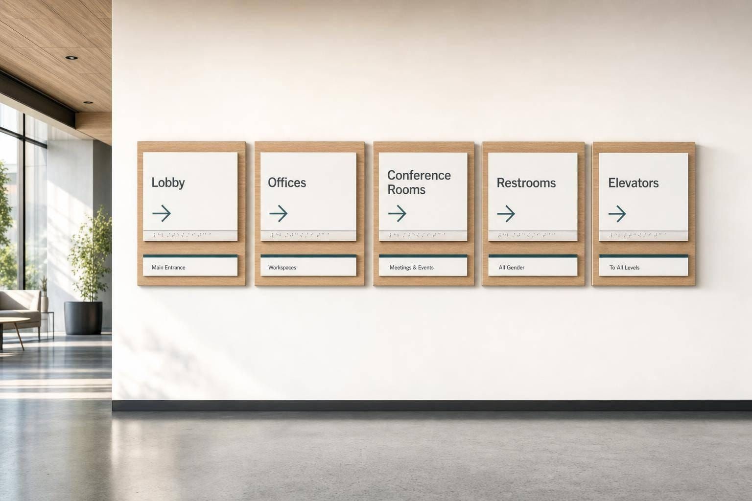
Good primary navigation helps people find key pages fast, stay oriented, and finish tasks with less friction. If your top menu is vague, too deep, or hard to use on mobile or with a keyboard, people get lost. And that costs clicks, sign-ups, sales, and support time. Baymard’s 2025 data found 58% of desktop ecommerce sites and 67% of mobile ecommerce sites had weak home page and category navigation.
Here’s the short version: I’d build primary navigation around user tasks, not team org charts. I’d keep top-level labels short and plain, use the lightest menu pattern that fits the content, keep the structure shallow, and test the hierarchy before polishing visuals. I’d also make sure the menu works with touch, keyboard, screen readers, zoom, and sticky headers.
What matters most:
- Primary navigation is your top-level menu, not your footer, breadcrumbs, or utility links
- Labels need to be plain and specific like Pricing, Support, or Resources
- Top-level items should reflect what users need most
- Flat menus fit small sites; dropdowns and mega menus fit larger sets
- Mobile navigation should keep the same hierarchy, even if the layout changes
- Use real HTML elements like
<nav>,<a>, and<button> - Keyboard and screen-reader support are not optional
- Tree testing and card sorting help fix structure early
- Post-launch checks should track task completion, errors, backtracking, and failed searches
- Every nav item needs an owner, review date, and removal plan
A few numbers stand out. Baymard reports hover dropdowns and mega menus appear on 88% of top U.S. ecommerce sites, yet 60% of sites still fail to group categories and subcategories well. And one Nielsen Norman Group case study showed IA changes improved tree-test findability from 4.0 to 7.4 out of 10 - an 85% improvement.
| Area | What I’d focus on |
|---|---|
| Structure | Keep top-level navigation shallow and task-based |
| Labels | Use short, familiar terms people understand at a glance |
| Patterns | Match the menu type to content size and screen width |
| Access | Support keyboard, screen readers, touch, and zoom |
| Testing | Use card sorting, tree testing, prototype tests, and analytics |
| Maintenance | Assign ownership and review the menu on a set schedule |
If I had to sum up the whole article in one line, it’s this: a primary menu should make the next step obvious, on every device, for every user.
Core Principles for Effective Primary Navigation
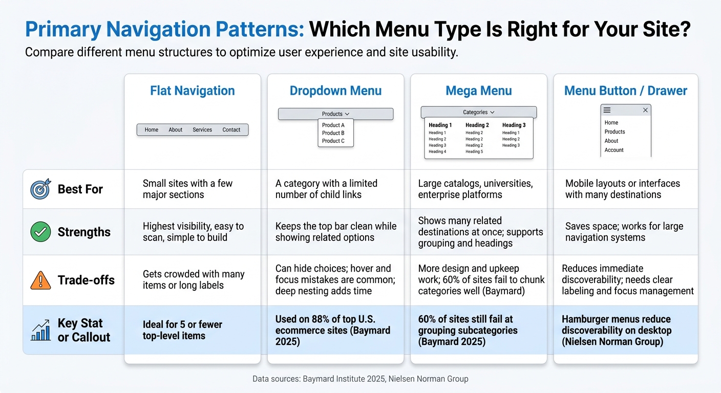
Primary Navigation Patterns: Which Menu Type Is Right for Your Site?
Once the scope is set, the next job is getting the labels and menu structure right. Strong primary navigation comes down to a few basics: clarity, consistency, visibility, and task fit. People should be able to understand each item in a split second and tell where they are without thinking too hard.
Write Labels Users Can Read at a Glance
Labels do most of the work in any navigation system. Short, specific, user-facing terms like "Pricing", "Support," or "Resources" tell people exactly what they’ll get. Vague labels like "Explore", "Solutions," or "More" force people to guess. And once users have to guess, things slow down.
Use the same language your customers already use in search, support, and card-sorting data.
Sibling labels should also feel like they belong together. "Products", "Pricing," and "Resources" scan well as a set. "Products", "Get Started," and "Company Information" don’t. The mismatch adds friction, even if each label makes sense on its own.
Put items in order based on importance and how often people need them, not based on internal politics or org charts. Then make orientation easy: show one clear active state through color, font weight, or an underline. Hover and focus states should also make it obvious what people can interact with. Hover alone isn’t enough, since keyboard users can’t rely on it and touch devices handle it poorly.
Once the labels are clear, the next step is choosing a menu pattern that fits the amount of content you need to show.
Pick the Right Menu Structure for Your Content Volume
Your menu structure should match both the size of your content set and the way people expect to move through it. Baymard found hover-based dropdowns and mega menus on 88% of top U.S. ecommerce sites. That said, common doesn’t always mean easy to use.
| Pattern | Best For | Strengths | Trade-offs |
|---|---|---|---|
| Flat navigation | Small sites with a few major sections | Highest visibility, easy to scan, simple to build | Gets crowded with many items or long labels; may need responsive collapse |
| Dropdown | A category with a limited number of child links | Keeps the top bar clean while showing related options | Can hide choices; hover and focus mistakes are common; deep nesting adds time |
| Mega menu | Large catalogs, universities, enterprise platforms | Shows many related destinations at once; supports grouping and headings | More design and upkeep work; Baymard reports that 60% of sites do not sufficiently chunk categories and subcategories |
| Menu button/drawer | Mobile layouts or interfaces with many destinations | Saves space; works for large navigation systems | Reduces immediate discoverability; needs clear labeling, keyboard support, focus management, and an obvious close action |
Keep the structure shallow. If common destinations are buried several layers down, that’s usually a sign the taxonomy needs to be simplified.
sbb-itb-124fdbf
Responsive and Accessible Navigation Patterns
Choose the Right Layout Pattern for Each Screen Size
Don’t try to squeeze desktop navigation onto a phone screen. Once you’ve set the top-level structure, keep that hierarchy the same across devices. The labels at the top level should stay the same too. What changes is how people get to them. At each breakpoint, decide what stays visible based on task data and analytics - not on what looks nice in a mockup.
A persistent horizontal menu works well on desktop. On tablets, an overflow or trimmed-down layout usually makes more sense. On mobile, switch to a menu button that opens a panel once the full navigation no longer fits. Use a native <button> for that trigger, keep a visible Menu label when space allows, and use aria-expanded to show state. Nielsen Norman Group warns against hiding navigation behind a hamburger button on desktop.
Use the simplest pattern that matches the screen width and the number of items.
| Pattern | Best fit | Key risk |
|---|---|---|
| Persistent horizontal | Desktop with a small set of top-level items | Wraps or truncates when labels are long |
| Menu button + panel | Mobile and narrow viewports | Low discoverability if the trigger isn't obvious |
| Priority-plus overflow | Interfaces where item count varies | Overflow order must reflect actual task priority |
| Sticky navigation | Long pages with frequent section switching | Can cover focused content; test with keyboard and zoom |
When a mobile menu opens, move focus into the panel. When it closes, send focus back to the trigger. Also, make touch targets large enough and leave enough space between them so taps don’t turn into a guessing game.
Build Navigation That Works for Keyboards and Screen Readers
Wrap your main navigation in a <nav> element and give it a clear accessible name, such as aria-label="Primary". That helps screen-reader users tell it apart from footer navigation or breadcrumbs. Use a <ul> with <li> elements for the link list, real <a> elements for destinations, and real <button> elements for expand/collapse controls. Don’t fake it with a clickable <div>.
Every part of navigation needs to work without a mouse. Tab and Shift+Tab should move between controls. Enter should activate links and buttons. Escape should close open panels. A Skip to main content link should come first in the tab order and point to the <main> landmark. It should appear when focused so keyboard users don’t have to tab through the full header every time a page loads.
Focus styles matter too. Never remove them with outline: none unless you replace them with something stronger. WCAG 2.2 requires at least a 3:1 contrast ratio between focused and unfocused states. You also need to check that sticky headers or open nav panels don’t hide the element that currently has focus. WCAG 2.2 calls this out directly.
For expandable navigation, aria-expanded tells assistive tech whether a submenu is open or closed. If content is collapsed, it should be hidden from assistive tech as well. And don’t stop at code review - test with at least one screen reader on macOS or iOS, plus one on Windows or Android if your audience spans those platforms.
Next, validate these patterns with users and assistive tech.
How to Test and Validate Your Navigation
Good navigation isn’t decided by how it looks in a mockup. It’s decided by whether people can find what they need.
That takes a step-by-step process. Labels and structure only matter if users can use them. And each testing method answers a different question, so the goal is to use measurable results instead of team opinions.
Match the Right Testing Method to Each Stage
Once the top-level structure is set, validate it in layers. Start with card sorting and tree testing. Then move to live interaction tests.
Use the inventory to spot duplicates, dead ends, and high-priority tasks. After that, pick the method based on what you need to learn.
Open card sorting fits the early stage, when you still don’t know how users expect content to be grouped. Give participants real content cards, let them make their own groups, and ask them to name those groups. This shows how users think about the content. For example, you may find that users treat Pricing, Plans, and Compare plans as one idea. Closed card sorting comes later, after you’ve drafted category names and need to see whether users can place items into them in a consistent way. It helps when you want to compare label options like Products, Solutions, and Resources, but it won’t give you better categories from scratch.
Use tree testing after the hierarchy is drafted to check whether users can still find key destinations. Show them a text-only version of the navigation and ask them to find specific destinations. Write the tasks in plain language. Don’t repeat the exact category name. Since there’s no visual styling or interaction pattern shaping behavior, tree testing isolates whether your labels and nesting work. It can show that Account services is too broad or that Claims is buried under Resources.
Once the interface is built, use prototype testing, then keyboard and screen-reader testing, to check the full interaction. Every navigation control needs to be reachable and usable without a mouse, especially for core paths like account access, product browsing, or support. Automated scanners can catch some structural issues, but they can’t tell you whether the navigation makes sense when read aloud or whether focus management works. Test with browser and assistive tech pairings that reflect how people browse, such as NVDA with Firefox and VoiceOver with Safari. Then verify that landmarks, link names, button names, expanded or collapsed states, menu levels, and current-page indicators are announced the right way.
| Method | Stage | What it answers |
|---|---|---|
| Content inventory | Before design | Content scope and task priority |
| Open card sorting | Early IA | How users naturally group and name content |
| Closed card sorting | IA refinement | Whether proposed labels accommodate content consistently |
| Tree testing | Pre-visual design | Whether users can find destinations in the hierarchy |
| Prototype testing | After IA is stable | Whether interaction behavior works |
| Keyboard + screen-reader testing | Development / QA | Whether navigation is operable without a mouse |
| Analytics review | Post-launch | What users actually do at scale |
After the hierarchy and interactions pass testing, the next step is governance: ownership, maintenance, and release discipline.
Measure Results and Fix Common Problems
Testing only helps if the results point to a clear fix. Set your success thresholds before testing, not after you’ve seen the numbers. Track task completion rate, time to destination, first-click accuracy, misclick rate, and route efficiency. For accessibility, include keyboard and screen-reader completion rates as core metrics.
When a test fails, tie that failure to the navigation problem underneath it. The table below shows common failure patterns and what to do next.
| Observed issue | Likely cause | Best corrective method |
|---|---|---|
| Users split across different categories for the same content | Labels don't match how users group content | Run open card sorting; interview users about terminology; retest alternative labels |
| Users understand the label but can't find the destination | Content is misplaced in the hierarchy | Review the content inventory, revise category placement, and rerun tree testing |
| Users reach the right section but take too many steps | Excessive depth or too many intermediate levels | Compare flatter and deeper tree variants in tree testing; simplify the hierarchy |
| Users select the wrong category immediately | Label is ambiguous or org-centered | Test plain-language alternatives with label-comprehension tasks and first-selection accuracy |
| Users can't open or close the menu with a keyboard | Inaccessible interaction or broken focus management | Conduct manual keyboard testing; inspect focus order and states; retest the implemented component |
| Screen-reader users hear incomplete menu information | Missing accessible names, roles, or states | Test with screen readers; correct semantics and announcements; repeat task-based validation |
| A menu item gets almost no clicks | Low demand, poor visibility, wrong placement, or unclear wording | Check analytics alongside task research before removing it |
| Desktop results are strong but mobile results aren't | Responsive pattern hides or changes important destinations | Run device-specific prototype and accessibility tests rather than assuming desktop findings transfer |
Use analytics to spot friction. Then use task research to explain it.
Repeated backtracking, internal searches right after a navigation click, and fast menu open-and-close sequences all point to friction. But those patterns don’t tell you why it’s happening. A navigation change should count as successful only when task completion goes up, errors go down, paths get shorter, and accessibility tasks pass.
Once the structure is validated, lock ownership and release rules so the navigation stays reliable as content changes.
Trends, Governance, and a Final Implementation Checklist
Judge Trends by Whether They Help Users Complete Tasks
Use trends only when they help people finish tasks and stay easy to manage over time.
Judge mobile-first patterns by one thing: do they cut friction on small screens? Not whether they copy desktop navigation. On mobile, collapsed menus, accordion submenus, or category landing pages often work better than a full horizontal bar. On desktop, a mega menu can help people scan a large, stable set of content in one view. But that only works when categories are grouped well, headings are easy to scan, and keyboard behavior is fully built out. A mega menu should not be a cover for weak information architecture.
Sticky navigation can keep key destinations within reach on long pages. But it can also eat up screen space or cover content at small sizes and high zoom. Use it with care, and keep the persistent area small. Progressive disclosure - showing secondary options only after someone picks a related category - can cut visual clutter in deep hierarchies. Still, hidden content must remain discoverable and fully usable for keyboard and screen-reader users.
Integrated search should support navigation, not take its place. That means strong indexing, autocomplete, spelling tolerance, and clear empty states.
Role-based navigation can shorten the path for certain audiences. The tradeoff is extra complexity, and it should never hide core destinations.
Before building anything, define the task and the success criteria. A Nielsen Norman Group case study found that revising an information architecture moved tree-test findability scores from 4.0 to 7.4 out of 10 - an 85% improvement. More opens or clicks don't prove navigation got better. What matters is task completion, time to destination, backtracking, search reformulations, exit rate, error rate, and accessibility defects.
Once a pattern shows it works, lock it into ownership and maintenance rules so it doesn't drift.
Assign Ownership, Set Maintenance Rules, and Use a Release Checklist
Navigation drifts when no one owns it. A label that felt clear at launch can turn fuzzy after a product rename. A destination that once mattered can get buried after a restructure.
Assign ownership at three levels:
- An information-architecture owner for hierarchy and taxonomy
- Content or product owners for individual labels and destinations
- An engineering or design-system owner for component behavior and accessibility rules
Ownership keeps labels, destinations, and behaviors lined up with user tasks as products change. Keep a navigation inventory that records each item's label, destination, purpose, audience, owner, status, and last review date. Review it on a schedule and any time products, URLs, teams, or user roles change. Remove old destinations instead of letting the menu turn into a junk drawer.
Document responsive behavior, breakpoint rules, keyboard commands, focus logic, screen-reader semantics, and active-state logic in the design system next to the reusable components.
Use this checklist before launch or after any structural change.
| Area | What to verify |
|---|---|
| Information architecture | Reflects current user tasks, content priorities, permissions, and business goals |
| Labels | Concise, specific, familiar to users, consistent with page titles and search terms |
| Hierarchy | No unnecessary depth, duplicate destinations, dead ends, or overloaded menus |
| Active states | Visually clear and programmatically exposed for current page and ancestor levels |
| Responsive behavior | Works with long labels, zoom, orientation changes, and touch input |
| Keyboard support | Every menu can be opened, navigated, traversed, and closed without a mouse; focus order is logical |
| Screen-reader support | Names, roles, states, relationships, and focus restoration are correct |
| Testing evidence | Findings from representative users, devices, browsers, and assistive technologies are recorded |
| Maintenance ownership | Every item has a responsible owner, review cadence, destination status, and a removal or redirect plan |
After launch, keep reviewing navigation. Watch for broken links, zero-result searches, repeated queries, high exits, and support tickets. Re-test after major changes to content structure, branding, authentication, permissions, responsive components, search, or assistive-technology support before assuming the current navigation still works. Tie post-launch monitoring to the same measures used in testing: task completion, errors, backtracking, and accessibility failures.
FAQs
How many top-level nav items is too many?
In most cases, more than 5–7 top-level items is too many. Once you push past that range, people can start to feel overloaded, and satisfaction usually drops.
A good working target is about 5–7 items. If you need to show more than that, move lower-priority destinations into secondary navigation or use disclosure patterns.
When should I use a mega menu instead of a dropdown?
Use a mega menu when you need to organize a lot of content or a site structure that goes past the usual seven-item menu.
Unlike standard dropdowns, mega menus give you a larger, more organized layout. That makes them easier to scan and can cut down on cascading issues and accidental closures. Group related categories in a clear way, but keep the design streamlined so users don’t feel overloaded.
What should I measure after a navigation redesign?
Measure both quantitative metrics and qualitative feedback to check whether the new structure is doing its job. Watch task completion rates, time on task, and directness to spot cases where users are taking the long way around instead of moving straight to what they need.
It also helps to track navigation-specific signals, including:
- Exit rates
- Next-page clicks
- Internal search queries
- Tap error rates
- Backtracking success
Those signals can show where people get stuck, where they hesitate, and where the structure may still be pushing them off course.