
Screen Reader Accessibility Checklist for Online Stores
A practical checklist to test screen reader access across search, product pages, checkout, dialogs, zoom, and WCAG 2.2.

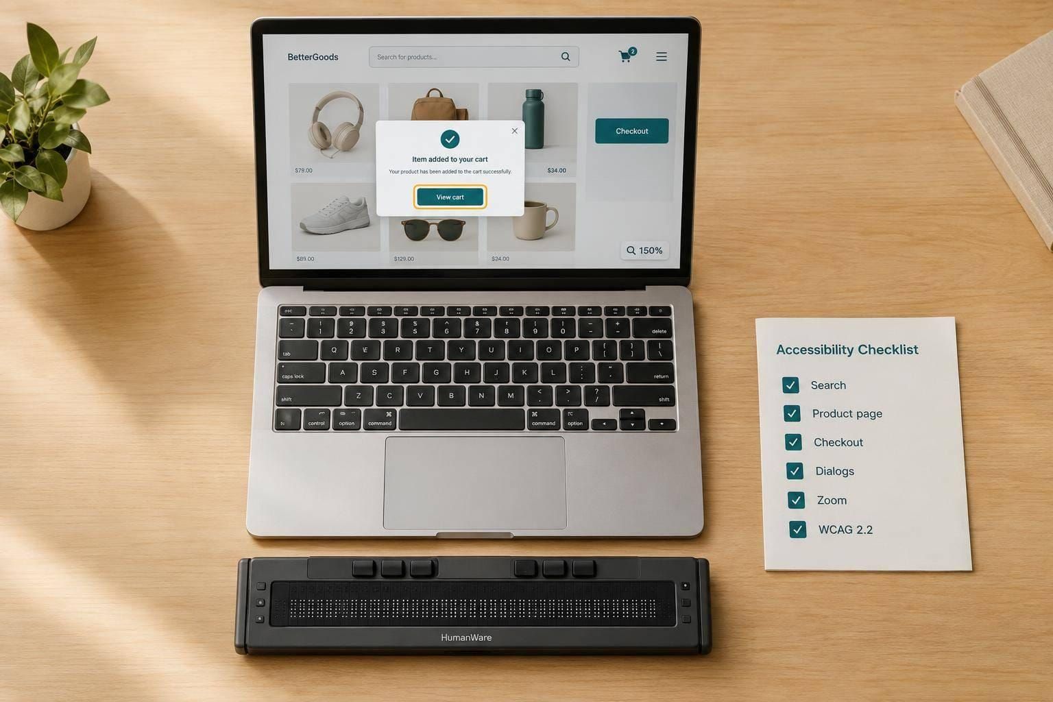
I check screen reader access by testing whether I can finish a purchase - not just pass an automated scan. I test from search to order confirmation, include a checkout error and recovery, and record what passes, fails, or does not apply.
My checklist covers:
- Setup: Choose screen readers, browsers, and shopping tasks; combine automated scans with hands-on testing.
- Browsing: Check page structure, keyboard access, search, filters, product details, and options.
- Buying: Test cart changes, checkout fields, error messages, payments, and lasting order details.
- Interactions and display: Check dialogs, announcements, contrast, 200% text size, and 400% zoom.
- Follow-up: Rank problems by shopper impact, track fixes, and repeat the purchase test after changes.
I use WCAG 2.2 AA to guide the checks, but <u>this checklist alone does not prove conformance</u>. The goal is simple: confirm that shoppers can find, choose, and buy products without sighted help.
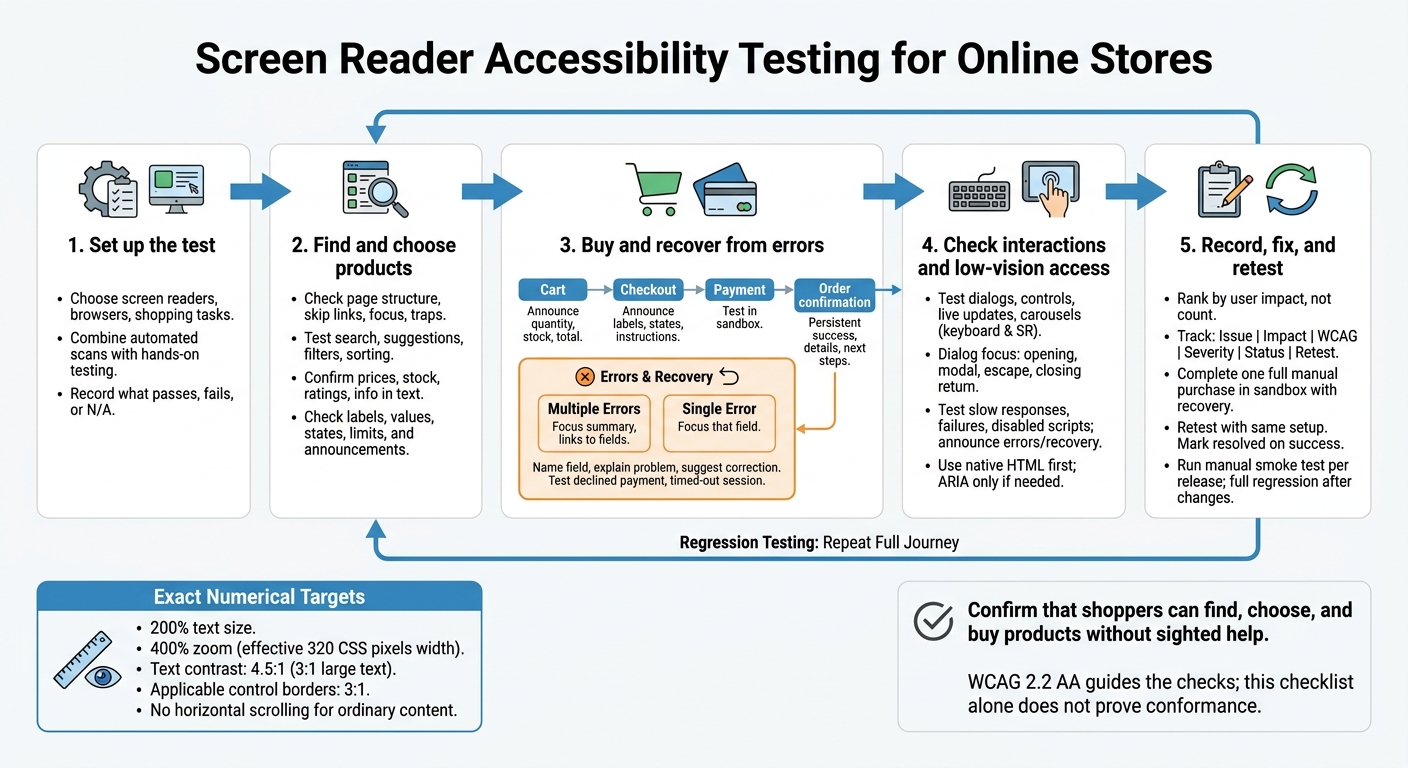
Screen Reader Accessibility Testing for Online Stores
Check Navigation, Search, and Product Pages
Move from setup to the shopper’s path. Test shared page structure, search controls, and product content on every template.
Check Page Structure and Keyboard Access
Check headers, menus, product cards, and footers across category, search, and product pages. The skip link must move focus past repeated navigation. Keep repeated menus in the same relative order, and check that focus follows a logical sequence.
Test each control’s name and keyboard behavior. Focus must remain visible, without sticky headers or overlays covering it, and users must never get trapped when navigating by keyboard. Collapsed menus must expose their collapsed state. Their hidden links must stay out of keyboard navigation and screen-reader reading. Use alt="" for decorative images and meaningful names for icon-only controls. Record each issue against the applicable WCAG criterion.
With structure and focus checked, move to the controls shoppers use to find products.
Test Search, Filters, and Pagination
Search needs a visible, associated label, not just placeholder text. Test typing, Enter, arrow keys, and Escape. Escape must close suggestions without clearing the query. Custom autocomplete must expose its name, active option, expanded state, and popup relationship.
Sorting and filters must announce selected values and keep them after updates. Price ranges need labeled number inputs. Announce result counts without taking focus, including when no products match.
Pagination needs descriptive controls and a programmatic current-page state, such as aria-current="page", so screen readers announce the current page correctly. Test disabled Previous and Next controls, predictable focus after page changes, and keyboard access to Load more. New results must not appear silently or cause repeated announcements. Document search and filtering failures that block navigation, hide updates, or prevent recovery.
Once shoppers can find products, check that product details and variant controls are fully announced.
Check Product Details and Options
Show regular and sale prices, stock, ratings, review counts, and shipping information in text so shoppers can compare and choose products independently. Use U.S. price formatting and clear U.S. units.
Size, color, and quantity controls must expose their labels, values, selection states, and minimum and maximum limits. Never use color alone to distinguish variants. When a shopper changes a variant, communicate any resulting price or availability changes without moving focus unexpectedly.
Write informative alt text for product images. Check that gallery controls have meaningful names and work by keyboard. Videos need accessible controls, captions, and audio description or media alternatives where applicable. Record the applicable WCAG criterion.
sbb-itb-124fdbf
Test Cart and Checkout Tasks
After product selection, test the cart, checkout, and confirmation for anything that blocks a completed purchase. Include a declined payment and a timed-out session.
Use this table to track what each checkout component must communicate to screen reader users.
| Checkout component | Required screen reader behavior | Common failure |
|---|---|---|
| Checkout fields | Announces labels, required states, instructions, and field groups | Placeholder is the only label |
| Error summaries | Identifies invalid fields and links to them | Errors appear silently; focus stays on Submit |
| Cart updates | Announces changed quantities, stock, and totals without focus loss | Only the visible total changes |
| Payment controls | Exposes names, states, and predictable keyboard focus | Hosted payment fields cannot be reached |
| Confirmation messages | Keeps success, order number, amount, and fulfillment details available | Order confirmation exists only in a temporary announcement |
Check Cart Controls and Totals
Make sure add-to-cart, quantity, and remove controls identify the product and variant they affect. Quantity controls must communicate their current value and limits. After an item is removed, move focus to the cart, the next item, or the totals.
Announce additions, cart counts, stock changes, and recalculated totals without unexpected focus shifts. Label the promo code field and provide a text message confirming whether the code was accepted or rejected. Clearly label each amount: subtotal, shipping, discount, estimated tax, and order total.
Test Checkout Fields and Error Recovery
Make the current step, field groups, persistent visible labels, instructions, and required states available to screen readers. Use native autocomplete tokens, including email, street-address, address-level2, address-level1, and postal-code.
Test address suggestions with a keyboard, including apartment information and military addresses where supported. Reuse information entered earlier in checkout. For sign-in, support password managers and avoid verification that requires users to memorize or transcribe information.
Test blank required fields and invalid email or ZIP code values. Errors must name the field, explain the problem, and suggest a correction when possible. Connect inline errors to their inputs with aria-describedby, and use aria-invalid to communicate invalid states where appropriate.
For multiple errors, move focus to a short summary with links to each invalid field. For a single error, move focus to that field. Keep valid, non-sensitive entries after a failed attempt.
Test Payment and Order Confirmation
Test hosted fields, wallet controls, and payment redirects only in sandbox or authorized payment flows, using approved test data. Check keyboard access, meaningful control names, processing and failure announcements, and predictable focus after navigation.
Before payment, provide a review step showing the full order and links for corrections. Test duplicate submissions and retries.
After success, keep the order number, amount charged, items, fulfillment details, next steps, and delivery date available as persistent on-page content. Use clear dates and include a time zone when a specific time matters.
Date format example: October 9, 2026.
Check Interactive Components and Low-Vision Access
Once the core purchase flow works, test custom widgets and responsive layouts for issues that could still block screen reader users.
Use native HTML controls first. Add ARIA only when semantics are missing. Test custom interactions with both a keyboard and a screen reader.
Test Dialogs, States, and Live Updates
Give every dialog an accessible name, preferably linked to a visible heading with aria-labelledby, and a clear close control. On opening, announce the dialog’s purpose and move focus to the first logical control. For modal dialogs, keep focus inside, support Escape to close, and return focus to the trigger afterward. Prevent users from interacting with content behind the modal.
Check that expanded, selected, checked, and disabled states match what users see and update immediately after each interaction. A disabled out-of-stock option should be announced as unavailable. Use polite live announcements for routine changes; reserve assertive updates for urgent ones. For carousels, check for named Previous/Next controls, a pause control, slide position information, and no unexpected focus movement.
Check Reflow, Contrast, and Failure Recovery
Test zoom and contrast on the same product, cart, and checkout pages as you browse, filter, add items to the cart, and complete checkout. Repeat those tasks at 200% text size, then at 400% zoom with an effective viewport width of 320 CSS pixels. Look for clipped text, overlapping controls, and dialogs that overflow or won’t scroll. Ordinary content should not need horizontal scrolling. Exceptions apply only when the content requires a two-dimensional presentation.
Check text contrast against a 4.5:1 ratio, or 3:1 for large text, and applicable control borders against 3:1. Test visible focus and forced-colors mode. Never rely on color alone to show selection.
Simulate slow search responses, failed inventory requests, and disabled scripts. Loading and error messages must be clear, announced to screen readers, and paired with a clearly labeled recovery action. Make sure retrying restores a usable interface instead of leaving users with a spinner and no status.
Record the test setup, the actual announcement or focus location, and the steps to reproduce each issue so fixes can be verified.
Conclusion: Record Fixes and Retest the Shopping Journey
After the component checks, complete one uninterrupted manual purchase in a payment sandbox, from search to order confirmation. Include one deliberate checkout error and recovery.
Prioritize Issues and Track Regression Tests
Rank findings by user impact, not violation count. Use the same format for every defect so you can compare retest results.
| Issue | User impact | WCAG reference | Severity | Fix status | Retest result |
|---|
Retest the audited journey using the same browser, OS, screen reader, viewport, account state, product data, and sandbox. Record what changed, the expected and actual announcement, the pass/fail result, the date, and supporting evidence. Mark a fix as resolved only after the task succeeds. Keep unresolved limitations visible, along with an owner, the affected task, and a target remediation date.
Use that same setup for every regression pass. Run a manual shopping smoke test with every release. Repeat the full journey after changes to templates, product data, checkout, or integrations. Include screen reader users in usability testing when possible.
Document the tested e-commerce purchase flow, conformance target, exclusions, and known limitations separately from U.S. legal obligations.
FAQs
Which screen reader and browser combinations should I test?
Manually test screen reader and browser pairings that match how people use your site. On desktop, prioritize NVDA with Chrome or Firefox, JAWS with Chrome or Edge, and VoiceOver with Safari. On mobile, test VoiceOver on iOS and TalkBack on Android. Each uses different APIs and gesture systems.
Always test on real devices, not simulators. This lets you accurately check how assistive technologies handle focus, labels, and dynamic content updates.
How can I verify third-party checkout accessibility?
Pair automated scans with manual testing. Automated tools can miss barriers that depend on context. Review the provider’s accessibility documentation to check compliance with accessibility standards.
Test the entire payment flow with Tab, Space, and Enter. Make sure keyboard focus stays visible, follows a logical order, and lets users move through iframes without getting trapped.
Using NVDA, JAWS, or VoiceOver, check that fields have labels, express checkout buttons have descriptive names, and errors are announced immediately. Enter invalid data to confirm that assistive technologies convey clear error feedback.
What else is needed to establish WCAG 2.2 AA conformance?
Automated scans are only part of the process. Pair semantic HTML with manual audits and usability testing across combinations of browsers and assistive technologies. Check that users can operate controls with a keyboard, tab through them in a logical order, and see focus indicators with at least 3:1 contrast. Make sure there are no keyboard traps, and keep ARIA roles and states in sync with component behavior.
Test key user flows regularly, checking labels, announcements, and focus management. Conformance alone doesn’t guarantee usability.