
How to Test Typography Accessibility in Responsive Design
Test typography across resize, zoom, reflow, contrast, spacing, dark mode, and screen readers to reveal accessibility issues.

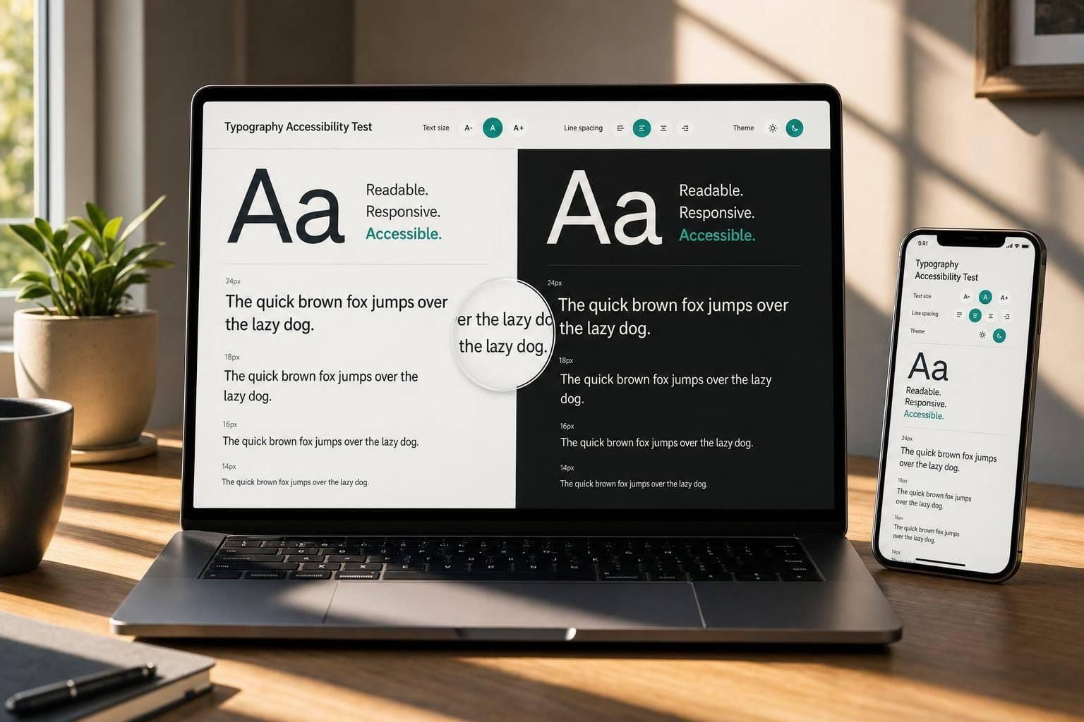
If I only check type on a desktop screen, I miss some of the most common accessibility failures. The short version is this: I need to test text at default size, 200% text resize, 400% zoom, 320 CSS pixels, and with custom text spacing. Then I need to check contrast, keyboard focus, screen reader output, dark mode, and error states.
Here’s the core workflow in plain English:
- I pick pages and states that stress the layout
- I log the viewport, zoom, browser, OS, and WCAG criterion
- I test contrast for body text, links, buttons, errors, placeholders, and focus states
- I separate text resize, page zoom, and reflow because they test different things
- I check for clipping, overlap, hidden controls, and horizontal scrolling
- I apply WCAG text-spacing overrides and watch for broken layouts
- I retest on real phones, not just simulators
- I verify reading order, labels, and focus with a screen reader and keyboard
A few numbers matter right away: WCAG AA needs 4.5:1 contrast for normal text and 3:1 for large text. Reflow testing targets the equivalent of 320 CSS pixels. And text resize testing goes to 200%.
Quick check: if text wraps badly, disappears behind sticky UI, loses focus visibility, or forces side-to-side scrolling, I’ve found a problem worth logging.
What I like about this process is that it keeps the review simple: test the same parts of the UI under the same conditions, record what fails, fix it, and test again.
Define Your Test Conditions Before You Start
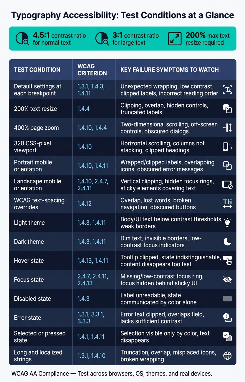
Typography Accessibility Test Conditions vs. WCAG Criteria & Failure Symptoms
Before you test anything, write down the setup: browser, version, OS, viewport, zoom level, text-resizing method, theme, and input method. That gives you a clean record of what happened and where. It also makes defects much easier to compare across devices and states.
Start with default browser settings. Also, turn off browser extensions if they change styles, since they can muddy the results.
Choose Breakpoints, Themes, and Content States to Test
Test across your main breakpoints, 200% text resize, 400% page zoom, and a 320 CSS-pixel viewport. Check both portrait and landscape. A page can look fine in one orientation and still clip text or trigger horizontal scrolling in the other.
Light and dark themes need their own pass. Dark mode often exposes issues that slip by in light mode, like dim placeholder text, borders that seem to vanish, and focus indicators that are too faint to spot.
Your content should push the layout a bit. Use examples that stretch the UI, such as:
- A heading long enough to wrap to three lines
- A button label that wraps
- A form field with a long label and a multi-line error message
- A long localized string
Pair those with realistic U.S. values like "$1,249.99", "September 30, 2026", and "11:59 PM." Short placeholder copy can hide problems. Production-style content tends to bring them into plain view.
State testing matters too. Check hover, focus, disabled, error, selected, expanded, pressed, and loading states. Hover is not a stand-in for focus. And disabled or error states can't depend on color alone.
Build a Table Mapping Test Conditions to Failure Symptoms
Use this table as your working reference. Adjust it to fit your product’s components and conformance target.
| Test condition | Relevant WCAG criterion | Failure symptoms to record |
|---|---|---|
| Default settings at each primary breakpoint | 1.3.1, 1.4.3, 1.4.11 | Unexpected wrapping, low contrast, clipped labels, incorrect reading order |
| 200% text resize | 1.4.4 | Clipping, overlap, hidden controls, truncated labels |
| 400% page zoom | 1.4.10, 1.4.4 | Two-dimensional scrolling, off-screen controls, obscured dialogs |
| 320 CSS-pixel viewport | 1.4.10 | Horizontal scrolling, columns not stacking, clipped headings |
| Portrait mobile orientation | 1.4.10, 1.4.11 | Wrapped or clipped labels, overlapping icons, obscured error messages |
| Landscape mobile orientation | 1.4.10, 2.4.7, 2.4.11 | Vertical clipping, hidden focus rings, sticky elements covering text or controls |
| WCAG text-spacing overrides | 1.4.12 | Overlap, lost words, broken navigation, obscured buttons |
| Light theme | 1.4.3, 1.4.11 | Body or UI text below contrast thresholds, weak borders |
| Dark theme | 1.4.3, 1.4.11 | Dim text, invisible borders, low-contrast focus indicators |
| Hover state | 1.4.13, 1.4.11 | Tooltip clipped, state indistinguishable, content disappears too quickly |
| Focus state | 2.4.7, 2.4.11, 2.4.13 | Missing or low-contrast focus ring, focus hidden behind sticky UI |
| Disabled state | 1.4.3 | Label unreadable, state communicated by color alone |
| Error state | 1.3.1, 3.3.1, 3.3.3 | Error text clipped, overlaps field, lacks sufficient contrast |
| Selected or pressed state | 1.4.1, 1.4.11 | Selection visible only by color, text disappears |
| Long and localized strings | 1.3.1, 1.4.10 | Truncation, overlap, misplaced icons, broken wrapping |
Use this matrix as the baseline for the contrast pass. Once the matrix is fixed, the next pass can check contrast and non-color meaning.
Check Contrast and Non-Color Meaning
Once you set the matrix, check each text color against the actual background it sits on. Start in the browser so you can see the page as users will. Then check that same state with automated tools. WCAG AA requires 4.5:1 for normal text and 3:1 for large text, which means 24 CSS pixels regular or 18.67 CSS pixels bold.
Check each text type on its own, in every state that matters:
- Body copy
- Headings
- Navigation links
- Inline links
- Button labels
- Placeholder text
- Captions
- Error messages
- Disabled text
- Selected text
- Text inside focused controls
Color can't do all the work by itself. Links, errors, required fields, selected options, and warnings need another signal too. That can be an underline, icon, border, label, pattern, or a shift in weight or shape. If a link depends on color alone, it needs 3:1 contrast against the surrounding text, plus an underline on hover and focus.
Use Contrast Tools and Follow Up With Manual Review
Start with WebAIM Contrast Checker to test a single foreground and background pair. After that, run axe DevTools and WAVE on sample pages to catch contrast and color-use issues in context. But don't treat automated results as final proof that your type system is accessible.
Here's the catch: automated tools miss plenty of messy, on-screen cases. Text over photos. Gradients. Transparency. Blur. Layered cards. That's where manual review matters.
Open those cases in the browser, sample the final on-screen colors, and test the lowest-contrast spot behind the text. Then move through the interface with a keyboard so you can reveal focus indicators, trigger validation errors, select controls, and activate hover or pressed states where that applies.
Compare Contrast Testing Tools in a Reference Table
Use the table below to match each tool to the kind of issue it helps catch:
| Tool | Primary purpose | Manual check needed? | Best place in workflow |
|---|---|---|---|
| WebAIM Contrast Checker | Evaluate a specific foreground/background color pair; reports contrast ratios and compares alternatives | Yes, especially for rendered states and complex backgrounds | Confirming design tokens, proposed fixes, and sampled colors |
| axe DevTools | Automated accessibility checks within a browser's page or component context; often identifies contrast violations and page-level issues | Yes, for missed backgrounds, states, and visual context | Development and component-level regression checks |
| WAVE | Page-oriented visual and automated accessibility evaluation; detects low-contrast text instances and page-level issues | Yes, especially for images, gradients, transparency, and dynamic states | Page audits and locating repeated low-contrast patterns |
| Browser DevTools and eyedropper | Inspect computed styles and final on-screen colors in context | Yes | Investigating overlays, pseudo-elements, hover/focus states, and exact failure causes |
When a state fails, log enough detail so someone else can reproduce it without guessing. Include the URL or component name, viewport width, theme, state, text role, font size and weight, foreground and final background values, measured ratio, the WCAG criterion that applies, the tool or sampling method, severity, owner, and the proposed fix.
After each fix, test again. And don't stop at the one failed state. Check nearby states too - default, hover, focus, selected, error, and disabled. A shared color token might solve one issue and quietly cause another somewhere else.
sbb-itb-124fdbf
Test Resize, Reflow, and Text Spacing in Responsive Layouts
After contrast checks, the next step is simple: make sure text still works when people make it bigger, squeeze the viewport, or change spacing.
These checks answer a practical question. Does readable text stay usable when users change how it appears?
For each test, record the purpose, setup, procedure, pass condition, failures, and results.
Resize Text to 200% and Check Common Components
Purpose: Confirm that users can enlarge text to 200% without losing access to content or controls. WCAG 2.2 Success Criterion 1.4.4 requires text - excluding captions and images of text - to remain usable when resized to 200% without loss of content or functionality.
Setup and procedure: Keep the viewport at the breakpoint you are testing. Resize text with browser controls. If the browser offers only page zoom, log that result separately.
Then inspect common UI parts across the page:
- Headings and paragraphs
- Navigation menus
- Forms and buttons
- Dialogs and tables
- Alerts and validation messages
- Cards, footers, and sticky controls
Pass condition: All text is readable, all controls are reachable, and no task requires horizontal scrolling or relies on inaccessible hover behavior.
Common failures tend to come from rigid layout rules. You’ll often see clipped buttons, hidden errors, or overflow caused by nowrap.
For example, a button labeled "Continue to payment" may clip its second line because the container uses a fixed height. A navigation bar with white-space: nowrap may hide menu items instead of letting them wrap. A form error may disappear behind a parent with height: 24px and overflow: hidden.
When that happens, log the component, the exact text-size or zoom setting, the affected breakpoint, the visible symptom, and the impact on the task. Add a screenshot and clear reproduction steps.
If 200% resize breaks the layout, check that same component again under 400% zoom.
Test Reflow at 320 CSS Pixels and 400% Zoom
Purpose: Verify that text, forms, navigation, and dialogs do not require horizontal scrolling at narrow effective widths. WCAG 2.2 Success Criterion 1.4.10 requires vertically scrolling content to work at the equivalent of 320 CSS pixels without two-dimensional scrolling or loss of information and functionality.
Setup: Set a desktop browser viewport to approximately 1,280 CSS pixels, then zoom to 400%.
Review the full page from top to bottom. Give extra attention to sticky headers, wide navigation bars, multi-column forms, data tables, code blocks, and modal dialogs.
Some problems show up fast at this size. A sticky header that takes up too much of the narrow viewport height can make focused content hard to reach. A desktop nav with no usable menu button may run off-screen completely.
Horizontal scrolling is sometimes okay. A wide data table or a code block may need it when the format itself carries meaning. That’s different from ordinary paragraphs, headings, form labels, or buttons drifting off-screen. When you find horizontal scrolling, note whether it is required by the content or caused by the layout.
If the layout passes this test, move on and see whether custom spacing breaks the same components.
Apply Text-Spacing Overrides and Fix Failures
Apply these four overrides only:
* {
  line-height: 1.5 !important;
  letter-spacing: 0.12em !important;
  word-spacing: 0.16em !important;
}

p {
  margin-bottom: 2em !important;
}
A pass means containers expand, focus indicators stay visible, buttons still work, and no information or function is lost.
When things fail here, the root cause is usually stiff CSS. Use the table below to match the symptom to the likely cause.
| Failure symptom | Likely cause | Corrective action |
|---|---|---|
| Text clipped vertically | Fixed height or overflow: hidden |
Use height: auto, allow wrapping, and remove unnecessary clipping |
| Text overlaps adjacent content | Absolute positioning or fixed row height | Replace with normal flow, grid, or flexible layout |
| Button label truncated | white-space: nowrap or fixed width |
Permit wrapping, increase available width, or provide a compact responsive arrangement |
| Navigation extends off-screen | Desktop-only flex row, missing breakpoint | Stack items, add a usable menu control, and preserve keyboard access |
| Dialog actions disappear | Fixed-size modal or constrained overflow | Make the dialog responsive; keep the title, content, and actions reachable |
| Paragraphs require horizontal scrolling | Fixed-width container or oversized minimum width | Use fluid widths, wrapping, and an appropriate max-width |
| Focused content covered by sticky header | Missing scroll-margin handling |
Add sufficient offset, preserve focus visibility, and test keyboard navigation |
| Status or error text disappears | Status-message container has fixed dimensions or clipping | Allow the message to expand; verify assistive technology receives it |
Retest each fix. Then check those same components again with screen readers and on real devices.
Verify With Screen Readers, Real Devices, and a Retest Log
After you finish contrast, resize, reflow, and spacing checks, test the same text with assistive tech and on actual devices. A visual review only tells part of the story. It won't show reading order issues, weak labels, or focus problems. To catch those, you need screen readers, keyboard testing, and hands-on checks on phones and tablets.
Check Heading Structure, Reading Order, and Focus With Assistive Technology
Use at least one desktop screen reader and one mobile screen reader. NVDA on Windows plus VoiceOver or TalkBack on mobile gives you coverage across the main platforms. Start by moving through the page by headings. This helps you confirm that the heading structure is logical and in the right sequence. Then read the page from top to bottom without looking at the screen. W3C explains that headings work a lot like a table of contents, and screen-reader users rely on them to move through a page fast.
As you listen, compare what you hear with what appears on the screen and with the intended flow. This matters because responsive CSS can shift the visual layout while the DOM order stays the same. So a form might look like it comes after instructions, but the screen reader may hit the fields first. Check that:
- Every link and button has its own clear accessible name
- Form labels and hint text are announced before the field
- Invalid submissions trigger an error announcement tied to the exact field
- Required fields and errors are not shown by color, font weight, or placement alone
After the screen-reader pass, test with the keyboard using Tab, Shift+Tab, arrow keys, Enter, Space, and Escape. Make sure every control can be reached, the focus order makes sense, and menus and dialogs open and close in a way that feels steady and expected. At the same 200% zoom and text-spacing settings, check that focus indicators still show up and that sticky UI doesn't cover the item in focus. WCAG 2.2 says focused components must stay at least partly visible.
Run a Cross-Device Pass and Log Every Failure
Use a responsive simulator to run repeatable checks for mobile, desktop, and wide-desktop viewports in both portrait and landscape. Then repeat the main checks on real iOS and Android devices. Simulators are good for spotting breakpoint bugs fast. Real devices show you things simulators often miss, like font rendering, text scaling, touch target behavior, virtual keyboards, and screen-reader gestures.
Use the same failing states on real devices to check whether the issue only happens in the simulator.
For each failure, write down enough detail so another tester can reproduce it exactly. The table below lists the fields that matter most:
| Field | What to record |
|---|---|
| Page or component | Exact URL, template, or component name and content state, such as default, expanded, error, or empty |
| Device and viewport | Device model, operating system, browser, CSS-pixel viewport, orientation |
| Zoom and text settings | Browser zoom, OS text scale, dynamic type, custom font settings |
| Theme and color pair | Theme, foreground/background pair, contrast ratio if measured |
| Assistive technology | Screen reader, browser, and OS version |
| Test method | Keyboard, screen-reader browse mode, touch, or focus navigation |
| Expected result | Intended behavior |
| Observed failure | Exact reading order, missing label, wrong order, clipping, or focus problem |
| WCAG reference | Applicable success criterion |
| Owner and retest status | Responsible team member, severity, and open/fixed/verified with date |
After a fix goes in, rerun the original failure first. Then test nearby breakpoints, themes, and shared tokens. If that retest didn't happen, the fix isn't verified.
FAQs
What’s the difference between text resize, page zoom, and reflow?
Text resize only makes the font bigger. The page layout doesn’t change. That can lead to overflow, where text spills out of its container or gets cut off.
Page zoom scales the whole page, not just the text. That includes the layout, images, spacing, and other page elements.
Reflow means the content shifts its layout to fit a narrower space. For example, text may wrap to the next line, or columns may stack on top of each other. For accessibility, content should reflow without overlapping or disappearing.
Why do I need to test typography on real phones too?
Testing typography on real phones matters because emulators and automated tools can only go so far. They don't fully match what happens on actual hardware.
A real device can expose problems those tools miss, including touch behavior, rendering quirks, GPU issues, and slow performance. That's the stuff that often slips through in a desktop test and then shows up the moment someone uses the site on an actual phone.
Real phones also show how typography performs in everyday situations. You can see how text holds up under glare, in bright or dim lighting, across different screen sizes, in portrait and landscape mode, and on devices with different levels of hardware power.
Which typography issues are most often missed in dark mode?
The issues teams miss most often in dark mode are low color contrast and weaker readability caused by font smoothing.
This usually shows up when light text sits on a dark background but still fails the required 4.5:1 contrast ratio. The risk gets worse with smaller text or lighter font weights, where letters can start to look thin or washed out.
To keep dark mode accessible, stick to a 4.5:1 contrast ratio for text. If text appears over images or busy backgrounds, use overlays with at least 40% opacity underneath. And for text under 24px, set font-smooth: auto to help keep it readable.