
How Visual Hierarchy Impacts Navigation UX
Clear visual hierarchy reduces mental effort and speeds navigation by using size, color, spacing, and typography.
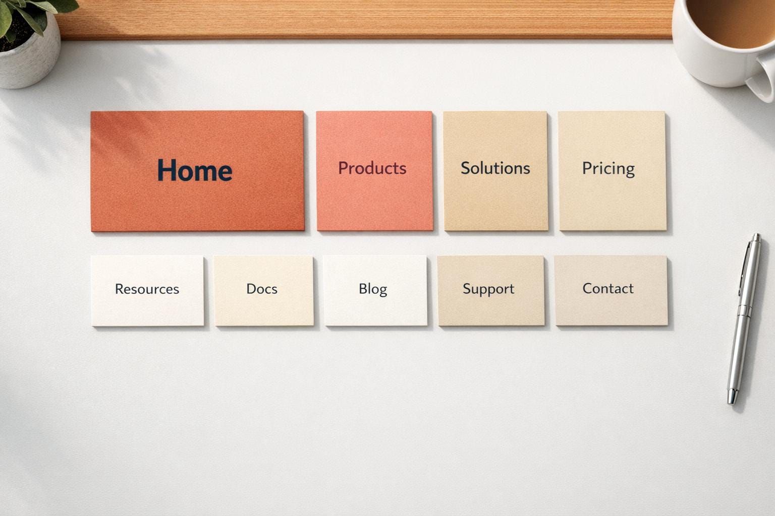
Visual hierarchy is the backbone of easy-to-use navigation. It ensures users can quickly identify important elements and take action without confusion. By using size, color, spacing, and typography, designers guide users' attention effectively. Without clear hierarchy, users face cluttered menus, weak call-to-actions (CTAs), and decision fatigue, leading to frustration or task abandonment.
Key Points:
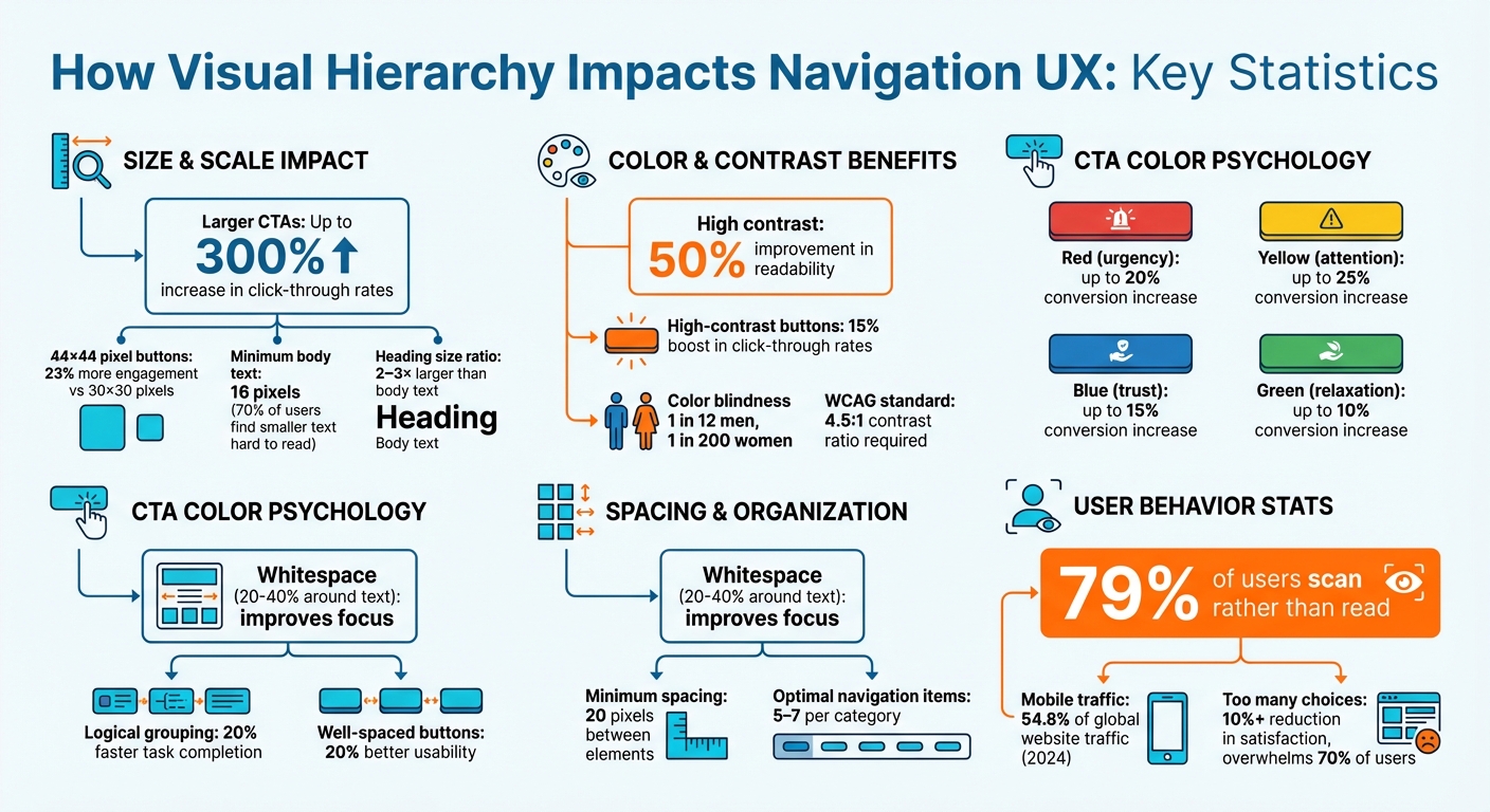
- Size and Scale: Larger elements attract attention first. Bigger CTAs can boost clicks by up to 300%.
- Color and Contrast: High contrast improves readability by 50%, aiding accessibility and user focus.
- Spacing and Grouping: Whitespace organizes content, reducing overwhelm and improving task completion by 20%.
- Typography: Consistent font sizes and bold text help users navigate content efficiently.
To improve navigation UX:
- Audit your design with tools like Hotjar or apply the Squint Test.
- Use clear hierarchy principles, such as limiting oversized elements.
- Test navigation with real users to refine structure and labels.
A well-structured hierarchy reduces mental effort, speeds up navigation, and increases user satisfaction.
Visual Hierarchy Impact on Navigation UX: Key Statistics and Metrics
Common Navigation Problems from Poor Visual Hierarchy
Poor visual hierarchy can wreak havoc on navigation. It's not just about looks - it's about whether users can complete their tasks or if they abandon the process altogether.
Unclear Priority of Navigation Elements
When every navigation item looks identical, users are left guessing what's important. This extra effort leads to cognitive overload, which can cause decision fatigue, making choices harder and leaving users less satisfied. Disorganized layouts only make things worse, often resulting in "pogo-sticking" - users bouncing back and forth through a site's hierarchy because clear local navigation is missing.
Another issue? Navigation elements that resemble ads or appear in non-standard areas, like the right rail, often get ignored due to banner blindness. With 79% of users scanning rather than reading, subtle visual cues become essential. Without them, users may abandon tasks entirely. All of this boils down to one common problem: a failure to establish clear visual priorities in navigation design.
Cluttered Navigation Menus
Cluttered menus are a recipe for confusion. When everything competes for attention, nothing stands out, leaving users overwhelmed. Busy, chaotic layouts can even make a site seem unprofessional, eroding trust. As one UX expert put it:
"When everything appears important, nothing is important." – UXTeam
Oversized menus that take over the entire screen or cascading dropdowns prone to accidental closures only add to the frustration. And in a world where over 5.5 million apps are vying for users' attention, these friction points can seriously hurt user retention. A clean, clear visual hierarchy is key to avoiding these pitfalls.
Weak Call-to-Actions
A weak call-to-action (CTA) is like a road sign hidden in the bushes - it forces users to search, reducing task completion rates. Without a clear focal point, users’ eyes wander aimlessly, leading to choice overload and decision paralysis. On the flip side, strong CTAs can make a big difference. For example:
- Using larger fonts for primary actions can boost click-through rates by up to 300%.
- High contrast improves readability by 50% and can increase conversions by 21%.
- Enlarging button sizes can drive a 32% increase in clicks.
Even the color of a CTA can influence user behavior:
| Color | Psychological Effect | Potential Conversion Increase |
|---|---|---|
| Red | Creates urgency | up to 20% |
| Yellow | Draws attention | up to 25% |
| Blue | Builds trust | up to 15% |
| Green | Promotes relaxation | up to 10% |
When CTAs fail to stand out, they don’t just reduce engagement - they actively block users from completing actions that navigation is supposed to facilitate. Addressing these issues requires thoughtful design reviews and iterative testing to fine-tune visual hierarchy effectively.
Core Principles of Visual Hierarchy in Navigation
Now that we've explored common pitfalls, let's dive into the principles that actually make navigation effective. These aren't abstract ideas - they're actionable strategies to improve how users experience your interface.
Using Size and Scale for Emphasis
Big elements naturally grab attention first. This is why larger primary CTAs can increase click-through rates by up to 300%. Similarly, interactive elements sized at 44×44 pixels see 23% more engagement than their smaller 30×30 counterparts. As Miklos Philips from UX Collective puts it:
"Size establishes visual hierarchy because the largest elements grab attention first, and therefore appear to be the most important."
To keep things clean, stick to the Rule of Three: small, medium, and large sizes. This avoids clutter while maintaining clear relationships between elements. For text, ensure body copy is at least 16 pixels - about 70% of users find anything smaller hard to read. Headings should be 2–3 times larger than body text to create a clear structure. And remember, limit oversized elements to two per view - if everything is big, nothing stands out.
Using Color and Contrast
Color is a powerful way to highlight key elements, but it’s the contrast in value and saturation that really does the heavy lifting. High contrast is especially critical for accessibility, given that 1 in 12 men and 1 in 200 women experience some level of color blindness. WCAG recommends a contrast ratio of 4.5:1 for standard body text to ensure readability.
The benefits are clear: switching muted gray buttons to high-contrast accent colors has been shown to boost click-through rates by 15%. To keep things simple, limit your palette to 2 primary and 2 secondary colors. Use warm, saturated colors like red for critical actions or warnings, and pair colors with other indicators like icons or labels to avoid relying on color alone. As Robin Dhanwani, founder of Parallel, wisely notes:
"When every element shouts, nothing stands out."
Don’t forget that spacing and grouping work hand-in-hand with color to clarify visual priorities.
Using Spacing and Grouping to Organize Content
Spacing isn’t just about aesthetics - it’s a functional tool for organizing information. Whitespace helps group related elements, making it easier for users to process information. This is based on the principle of proximity, where elements close together are seen as part of the same group.
The impact is measurable: adding 20% to 40% whitespace around text improves focus, logical grouping speeds up task completion by 20%, and well-spaced buttons improve usability by another 20%. To avoid clutter, maintain at least 20 pixels of space between distinct elements. For text-heavy layouts, use a line-height between 1.5 and 1.75 times the font size to enhance readability. Also, limit navigation options to 5–7 items per category - too many choices can reduce satisfaction by over 10% and overwhelm 70% of users.
Applying Typography Principles
Typography ties everything together, guiding users through content while reinforcing hierarchy. It’s not just about readability; it’s about creating a clear path from the most important information to supporting details. Font size, weight, and style all contribute to this flow.
Consistency is key. Use a typographic scale with a consistent multiplier (like 1.25× for a "Major Third" scale) to create harmonious font sizes. While a 1.5× ratio between titles and body text is a good baseline, a 2–3× ratio is better for content-heavy pages. Bold text is great for drawing attention to primary navigation links or active states, but don’t overdo it - limit contrast variations to three to avoid overwhelming the design.
How to Improve Navigation UX with Visual Hierarchy
Once you've grasped the principles of visual hierarchy, it's time to put them into action through audits, testing, and leveraging the right tools.
Conducting Hierarchy Audits
Start by evaluating your current navigation layout. Tools like Hotjar can provide heatmaps that highlight where users focus most and identify areas they overlook. If you don't have access to analytics, try a heuristic review - ask team members to describe where their eyes naturally go on the page. Another quick method is the Squint Test: step back from your design and squint or apply a 5–20 pixel blur. If your primary navigation elements don't immediately stand out, it’s time to rethink your hierarchy. Prioritize navigation elements based on their importance to your business goals.
Iterative Design and User Testing
To refine your navigation structure, tree testing can be incredibly helpful. This method uses text-only menus to highlight issues with labels and grouping. Key metrics to track include Success Rate, Directness, and Time on Task. If users take a roundabout path to find what they need, low directness scores will reveal the problem.
For meaningful results, aim for 30 to 50 participants to achieve a 95% confidence level. Take, for instance, the May 2023 case study from Invesp, where navigation testing for PrintGlobe led to an 18.5% boost in conversion rates. They tested three different menu prototypes, analyzed user behavior, and identified the most effective structure. As Page Laubheimer from Nielsen Norman Group puts it:
"If you're not checking, you're guessing; you need to test your information architecture to be sure that your users will be able to find key resources and features."
When creating test tasks, avoid directly matching the phrasing of your navigation labels. Instead, use alternative wording or "sleight-of-hand" tasks to ensure users can find less obvious resources. This approach tests whether your category labels provide a clear enough "information scent".
Once your testing yields actionable insights, use these findings to refine and enforce a consistent navigation hierarchy.
Using Tools and Resources
To validate your navigation hierarchy, tools like Optimal Workshop (Treejack), UserZoom, and UXtweak are invaluable. Establishing a design system is equally important - it should define type scales, spacing (such as 8-point grids), and color palettes to ensure a unified navigation experience. Accessibility tools can also help verify that your contrast ratios meet the WCAG standard of 4.5:1, ensuring readability for all users.
For those looking to deepen their expertise, consider resources like DeveloperUX's Master Course on UX, which covers essential topics like typography. And with mobile devices accounting for over 60% of global web traffic, make sure to test and validate your navigation hierarchy on smaller screens to ensure a seamless experience across devices.
Conclusion
How Hierarchy Affects User Behavior
Visual hierarchy plays a crucial role in shaping how users interact with a design. By organizing elements intentionally, it reduces mental effort and helps users navigate more efficiently. This structured approach ensures tasks are completed without unnecessary frustration or confusion.
The results speak for themselves. For instance, using larger fonts for call-to-action (CTA) buttons can boost click-through rates by up to 300%. High contrast between elements enhances readability by 50%, while well-aligned layouts can lead to a 30% increase in task completion rates. Additionally, a clear hierarchy fosters trust, as users often judge a company's professionalism and reliability based on its design.
To create effective designs, it's important to limit emphasis to 3–5 levels and make strategic use of whitespace. This approach prevents users from feeling overwhelmed and helps them scan content quickly. Considering that 79% of online readers skim rather than read word-for-word, your design must communicate effectively at a glance.
Next Steps for Designers and Developers
Here are some actionable steps to translate these insights into better user experiences:
- Test your navigation with the Squint Test: Blur your design and check if the primary elements remain noticeable. If they don’t, your hierarchy needs adjustment.
- Set a clear typographic scale: Ensure headings are 2–3 times larger than the body text (e.g., 16px body text paired with 32–48px headings).
- Simplify your color palette: Stick to two primary and two secondary colors, reserving one bold brand color exclusively for primary CTAs.
- Document your design system: Include type scales, spacing (like an 8-point grid), and elevation guidelines to maintain consistency across navigation elements.
- Use heatmaps to validate focus: Ensure users follow the intended scanning patterns, such as the F-pattern for text-heavy designs or the Z-pattern for more visual layouts.
With mobile devices accounting for roughly 54.8% of global website traffic in 2024, it’s essential to optimize for smaller screens. For instance, ensure touch targets are at least 44×44 pixels to enhance usability.
FAQs
How do I know my navigation hierarchy is working?
An effective navigation hierarchy helps users quickly grasp and move through your site with ease. Key indicators of success include clear organization, a logical structure, and strong visual cues that naturally guide users. When done right, this minimizes confusion, improves user satisfaction, and ensures visitors can effortlessly find the information they need - keeping them engaged longer.
What should I prioritize first: size, color, spacing, or typography?
Size is the most important factor to focus on first, as it establishes visual hierarchy and guides where users look. Once you've nailed the sizing, you can fine-tune the design by working on color, spacing, and typography to improve both clarity and usability.
How can I improve navigation hierarchy for mobile menus?
Creating a well-organized structure is key to making mobile menus easy to navigate. Start by arranging menu items in a way that naturally guides users, placing the most important pages at the top. Use contrasting colors or bold text to make key elements stand out, helping users quickly identify where to go.
Keep the menu streamlined by cutting out unnecessary options - this reduces clutter and makes the experience more intuitive. By ranking elements based on visual importance and simplifying choices, you can design a mobile menu that feels seamless and user-friendly.